
-
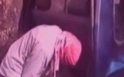
- Army Jacket
-

- Die Leguane
-
- Happy Boots
-

- Keep Hollywood Close
-
- NY Sorrow
-

- Tale of the Skull
Time’s up, pencils down! You’ve had two weeks to see the Seth Price show at Friedrich Petzel, so what’d you think? Personally, we’ve got a few questions we can’t figure out:
- Why, at the very end of “Fire and Smoke”, is an element of doubt added? There’s no reason to believe, from the rest of the story, that the little girl would say anything but ‘no’ to her parents’ question – “Is this the one who led you astray?”. Yet, in the final line – she looks at him, he looks at her – it’s heavily implied that there is some possibility of the little girl choosing to falsely accuse this guy out of, what, pure malice? It’s like a really good ending was taken from an entirely different story and tacked on.
- To what degree is “Fire and Smoke” about the old woman? She’s a not-so-nice person who, through supernatural force and injury, is made into an artist; it’s classic arty material, and it could go somewhere, but the story doesn’t really focus on her. I’m not sure I get why.
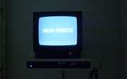
- “Non Speech”: how political is this? And if it is political, does it fail by our needing to ask this question?
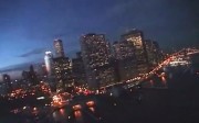
- “NY Sorrow”: is this piece really as bad as we think it is? Will anyone defend it?
- “Keep Hollywood Close”: is there any interest to this besides what would exist in the original video? It’s been slowed down a bit and has a pretty O.K. song, and I suppose now it’s in a gallery: that’s the total of the changes Price’s made here, other than adding the meaningless first and last few seconds. Do any of those changes make it better?
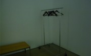
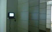
- We love the display and the design of the exhibition – the coat rack particularly was a very nice touch in terms of making people stick around and finish videos. Does anyone disagree?
Enough of us. Let’s talk about this!

{ 11 comments }
Thanks for the post. I liked it……
The way i looked at it was as a whole thing, as one piece. I guess that’s what it was, an installation. One of the best things about art is that it doesn’t ask for a literal reading–at least good work doesn’t.*
I think it’s apparent that the overall meaning is ambiguous, which i like, but there definitely was a political/war/military/9-11 theme. And even the videos that weren’t overtly about that obviously succumbed to it: footage of soldiers or clips from an Air Force commercial (or whatever the sources were) or Al Qaeda propaganda videos are all (probably) going to leave a more forceful impression on a viewer than an iguana in a tree or an ambiguous beach scene (which i think was footage from some Arabian beach). That said, it was, for me, a series of short art-movies that can’t be assessed separately.
That said, I didn’t “pay attention” to the short stories in the two videos…. the rolling skull story was easier to follow, it was simpler and the al-qaeda footage was something that you were forced to deal with (it is, in itself, provocative). but the other story (Fire and Smoke) I was hardly able to follow along–but the Fire and Smoke video i interpreted as a place-holder (in relation to the other ones, and i think there were others)–it was interpretive downtime. the overriding quality of both short story videos was the Garrison Keillor-like voice and pacing of the narration, which for me, and perhaps many people, makes you recall tuning out while you wash the dishes or carry out some mundane task on a Sunday afternoon. In a sense it’s like Price’s bad-design calendar paintings Price’s bad-design calendar paintings which are both vacuous and thoughtful at the same time.
The overall war theme, especially considering the soundtracks, has to be considered political in some sense but I think it’s more of Price (or his neutral/information-consumer/everyman stance–if that is his stance) presenting a series of works that try to reflect the absurdity of the political sphere and war specifically, and of contemporary existence in general. In that way definitely political, but I think, one way or another, everything is political.
I agree on NY Sorrow in that it was the most literal segment, and thus the least interesting. Whatever it is, it basically forced a literal reading.
*As I’ve been trying to (co-) write a novel about the suburbs I folded and decided to read Franzen’s Freedom. It certainly has been a long time (if ever) that I read something like that. And while it was really good, basically everything was spelled out for the reader–it was too literal to be great. When things get too literal, including interpretation, you get bogged down unnecessarily. Like when someone asks (during a film), for example, What did he say? If that line of dialogue is so important, it’s not art. If it’s art you probably don’t really need to be paying attention in that manner. Engagement is important, not attention. Kiarostami, the director, said in an interview that he often falls in and out of sleep when he goes to the movies, and that it is a fun and important part of his movie experience. And I can’t remember if it was Cahiers du Cinema or Kiarostami that opined that you should be able to watch a foreign language film (a good one) and not need to understand anything they are saying but understand the film, or at least enjoy it completely. Some things are simply about the experience. Hopefully these asides seem relevant to the commentary.
Also, the imagery that is recognizable as from a time and place–specifically, the military/rolling skull/NY sorrow videos–these are ambiguously of a recent past–decidedly not current but not quite historical. This invokes a warped (non-) memory of received images, previous or contemporary. A nostalgia or remembering that isn’t really actual. Obviously the credit sequence of a 1995 CGI festival is from a specific past–but either way, in one way or another, they are things we’ve lived through somehow and have processed and possibly reflected on even though it’s mostly easily forgotten content.
Most of Price’s other work (that I’m familiar with) mines this field of recent history, and pretty consistently.
We are so inundated with media that it is easily forgotten, and in a sense disposable. So when I see there was a suicide bombing in Iraq or some people died in Afganistan it doesn’t even register. It could have been today or yesterday or last month or five years ago, but I think eventually it starts to look like it was from five years ago.
I agree that the show is meant to be seen as a whole, which is part of why I think the installation is so successful. He definitely wants people to stick around. He also wanted the audience to see the work from a particular starting point, as evidenced by DVD players, which all had play buttons you had to press.
When I start to think of the role timed experience has in this show though I get annoyed. In NY Sorrow he tells us the video is shot in March 2001, and the sound made about a year later, in Army Jacket the video is made in 2002, the song made after 2001, in Keep Hollywood Close, he got the imagery after the tsunami and recorded the music in 2000-2001. But isn’t all this date keeping a little trite? It’s not like it’s a mystery that footage and music can be interpreted differently, even by the maker as events occur.
To my mind, Jonas Mekas does a much more effective job of using archival footage and building a powerful narrative out of it. His World Trade Center Haikus (2010) are a far more poetic response to the presence the towers had in peoples lives then, today. Mekas more easily embraces sentimentality than I can, but he pulls it off because the work really is that poetic.
Anyway, the bad calendar design painting reference is useful, though I wonder whether the vacuity to thoughtfulness ratio might be a little off in this show. Either way, I have a hard time distinguishing a neutral stance from having nothing to say at all.
Knowing when and where the footage is from makes it less interesting as it deflates the ambiguity. I guess that’s Price’s decision.
I think the installation is like anything else where reading reviews beforehand (and knowing too many facts) often takes the fun out of it, which is best to try and avoid.
I posted some of these videos on the art-blog I post to for the Interdependence Project. I’m totally into Price’s exhibition. The duration of time. The simplicity of it. Like a video sketchbook. Saying that feels corny. Sketches are often my favorite thing.
I think describing the show as a sketchbook makes a whole lot more sense than attempting to argue (as Paddy or Guy Forget have) that it’s a single work. I just don’t see anything in common (or in distinct opposition) between, say, Fire and Smoke, Keep Hollywood Close, and Army Jacket. Are there smaller thematic groups? Sure. There’s war, and there’s disaster, and there’s (non-war or -disaster-related) storytelling. That’s as far as it goes, though, and I’d be uneasy grouping a decade of work under one title anyway. Point is, I like the sketchbook as a basis.
That said, does this do anything we like sketchbooks to do? It seems to me that we mostly get interested in sketches as remnants – as either works-in-progress where we have some ‘final’ version to compare, or as a catalog of the artist’s ideas that’s more expansive, and less edited, than their work proper. I don’t really see that here; certainly there’s not a conscious engagement with that concept (which isn’t what you suggested, I understand).
I agree that duration is important, but I’m not sure I understand why. Certainly, the display – which heavily influences viewers to sit (or rather, stand) through the videos in their entirety – operates in the same way that displays for durational works typically do. The works themselves, though, are quite short, and the pauses in them… well, they aren’t the sort of Zen for Film/24 Hour Psycho long that gets you frustrated and mad and then calm. They’re more like the length of pause you get on a Deal or No Deal episode, where you’re (at this point) conscious of being manipulated into anxiety and expectation, but go along with it anyway. “Army Jacket” was particularly pronounced that way – the shot of the driver in the car lasts a while, and is better for it, but it still comes off like the slo-mo intro to a thriller movie – and, for clarification, I don’t think there’s anything much deeper to that similarity. Honestly, it seems to be about 25%/75% durational intent/needing to make the videos last as long as the songs; which is a nasty thing to say, I know.
I understand what you’re saying but if this show is like a sketchbook then what are his finished works?
There aren’t any (certainly not in this exhibition), and that’s exactly it – a sketch without a final product is just unfinished.
I’m not totally convinced that the concept of “finished” is that important. I know that I’m not very interested in it. There’s a lot of promise in the “unfinished” and setting up possibilities for completion in one’s mind is a difficult and occasionally beautiful task. Aren’t they all set ups for the record release that accompanies or is related to this exhibition?
The flow of the show is totally right on, AFC. A great solution to the “oh god, another large video installation I walked into at 3’24”? Should I watch until it re-starts? What do I do? Oh there’re paintings over there? Ok I’ll check those out” problem. The specificity in viewing experience is like listening to an album. Like, like, like. 😉
Meh, sketch books aren’t usually as carefully installed as this. Each TV is set up with a DVD player with a carefully labeled play button. Why be so careful about ensuring people see the videos beginning and end if it’s a sketch? Surely it would matter less.
I’m not sure we can say with any kind of certainty that the sound pairings are strongly influenced by sympathetic lengths, though I get the point. It doesn’t seem intentional enough. But it’s not that difficult to produce a fade or arrange sound so it matches, and I generally think the music works with the imagery, which can be difficult to achieve.
Personally I wish the music were a little more inventive. Art collective Lansing-Dreiden probably has the closest sound to Price I can think of in the art band+artist field:
http://www.myspace.com/lansingdreiden
I’m not sure there’s really a point to this, in the sense that I’m not sure how to position either comparatively, but they seem relevant in this instance.
In this exhibition, the length of Seth Price’s videos are kept at the length of a pop song—at about 3 minutes and 30 seconds. The duration, along with the works’ previous method of broadcast on YouTube points at this popular model of communication and punctures a hole into the medium’s liberatory potential. Just as early video art in the 1970s (with groups like Radical Software) and then into the 1980s with public access TV (Laurie Anderson, among others) was discussed by artists and critics alike for its participatory potential—anyone can use a Portapak, anyone can buy time on public access—so too has YouTube been written about in a very populist fashion. The sheer number of videos posted by teenagers making their own karaoke versions of Ke$ha (for example) or making cut-and-paste interpretations of Ke$ha is evidence of an active consumption. Seth Price’s videos utilize the YouTube language, but a work like “NY Sorrows†reeks of the self-absorption that undercuts any grand delusions of participation. The first-person footage of a sunset helicopter ride was, for those in the cockpit, a meaningful and possibly breathtaking experience. It’s like how home movies don’t have much meaning or enjoyment for those who aren’t family members or who weren’t there to experience “Sally’s first birthday.†Regardless of the personal relevance “NY Sorrows†had for those in the helicopter, translated into Seth Price’s version, any of the original emotional heft has been sucked out. “NY Sorrows†is an artifact of a previous time, of someone else’s experience. When watching this, I felt nothing, having no emotional draw to the skyscape—as if it were a postcard of NYC from the 1990s.
I agree that the works are like sketches, sketches in the sense that they embody very basic elements of videomaking: speeding down images and then overlaying these images with seemingly unrelated audio. And like sketches, there’s no resolution. What unites these works, though, is the tactile quality of the on-screen images. Either grainy or ultra-glossy, the images almost seemed to have a second skin through their very physical presence. This was my favorite aspect of the works, although favorite is a difficult thing to say about an exhibition that utilized the language of YouTube to dismiss it as anything other than a self-involved practice. One reason for sketching is for an artist to work through ideas in the studio before making a finished work for public consumption. YouTube is like a studio space where you can work through your ideas through simple cut-and-paste techniques. The problem, like with sketching, is to convince other people of the works’ relevance other than as a personal practice. I’m reminded of Rosalind Krauss’ critique of early video’s narcissism.
Comments on this entry are closed.