
David McBride
NAME: David McBride
MEDIUM: Painting
STUDIO LOCATION: 1182 Flushing Ave, 2nd floor
BUSHWICK OPEN STUDIO HOURS: Saturday June 2nd, 2012, 12pm-7pm, Sunday June 3rd, 2012, 12pm-7pm
TIME IN BUSHWICK: Going on 4 years
SHARED STUDIO: No
[Editor’s note: Over the next three days we’ll be recommending artist studios we think readers should visit during Bushwick Open Studios this weekend, providing interviews with selected artists and compiling it into handy AFC maps you all can use to get around. We know the size of this event can be a little overwhelming. Hopefully, our work will make navigating the Bushwick terrain a little easier.]
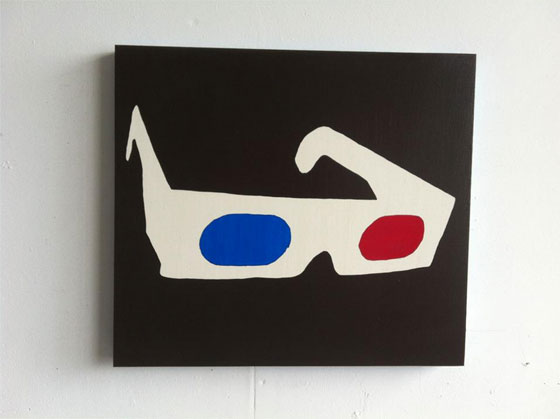
David McBride makes his paintings with a stencil and blue, red, and brown glaze. The result is a studio filled with what appears to be a lot of chocolate brown paint. The importance of the subjects is not immediately apparent: in one painting, he pairs a roller coaster with a clothesline of hanging flags, while in another, he fills the canvas with botanical illustrations. The key to understanding the work might be the 3D glasses painted above, which remind us that these paintings, like everything else we see, are constructed from light. It’s an almost obsessive interest in practice, and we like that.
Your painting technique uses old master glazing techniques which you then conceptually pin to advertising printing processes. Can you talk about how that’s achieved in your work?
The glazing technique is a way to achieve multiple colors from fewer colors. Technically, the idea is that transparent layers of paint allow light to pass through them and reflect back off the white of the gesso ground. This kind of color approach results in deep, complex colors and the kind of luminosity we associate with antique paintings. An example would be to lay down a transparent layer of yellow, then a transparent layer of blue, and the painting will look green.
This approach in my work is often used to create depth and illusion. More often, though, the result is a shade of black, and the colors I use for the glazes are quite synthetic. Here, the idea is that this old technique of indirect color mixing can approximate modern, mechanical techniques; I’m thinking of something like CMYK and the range of colors fancy printers can produce with only a few color cartridges. I’m not interested in a kind of slavish verisimilitude of the process though, so the colors I start with are not yet duplicates of colors used in modern printing.
Throughout my work, I’m interested in destabilizing categories or areas of supposed exclusivity associated with media. I think this use of a very traditional oil painting technique to approximate modern printing is one area where I might achieve this.
It seems like just as much action occurs in the space between your paintings as it does on the surface itself. In other words, it seems like you’re building relationships. Do you do this with a specific narrative in mind, or is it more associative than that?
I think it’s more associative. I think of the images as motifs, where the imagery is always a kind of reference to a broader theme. In general, that theme is the way reason is suspended more often than we might generally acknowledge. It’s the trickster idea, or the kind of thing Poe seemed to be representing, and it’s why I’m interested in surrealism—a kind of rupture in how things are supposed to go. If my work can manage to evoke this notion, I’ll be happy. I’m probably not disciplined enough intellectually to be able to come up with a specific narrative.
You recycle some images in your work. Can you talk about how you chose the images you’ll reuse?
This started out as a purely pragmatic activity. Cutting stencils takes time, and it always seemed a shame to throw out exactly half of the work I’d just done, which is a result of using stencils. So whenever I could, I would save the halves of stencils that I didn’t use so I could potentially make another painting using it (only, it would be the negative of its counterpart).
So usually when you see a repeated image, it’s actually the reverse image because I managed to hold onto the stencil. For me this is valid because I’m interested in the transience of all these images, or maybe it’s more accurate to say the non-uniqueness of images, their repetition.
I’ve begun working on larger surfaces again, where the duplication of imagery becomes more pointed. The duplication happens in the same painting, on the same surface. And theoretically, for me any image can be duplicated then, and my choosing is more or less random.
What search terms do you most frequently put into Google Images?
Forest and ring of fire.
Would you rather: Lower East Side or Chelsea?
LES (that one’s easy).
What music do you listen to in your studio?
Music this time of year is baseball games.

Comments on this entry are closed.