

Lisa Cooley, 107 Norfolk Street
(Through 2/3/13) Air de Pied-à-terre
Will Brand: I’ll be the first to admit I have no idea what’s going on here. There’s some vinyl false walls by Matthew Darbyshire, some freestanding mobiles by Lisa Williamson Hanna Sandin, and Birgir Andresson’s text-silkscreened-on-paper Portraits, which I guess prove that a picture is worth like 200 words, max. Then there’s a pair of bad-bad Alan Reid drawings that were supposed to be good-bad, some named houseplants, and then a bunch of chairs, some from contemporary designers, some from the 1940s.
Whitney Kimball: Well, think about it. You’ve got what looks like Swedish design; a lot of variations on type; office plants; Alan Reid’s (beautiful) fashion portraits. Everything’s totally defined by style and surface. It’s like an Alex Katz show. Which is whatever.
I did like the way Birgir Andrésson’s text portraits start to talk about the judgements that are implicit in minimal perfectionism, by describing people’s character completely based on appearances. He writes: “Although he is not handsome, his forehead is beautifully shaped and his eyes, when studied closely, are clearly those of an intelligent man.” That’s totally meaningless. And then he adds the Pantone color of the text at the bottom.
Will: Andrésson’s work reminded me a lot of the Douglas Huebler show at Paula Cooper last year, that way.
Corinna Kirsch: I think you nailed it with the “style and surface” comment for this show. I liked Andrésson’s descriptions alright, but they really just seemed to be the type of judgements that’d be made by any old private investigator, like Poirot. Even though they’re descriptions, they’re still partial snapshots of an invisible thing you can’t see. That’s another line of thought going on in this show, with works that only show you a peek of a scene (Andrrésson’s snapshot text portraits, Alan Reid’s almost-legible nonsense words in Old English, and Darren Bader’s conversations between plants, that are missing only that all-important part of communication, speech).
Paddy Johnson: It sounds like Darren Bader’s performers were on a break when you guys were there, which is a shame, because it really made the installation for me. It’s just two people hired to talk about whatever on mall-like park benches, but they’d been there all day, so they were sitting in silence. They’re flanked by Matthew Darbyshire’s wall facade which, transformed the gallery into a cookie cutter mall.
I talked to Bader’s guests briefly, suggesting they discuss the piece of raw steak beside them. They were having none of that. “Already done.” the one woman told me, “We’ve even talked about cannibalism.” Apparently the participants can talk about whatever they like, a decision she took issue with. “That would have made the piece better. We’re supposed to do this again, but after today, we’re not going to do it.”
The critique of the show from the participants was really great in my opinion, but also a practical suggestion the gallery should pay heed to, moving forward. Eight hour shifts are too long for performers.

Louis B James, 143 Orchard Street
(Through 2/22/13) The White Album
Whitney: There wasn’t yet a title on the show this morning, so we tried to come up with what we thought it could be. It was something like “The Abstraction of Imperialism” because of the images of the Black Panther party, Britney Spears in an “I Am The American Dream” T-shirt, and Nate Lowman’s gritty climate change headlines. Based on this Joan Didion quote in the press release, I guess there isn’t a premise at all. She writes: “…all I knew was what I saw: flash pictures in variable sequence, images with no “meaning” beyond their temporary arrangement, not a movie but a cutting room experience.” I get it, but that’s a boring way of presenting art.
Corinna: Premise aside, the work seemed predictable: a predictably nice abstraction with pleasing, controlled drips; a predictably nice collage, sculpture, et cetera. Not bad, but nothing I’ll remember in another month.

"Forget About the Sweetbreads" at James Fuentes

Sculptures by Alice Macker
James Fuentes, 55 Delancey Street
(Through 2/3/13) Forget About the Sweetbreads
Will: The theme here is bright, lumpy, cartoony stuff—ahem, “ceramic sculpture, and the way it activates traditional yet internal sensibilities”—which could be a lot of shows in the Lower East Side; the catch here seems to be that while the work is all recent, the artists are all old and/or European. The show holds together really well, but there’s nothing surprising here. The little sculptures above, by Alice Macker, are charming, but so are most lumps with faces.
Corinna: When I walked in, I remember thinking the work seemed like it’d been made by troubled kids, like the ones Bjarne Melgaard recruits for his shows. But then, it seemed like the paintings and sculpture were too self-conscious to be just that. Not that there’s a problem with that, it just looks too familiar. Even for Annette Messager, who I tend to like, minus her crucified stuffed animals, didn’t do much to stretch the limits of odd sculpture here.
Whitney: James Fuentes shows a lot of work in the finger-painting and birdshit genre. I always kind of like it, but there’s a limit.
Paddy: Man, you guys are grumpy. I didn’t love that the art in this show looked like it could have all been made by one artist, but there was some good shit here. Heike Kati Barath’s evil yellow rabbit painting was hilarious, as were Alice Macker’s happy face ceramics (I don’t think the universal appeal of lumps with faces diminishes the work). Norbert Prangenberg’s painting of what might be an anthropomorphized caterpillar in a forest might be bad—what the hell is going on with all that paint on his surfaces?—but that confusion made me think that there might be something to it.
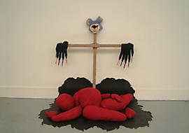
On the subject of Annette Messager’s Deux Replicants Ensembles, I feel like it’s a lot to ask of a single work to “stretch the limits of sculpture”. We’re looking at January group shows here. The piece held the corner of the wall well, and had witch hats for feet. That last part is just description—I’m not sure why I enjoyed the feet so much past an enjoyment of witch hats in art—but I’m not going to worry about it. It was a good piece.

{ 2 comments }
Hi there, the “freestanding mobiles by Lisa Williamson” in Air de Pied-a-terre are actually by Hanna Sandin.
Correction made. Thanks!
Comments on this entry are closed.