
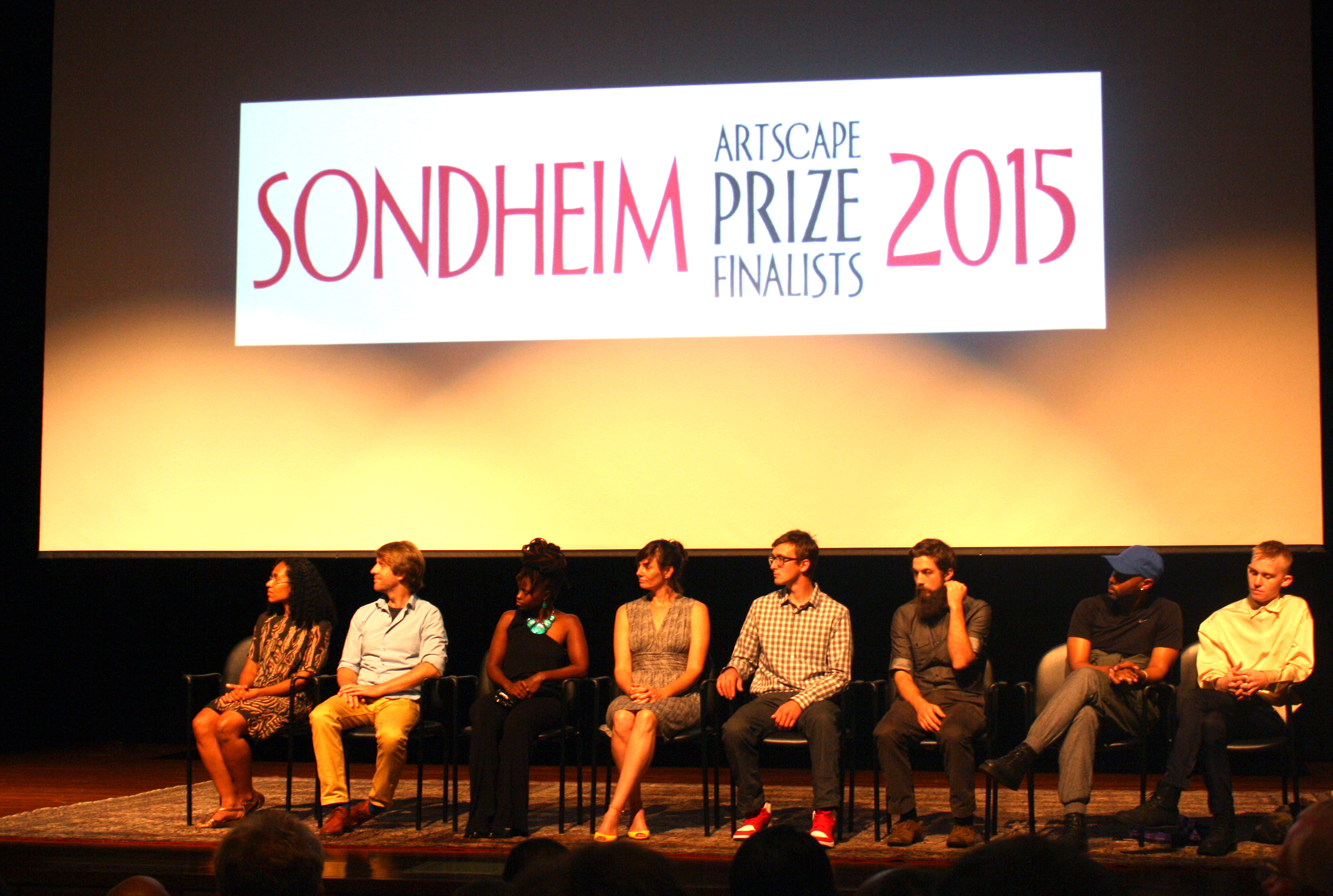
The 2015 Sondheim finalists (left to right): Mequitta Ahuja, Ryan Syrell, Zoë Charlton, Magnolia Laurie, Jim Leach, Malcolm Lomax, and Daniel Wickerham
The Janet and Walter Sondheim Prize, as I mentioned Monday, is one of the largest, and probably the most glamorous art awards in the Mid-Atlantic. We checked it out last year. The competition draws entries from a watershed of Washington, D.C., Maryland, and Virginia. But this year, the Sondheim’s 10th, I say with no small tinge of civic pride that all of the finalists were from Baltimore. And they were all really, really good.
Ultimately, Wickerham & Lomax (formerly DUOX) were awarded the $25,000 prize. Full disclosure: they’re friends of mine, but I would’ve been rooting for them even if they weren’t. Which isn’t to say that the other artists nominated for the prize didn’t put up a good fight/exhibition, which is on view at the Baltimore Museum of Art until August 9th.
Here are the highlights:
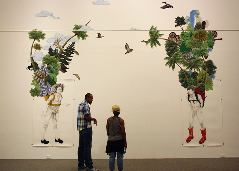
Zoë Charlton, “Companion, Constant,” 2015.
My first thought when I saw this: contemporary artists are faced with an absurdly over-sized burden of history. Colonialism, complicated issues of representation, environmental and racial injustice, et cetera seem crushingly unbearable. In reality, Charlton approaches that mountain of heavy baggage as a wealth of imagery to be mined; singling out overlooked narratives. “Companion, Constant” is a reference to Kalulu, the African servant/companion to the British explorer Henry Morton Stanley. Apparently the two had a close relationship—Stanley was devastated when Kalulu drowned in an accident.
Charlton imagines the colonial-era boy as a contemporary adult, transporting an “exotic” landscape to the gallery, or perhaps embarking on his own expedition. It’s a super obscure reference, but perhaps that’s the point—to provide an alternate illustration of a figure who is otherwise a footnote in someone else’s biography. I’m not quite sure how the viewer is supposed to interpret it, but the charcoal drawings and digitally-collaged vinyl appliques are gorgeous. It’s hard to look at this without realizing the imagery is loaded—even if we’re unsure of what to do with all that weight.
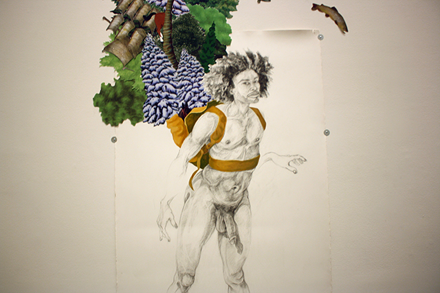
Detail of Zoë Charlton, “Companion, Constant,” 2015
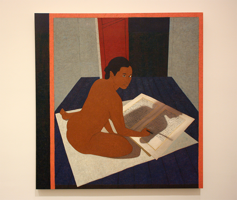
Mequitta Ahuja, from the series “Performing Painting” 2015.
Ahuja also mines identity and historical references. This is my favorite panel from a series of self portraits in built-up layers of oil on canvas. Performing Painting seems very site specific to the BMA as context. The museum is home to the Cone Collection, a world-class assortment of early modern art, including many works by Gauguin and Matisse—two figures forever associated with loaded issues of appropriation and depictions of women and POC. Those titans of early modernism are clearly a stylistic and conceptual inspiration here. The museum also has a sizable selection of African art and classical European oil painting in the permanent collection. Ahuja remixes these all into a surprisingly logical series that seems performative: in each panel Ahuja depicts hereself enacting various roles of authorship. The aesthetic borrows from multiple overlapping lineages of art history and positions herself as auteur of the hybrid result. Assuming the pose of an Egyptian scribe hard at work in a chamber of wonky Renaissance perspective, nude? Sure! Globalization has stir-fried contemporary points of reference and identity, why not pick out the most savory bits?
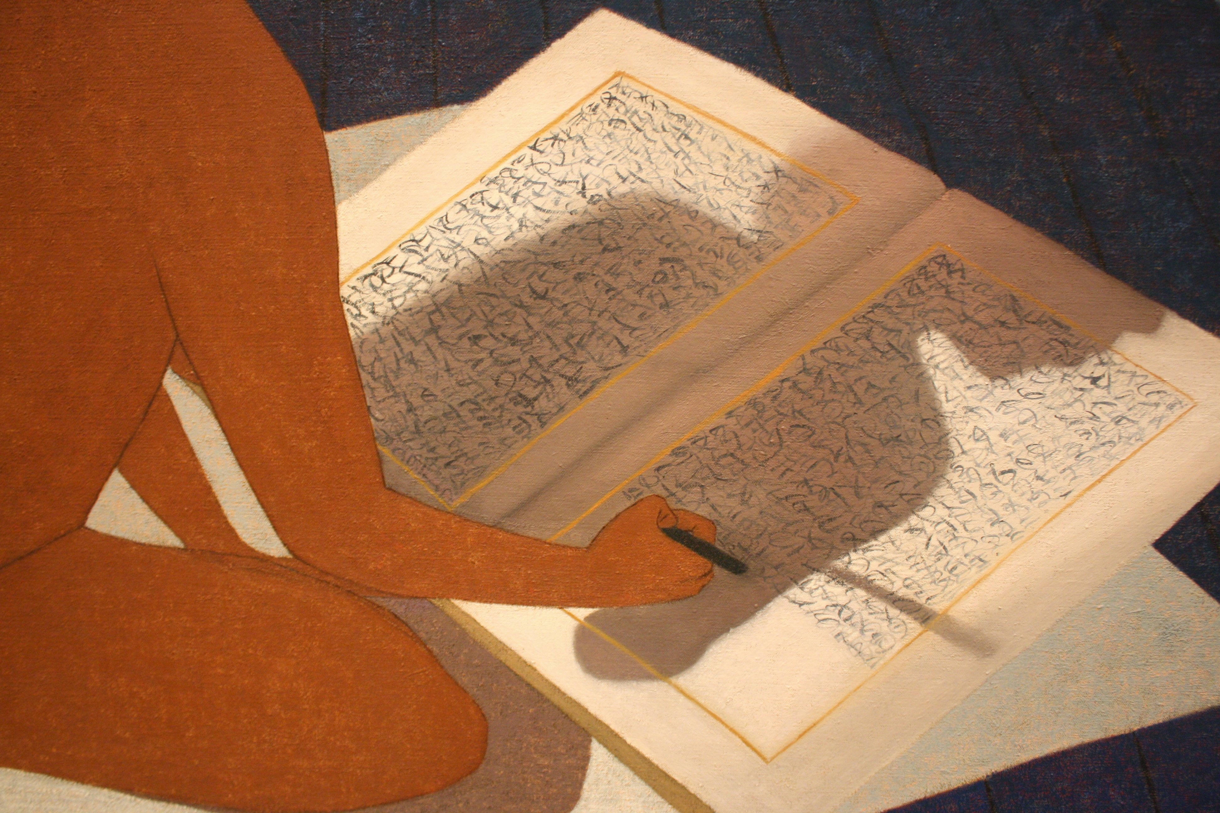
Mequitta Ahuja, from the series “Performing Painting”, 2015. Detail.
I love how this shadow draws the eye to the open book. It’s such skillful handling of color, totally registering as a directional shadow with reflected light from the artist’s body. It’s a huge departure from the Gaughin/illustration-like quality of the rest of the image. But then we’re met with a totally inscrutable text being written. It doesn’t seem to be legible as any one language, but perhaps a nod to cuneiform, the language that started it all? Carved into oil paint instead of clay? Or is this a critique of Orientalism, where non-Roman alphabets were often represented as squiggles? Perhaps a fictional Esperanto for the multi-cultural world of Ahuja’s paintings? A nod to the inability of all cultural signifiers to translate legibly?
Then again, it’s easy to imagine Ahuja’s alter ego staring down the prying viewer and saying “fuck you! I’m writing whatever I want!”

Wickerham & Lomax
Where to even start? Digitally printed fabric, mesh belted to giant frat hazing panels, multiple video screens, and smaller sculptural assemblages—each packed with networked references to pop culture, queer subcultures, signifiers of identity or belonging, and the duo’s own constructed mythology. I really love the paddles-in-sportswear pieces for the context—the BMA’s neighborhood is notorious for its contingent of frat houses and their bro-y denizens.
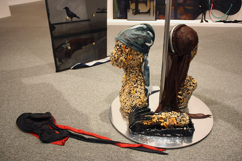
Wickerham & Lomax, (detail)
These are wig heads made out of birdseed/trailmix modelling du-rags. They reminded me of Kader Attia’s creepy birdseed children fenced into a cage full of pigeons for an installation called “Flying Rats” at the 2005 Lyon Biennale. And here, there are ravens subtly lurking in the underside of the hazing paddles. From Edgar Allen Poe’s famous poem to the city’s football team, we can imagine the raven—symbol of Baltimore—pecking away at the du-rag’s wearer.

Wickerham & Lomax
One of several Wickerham & Lomax video screens, a medium that’s referenced in nearly every tangible artwork on display. This one depicts a group of people at the fictional “Khroma Klub” dancing in matching “Dora The Explorer” uniforms. I love how their environment reads as idealized ruins at “street level”, but modernist high-rises above their heads.

Wickerham & Lomax.
In another screen, we see a statement about homelessness disproportionately affecting queer individuals. As the text scrolls up, an absurdist list of “suggestions” for addressing the crisis includes giving makeup tips for tips, interior decorating cardboard box shelters, and other stereotypes of gay culture awkwardly grafted into the realities of poverty. It’s pretty biting, bleak humor, even for Wickerham & Lomax.
There’s always been a deep streak of black tragicomedy to their practice, but this installation felt much darker than previous works. Critic Brandon Soderberg did a fantastic job contextualizing this bleakness as a reflection of Baltimore’s present climate and zeitgeist in a review titled: “Maximalist-Capitalist Installation Builds a Dystopian but not-too-distant Baltimore.” He describes the aesthetic as “over-the-top, late-capitalistic, post-apocalyptic”, a “cyberpunk-ish” vision: “Even at its most bitter, it’s a funny form of protest art, and some truly world-building shit through which we can both better understand our seemingly forever-fucked city and, also, briefly escape it.” It’s a good observation I found complimentary to Bret McCabe’s review for Bmore Art: “they recognize that if you’re not a white heteronormative male in 21st-century America, then you’re already living a kind of sci-fi existence, a time and place where the world as you might desire it hasn’t become reality yet.”
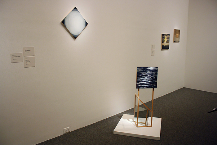
Magnolia Laurie, installation view with “a reflecting return” foreground.
That sense of bittersweet escapism is also present in Magnolia Laurie’s work. Her small oil paintings on panel and sculptural assemblages seem to originate in abstraction, but get reluctantly pulled back in to the real—painterly fields of color are treated with just enough detail to imply moody landscapes. There’s something almost sad about them—the sculptures feel precarious and vulnerable, and the paintings have an uncomfortable, intimate loneliness. Everything seems to be describing a place the artist is imagining but doesn’t want to inhabit.
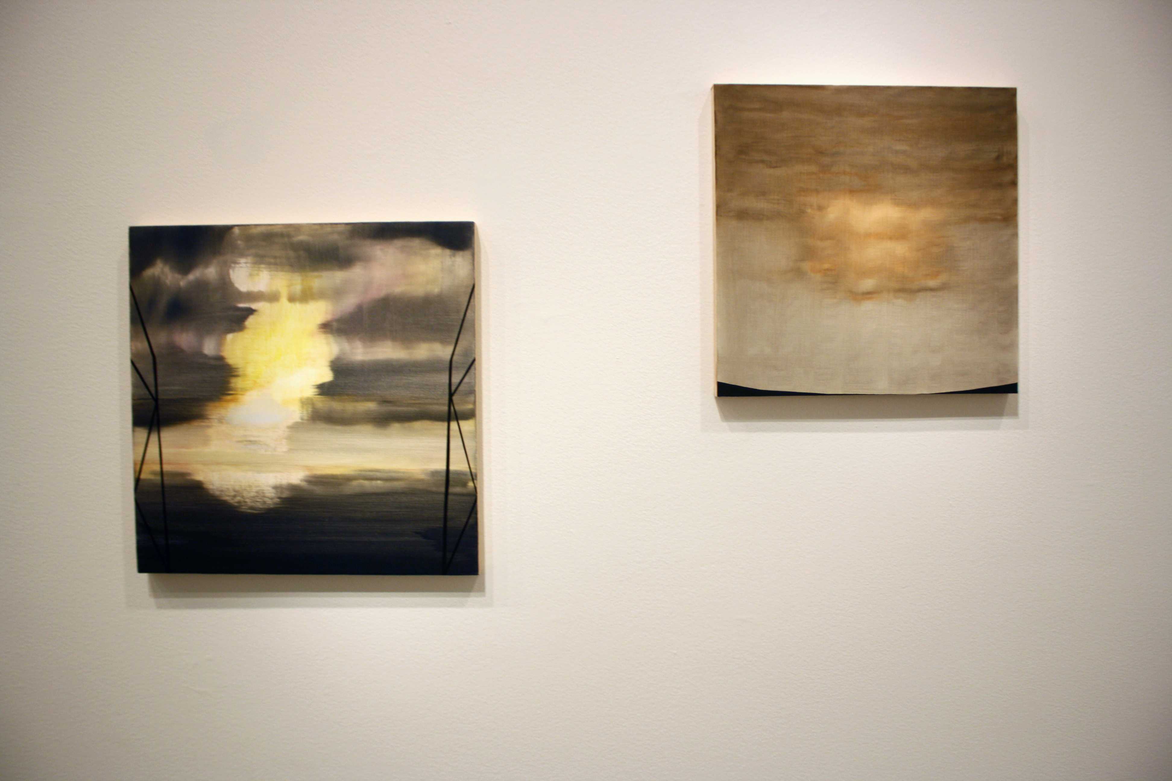
Magnolia Laurie, “the near to far,” 2014 and “projectiles come to rest, we understand that now,” 2012.
I can’t tell if I got the impression from having just seen Wickerham & Lomax’s work, or from the “projectile” reference, but I read these as post-apocalyptic too. What would J.M.W. Turner paint for the atomic age? Mushroom clouds, blankets of smog, nuclear winters, or carbon-fueled superstorms? Maybe I’m predisposed to cynicism, but I couldn’t shake the feeling that these kind-of-gentle, atmospheric paintings were full of anxiety.
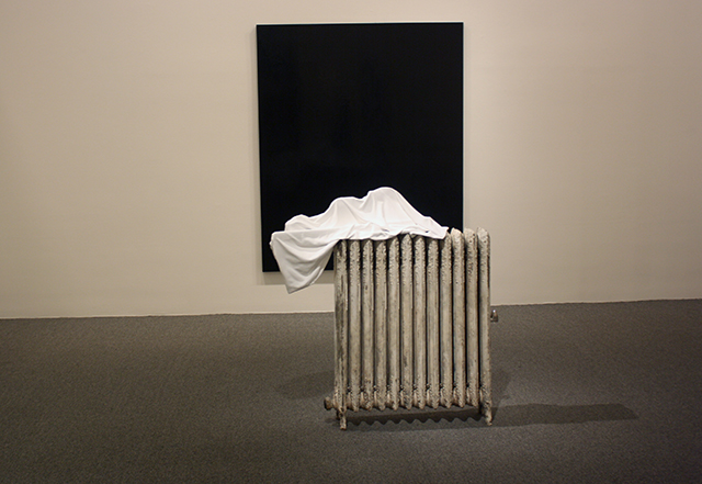
Jim Leach, “Acciaccatura,” 2015.
Of Jim Leach’s mixed-media sculptures, this one stands out. It’s the most minimal, but also has the greatest suggestion of narrative. We’re told there’s a violin on top of that radiator (I didn’t check). I like to imagine this as an implied domestic interior, like a musician’s live/work space might be depicted in a theatrical set. There’s something strangely romantic about the idea of a violin haphazardly placed on a surface, yet covered in a shroud, next to a (window?) Mostly it’s formally really nice: the crisp black square, the bright white organic shape resting on a patinaed object that’s also a square. The distance between the black background and white, texture-rich foreground gives it a cinematic quality, as if one’s perspective while walking past it becomes a calculated camera pan.
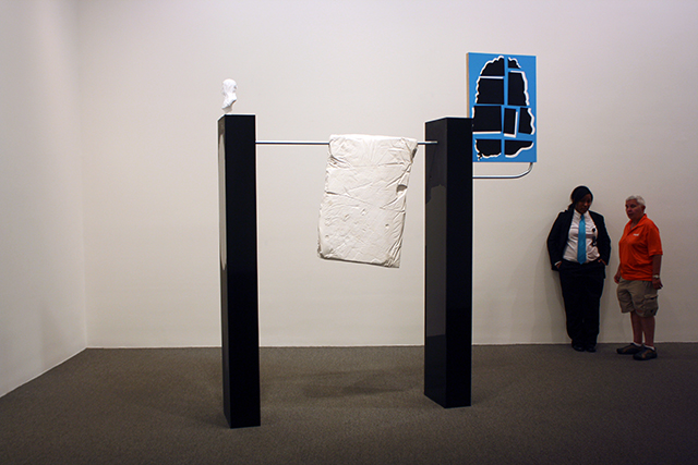
Jim Leach, “The Difference Between a Fruit and a Vegetable,” 2015.
Again, sculpture that compels the viewer to move around and get a closer look. This one lacks the suggestiveness of “Acciaccatura,” however. I’m not sure what to do with the information I’m given—including the wall text, which cryptically lists “sack full of cats” and “Concrete #2 by Sean Sweeney” as its materials.
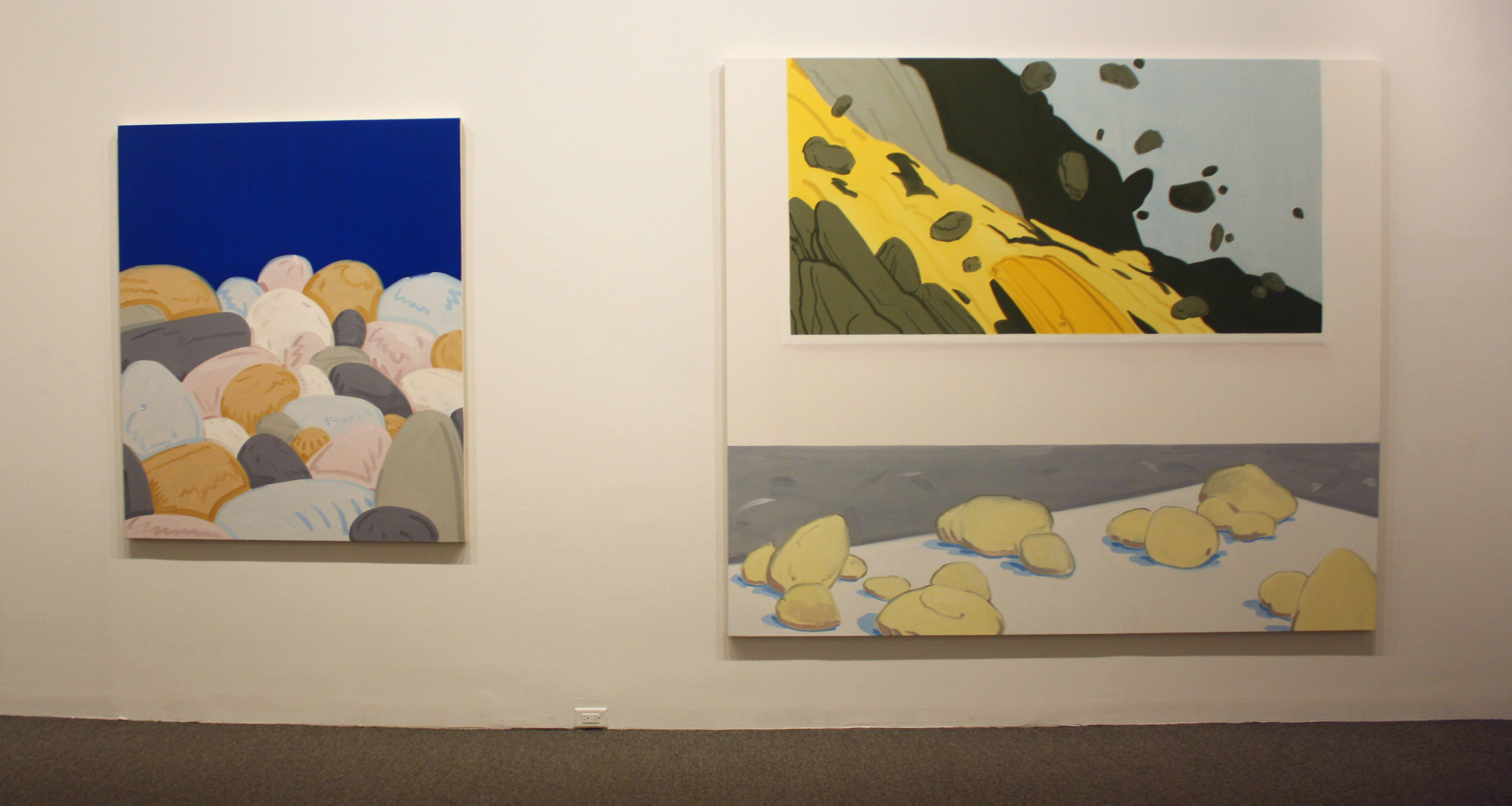
Ryan Syrell
Ryan Syrell is arguably one of the smartest painters in Baltimore. He also approaches representation and artifice with a sense of humor that’s surprisingly cheery and less snarky than most of his peers. The painting on the right is titled “Rocks on Low Pedestal with Painting” (2015) and could serve as a concept illustration for his installation (Syrell also installed a pile of cartoon-colored plaster rocks in the corner). Cleverly, the painting-within-a-painting is much more vivid and animated than the foreground “objects” supposedly representing a physical space. Syrell’s work always seems to present a cleaner, brighter alternative to the real world—one with the simplicity of comic-books and safe slapstick of Looney Tunes. The avalanche looks exciting, but never scary. Doesn’t the gallery depicted in the painting look somehow better than the one it’s in?

Ryan Syrell “Overcast Lake (Oswego)”, 2015
Even Ryan Syrell’s “Overcast Lake (Oswego)”, 2015 seems strangely inviting—a quality helped by the human-height canvas. There are never people in Syrell’s paintings, which makes them appealing as a familiar dreamscape the viewer can project one’s self into. In an appropriately pop-culture-reference, if paintings could interact with one another—as in the world of “Harry Potter”—I feel like all the neurotic-looking figures in Alex Katz’s work would go on much-needed vacations in Ryan Syrell’s.
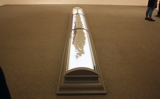
Benjamin Kelley, “The Steward,” 2014.
I’ll be honest, I didn’t notice this piece (despite the amount of floorspace it takes up) until the second time I walked back through the galleries. Maybe because it emulates museum display infrastructure? Despite the backlight, it’s the artwork that screams for attention the least.
But in a way, it’s one of the most impressive pieces here. The casket holds an ancient soil sample from deep-core drilling in the Bering Strait. The more time I spent with it, the more I liked it. The vitrine reminds me of a set piece from one of Stanley Kubrick’s sci-fi masterpieces—a futuristic memorial to a planet we’re almost certainly going to kill. And in the context of so much work that’s related to identity politics, a physical piece of the land bridge that allowed humans to first settle in North America during the ice age seems even more significant. Pangaea lost: her prodigal descendants doomed to spend eons fucking each other over.
We’re so used to core samples giving us dire warnings about the future: Based on the composition of this ice, carbon is linked to climate change. Based on the sediment in this rock, global temperature changes cause mass extinctions. Based on evidence from these tree rings, you’re all screwed. Just this week, an article in The New Yorker painted a panic-inducing picture of the Pacific Northwest’s impending seismic catastrophe. Based, of course, on evidence from geological core samples.
The core sample is an object we’ve come to trust and fear—the secular prophesy handed down by the cruel god of facts. Here, it’s laid to rest, inert in its vitrine—all of it’s ominous warnings visible but illegible to the layman. “The Steward” is a brilliant summation of all the concerns addressed by the other finalists: coming to terms with the past, anxiously extrapolating futures based on present trajectories, and ontological subjectivity as it relates to all these objects around us. But this strange earth-turd just kind of hangs out in the gallery. Not offering any one perspective, just perspective.

Comments on this entry are closed.
{ 3 trackbacks }