
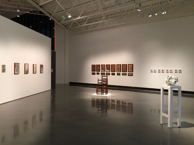
Point & Counterpoint at SECCA. Installation view.
Point & Counterpoint: NC Arts Council Fellows 2014-2015
Southeastern Center for Contemporary Art (SECCA)
750 Marguerite Drive,
Winston-Salem, NC 27106
Artists: Maready Evergreen, Kiki Farish, Dustin Farnsworth, Heather Gordon, Harrison Haynes, Stacey L. Kirby, Peter Oakley, Bob Ray, Damian Stamer, Aaron Wilcox, David Chatt, Jeana Eve Klein, Richard Prisco, Thomas Shields, Joshua Gibson, Elisabeth Haviland James, Sara Baird, Cara Hagan
On view until January 17, 2016
What’s on view: Projects from ten visual artists, four craft artists, two film/video artists, and two choreographers who had each received a $10,000 North Carolina Arts Council Fellowships for the past year.
Paddy: Pretty much everyone we spoke to while we were in North Carolina was excited about Point & Counterpoint at SECCA. And for what it is—a group show of artists whose work was not selected for any kind of commonality past being a recipient of the North Carolina Arts Council Fellowship—it’s not hard to see why. The show was so masterfully installed by SECCA curator Cora Fisher that it’s hard to imagine most of the work ever looking better than in that context.
That said, I was a little underwhelmed by a lot of the work on view. It’s not that any of it was wholly bad—in each case, the artist’s mastery of the materials and subject were remarkable—but much of it seemed familiar. Damien Stamer’s gestural landscape paintings, for example, impressed through scale, but also looked like boilerplate art fair painting. The patina of age benefited the Tom Shields wicker throne made of old wooden chairs, but didn’t distinguish itself in any way from the larger genre of reclaimed furniture makers. And Aaron Wilcox’s bundles of curved shards of ceramic shells simply resemble the kind of modernist inspired home decor you might see in a common commercial gallery.
It’s also worth noting that in almost every case, the wall text made the work worse. The didactic press material meant to help viewers understand the work, usually did little more than inform a viewer that there was even less to the work then you might have thought.
Michael: I completely agree with what you’re saying—I was impressed by the curation but a little underwhelmed otherwise, which I think has a lot to do with how much the show had been hyped to us by people in cities an hour away. For context, SECCA is in a gorgeous prewar mansion and an equally gorgeous modern addition that looks like a grand government building from Brasilia. It’s a really odd museum (which I always like) but also kind of in the middle of nowhere… so it feels like a pilgrimage that’s more special/time-consuming than the actual galleries. I think a lot of smaller, process-based, personal work felt somewhat boring in that context. I honestly can’t even remember any of the work you just mentioned, or a lot of what we saw beyond what I absolutely loved and the things we photographed.
Oddly though, I did find myself narrativizing the exhibition, which is largely due to the circumstances/structure of how the grants are distributed. I was most curious as to how the distinction is made between “craft” and “visual art”. Several fiber-based artists such as Jeana Eve Klein and David Chatt had very conceptual artworks, while Maready Evergreen used ceramics and tar paper—two media associated with practical applications—for sculpture. On the other hand, Harrison Haynes is a photographer/performer who seems to reflect on the craft (or at least materiality/ontology) of photography as the focus of his practice in and of itself. The “what is craft? what is art?” question is one that’s old and not particularly interesting, generally, but here I found myself thinking about that a lot.
Paddy: It’s funny, I’ve only been to SECCA a couple of times, but I never thought of it as odd.
Michael: WHAT? It’s a Downton-Abbey-esque mansion with a wing that looks like a cool 1960s airport in Latin America! In the middle of golf courses and forests! That’s a contemporary art museum for a whole region! It’s SO WEIRD! AND WE WERE THE ONLY PEOPLE THERE!!!
Paddy: LOL. You make a good point! I guess part of it is that I had never been to the mansion before, so I never thought about two buildings together until our visit. At that point, my thoughts had already been formed. The contemporary building reminds me an awful lot of the Serralves in Porto, Portugal, which is situated in a giant park. The Serralves is bigger and brings in more people, but there’s a similar lightness to the space. So, SECCA feels familiar in that way.
Michael: I think I took more photos of the midcentury wallpaper in the mansion’s bathrooms than anything else.
Paddy: Well, those were amazing.
Anyway, I think we both thought there were works worth more discussion in the SECCA show. Let’s talk about them.
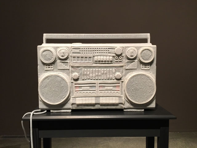
David Chatt, “1982,” 2015.
Michael: David Chatt painstakingly encases domestic objects in tiny white beads, as if to “freeze” them. This boombox was purchased using the artist’s first credit card as a young man, which he viewed as a passage into adulthood. Of all the pieces, I think the boombox is the most effective because it feel less affected than the more “homey” objects such as cooking implements. It evokes a popular nostalgia for the era, which is usually not that interesting to me, but here it’s personal and poignant in a way I wasn’t expecting. It feels like a bittersweet labor of love. I found myself imagining a young person sitting alone intently listening to music and thinking about the future, and then the same person years later, older, thinking about the past, sitting alone doing this meticulous beadwork. That struck me as very beautiful without being overly sentimental. This moved me and stuck with me long after we left the exhibition.
Paddy: I’m always impressed by how much thought you bring to the art you look at, Michael. I do think, though, that you bring more to this work then it may deserve. According to the wall label, the boombox, the cooking implements and the letters are all supposed to make up a family portrait. The mother is the cooking supplies. The father is the letters. The artist is the boombox. There was a time when the boombox supplied the “soundtrack to his life.” Beyond the problematic maternal stereotype being perpetuated here, there’s no metaphor or meaning to this work beyond what it is—objects wrapped in beads.
In fairness, though, after looking at the piece for a while I began to appreciate Chatt’s comprehensive approach to the beading. The artist even beaded the boombox electrical cord! This seemed a little more interesting to me standing in front of the piece, then it does in retrospect.
Michael: Oh, don’t get me wrong—I think the letters and the kitchen tableau are way too schlocky. Would you have appreciated the boombox more had it been on its own? I think that might point to a problem with artists falling in love with an obsessive process: one hit might not translate to repeated success.
Paddy: Agreed.
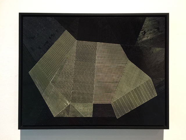
Heather Gordon, “How to Fold My Heart as a Dryer Coil 2”, 2013
Michael: It’s funny, immediately upon landing in Queens, we went straight from the airport to Greater New York at PS1 and saw an almost identical painting by Yoshiaki Mochizuki.
Paddy: That’s actually why I wanted to discuss this piece—I think we’re seeing a lot of this kind of work right now. Mochizuki, Mark Barrow, Michelle Grabner, Danielle Mysliwiec, Angela Teng, just to name a few.
Michael: Actually, we just posted a recommendation to see Emma Langridge’s work at Transmitter this Friday, which is also monochromatic paintings of lines.
Paddy: Many of the artists I just mentioned use material patterning as the inspiration for their work. I wonder what’s behind the new popularity of this interest?
In any event, as far as examples in the genre go, Gordon’s work fits well. I enjoyed the art op quality to monochromatic lines she painted on her larger wall piece, and like most artists in the show, the craftsmanship to the work is remarkable. And this isn’t just a formal exercise. The lines are a means of mapping interpersonal relationships using numerical and linear data. None of that is apparent, though, which makes me wonder why viewers need to know about it. It makes the wall text read a bit like sales copy.
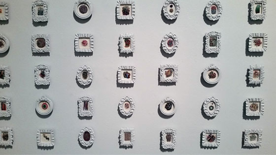
Jeana Eve Klein, “French Knots for Trade,” 2014-2015, installation view.
Michael: Jeana Eve Klein had several different series of embroidery pieces, each with a different concept, though most of them looked almost exactly alike—owing to the fact that they exclusively comprise french knots and seemingly random colors/compositions. I think this is the Southern equivalent of provisional painting in Bushwick.
Paddy: LOL
Michael: To produce one series, Klein hired an assistant to attempt to replicate her original embroideries, with varying degrees of “success”. In another series, the knots are counted and assigned a monetary value—each work is priced to reflect nothing but the quantity of labor and thread that went into its making. I’m not sure if this is intended as a Marxist critique, or what market exactly is being critiqued here. I liked a handful of the embroideries, but I got the feeling these were intended to make the viewer feel silly for liking them, which is always a little off-putting.
Paddy: I read the critique as questioning the talking point many gallerists use to sell work: the number of hours it takes to make something, not its conceptual or aesthetic merit. Which, well, okay. I don’t think this work does much to reframe the practise, though, which made me think it lacked imagination.
Michael: Conceptually, the piece is all about accumulation—but aesthetically that accumulation doesn’t do the work any favors. It was hard to focus on individual pieces that were strong out of a series with too much going on. The frames are just awful and give the whole thing an Etsy vibe that I think detracts from work that could otherwise be solid. I wonder what other strategy for translating the idea of process and aggregation could result in something nicer—creating a larger, collaged composition from these? I thought about a really great piece called “Minimum Wage Page” by an artist I worked with, David Ubias. Ubias created colorful drawings that each depicted “labor”—from work to childbirth—within the space of one hour. He then sold them for the minimum hourly wage, creating a “fair”, accessible rate of exchange between himself and literally anyone who might want to purchase an artwork. They were hung unframed on a wall that mimicked sales displays in a grid that gradually depleted as people purchased them.
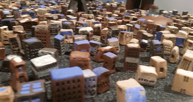
Maready Evergreen, “The Long Road,” 2014, 2500 ceramic pieces, tar paper, wooden table, 84x60x48 inches, installation view.
Michael: Nearly-obsessive craft and accumulation are recurring themes here, and Maready Evergreen’s “The Long Road” is one of the best examples. She’s populated a sheet of asphalt paper with over 2,000 tiny, anthropomorphized ceramic buildings and other caricature-like figures that seem to have broken free from the grid and swarmed all over the pavement. I really like this, because it’s playful without relying on pure irony. Each tiny building has its own character—with irregular details like windows and weird faces. The sheet of paper is still only half-unrolled, suggesting a promise of more to come.
When I looked at Evergreen’s website, I realized that the installation is an allegory for the Occupy movement, with the larger, sci-fi looking figures representing the banks and the disorderly city representing the populace rising up against them. I’m not sure that I would’ve gotten that backstory from the piece without reading that, but it definitely conveys a sense of potentiality and the idea of a joyful “strength in numbers” ethos.
Paddy: Yeah, I wouldn’t have gotten that either, particularly because at the far end of the piece is a very large building/spirit, wearing a hat that appears to hold anthropomorphized french fries in a swimming pool. What does that have to do with Occupy?
Anyway, you’d think the pool would be gross, but it’s not. It’s just playful, weird and wonderful. There’s not a lot of that elsewhere, so Evergreen’s ceramic city is an essential piece to have included in the show.

Comments on this entry are closed.