
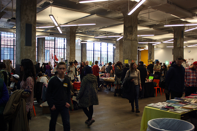
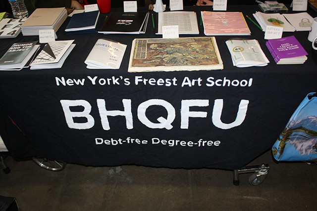
Open Space’s seventh annual Publications and Multiples Fair ran on Saturday and Sunday this past weekend at the Baltimore Design School. PMF is one of my all-time favorite art events—attracting DIY press, small publishers, artist-run spaces, and hundreds of artists working in a surprising variety of media. It’s free, most of the art is incredibly affordable, and the general vibe is somewhere between art fair, surreal craft show, indie Comic-Con, and garage sale at a punk house.
This is PMF’s second year at it’s new, larger venue at the Baltimore Design School. I was unfortunately not in Baltimore last year, so I can’t speak to that iteration, but the fair felt bigger and more diverse in terms of offerings than in years past. The shear breadth of artists’ goods that one can actually buy is totally overwhelming—I’m sure I didn’t even see 60% of the highlights, but I snapped some photos of what caught my eye.
The only downside to the new location is really, really bad lighting for viewing art, so I apologize for crappy and/or flash photos. The building recently underwent an eco-friendly renovation, and all the low-energy lighting casts a pinkish-yellow tint (it seems like an odd choice on behalf of a design school).
At any rate, by the end of day one nearly everyone I spoke to had sold enough work to at least cover their expenses. Much like Open Space’s smaller Artist-Run Art Fair—”The Art Fair That Doesn’t Suck“—attendees and vendors seemed downright ecstatic to actually be able to buy and sell work to their peers. That’s all too rare, but based on what I observed at brick-and-mortar spaces during the weekend, that excitement also translated to a lot of sales of non-editioned pieces at local galleries as well. This is exactly the type of thing that Baltimore’s art scene needs.
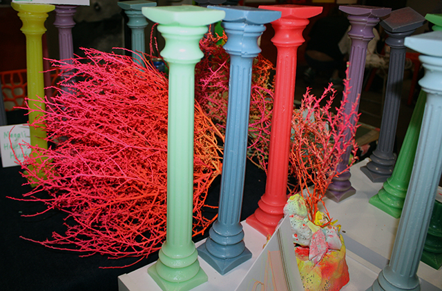
Magali Hébert-Huot’s cast wax columns at Six Finger Savior.
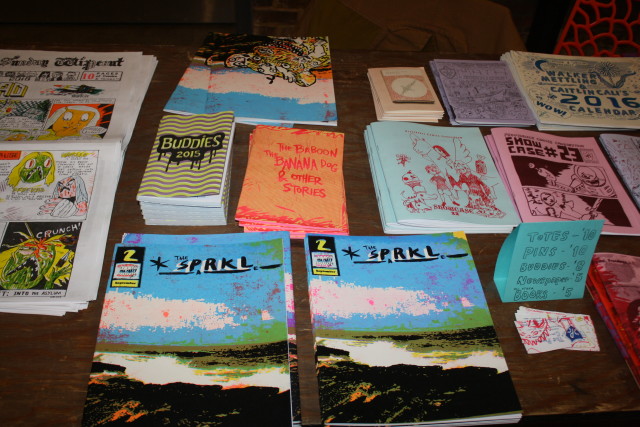
Providence Comics Consortium’s table was a prime example of the lovingly-crafted print material that PMF is known for.
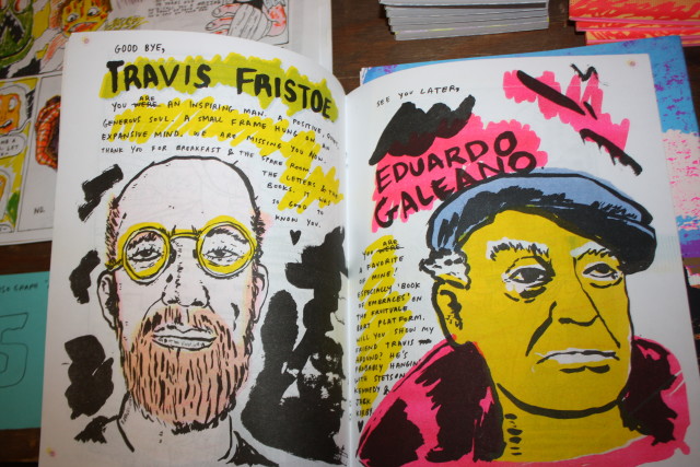
The interior of “The SPRKL” Volume II. These are so beautifully printed with a really smart economy of colors. The Consortium sells zines and other print material to fund free comics classes for kids at Providence public libraries. Amazing.
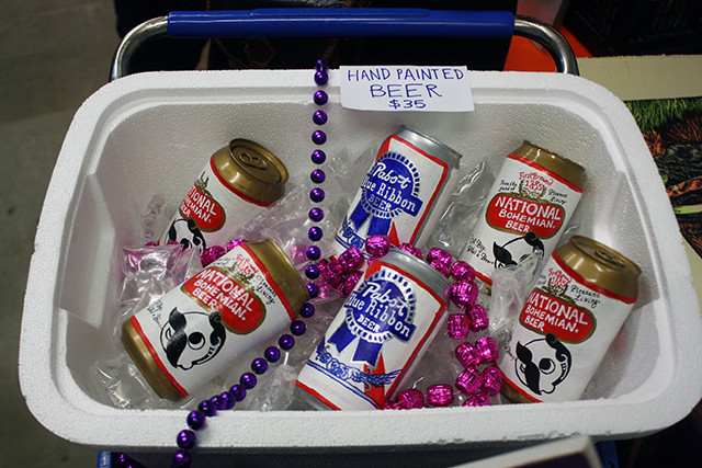
Lindsay Rowinski brought back the hand-painted beer cans from Open Space’s “Stupid Bar” for her booth “Street Jazz”. These were displayed in a shopping cart decorated like a drunk’s impromptu Mardi Gras float. I love everything about these, down to the “ice” in the cooler made from clear plastic wrap. There’s so much attention to detail here I can’t believe these are only $35.
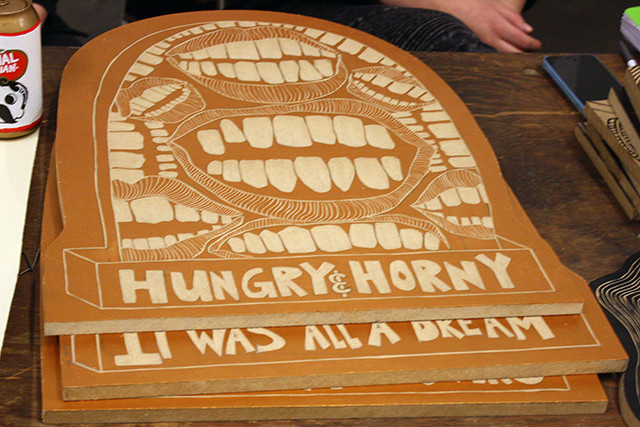
Also at Street Jazz, these hand-cut wood blocks from Bloqhead in a variety of sizes. This is what I want my tombstone to look like.
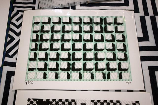
April Camlin
April Camlin had a whole table of her signature, obsessive-looking black-and-white graphic embroideries, as well as limited edition print reproductions that were so high-resolution you could see the fibers on the yarn. One of my favorite details was the digitally-printed tablecloth—the “perfection” Camlin plays with in her handmade work is at times distorted by the Photoshop “smudge” effect. Everything she makes is such a nice balance between graphic purity and traces of the hand (or its digital surrogate).
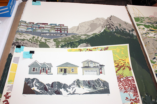
Matthew Van Asselt
At Mt. Home Arts’ table, Matthew Van Asselt’s gorgeous screenprints of 20th-century-looking suburbia against mountain landscapes feel equally nostalgic and somewhat dread-inducing. The past few generations really fucked up the landscape. The artist is originally from northern Westchester County, and these capture that gut-wrenching feeling of a train ride upstate, where a pastoral view might give way to a claustrophobic smattering of vinyl-sided sprawl.
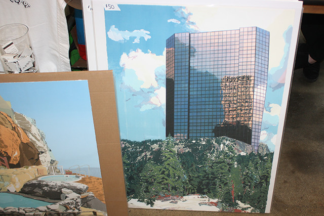
Matthew Van Asselt. This was hands-down one of my favorite pieces at the fair. It’s so evocative of Superstudio’s 1970’s planet-swallowing archiectural graphics.
Also channeling the pastoral-meets-consumer, the Bruce High Quality Foundation University brought these “Sublime” bags from Andrea McGinty.
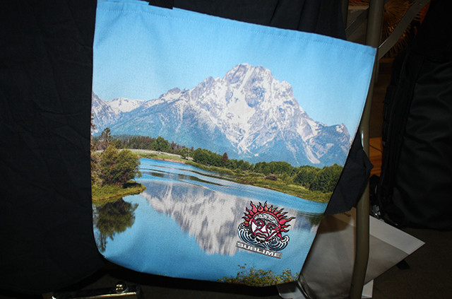
Andrea McGinty
Brooks & Rosebud (Becca Brooks Morrin and Rose Bell)
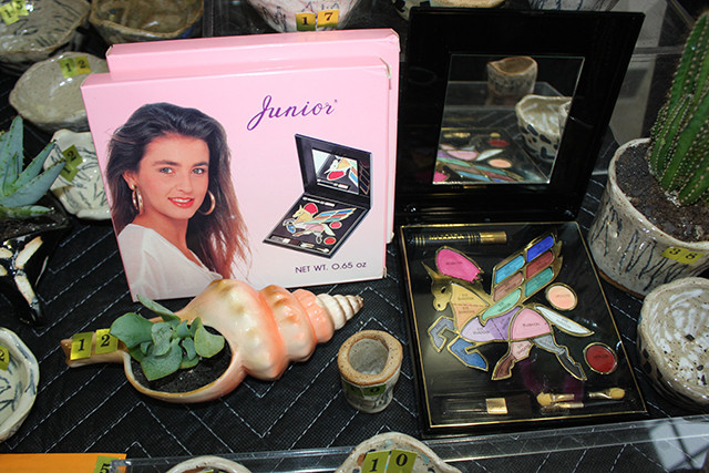
Brooks & Rosebud’s table fully embraced the weirdest-garage-sale vibe with affordable ceramics pieces and found multiples gems like these totally bonkers unicorn makeup palettes. These tiny embroidered patches and hats with reclining nudes are also just so great.
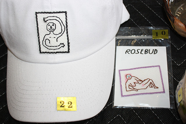
Rose Bell
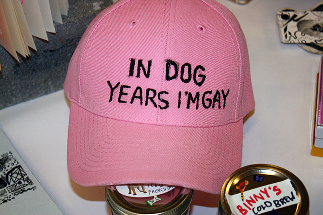
In other hat news, I can’t believe I didn’t get this. By Maddy Horan.
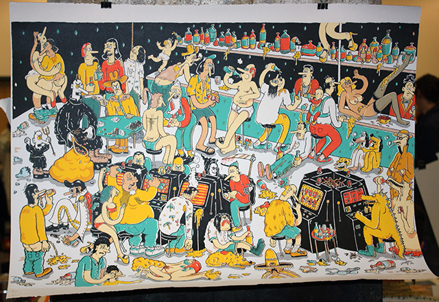
Matt Carignan “You Lose,” at the same booth as the hat. This tableau of degeneracy is so packed with multi-color details I can’t believe it’s a screenprint. From the woman doing lines of cocaine off the casino floor to the baby-sling-sporting dad watching a stripper drenched in booze, there’s something new and disgusting to see every time you look at this.
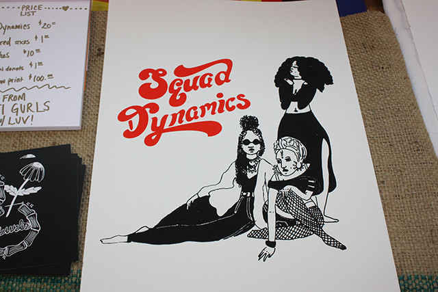
Balti Gurls posters. So glamorous! I feel like this is the cover to the feminist dance anthem album someone should have made in the heyday of disco.
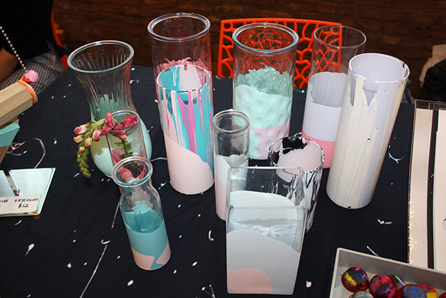
Elena Johnston’s dipped-glassware is nice because it’s pretty but not too pretty. These drippy pastel colors feel a little left-to-chance, as if she surrenders just the right amount of control. They make me think of the hyper-gendered children’s toys of the 80’s and early 90’s, melted into abstraction, like “playing house” gone wrong.
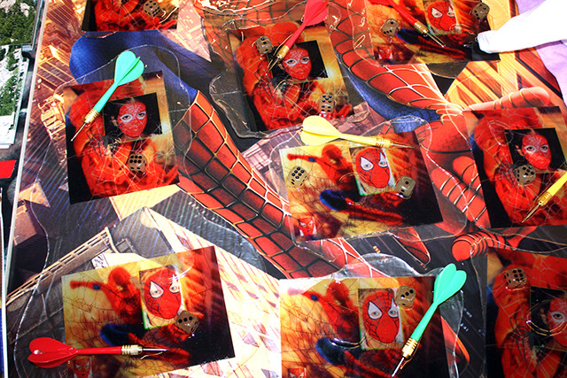
Helen Jackson-Adams
Helen Jackson-Adams’s table was entirely covered in promotional materials for Spiderman. Each of these individual pieces comprises some sort of “official” Spiderman card with plastic dice, a dart, and an image of someone in bootleg Spiderman facepaint like one might encounter on a Times Square performer—all frozen together in a puddle of epoxy or resin. They’re a little like an inscrutable still life and a little like an ID badge for a fan club. They were probably the strangest thing for sale at PMF VII, and for that alone, they deserve recognition. I asked Adams if they had been selling and she shrugged, “Yeah, kinda.”
This is exactly what I love about PMF.

Comments on this entry are closed.
{ 1 trackback }