
The Frieze entrance. Photo: Paddy Johnson
Every year Frieze installs a massive tent on Randall’s Island and lures jetsetters from across the globe to its contemporary art fair. This year, the fair expanded its usual roster of contemporary art galleries to include a few secondary market stalwarts as well. Newcomers to the fair included Bernard Jacobson Gallery, Castelli Gallery, and Axel Vervoordt and Eykyn Maclean.
That’s not a huge change in the landscape of the fair, but notably the fair’s director, Victoria Siddall, told the Art Newspaper recently that there was a significant uptick in applications from galleries in this market. Is Frieze grooming the New York market for an edition of their London-based Frieze Masters (a fair focused on secondary market art works)? Only time will tell.
Meanwhile, Frieze New York is much better than usual. Art fair standards that drag these events down—geometric abstraction, process based abstraction, and assembly line art works by A-list artists—were few and far between. Overall, the work on view seemed unusually fresh and thoughtful. Neither are words we normally use to describe art fair art, let alone that at Frieze.
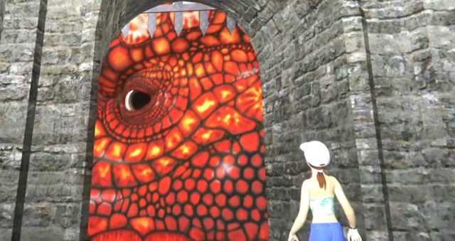
Jon Rafman, Dream Journal, 2017, single-channel video
Michael: The first artwork we saw entering Frieze this year was a painting by Tala Madani of a man crawling away from the viewer, scrotum in tow. The last piece we saw was a Jon Rafman animation that involved voluptuous young women wearing a xanax cap, popping demons’ pimples, navigating holes in space time, and pooping balls of demon blood.
Paddy: Well, technically speaking the first work we saw was an Elmgreen & Dragset piece at Massimo De Carlo that placed a plaster vulture on top of a wire fence and gate with a sign that read “Miracle”. It seemed like an appropriate way to start the fair. I interpreted this message to mean that as fair visitors, we’re all scavengers seeking the false hope that art provides.
Michael: Ha! I literally had to convince myself it wasn’t a reference to the gated-off holy town (with meta-promotion) in HBO’s The Leftovers. But I’m pleasantly surprised by how much we enjoyed Frieze this year. In a strange way, some of the booths reminded me of NADA a few years ago, back when we actually liked NADA. By that I mean the boring, fussy, predictable stuff we expect from “mature” fairs seems to have retreated significantly at Frieze. So many booths this year felt fun, for lack of a better word.
A few quickly-identifiable trends:
- Political work that didn’t take itself too seriously (and some that did).
- Less video and installation.
- Artists referencing classical architecture in new ways (works that wouldn’t look out of place in an old townhouse with a very modern renovation, perhaps?)
- Afro-centric photography
- Playful paintings (Plenty of figuration including strange nudes or more-fun-looking abstraction).
- More people wearing Comme des Garçons than I had ever seen in one room in real life. (Thanks Met Gala).
- Text based neon
- Mirrors on furniture
- Seagull paintings with poop
Here are some of the highlights (and a few lowlights) from Frieze, with more to come tomorrow:
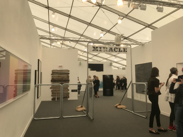
Elmgreen & Dragset at Massimo De Carlo
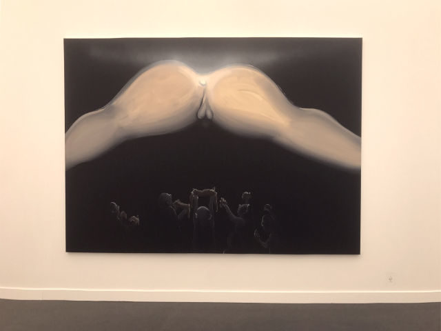
Tala Madani at David Kordansky Gallery
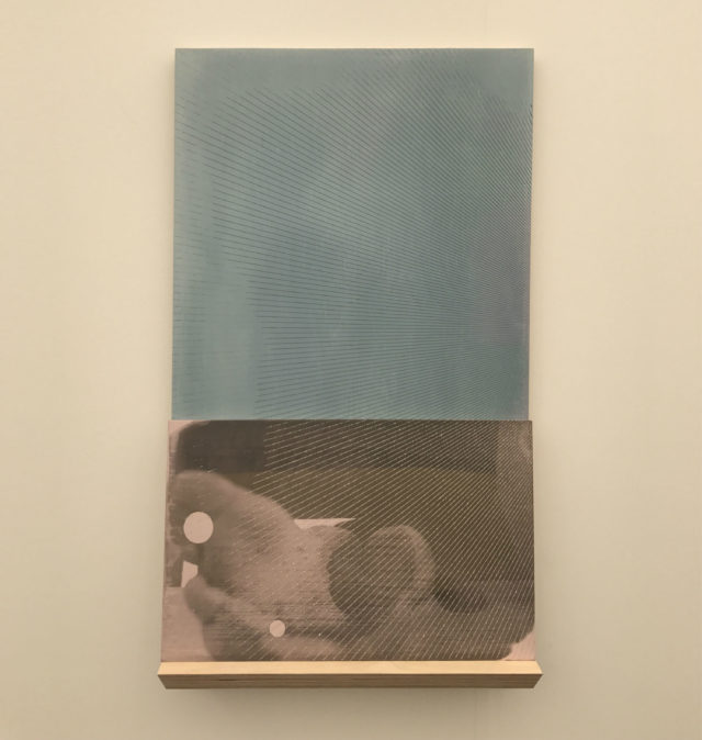
R.H. Quaytman, “D. Kasper”, 2017, Silkscreen ink, diamond dust, gesso on two wood panels with self. Miguel Abreu Gallery.
Paddy: Miguel Abreu Gallery’s stock and trade might best be described as careful formalism paired with academic intelligence, and the booth showcased some of the best versions of this ranging from a Liz Deschenes striped chromogenic print to a Hans Bellmer photograph of a doll dismembered and bound. None of these works photograph well, including the R.H. Quaytman above made with diamond dust. I’m assuming the work above refers to artist Dawn Kasper, who perhaps most famously transplanted her studio to the Whitney Biennial in 2015. Normally, Quaytman has a tome of background that goes into her paintings. None of that is visible here, though. It’s just a foot ornamented with lines diamond dust—a rather pristine representation of a performance artist whose studio looks like a hoarders depot.
Michael: That’s funny: this is the kind of work I was excited to see less of this year. I was bored almost immediately upon walking into the booth.
Paddy: Why?
Michael: I suppose it all felt familiar? I think I was in a headspace of wanting to be surprised all day and this just looked like such an art fair booth. Even when I found kinda average works from artists I really love (Marilyn Minter at Salon 94, for example) I just wanted to move on to something new.
Paddy: I’d agree that the Bellmer’s were lesser works from his overall oeuvre—the photographs were a bit boilerplate Bellmer creepy—but the quality of the Liz Deschenes wowed and surprised me. (It is made up of white glossy stripes and impossible to photograph, so sorry—no reproduction here.) It’s exactly the kind of work I’d dismiss as easy minimalist abstraction, except that in the same way that a Daniel Buren stripe painting can kind of vibrate from the wall, so too did the subtle undulations of the fading black and white stripes in her print. If there was any way to photograph it I would have made it a highlight.
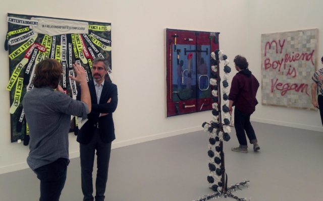
Adriano Costa at Mendes Wood DM
Michael: I can’t tell if Adriano Costa’s work is terrible or brilliant… and for that I have a total art crush. We first spotted a painting comprising spray paint on ugly HGTV-makeover-show-looking tiling, which read “My Boyfriend is Vegan”. I literally LOLed. Another piece features real tools sewn to the canvas and another is covered in knee-length socks the artist has ironed-on phrases to. The majority of these socks just ask “FANCY A FUCK?”
Paddy: I suppose if you’re going to put text on socks affixed to a painting that’s a reasonable message?
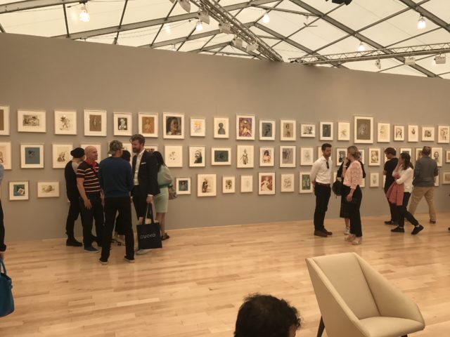
John Currin at Gagosian, Installation view
Paddy: I’m not sure I can forgive John Currin for being a Republican, particularly now that congress just voted on a bill that would boot 24 million people off healthcare, but I have to acknowledge the skill of these drawings. The left half of the booth is weaker than the right, which tends to have a few more fully rendered images that have been more thought out. As per usual with Currin, the weirder, the better.
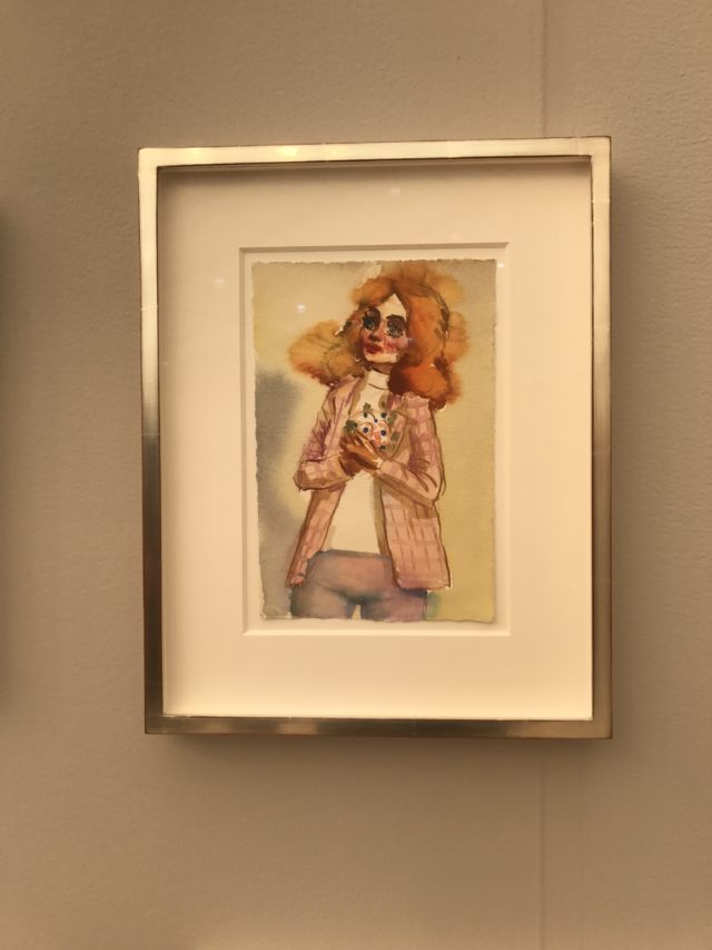
John Currin at Gagosian
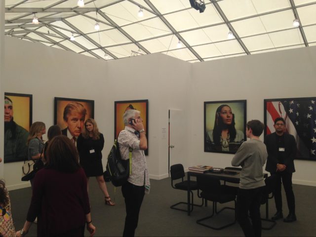
Andres Serrano, “America” at Galerie Nathalie Obadia
Michael: Boy, French/Belgian Galerie Nathalie Obadia probably thought they had hit the mother-of-all-timely/conceptual-bombs when someone remembered “Oh yeah, didn’t Andres Serrano do a photo series after 9/11 where he took pictures of Muslim girls and Mexican workers and Donald Trump for some reason and American flags with blood on them and called it ‘America’? Like back when Donald Trump was just a weird C-List celebrity? So deep and prescient!”
The problem with this improbably hot-button-relevant series from over a dozen years ago is that the work is just terrible. The fact that Serrano’s response to 9/11 was to photograph “BLACK PEOPLE! WHITE PEOPLE! INDIAN PEOPLE! FAMOUS PEOPLE!” like a buy-the-world-a-coke commercial (that’s selling me what, exactly?) is so cheesy. That this series now looks important because it features Donald Trump as a sitter and he’s an asshole to the demographics of the other sitters just makes this more cringe-worthy.
Paddy: These aren’t even good commercial portraits. The backgrounds looks like they’re made from cheap colored gels and the only visual trick to the work is that he’s managed to infuse the skin tones with some of the same lighting tones. Someone needs to show his bunny series. There’s no intellectual heft to them either, but there, the cheeseball backgrounds seem funny—like intentional faux-preciousness for an already ridiculous concept—rabbit portraits.
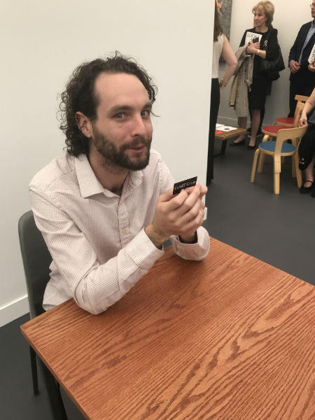
Roman Ondak, “Swap”, 2011, Performance, edition 3 of 5 at Esther Schipper.
Paddy: Okay, I know this looks like a terrible photo of this poor lad, but it’s actually incredibly illustrative of the annoying qualities in this performance, which is why we’re using it. (Also, it’s the only photo we have.) The performance title, “Swap”, tells a viewer everything they need to know—the guy pictured above sits at a table for four days, swapping one item for another, in the hopes of swapping upwards. It’s an art fair, though, so when we saw him all he’d been able to do was swap business cards.
Michael, you refused his business card swap offer when you were approached, explaining that that’s the last thing you want more of at a fair. When he tried to tell you this card would be art, I lost my manners. “OoooOOOOooooh, Art!” I told him, laughing hysterically. After that he refused to talk to me.
Anyway, apologies to the man in the chair, but this Roman Ondak performance deserves a special place in hell. What in God’s name is the purpose of this piece? To unpack and aggrandize the concept of swapping? Sell someone else.
Michael: I kept thinking this performance was never meant for an art fair. At a gallery in a warehouse district in Berlin (the gallery’s hometown) I am sure the exchanges would be much more interesting. Here, of course the only thing people would have with them are business cards or maybe an overpriced bottle of juice. Don’t they make you check all your personal effects at the door of the tent?
Paddy: I still think he should have took the elastic a nearby photographer offered him. He could have done better with that.

Comments on this entry are closed.
{ 1 trackback }