
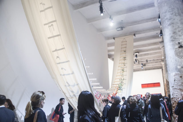
David Medalla, “A Stitch In Time”, 1968. All photos: Marsha Owett
It was close to midnight when my phone started lighting up last week. James Comey, the head of the FBI, was fired and the freak out was almost immediate. I felt lucky to be in Italy. A buffer from US news was necessary to maintain any kind of focus on the Venice Biennale, not to mention one’s sanity. And yet, even from this distance, the turmoil back home certainly drove home one point: Art isn’t going to save democracy. Art has no impact on Donald Trump’s actions, the FBI, or any of the Republicans in the senate and congress. People can call their representatives. Art cannot.
All of which is to say, the art professional who believes artists are magical unicorns who will save us all is looking increasingly silly. And so, visiting this year’s Venice Biennale Viva Art Viva curated by Christine Macel, which begins with the premise that artists will shape the world to come, felt a bit like walking through a United Way commercial. The upside of this: the 2017 Biennale is more diverse than many of its predecessors. The downside: diversity isn’t of much value if the show is bad.
The Biennale fails both thematically and visually. Macel describes Viva Art Viva as “designed with artists, by artists and for artists, about the forms they propose, the questions they ask, the practices they develop and the ways of life they choose.” This is not a unifying concept. It’s simply a group of people who are connected by their inclusion in the Biennale. The only other commonality between the works is their own unquestioning value of their self-worth.
Beyond the “Save the Children” earnestness to the Biennale, the lack of a cohesive narrative, and the nearly deafening pretentiousness to any and all text that accompanied the show, the Biennale is just a completely underwhelming visual experience. That’s an accomplishment of sorts given the location. Venice is generally regarded to be one of the most beautiful cities in the world, and the show is located in the Arsenale and Giardini, two buildings renowned for their grandeur. And yet, half way through the Arsenale, I wondered if I’d even be able to finish looking at the show. Every other piece seemed to use stitching as an easy metaphor for inclusivity and much of it invited the viewer’s participation. That was a stated interest of Macel’s, though there seemed to be a default assumption that any participation would make an art work more engaging, no matter how infantile.
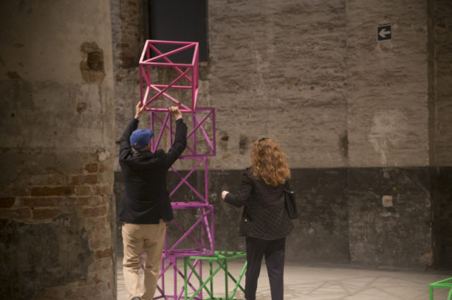
Rasheed Areaeen, “Zero to Infinity in Venice”, 2016-2017
This was apparent from the start. Take Rasheed Areaeen’s “Zero to Infinity in Venice”, a collection of modular cubes in green, pink and orange on view at the entrance of the Arsenale. Each is stacked on top of one another and made of thin wooden pieces so the cubes can be easily moved around. I saw one or two people manipulating the cubes when I came in, and started to do so myself before I decided that moving a cube wasn’t going to deepen my understanding of the piece. Even if there was something to be gained by playing Legos, the piece simply wasn’t visually compelling enough to hold the room. A disappointing beginning.
From there, things got worse. David Medalla invited people to sew their personal effects into his giant banner and Anne Halperin presented documentation from her drumming circle/”Planetary Dance” project. Both underwhelmed. Perhaps the low point, though, was Shimabuku’s “The Snow Monkeys of Texas—Do snow monkeys remember snow?” a video in which snow monkeys that were transplanted from Japan to Texas in 1972 were treated to a pile of ice a year ago and filmed. Would they remember the snow? The video is a bunch of monkeys eating the ice.
At this point, the show began to feel insufferably huge. Macel had divided the show into pavilions, but they made little sense in the context of a show about artists. Was the “Pavilion of Shamans” supposed to be indicative of a shaman trend amongst artists? (The grouping is actually supposed to represent those moved by an “internal vision”). Could a “Pavilion of Colors” provide any kind of meaningful distinction within the show? And where was the “Pavilion of Macel Approved Activism”, that made up so much Arsenale? (Most of the climate change work fell under the heading, “Pavilion of the Earth”). Of all the terrible decisions, the “Pavilion of Time and Infinity”—which greeted viewers with a veritable shipwreck of broken clocks, watches and piano bits by Liliana Porter—deadened the most senses. The piece would have been bad on its own, but the curation just exaggerated its weaknesses.
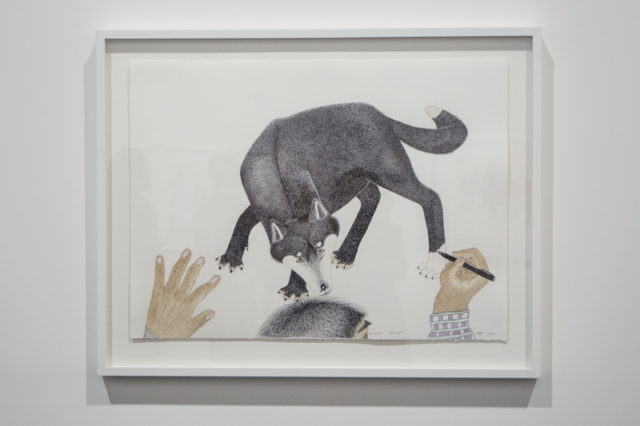
Kananginak Pootoogook
That’s not to say The Arsenale was devoid of highlights—Kananginak Pootoogook’s colored pencil drawings of Inuit people in their daily lives couldn’t have been more charming. (The drawing of a man in a Maple Leafs toque crouching to take a photo seemed particularly Canadian, as The Leafs are a terrible hockey team, but enjoy endless support from citizens—even up north.) Also of note: Ernesto Neto’s enormous knitted tee-pee for relaxation, Guan Xiao’s music video pondering why Michaelangelo’s David is so frequently reproduced and Pauline Curnier Jardin’s campy video on the origins of the world, which included a Venus de Willendorf character. But these works were outliers in a show that seemed to assume that any given artist’s practice amounted to a revelation. Naturally, there was no connection between these pieces, except perhaps that each skirted territory outside of art—be it wellness, music, or camp.
I held onto the memory of those works for just that reason in the Biennale building, which at times was so earnest in its worship of artists and artistic vision that I felt embarrassed. Did we really need to see the inside of Dawn Kasper’s studio to understand that she’s poor and makes sound art? Admittedly, I tend to find gallery presentations of artist studios a bit hooey—if we can agree that a painter’s palette won’t unlock the secrets of their paintings, a whole studio just seems gratuitous—but to be fair, Kasper wasn’t a deal breaker for me. In a show exalting the artistic process, her inclusion made sense.
What I didn’t need was four more studios, workshops, and automatic writing exercises to drive whatever point there was home. Immediately following Kasper’s studio, between 20 and 30 artists, migrants and members of the public milled around Olafur Eliasson’s transported production studio, which manufactured and sold his cheapo polyhedron-shaped sculptures with green LED lights in them. (They cost 250 euros each). According to a promotional poster the green light explores perspectives on migration, citizenship, statelessness, arrival, memory and belonging. (It does all this because Eliasson has invited asylum seekers, refugees and other volunteers to work in his workshop.) The end result is a rickety geodesic dome and what amounts to a petting zoo for migrants.
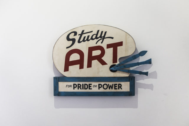
John Waters, “Study Art Sign (Pride or Power)”, 2017
There were all kinds of underwhelming works like this in the Biennale, from Lui Ye’s trash can filled with shredded paper (yes, that was an actual piece), to John Waters’s sign paintings with messages like “Study Art, for Fun or Fame” and “Study Art, for Breeding or Bounty”. At one point I grew so angry and impatient I thought I would need to leave the building—the vibe of the show was near celebratory, but little of the art was even worth viewing. What highlights there were—Hajra Waheed’s constellation of small video screens displaying vast body of water gracefully evoking the subject of migration and refugees, for example, or Sung Hwan Kim poetic video about people who have never met but share displacement—disappeared into the cacophony of the show.
Maybe in 2015, when Macel first started planning the show, it seemed like a good idea to see how artists address issues such as climate change, the refugee crisis, and gentrification. But the world changed. Yoga matt platitude art that consists of well-intentioned gestures now reads like out of touch optimism (and was probably always bad art.) What this show needed to feel relevant is the despair and helplessness that makes the past two years so uniquely painful.
But perhaps beyond despair, the current real-world mood has been one of uncertainty. And uncertainty is a quality that’s all-too-rare in the art world, but can add compelling relatability and humility to artistic practice. Artworks that have absolute confidence in their morality or importance don’t make sense to me right now. As a viewer, I want to know that others are questioning why we’re sewing business cards to a banner while the world burns.
All images: Marsha Owett

Comments on this entry are closed.
{ 5 trackbacks }