
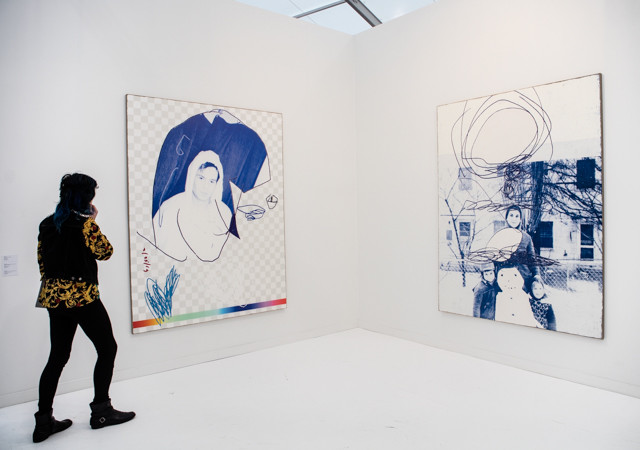
Rob Pruitt at Gavin Brown. All photos by Marsha Owett.
Paddy: It’s a common adage around blogs to say that “we did x, so you don’t have to.” Well, to conform to popular writing convention, “we went to Frieze so you don’t have to”. And trust us, you don’t want to go to Frieze. Plagued by walls papered in secondary work by a-list artists—most of it smaller or less interesting—this year’s fair conforms to almost every art trope we can name. Many collectors will leave with less than that—we heard many complaining that work they wanted was not available at all.
Pretty much everyone I spoke was at a loss of explanation for the fair’s poor performance. Has a lot of the better primary market work simply been sold? Are galleries selling more work through their brick and mortar locations again? Are we all finally sick of art fairs? (Maybe. There were certainly far fewer people in attendance than in years past.) Marion Maneker, elucidate us, please.
Michael: Walking around Frieze, I was reminded of my surreal digital experience of Paris Photo, the art fair cancelled after the terror attacks in the French capital. The organizers documented the fair and published it as a virtual environment online using technology similar to Google Street View. I felt as if Frieze could be viewed in a similar simulacrum without losing much, other than the fun of a ferry trip. Most of the work was large and immediately digestible—meaning the experience of viewing it from a remove was exactly the same as the experience of viewing it up close. Often, I either knew who the artist was or what the work was “about” at first glance from across the room. That immediacy isn’t necessarily a bad thing in and of itself, but when nearly every piece in the fair functions on the same level, it might point to a problem. Perhaps we just have too many gigantic art fairs and the art of curating for the fair as context has been reduced to repetition of proven strategies for making sales. Big=expensive. Recognizable=prestigious. Legible at a distance=attention grabbing.
I don’t think I hated the fair as much as you did, Paddy, but I agree the general consensus was one of disappointment. I think it’s worth a visit, because there were a handful of highlights.
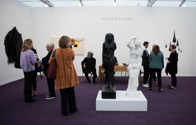
Fred Wilson at Pace.
Michael: I love Fred Wilson, and Pace’s booth dedicated to his interrelated practices is one of the fair’s highlights, in my opinion. Paddy, I think you disagreed. Wilson’s black glass mirrors are so striking and beautiful it almost didn’t occur to me that they’re total selfie machines in the context of an art fair booth. Wilson has been working with Venetian artisans since his time in the city representing the United States in the 2003 Biennale. He apparently introduced the idea of using black glass to the craftsmen, and they’ve since collaborated on a few different series. Here though, we also get to see Fred Wilson the painter, which was refreshing, through a handful of canvasses that aggregate cross-cultural symbols and pictograms for different concepts. And of course, Fred Wilson the racially-charged curator—presenting the stiff, black stone Egyptian figure with its cracked face next to the crisp white, “relaxed” marble sculpture from European antiquity.
Paddy: The sculptures Fred Wilson has become known for—the black hand crafted mirrors and glass tear drops—look a little too much like Dune set pieces for my taste. Now, that’s a purely visceral reaction to the work, and I get that it’s reductive. But my general feeling is that an art fair can’t give this work enough space to do it justice. A lot of this work is recycled from his 2014 retrospective at Pace, and the great moments from that show were all but lost. Yes, we have the still, black stone Egyptian figure with its cracked face next to the relaxed white European antiquity, but it’s stationed in front the gallery’s desk. The message may suggest a history of hardship, but a lot of that gets sublimated into the purpose of the fair, which is to sell art.
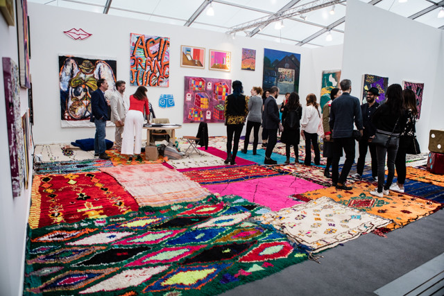
Katherine Bernhard at CANADA. Installation view.
Michael: Just as I immediately spotted Fred Wilson’s work that looked “like a Fred Wilson”, I realized we were heading into Katherine Bernhardt territory from 40 yards away. That’s because CANADA’s booth is covered in her signature technicolor rugs, which she buys from Moroccan craftspeople, and plenty of “sloppy” gestural paint-sketches of random objects. Usually, Bernhardt’s paintings don’t do much for me. Here, though, I was really into Sadie Laska’s cut-outs of clothes—a motorcycle jacket, booty shorts, skinny jeans—that are almost indistinguishable in style from Bernhardt’s work, but better. The cut-outs feel a little more deliberate and crafted than the pattern-like rectangular canvases with their arbitrary content. These clothing paintings also skirt way around the issue of a particularly-problematic strain of cultural appropriation that’s always bothered me in some of Bernhardt’s work. As deliberately unpolished as Laska’s pieces look, they’re just good, clean fun.
Paddy: Yeah, at certain angles the booth felt like a solo booth—evidence of Bernhardt’s singular vision. It’s nice to see at least one or two galleries taking a few risks at the fair. To whit, gallery artists like Laska, Luke Murphy, and Michael Williams fill a few spaces on the wall, but a lot of the artists weren’t part of CANADA’S usual stable. The dealers joked about not knowing much about the artists—I’m sure they were quite up to date—but I think that fed the energy of the booth.
But let’s be clear, most of that came from the artwork itself. Elizabeth Ferry’s fabric covered cubes, Alicia Gibson’s scrawled out “Acid Orange Juice” painting, the I-don’t-even-know-what figurative blob painting by Gerasimos Floratos—this work stood out, not just for its bright palette, but the fact that so many of the paintings seemed playful to the point of joy. Imagine that—joy at an art fair!
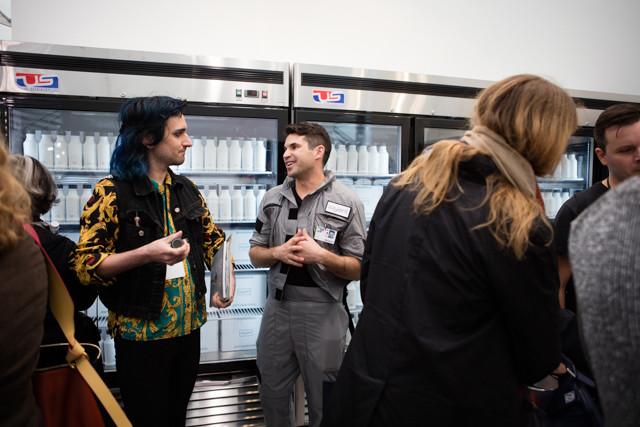
Sean Raspet installation view
Michael: Sean Raspet partnered with meal-replacement beverage-makers Soylent to transform Société’s booth into a trade fair presentation. Visitors could sample Soylent, as well as a gelatinous prototype developed by Raspet himself. It worked on a few levels—Soylent is marketed as an environmentally-friendly alternative to meals for people without the time or energy to cook. It’s made largely from algae, which is actually a pretty sustainable food source for our increasingly resource-stripped world. Everything about the beverage, from its name and packaging to the actual problems it proposes “solutions” to, is pretty dystopian. I was reminded of Miriam Simun’s similar futuristic foodtruck project at The Contemporary last year. But this is also a commentary on the art fair’s similarity to its convention-center cousin, the trade fair.
Paddy: Sean Raspet is a smart artist—he wrote an IMG MGMT essay for us back in 2010—and I agree that the concept worked and was executed really well. Raspet and his colleagues, when talking about the fair discussed flavors with all the food specific jargon you might want. There were “floral notes” and “umami notes” to the bright yellow protein goop made from algae they were giving out. It was fun to listen to Raspet give his spiel, and a little less fun to taste the products. Michael, I know you liked the Soylent drink Raspet was giving away, but to me it tasted like a grainy protein drink combined with almond milk. I hate both. I’d view that product as a success, though, that simply didn’t match my flavor profile. By contrast, we both had problems with the goo, which was literally the most disgusting food product I have ever put in my mouth. It tasted like rancid tahini butter and made me so nauseous I could barely talk.
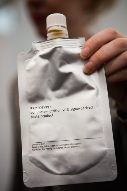
Sean Raspet, detail. AVOID THIS AT ALL COSTS.
Michael: The Soylent drink would be so good over ice with a little cinnamon—just like horchata! Or to really replace a “complete” meal (by my definition), some amaretto or orange vodka. The gel in the tube was just awful. I felt like my mouth had been violated after tasting it, and will never be the same again. I would say “notes of past-due seafood kimchee with a squirt of toothpaste” or perhaps “blue cheese with cleaning product” would be more accurate. The only alcohol one could pair this with is hand sanitizer.
Paddy: I’m not sure I ever tasted notes of “toothpaste”, but it definitely had the same staying power. The texture was so sticky I couldn’t get it out of my mouth.
Elmgreen & Dragset, “Self-Portrait, No. 20” 2015, at Victoria Miro.
Michael: This series of paintings from Elmgreen & Dragset—which consists of nothing but wall text labels blown-up to the size of sublimist landscapes—deserves recognition for being exemplary of the final stage of the reductive process that characterizes Frieze this year. We can read these from across the room, and like so many works here, are legible as little more than a “brand name”. One detail about this series I appreciate is their own labels—they’re titled “Self Portraits,” as if the artists are citing their influences, beyond an act of snarky commentary.
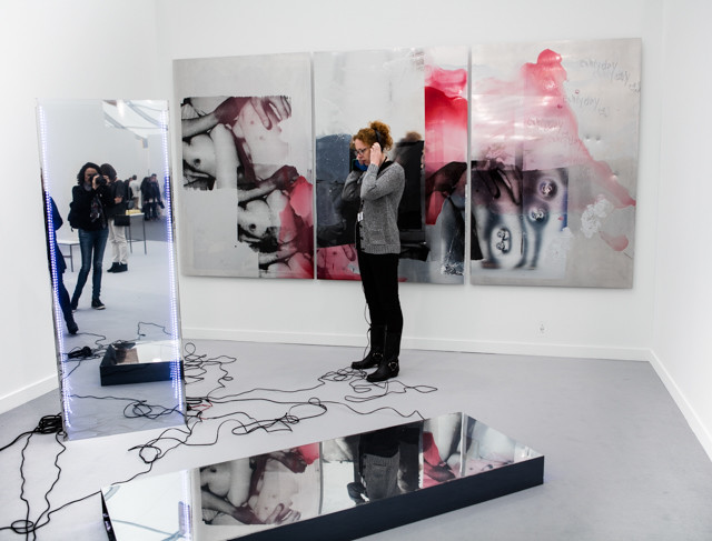
Hannah Perry, installation view, at Jeanine Hofland.
Paddy: I found this Hannah Perry installation at Jeanine Hofland pretty entertaining. As the image indicates, the installation is basically a bunch of mirrored plinths, and wall mounted shiny objects covered with photo transfers of bruised, copulating bodies. Put the headphones on, and a track of loud banging and electronic music pierces the ears. I listened to the track for a minute or two, and thought to myself, “Okay, so this is about fucking.” A few seconds later voices begin to chant “fucking, fucking, fucking.” Point made, I guess.
Maurizio Cattelan’s Frieze Commission.
Paddy: So, thanks to Maurizio Cattelan and the Frieze commission program there was a donkey grazing at the fair. The piece, “Warning! Enter at Your Own Risk. Do Not Touch, Do Not Feed, No Smoking, No Photographs, No Dogs, Thank You,” restages Cattelan’s original, at Daniel Newburg Gallery in SoHo in 1994. As the story goes, Cattelan proposed a number of show ideas to Newburg, all of which were shut down. Finally, they settled on a donkey under a chandelier, a piece that lasted all of one day.
I guess this counts as art fair criticism. Cattelan’s ass stands in the center of the fair, as if to say that, yes, this scene is just as trivial as many of us think. But even this installation has been sanitized for collectors. Heaven forbid the animal shit inside the fair—it was given regular breaks every two hours so it could do its business, free-range style. I’m glad the animal is not being submitted to any undue hardship, but a real, balls out, installation, might have allowed its shit to pile just a little.
Michael: The message here: art fairs are now indistinguishable from children’s birthday parties. In the past year we’ve seen ball pits, gift bags of macaroons, giant stuffed animals, make-your-own-T-shirt stations, plenty of funny hats, and now, a donkey.
François Morellet at Galerie Hervé Bize (Nancy, France)
Michael: Standing in this installation literally hurt my eyes, which was actually kind of nice, because it was one of the few times at Frieze I actually felt something. Anything. Well, anything but umami-infused gag-reflex.
Paddy: Eh, it stood out because the booth was covered in wallpaper. A low bar for success if you ask me. But yeah, it was nice eye candy.
Michael: Oh, don’t get me wrong—I think this booth is noteworthy exclusively for its ability to cause a visceral reaction, not for artistic merit. It reminded me that sometimes standing in front of something is different than seeing a photo of something, and I can’t say that about much else here.
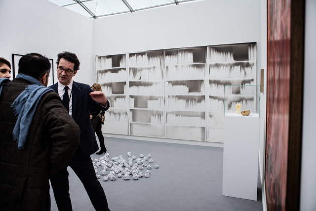
Claudio Parmiggiani at Meessen De Clercq
Michael: Of all the wall-sized work at Frieze this year, Claudio Parmiggiani’s ghostly bookshelf was one of the few things I wanted to get up close to. We were unsure exactly how he produced this emulsion-like image on panels. We were told the artist sets up an installation and then burns it, leaving an impression on the white surface. It’s really, really good. These look ethereal and special without feeling too precious. There are plenty of imperfections and scuffs that give it character, but it’s a little sad, too. It reminds me of those negative-space impressions that are associated with disasters—the cast figures from Pompeii or the haunting silhouettes of victims burned onto walls in Hiroshima.
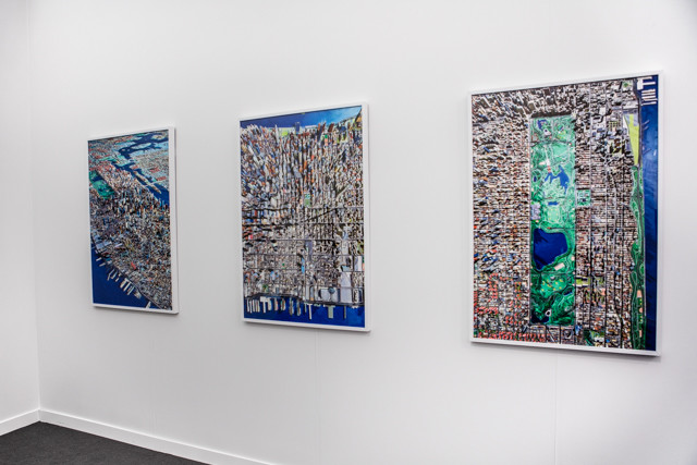
Spencer Lowell at the Queens Museum
Michael: The Queens Museum was the rare institutional space with a booth at Frieze, showing photographs of the museum’s epic panoramic scale model of the city from Spencer Lowell. I wish these were printed about three times larger than they were. The images are gorgeously high-contrast and oversaturated to the point that they look like watercolor illustrations in a children’s book. That’s appropriate—they present a mythical past vision of the city. Because the model hasn’t been updated since 1992, it shows us what the city looked like (sort of) pre-Giuliani, before he cleared the way for the waves of development that have totally transformed the cityscape. The Western half of Midtown looks oddly bald without the now-familiar forest of glass condo towers. Brooklyn and Long Island City likewise seem quaintly low-rise. But the images are also romanticized versions of the past—none of the grime or graffiti or dilapidation is visible from this bird’s eye view. It’s the Manhattan of Eloise in her penthouse at the Plaza or Lyle Lyle Crocodile, candy-colored and clean and cute.
Paddy: I love your interpretation, but I find this work insufferable for pretty much all these reasons. It’s not a representation of anything real—the city in 1992 was far more gritty and full of creative and sexual energy, and these photographs reduce and sanitize that by turning it into something you’d see in a children’s coloring book. The beauty of the city in 1992 was that it still had a vibrant working class in the city. These photographs look like tedious formal exercises to me, that make the city’s buildings resemble a rug or a circuit board, or postcard. They’re designed to look like anything other than what they are—a transformation of form, but one that serves no meaningful purpose whatsoever.
Top: David Shrigley, below: sculptures by A Kassen at Galleri Nicolai Wallner.
Michael: Galleri Nicolai Wallner gets a nod for being the most “art fair booth” art fair booth at Frieze. And doing it really well. The image above illustrates two trends: Frieze 2016’s characteristically pun-y, oversize, “what you see is what you get” work by David Shrigley and Frieze 2015’s penchant for glittery meteorites (which continued, albeit with less gusto, this year). These hunks of bronze are by A Kassen, and as far as metallic meteorites go, I guess they’re pretty nice.
Other highlights in the booth included a diptych from Elmgreen & Dragset “Lowered Goals” that comprises a basketball backboard paired with an identical rectangle-within-a-rectangle sans hoop, which looks just like a hard-edged abstract painting.
*All photos by Marsha Owett. See more of Marsha’s Frieze photos here.

Comments on this entry are closed.
{ 2 trackbacks }