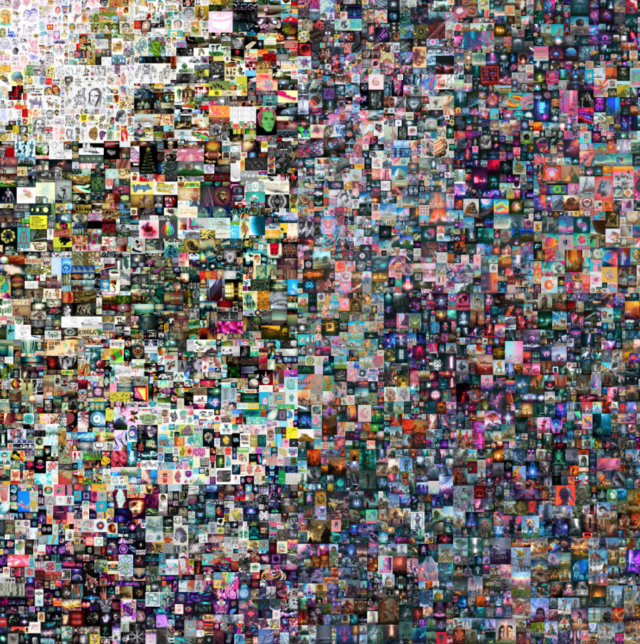
Beeple (b. 1981), EVERYDAYS: THE FIRST 5000 DAYS, 2021. Non-fungible token (jpg). 21,069 x 21,069 pixels (319,168,313 bytes). Minted on 16 February 2021. Starting Bid: $100. Hammer price: 6.6 million. Offered as a single lot sale concurrently with First Open. Online, 25 February to 11 March
- 6′ 21” Explain Me’s episode Related Utopias: Bitcoin and the Artworld with Kevin McCoy.
- 7′ NFT definitions and the blockchain
- 13 Do artists need to care?
- 21′ The Guardian features Marina Galperina’s Vine Show.26′ Beeple Mania and aesthetics discussion – Liberal Jon McNaughton or early digital art maximalism in the style of Cliff Evans and Kenneth Tin-Kin Hung?
- 40′ NFT platforms and markets. Massimo Franceschet and Sparrow Read’s The Inconvenient Truth About Secondary Markets, Part II 43′ Legacy Russell tweets about the toxic white male culture dominating NFT conversation. Follows up with a shout out to QTPOCIA+ and female-identified people engaging NFTs.
- 44′ Who is the face of NFTs? Kenny Schachter. His NFT article on Artnet.
- 47′ Kenny Schachter’s “Scam Likely” on Nifty Gateway.51′ Alternatives – Casey Reese’s Artist-to-artist exchange with Bitmark.com, Feral File. Goes live March 19.
- Also relevant: Reese’s Medium article, Collecting Art in the Age of Digital Reproduction
- 57′ – NFT and blockchain carbon footprint1 hour 10′ Reasons for optimism1 hour 16′ Art pricing and Greg Allen’s Facsimile Objects
- 1 hour 22′ Amy Whitaker discusses valuation and commensuration sociological studies
- Amy Whitaker, A New Way To Pay Artists, TEDXfoggybottom
- Amy Whitaker and Roman Kraussl, Fractional Equity, Blockchain, and the Future of Creative Work, Management Science, July 2020
- Amy Whitaker, Art and Blockchain: A Primer, History, and Taxonomy of Blockchain Use Cases in the Arts, Artivate: A Journal of Entrepreneurship in the Arts. Summer 2019
- Amy Whitaker, Hannah Grannemann, Artists’ Royalties and Performers’ Equity: A Ground-Up Approach to Social Impact Investment in Creative Fields, CMSE Vol 3, no 2, pg 33-51.
- Memo Atkin, The Unreasonable Ecological Cost of #Cryptoart, Dec 14 2020
- Rea McNamara, How Crypto Art Might Offer Artists Increased Autonomy, March 2, 2021

