
While yesterday’s post discussed the suckiness of gallery websites, today we get to discuss the good ones. Since there are about two of them in the city that fall into this category the likelihood of there being an encore post is all but eliminated, but one can always hope.
The AFC grand prix goes to Sikkema Jenkins & Co whose site design by Kyung Jeon is virtually flawless. The design is simple, elegant and versatile, (meaning, you could upload the picture you took of the floor by accident and it would still look artful). Straight forward and easy to navigate this sight sets itself apart from a great many gallery sites. But what really earns the site a gold star in my books is it’s management of artist images. On this site each artist has a section called works which displays thumbnails of the all the available works. This method of display is preferable to the commonly used large single image that then links to a pop up window, because the user can see at a glance how many works are available and what they look like. One of the pitfalls of the single image pop up window is that it assumes a user who is savvy enough to know that the image represents a link to additional works. Since there are plenty of people who barely know how to turn their computer on, it makes sense to lay a page out this way. I should mention that Kyung Jeon designed a near identical site for Zach Feuer, and to be honest the color choices and masthead are slightly better from a readability standpoint, but the site uses the pop up window in their artist section, so it ends up with a runner up status.
Bitforms Gallery also wins AFC approval for it’s excellent site. Like Kyung Jeon’s websites, this one seems to buy into the fashionable white background with grey text. I’d like to be critical of this look because it is so pervasive, but ultimately I figure, if I have nothing snarky to say about the white walls of a gallery I don’t need to come up with anything about this either. The outstanding feature of the Bitform’s website is their display of images. One of the most common design flaws on the websites I have visited is that the frames have been designed to fit medium size images (a good example of this can be found on the Caren Golden Gallery website). This is a problem since a large sized image is always desirable. One of the things I love about all of the sites I am discussing today, but in particular Bitform’s, is that the large image size they provide on their site is at least 400 pixels in height or width (I know, I know, pixel talk is nerdy. 400 pixels=big, 500 pixels=big ass).
Another great feature on this site in the artist section, is a handy dropdown menu that allows the user to switch artists without having to go back to the main artist menu. Although I assume this kind of thing exists elsewhere I haven’t seen it and I love it. Really, I like almost everything about this site, except that they have a shopping cart function that doesn’t work. Boo hiss, bitforms! While most people don’t buy art this way (and well they shouldn’t, condition aside, you don’t want to give away your 10% discount), it certainly makes sense to have the shopping cart for catalogue sales. A gallery I worked at several years ago saw a 40% increase in catalogue sales, which was almost entirely due to the launch of their website (though I tried, unsuccessfully I might add, to convince them it was me).
Finally, AFC sends a tip of the hat, to Autumn de Wilde, and web designer Dale Smith for having the best photographer website we have seen, period. The website is a little outside the scope of this project, being that of an artist, but from a design perspective it cannot go without mention. Setting the site apart from others is that is has both functionality AND character, (which is definitely issue on some sites.) Each genre heading is fronted with a charming illustration which infuses life into what can otherwise be a cold medium. I have featured the illustration preceding the genre of videos below.
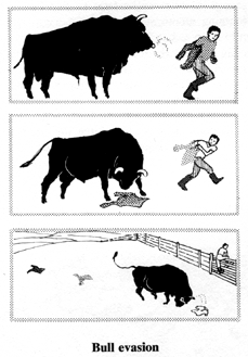
The image here is a great example of the skill of de Wilde as it relates to the videos she has shot which are frame driven, without being a literal or redundant representation of her work. All of the illustrations she has used are successful in this way.
Another great aspect of this site, is the layout of images. de Wilde lays out her photographs horizontally, and a two toned grey wavy line at the top of the frame leads the eye naturally across the screen. It takes all of two seconds to figure that you have to scroll from left to right, which is a sign of it’s success since it breaks with the vertical convention of image layout. One final unrelated point I’d like to make about this site is that it is nice to see an active link rollover that is orange as opposed to 2000 gallery blue, which is so gallery corporate. Also, I do have an affinity for orange.
So there you have it folks. Proof that not every gallery site sucks…just an awful lot of them. I have to admit, dispite what I said earlier, I feel a regular segment coming on.
****update*****Autumn de Wilde kindly sent me the name of her web designer Dale Smith. He has been credited accordingly.

Comments on this entry are closed.