The New York art world may run on cash and glitz, but emerging artists usually don’t. So we’ve been looking around lately to see what it’s like where the money never was to begin with. This week, we went to Baltimore, where the people are still weird, the space is still cheap, the work is still exciting. Let me tell you, the grass is a whole lot greener. May New York never figure that out.
In part one, we visit NUDASHANK’s Conor Backman show, Gallery Four’s Lisa Dillin exhibition, and Sophia Jacob’s Harrison Tyler gallery take-over with writer, artist, curator, and hands-down, best-ever Baltimore tour guide, Michael Farley.
Conor Backman, The Other Real March 23 – April 28
NUDASHANK, 405 W. Franklin Street, 3rd Floor
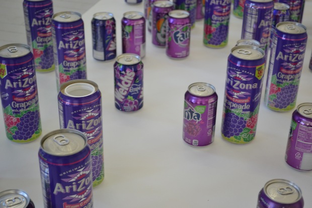
What’s on view: Trompe l’oiel, trompe Fanta cans, trompe wrapping paper..
Whitney Kimball: This show has an appealing personality behind it, resulting in things like a found stashcan hiding in a crowd of actual grape sodas, or a painted dowel made to look like deer hunter wrapping paper. Still, I’m not particularly interested in the commentary here, which I interpreted as the desire to integrate painting with the real world. Backman doesn’t tell us much more than that, and for that reason, his objects feel arbitrary; Lisa Dillin’s using the same devices upstairs, but with definite purpose.
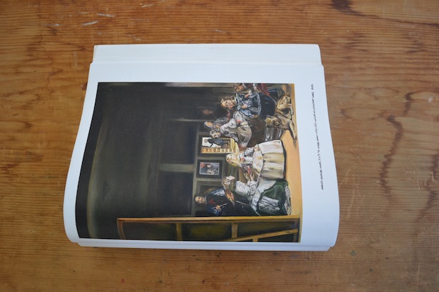
Michael Farley: I too was unsure of Backman’s commentary; I’m not sure any of the work is intended to provide us with any. I think Backman operates under the correct assumption that the “high/low” culture binary that provided so much of the tension in 20th century art has finally collapsed. I love the reference to Velásquez’s Le Meninas (the painting Foucault discussed so much in relation to the panopticon, hierarchies, and the obscured/revealed subject) alongside oil paintings of tabloids. Then again, that reference could be seen as a clever (if not a little esoteric) key to Backman’s work, where there are layers of representation masking whatever the subject of a piece is. Laying on the worktable, that painting contextualized in a sculptural textbook could be seen as a kind of “tool” for dissecting Backman’s somewhat opaque take on mass media, painting, and pop culture.
Whitney: Definitely- I saw that textbook painting as a key to the show, too. I thought it was a playful hint that there’s no avoiding representation.
Paddy Johnson: I don’t see Backman’s objects as all that random, but I agree with everyone here that their meaning isn’t always readily apparent. As I recall, the folks at Nudashank mentioned that Backman’s interest in the grape soda was inspired by an ancient Greek myth about a painting competition between Zeuxis and Parrhasius. Zeuxis painted grapes so real birds flew down to peck on them, but even the curtain Parrhasius used to cover the painting was an illusion, so Parrasius won the contest. He deceived even Zeuxis.
It’s a great bit of backstory to the cans and to the work in general, which as Michael points out, is less about deception than it is, masking the subject itself through representation. It’s a wonderful paradox.
I’m not convinced the gallery is always best context for Backman’s work. I think Whitney’s right that the work is often about integrating representation into the real world, so for me, it’s usually better when a more complete integration is made. That occurred last year in the Mixed Greens hotel room at the (e)merge art fair, where Backman painted some cans of grapeaide, and mixed them with real cans. They were thrown around on the floor, in the way pop cans might be, and I liked that. It’s a completely dismissive way to treat one’s labor, which feels roughly in line with how our culture values creative labor.
Whitney: The added story of the grapes does make the grape soda cans and the shower curtain concealing a stretcher a lot more poetic.
Lisa Dillin: Stopgap March 16th – April 20th
Gallery Four, 405 W. Franklin Street, 3rd Floor
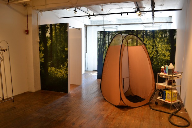
What’s on view: Nature meets photoshop: arranged and piled formica cubes with fake ferns growing out of them; a tanning booth; a mini fridge made from a boulder; a watering hole (astroturf platforms around a communal drinking fountain).
Michael: Lisa Dillin’s Stopgap is a fantastic example of everything I love about Baltimore art but manages to avoid all of the tropes I hate about Baltimore art. It’s gregarious and engaging without coming across as overly pedestrian or patronizing. It has a great sense of humor about it but is executed with serious attention to detail; Dillin’s commitment is evidenced by her clever use of snakeskin-print duct tape to conceal a pesky power cord. Her objects are flawlessly crafted without feeling introverted, or (worse) decorative. The work isn’t readily salable, but fluently speaks a sexy, commercial language. It manages to have content without telling the viewer what to think; rather than rehashing a clichéd “man v.s. nature” narrative, Dillin seems to be negotiating a new “habitat” out of the built environment- specifically the un-places produced by late capitalism. The real irony of Stopgap is that the show would probably function even better in the kind of sterile, institutional venues Baltimore is blessed with a dearth of.
Whitney: Wow, I couldn’t put it better. Yes, Dillin has the rare gift of being able to just kind of assemble art from the environment around her. I know she’s talking about nature vs. capitalism, but for better or worse, I end up celebrating the crappy environment we have. She makes me delight in things like Chia pets, and I like it.
Paddy: I got more out of the work that asked me to be a participant. The formica cubes with rendered ferns and dirt is done well, but the most you can do is sit on those things. So, while the tension between nature and manufacturing is present in that work, it’s not nearly as tangible as it is in the safari tanning booth, or a communal clover fountain (warning: the water tastes terrible).
I love that the spray tan is crap and hard to get off; it’s art that literally won’t get off your back.
Harrison Tyler April 5th – 13th
Sophia Jacob, 501 W. Franklin Street
What’s on view: Architectural intervention: A hole in the floor, through which a viewer may watch his own ass monitored from a ceiling-mounted video camera. Also, a video of a camera programmed to jump at random points throughout Sophia Jacob’s basement.
Whitney: An empty gallery manned by three people sure builds suspense. In terms of “architectural intervention,” this show’s a success; you walk around a little white box looking for the show, and then it comes up and kicks you from behind, literally, as you end up on your knees looking down on your own butt. It’s more of a prank than the full, savory discovery of Lisa Dillin’s show, but points for being clever.


Comments on this entry are closed.