Last week in part one, we raved about Baltimore. In part two, we discuss an overhung student show at Current Space, room for improvement at Creative Alliance, and a puzzler at Gallery CA. We also find Baltimore’s own version of the Jogging, and a palatial penthouse gallery, Penthouse.
Odd Logic April 5th – 28th
Current Space, 421 North Howard Street
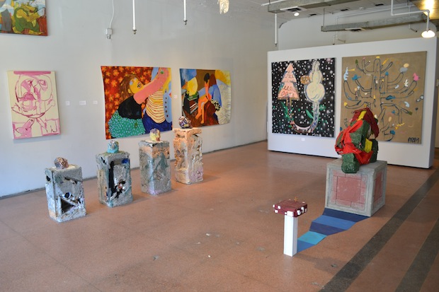
What’s on view: A four-person MICA BFA show, mostly painting and sculpture; a smaller show of Elle Perez’s photo portraits from a queer commune
Michael: Ok, this is kind of a mess. I understand that’s the whole point, but it’s just not done well. I hesitate to use this as an example because it’s student work and not really “local” in the truest sense, but this show illustrates a major frustration I have with many un-curated group shows in Baltimore.
“A-Bunch-of-Stuff-that-Shares-Some-Formal-Qualities-by-Friends-From-Art-School” seems to be an over-used concept for exhibition development here. I call this approach “Conspicuous Production” and it’s everywhere in Baltimore. As we are mostly without a commercial art scene, we are mostly without the “middle men”—curators, critic, gallerists, etcetera—who explain to artists that surrounding your handful of really nice paintings with an equal number of really mediocre paintings doesn’t make the bad paintings look good; it makes the good paintings look cheap. As much as I wish the best pieces in the main gallery hadn’t been drowned out by a sea of sloppiness, I really wanted to see more of Elle Perez’s beautiful photographs of Ida (a queer commune in Tennessee). Those could totally get away with filling a wall while maintaining integrity. Student gestural painting, not so much.
Whitney: Totally.
Paddy: I wanted to see more of Perez’s photographs of Ida because I didn’t like the student show and wished her photos were in the main space, but her show was similarly overhung. There’s no reason the entire space needed to feel so frantic; it made me want to leave.
Tim Horjus
Creative Alliance, 3134 Eastern Ave.
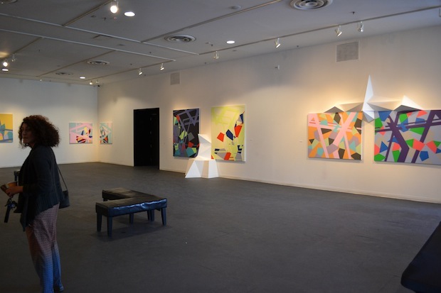
What’s on view: Brightly-colored architectural paintings and geometric wall growths
Whitney: First off, I can’t find anything about the show on Creative Alliance’s website, which is a big disservice to the artist.
The show has a corporate feel to me, because it looks as though it were made generic enough to appeal to as wide an audience as possible. I know that’s really mean, but we’re talking about architectural space in the most literal possible way, just colorizing and growing it. I don’t see any of the artist in here.
Paddy: I searched Facebook for an event listing for the opening and couldn’t find anything there either. I didn’t like the show that much either, but that kind of negligence is really upsetting.
I wish a little more thought had been put into the install. Two horizontal paintings flank the top of a entrance to offices as if they were wings. It’s a terrible idea, and calls into question the architectural skills of the artist. Still, I’ll offer the artist a bone for fastidiousness. The result might be boring, but he’s at least careful in his paint application.
Michael: Again, here I feel like less would’ve been a lot more. That gallery is a huge, intimidating space and I wish artists didn’t always feel the need to fill it. A handful of carefully-selected, well-spaced works that really clearly achieve what the artist was going for would speak so much more coherently than a roomful of paintings that are hard to consider as individual compositions.
I like that Horjus repurposes house paint remnants to produce his work. The connection between wall paint-on-canvas and architectural intervention in the gallery has a lot of potential that maybe wasn’t 100% realized. The installation seemed almost like an afterthought and a little disconnected from the paintings. I think it poses an interesting problem that could be resolved.
But yeah, Creative Alliance has great people and a great space but serious communication issues with the rest of the Baltimore art scene. I refer to it as “That place where everyone I know has worked and no one I know has visited.”
Seth Crawford: JUMBO MUMBO, April 6th – 27th
Presented by ICA Baltimore at Gallery CA, 440 East Oliver Street
What’s on view: Sculpture inspired by mumbo-jumbo, including stand-up comedy, phallic sculpture, the occult, a skull with pencils coming out of its head, a styrofoam cup of cologne, and a pentagram made of friendship bracelets.
Editor’s note: Thanks to Gallery CA curator Deana Haggag for leading our tour of Baltimore! We’re mentioning her show because we think it’s relevant to the trip, but this is also our disclaimer. We know and like Deana Haggag.
Whitney: I wasn’t sure what to think of this show at first, because it felt like an Eye Spy book, pulling in just about anything that happened to be on the desk top at the time. I was looking for clues to break this down, and then the press release just puts them all out there: stand-up comedy, death, etc, followed by: “Hope that helps.” Though that doesn’t leave me bookmarking any one work in the show, or putting together a take-away idea, I think Crawford’s trying to stop me from playing that whole game in the first place.
Paddy: Just so it’s clear, this is a show about a bunch of unconnected subjects and ideas that have at some point run through the artist’s mind. The result looks a little like art fair meets non-profit exhibition space; none of the art has any plotted connection, but the work itself isn’t defined by its salability.
Having seen my fair share of earnest art skulls as pencil holders at the fairs, it took me a while to warm up to this show. The cologne in a styrofoam cup did it for me; it’s disgusting and absurd as an art piece, and I hope I never forget it.
Ian MacLean Davis at bmore <art> takes issue with the name of the show, Jumbo Mumbo—he thinks the confused title is too obvious, doesn’t like the colonialist connotations and thinks it encourages people not to take the show seriously. But that assigns a little too much weight to an exhibition title for my liking. It’s the kind of detail a critic will look at, but won’t affect the reading of the show too much. The press release does a better job of that.
Michael: I deliberately did not read the press release because I thought of this show as a puzzle I wanted to put together without looking at the picture on the box. It seems like Crawford is wrestling with fetishized or revered objects; from the monumental to the superstitious. They are somehow negated through their obvious artifice. The artist’s hand is visible in most of the objects; just as we understand the concepts they represent to be societal constructs. The chair/obelisk hybrid cracks me up. It seems to suggest that one should literally “sit on” the overtly phallic archetype.
I think the stand-up comic set is a nice backdrop to the show. It points to the absurd and a sense of performance anxiety. It’s the audience’s expectations, however, that are rendered impotent by the performer’s admission of smallness.
I think it’s a great show and very telling of the complete turnaround this gallery has accomplished with our lovely friend Deana Haggag as a curator. When this space first opened, pretty much the only dialogue generated by an exhibition was something along the lines of “um, that psychedelic watercolor is hung crooked.”
Dust-Off, April 6th – ?
Springsteen Gallery, 1511 Guilford Ave, B303
What’s on view: Sculpture reminiscent of the Jogging, cartoons printed on curtains, and Photoshop-style abstract internet prints. Internet Stuff. Milton Melvin Croissant III, Colin Foster, Margo Benson Malter, Nick Peelor, and Nick Vyssotsky.
Michael: This space is gorgeous, and knowing what this loft looked like prior to the gallery moving in, someone worked their asses off to make a space that’s polished but has character. Conversely, this inaugural show comes across as sloppy and trendy.
I have a hard time responding to most of this work because it’s so saturated in irony that there’s very little room for content. Then again, I don’t think any of this work was intended for contemplation; it was meant to be reblogged. Why even have a beautiful gallery space to show work that’s of and destined for Tumblr?
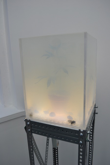
That said, I kind of like Nick Vyssotsky’s artificial weed plant in a tank of translucent Mountain Dew. It really looks like a real weed plant surrounded by real weed smoke! I wish the craftsmanship was a little better.
I also think his other piece in the show is interesting, but I can’t tell if I like it or not. A pile of bricks on a mirror is so totally the stereotype of “hipster sculpture” that a lot of more mainstream people have, but it’s drenched in Mountain Dew which is so totally the stereotype of mainstream culture that hipsters have.
Since trendy art loves a saccharine palette and high fructose corn syrup is really making a splash in galleries these days, I would advise diabetics to steer clear of contemporary art for the next few months.
Whitney: I know what you’re saying about trendiness; the pot plant, motorized mouse, the pile of bricks in soda, and 90s anime-style curtain are absolutely indistinguishable from the Jogging. I actually thought the pot plant follows the formula better than anything here. It’s beautiful and atmospheric, and the soda lends itself a slow reveal, but I’m way more interested in the soda than playing the Jogging game again.
Still, I wouldn’t call it sloppy. The prints also feel a little derivative of Artie Vierkant and Kate Steciw’s aesthetic, but I thought these were pretty strong. They look to me like emotions, or sloppiness, fighting through perfect renderings. There’s a chrystalline explosion of gasoline, a comma that looks like a tear, computer mouses made to look like stretched eyes and tongues. There’s a tension between total control and explosion that I found really compelling, beyond style.
Michael: Yes. The Jogging.
Very few individual pieces in the show spoke to me or had enough of an independent voice to distinguish themselves from the shrill chorus of ironic product placement and “wacky web art”. I mostly see these works as evidence of a trend I dislike rather than pieces I can have any kind of unique, meaningful interaction with. That trend being cynical detachment and a reliance on a cultural context of hipsters pointing and LOLing at the ruins of western civilization.
Paddy: One last note on the show: Springsteen’s not been open for more than a week, but it’s already garnered the nickname “the north star”. That’s because their fluorescent lighting is so bright and even and can been seen through the windows of their space. I like this kind of lighting because I like art, and the lighting makes everything look like art. I recall seeing a bit of garbage on the floor and momentarily mistaking it for art.
Reptocline, April 6th – ?
The Penthouse Gallery, 1511 Guilford Ave., apt. 501
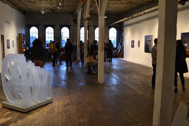
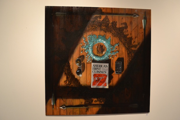
What’s on view: Photographic still-life paintings, often of objects on hardwood, by Pete Cullen; geometric grey prints and acrylic floor sculptures of obscured letters by Colin Benjamin
Whitney: Dusty realist paintings and prints of Ben Day dots remind me of Jack Goldstein, Robert Longo, and Troy Brauntuch, making me think of a strong Pictures Generation influence. (Pete Cullen’s other work says that even more). Still, though, this not a fresh take. The show repeatedly acknowledges image reproduction, but doesn’t have much say about it.
Michael: I read this show as a nod to the printed word and image. Some of the oil paintings are gorgeous. I recently re-read John Berger’s “Ways of Seeing,” and I can’t stop thinking about how tactile oil paintings can be. They seemed to be inviting viewers to pick up the books and flip the pages in a way a Kindle just can’t. Similarly, the screenprints function as a reminder of the formal qualities unique to printmaking. I think they work very well with the paintings. I like the play of an abstract print celebrating its own medium next to a representational painting depicting printed matter. Outside of this exhibition context, however, I’m not sure I’d be crazy about the prints. I’ve seen a lot of work that’s already done what these are doing. Add the names of some Wham City bands in italic helvetica to the borders and you’d have every show flier on half the lampposts in Baltimore. That said, I love the plexiglass letters spelling out “EVER FORWARD”. It could be a monument to the written word as our collective cultural patrimony or a tombstone bemoaning the loss of physical texts in the name of progress. Well done.




{ 6 comments }
this is the worst review ive ever read
What’s so bad about it?
This review lacks intelligible criticism and opinions, as well as assuming that these couple shows represents the entire city’s art scene. The article’s criticisms only push the Baltimore art scene to be more like New York’s, when these are the very differences that make Baltimore such a special place. if we wanted to be stiff assholes making art like art is made in New York then we would just live in New York.
That’s weird. We never mention New York and I don’t think we ever advocated for stiff assholes in this piece. We certainly don’t think this represents the entire scene—it’s simply a sampling.
Did you read Part One, where we talk about how much we like to Baltimore scene as compared to New York? Michael specifically mentions the qualities that make Baltimore special. http://artfcity.com/2013/04/12/we-went-to-baltimore-you-should-too-part-one/
Two of the pieces you are looking at were from a guy born and raised in DENVER.
In case anyone is interested:
Odd Logic Artists:
Dave Eassa
Louis Abbene-Meagley
Peter Ferguson
Nicole Dyer
Comments on this entry are closed.