Psychosexual (Featuring artists Lutz Bacher, Tom Burr, Edmund Chia, Matthias Dornfeld, Jayson Keeling, Jutta Koether, Nazafarin Lotfi, Jeffry Mitchell, John Neff, Rachel Niffenegger, Peter Otto, Kirsten Stoltmann, and Brenna Youngblood), runs through May 25th
Andrew Rafacz Gallery, 835 West Washington Boulevard
What’s on view: Group show of work by thirteen artists from Chicago and abroad, curated by Dr. Scott J. Hunter, a Chicago-based art collector, psychiatrist and Associate Professor of Psychiatry at the University of Chicago
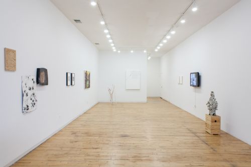
Robin Dluzen: An exhibition titled “Psychosexual” and organized by a psychiatrist sounds like it could have had the potential for a context that is too heavy-handed, but luckily the exhibition actually feels conceptually open and light in tone. The curatorial statement asks us to interpret the notion of “the gesture…taken as a representation of the artist’s underlying self”; Tom Burr’s folded, white t shirts tacked to square boards, and Nazafarin Lotfi’s wooden objects riddled with furious drilled holes and paper poked through with a needle contain the intended obsessive, bodily associations in a material and formal way. However, the video works (there are three) are surprising standouts.
In particular, Lutz Bacher’s Girl in a Blue Dress embodies that psychoanalytic idea of the gesture with jerky, cellphone-quality camera work. Stalking a seemingly young girl in a princess-ish nightgown through an art museum, the first-person perspective makes the viewer feel like the creeper, especially as the camera attempts to zoom in on her underage butt and legs.
Pedro Vélez: Is Psychosexual a portrait of the psychologist as a collector? If so, Mr. Hunter has a thing for formality and abstraction.
You can see him struggle throughout the installation, playing the role of the curator, trying to consolidate high concept and marketability down to a domestic scale. Aside from being a hot art star right now, why is Brenna Youngblood included in this show? Her white abstraction with ring tab is nothing but a lifeless, and I bet expensive, piece of abstraction.
Having said that, I was also taken by the contained energy in Lotfi’s drilled surfaces; they reminded me of Abel Ferrara’s arty horror flick Driller Killer. But Bacher’s low budget voyeurism didn’t amuse me since you can find more eloquent transgressions between objects of desire and the female body in Babes At The Museum. Then there are the required odes to orifices found in the pseudo-documentary photography of John Neff. He makes anal objectification seem so elegant, though he doesn’t go as deep as Octavio Paz in his book “Conjunctions and Disjunctions.” There, Paz analyses Guadalupe Posada’s engraving of a dwarf who sports another face down by his buttocks as he draws parallels with Francisco De Quevedo’s Baroque poem “Graces and Disgraces of the Eye of the Ass.” Paz concludes that the face and the ass are the same as he examines the pleasure principle, the ruling class, vulgarity and religion.
But it is Kirsten Stoltmann who I feel steals the show with The First to Arrive, a sleek short film about female competitiveness. The narrative takes place in a big suburban home during the preparations for a gathering. As the host serves tea to one her guests, the first one to arrive, she notices a bunch of her decorative seashells and a fossilized starfish protruding from underneath the woman’s stockings. The thief makes no attempt to hide the fact and she offers no apology, leaving the host dumbfounded. Obviously, the thief’s desire has overpowered any sense of guilt or shame. Because Stoltmann leaves the conclusion open to interpretation, I couldn’t help but let out a nervous chuckle.
Robin: I don’t see Hunter’s curating as a portrait of himself anymore than any other curator or gallerist is creating an exhibition about themselves when they curate. Save for the video pieces, I actually prefer the formal and abstract pieces over the representational works. Dornfeld’s spindly, masked nurse and Neff’s blatant sexual content come off to me as being illustrations of the exhibition title, “Psychosexual,” while works like Lotfi’s, Edmund Chia’s seashells-and-ropes sculpture, and Youngblood’s dripping red paint are all about the individual artists’ gestures—an outcome of psychological behavior.
Pedro: Robin, there’s no visible gesture or eroticism in Youngblood’s abstraction. That thing is just plain ugly, too white, and constrained. It looks like a limp Rauschenberg or as if someone had defaced a Rauschenberg. Whoever ends up buying it—and some uptight collector will because it is a Brenna Youngblood memento—will definitely need a therapy session with Dr. Hunter.
Robin: The streak of red paint doesn’t look like blood to you?
Pedro: Blood as in menstrual cycle?
Robin: It’s definitely got bodily connotations.
Pedro: But the red is only a thin drip of paint. It could be anything.
Paralyzed Enchantment (Michael Madrigali and Oliver Henry), runs through April 28th
Courtney Blades, 1324 West Grand Avenue, Chicago
What’s on view: Paintings, a large concrete sculpture, and a collage on top of a reflecting sunshade.
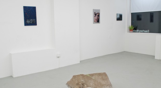
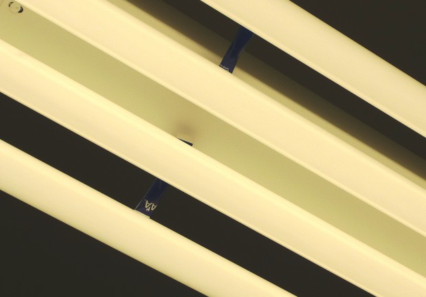
Pedro: Nuanced, defiant, who would have thought that a piece of found concrete in the middle of a gallery could still be the cause for excitement. What makes Oliver Henry’s Drifft drift so charming is the fragile line drawing resting on top of the man-made rock. The artist made it using American Airlines creamer. Now, if you look to the ceiling, right on top of the fluorescent light bulbs above the sculpture, you’ll notice Lovi Dovie, another conceptual line drawing made using the blue paper wrapper of the creamer. Since the paper has the AA logo, it kind of doubles as the proof of provenance for the dusty substance. This calculated diptych is proof that Henry’s remnant is not only a collage of a landscape as seen from the sky, but a suggestion of a cocaine line, a chemtrail, weightlessness during flight, the fragility of life, and even a joke, in the tradition of Martin Creed or Ceal Floyer. On the other hand, Madrigali’s so-called paintings of abstract patterns, office cubicles and close ups of chic models, carry little paint. In reality, they are prints on embossed vinyl, fiberglass screens and other lightly textured materials. To me, they resemble the trivial, glossy airline magazines one never reads during flight.
Robin: I’m vaguely interested in the optical effect of those screens stretched on top of the printed imagery (I use screens that way in my own art practice), though I was certainly far from excited when standing in front of that piece of concrete. I found no way to conceptually enter the piece, formally or otherwise. The surrounding works provide very little context that could be used to interpret it, and turning to the provided “artist statement” doesn’t help as the text is some enigmatic prose that seems unrelated. During the opening, the artist spoke to us about that concrete slab, but I was still frustrated; he talked about how it came from the sidewalk in front of his house and that the blurry line of green paint was added by him after finding it, which still didn’t help me see why I was looking at it in the gallery. Overall, the exhibition feels cool and removed, as if there’s some kind of joke or critique at the core of the works but it’s withheld to such a degree that it’s inaccessible.
Pedro: I understand your frustration. Still, the piece of concrete spoke to me and it told me that people should not take art so seriously.
Guy Ben-Ner, runs through April 26th
Aspect Ratio, 119 North Peoria Street, Unit 3D
What’s on view: The United States premiere of Guy Ben-Ner’s film, Soundtrack
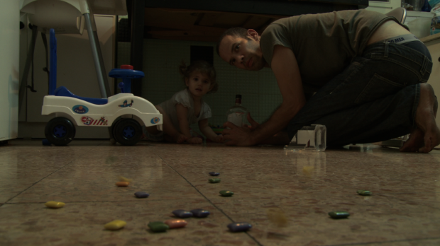
Robin: Frankly, I like the way that Guy Ben-Ner incorporates domesticity in his work, and this piece is no exception. Taking a section of audio from 2005’s War of the Worlds with Tom Cruise, Ben-Ner casts himself and his three children to act out a particularly suspenseful, action-packed sequence of scenes. Much of the piece is shot in their small, lived-in kitchen, and the sounds of explosions, crashes and whirring of spaceships are visually interpreted with falling dishes, buzzing blenders and slamming refrigerator doors. It’s really quite funny, but often when you’re on the verge of finding it completely absurd, you’re taken aback by something serious—like Ben-Ner’s baby girl looking at a laptop with YouTube clips of real-life riot footage. This third layer of media comes as a surprise, and sobers you up with little doses of reality.
Pedro: It’s no coincidence that War of the Worlds is an allegory for the Gaza-Israel conflict, yet I feel kind of dumb because I know I’m missing out on some serious cultural allegories underlying this work. Take, for example, Ben-Ner’s epic obstacle run from the family’s home to a nearby laundromat and back only to rescue his daughter’s missing sock from the bowels of a dryer. It is portrayed in such heroic fashion that I can’t help but think there has to be some other, deeper layer here. Remember when we asked Ben-Ner about the sock at The Suburban gallery? He told us that that the sock is not a metaphor for anything, that losing one of a pair while doing laundry is a normal tragedy of parenthood. I get it, I’m a parent, and still I feel Ben-Ner is not giving us the whole story. If not, then how do we differentiate his work from a sitcom?
Robin: I feel as though Ben-Ner’s film and Kirsten Stoltmann’s film in Psychosexual (discussed above) are alike in many ways: their relatively high production quality, humor, and tightly focused plots and characters. If we’re judging films by their plots’ similarities to sitcom storytelling, I would find Stoltmann’s film to have the sort of vaguely shocking humor we see in offbeat, but mainstream television comedies. So what if Ben-Ner’s sock isn’t a metaphor? Almost everything else in the film is representing something larger than itself: his kitchen, his family, the film from which the soundtrack is drawn, and Ben-Ner’s invented plot acted out by him and his children. As is the case in all kinds of art, we don’t get the whole story because it’s too varied, too complex to boil down to a single point.



Comments on this entry are closed.