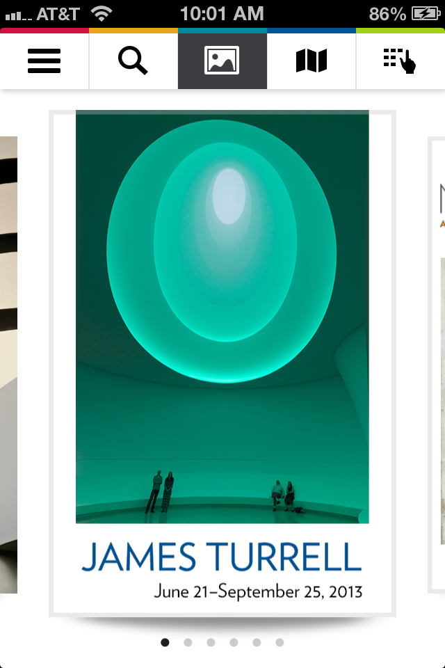
Both the Twitterati and the media sure love the updated Guggenheim app, and why not? The app lets you buy tickets, browse the collections, and keep up with current and upcoming exhibits, from within and without the museum. If phone memory isn’t an issue for you, the app is incredibly useful if you go to the Guggenheim a lot. If it is an issue, well, there’s nothing in the app that you can’t find elsewhere.
5 Things to know:
1. Museum view is awesome. It’s like a blueprint version of Google Art Project (and it’s a great reminder that the Guggenheim is a giant curlique). When you click on the galleries, it shows you a description of the show occupying that space, and, for some of the shows, you can click through to the artwork.

What’s weird is that you can zoom in or out, but just a little bit, making me wonder why there’s a zoom at all.
2. Memory consumption annoyed me a little. The Guggenheim lists the app as 4.0 MB on iTunes, but when I downloaded it, my phone told me it was 5.6 MB. Then, when I clicked on it, the first thing the app told me is that I need to download about 85 more megabytes. Then, once I had the app, the guides of the exhibits would require even more memory.
And, if you’re like me, that can be a problem.
If it just said “90 GB” on the iTunes store, I wouldn’t take an issue with it, but I don’t like the false advertising.
3. The layout is very user-friendly: the icons are easy to interpret, navigation is intuitive, and the design is relatively uncluttered. The opening screen is, well, pretty. The Guggenheim knows their color schemes.

The sidebar reminds me how much the app can do. It doesn’t even fit on the screen —”browse”, “join”, “donate”, “information,” “my favorites,” and more require a downward scroll to see them all. There are a lot of headings. I only wish that, for an app that’s so visual, it could turn sideways for a cleaner image-scrolling experience.
4. “Browse Collection” is wonderful. You can search under “on view,” “by date,” or “by artist.” When you search by artist, it gives a little biography under all the work. Sure, the same feature’s on the website, but the app is more seamless, especially on a small screen. The site on the phone is slow to load and requires a lot of zooming in and out to navigate, where the app is fast, intuitive, and works offline.
5. “Favorites” is helpful. It’s basically just a fancier version of a Pinterest board, but I like being able to keep track of the work that stands out to me. It’s nice to have my Picassos, Kandinskys, Marcs, and Légers all in one place.
There’s nothing in the app that’s especially surprising, it’s not much help outside the museum except for looking at the art and scheduling visits, and there are, of course, the memory issues. Still, it’s very usable and it’ll be a great tool next time I go to the Guggenheim. And it’s free. Free is good.


Comments on this entry are closed.