
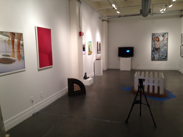
Install shot from “Womanhouse”
A.I.R. Gallery
111 Front St #228A
“Womanhouse” or a Roaming House? A “Room of One’s Own” Today,” curated by Mira Schor
Through Feb. 2nd.
What’s on view: Mira Schor curates work by forty women: multi-media images of femininity, often interacting awkwardly with domestic or gallery space. The show begins with the questions: “What is the room today? Who occupies it? What is the space necessary for an artist to make art in and for whom?”
Whitney: Clichés come with the territory in DUMBO, and there’s a bunch here. You’ll find distressed antique wedding shoes, women looking sternly from their prison-like suburban homes, and lots of images of mopping and cleaning. The metaphors are still relevant, and I know it’s a show about the home, but the simple woman-to-kitchen relationship seems limited considering the many territories where women are most visibly pigeonholed today (the Internet, the corporate world, the arts, etc.). So a lot of it feels more like a continuation of “Womanhouse” than an update.
Paddy: I’ll agree that the metaphors are well-worn, but in a show about women in “space,” which is already something of a cliché, maybe that’s unavoidable. Nancy Youdleman’s bound antique wedding shoes were probably the most over the top cliché, but I was more bothered by the bad figurative painting than anything else. Sharon Louise Barnes’ decision to leave much of her figure unfinished feels more like a painterly contrivance, since the marks aren’t graceful enough to hold the canvas. Kimberly Brooks’ monochrome painting, depicting Helen Frankenthaler in her studio, didn’t seem to be doing much inventive with the brush either.
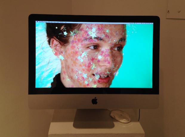
Irina Arnaut’s “Working Title”
Whitney: Yeah that was an issue everywhere; photographic and video work in general was a lot stronger.
The best communicators in my opinion went beyond displaying problems and got inside female psychology, like Irina Arnaut’s memorable video, “Working Title,” a half-slapstick, half-monologue mash-up of different forms of female delusion. One sounds like an interview with a preachy Beyoncé-type. Arnaut’s glowing face in covered in sparkly stars as she tells the camera: “I guess all I can say is I really feel healthy and fulfilled…one day I just began to shine…I have achieved a state that not everybody has achieved. I feel it’s my mission to help everybody get into this state that I am now.” Then we see Arnaut in an empty studio, manically switching between poses of sex goddesses and famous paintings, or a disgruntled Charlie Chaplin, choking on a banana. The slapstick with studio props has a similar sensibility as Kate Gilmore, but she winds through various facets of the female experience which cut deeper than the necessary first-wave polemics.
Paddy: That was definitely a highlight. I also liked Kalena Patton’s”Often treated like an annual,” a photograph in which two opposing petals of a flower are bound and pulled in two directions. It’s a pretty obvious metaphor—we’re pulled in too many directions at once, and we need down time—but I liked it for its simplicity. It’s not trying to say more than it needs to.
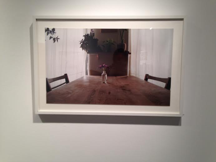
Kalena Patton, “often treated like an annual”, 2013 (Image courtesy of AIR Gallery)
Overall, I thought there was more good work than bad, but as you said at the show, it could have used more space. I’d add to that, that there were some technical difficulties that made it difficult to see in its entirety. The headphones for Kara Rooney’s “Four Poems for Paz” were broken and we had to ask to have Irina Arnaut’s piece set up for us, as it was displaying a menu of 10 works. That’s a real problem for a show where the strongest works use technology.
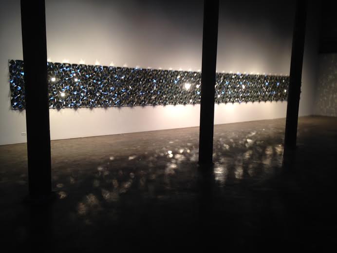
Robert Hickman and Mónika Sziládi, Smack Mellon
Smack Mellon
92 Plymouth St, Brooklyn
Rob Hickman, “DMMDIA”, Mónika Sziládi, “Wide Receivers & Tight Ends”
Through March 2nd.
What’s on view: Robert Hickman’s latest mosaic, DMMDIA, a wall of mirrored pyramids; Mónika Sziládi’s gauche-glam portraits, or ass-and-back photos, titled “Wide Receivers & Tight Ends”
Whitney: Mirror art rarely gets me too excited, whether that’s Josiah McElheny’s “Walking Mirrors,” selfies in mirrors, or the mirror-tiled sculptures that seem to be so popular on the fair circuit. Maybe that’s simply just because mirror, as a material, deflects, so you can’t look to the surface for a story or a trace of the artist.
The better mirror works I can think of compensate for that fact with an extra level of sensitivity, like Tony Matelli’s trompe-dust paintings, created with a light spray of automotive paint. The best I’ve ever seen are aluminum boxes by Donald Judd, which I appreciated because they seamlessly reshape the surrounding landscape. This wall of triangles does not have that intention.
Paddy: My favorite part of this exhibition was the giant sign in the window warning people that their children could get hurt because of the extremely sharp glass. Naturally the first thing I did was touch the glass to see just how sharp it was. I survived, but yes, it’s sharp.
This work barely seemed to function as a mirror, since every surface was angled. It read more like a long jewel to me, so I wondered why this piece wasn’t at Pace, or some similar blue chip contemporary art gallery.
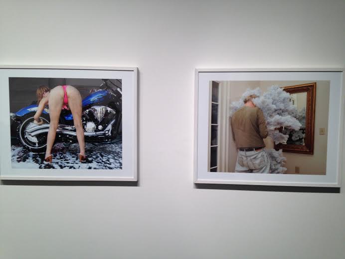
Paddy: It’s hard not to think of Jessica Craig-Martin’s photographs when looking at “Wide Receivers and Tight Ends,” a series of 13 photographs by Monika Sziládi. That’s a good thing, because Sziládi captures the same kind of “failed armor” Jessica Craig-Martin describes as her subject. People seem exposed.
There are, of course, differences. Monika Sziládi’s photographs don’t focus as much on high society, but rather a relationship between performance, social circles, and technology. Everyone is either posing or getting their camera phone ready for something. For that reason, the subjects are sometimes a little more like participants in the project rather than material to be manipulated by the artist.
Now, I realize that’s a little odd to say given that Sziládi digitally manipulates her photos, but those manipulations are not always apparent. Take for instance, the photograph of a woman in a bikini bent over a motorcycle. We see every vein in her legs, and even the brown of her ass crack. It’s probably the least attractive lighting I’ve ever seen used and I have no idea what, if anything has been manipulated. This image read more like a re-presentation of amateur soft-core porn, so on its own I’m not sure it would be much more than grotesque.
But these photographs benefit from being displayed as a group. The picture beside it is a shot of a man, back arched, who’s either diddling with this phone or his dick in a mirror while carrying parts from a disassembled Christmas tree. There’s a push and pull between the two poses that’s incredibly satisfying.
If it’s possible to have a preference in this group, for me it was probably “Untitled (Pink Accent)”, which pictures a maniacal woman (or man) wearing a pink cocktail dress and pink periwig in a ballroom that doubles as a convention center. Beside her is a figure who looks like Comic Book Guy from The Simpsons. Here, I like that the cast of characters seems broader, and weirder than you’d normally see. That construction seems a little more interesting than some of the other manipulations. The ones where you would notice different versions of a scene in a camera view finder after looking for a while weren’t quite as good—it seemed like the redundant visualization of a process (though I say this knowing that I’ve just noted that process isn’t apparent a lot of the time, so maybe those images are needed).
Whitney: Totally. I didn’t notice that the figures were collaged until you’d mentioned it, since they’re so seamless, but you immediately notice slight inconsistencies in scale and depth that make these feel very surreal. Something’s definitely off but it’s not clear what.
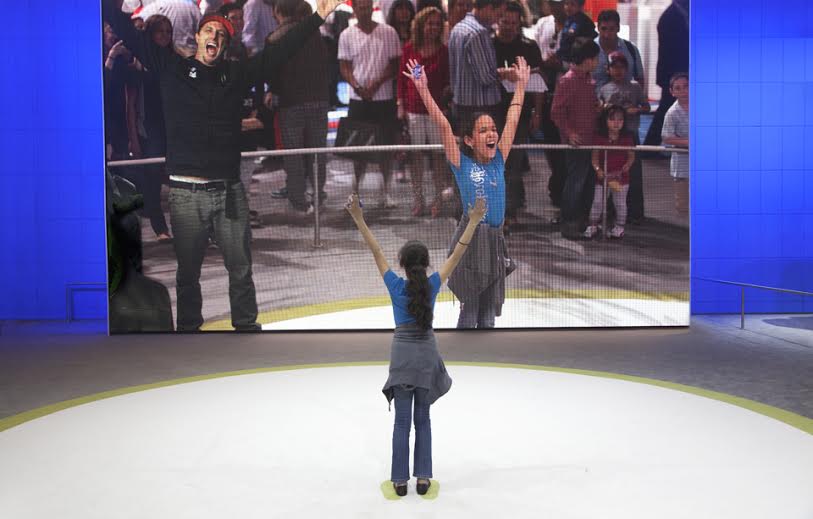
While a lot of these immediately stand out as raunchy or unnerving, the image that stuck out most to me was “Untitled (Cheer Circle)”. It’s just a girl on an ice rink, with her back to us, cheering with a cell phone in her hand, in front of a slightly larger projection of herself, which shows a big crowd behind her. The more you think about it, the more you realize this situation makes no sense. Why is there a crowd facing a screen that just displays itself? Why is nobody directly facing each other, or the viewer? Sziládi has set up a chain of mirrors that illustrates the degree of removal that happens when you project your identity through technology.

Comments on this entry are closed.