 “This year’s Whitney Biennial is three biennials,” Whitney Director Adam Weinberg told the press yesterday, noting that each floor belongs to a singular curator with Anthony Elms taking the second, Stuart Comer the third, and Michelle Grabner the fourth. Dividing up the Biennial points to the problems of its scale; with over 103 artists, along with numerous performances and lengthy media (including a screening of Andrew Bujalski’s 2013 film Computer Chess in its entirety), this Biennial’s one for repeat viewings. And so the 2014 Whitney Biennial cannot be just one thing: It is both an exhibition and a process.
Second Floor, Curated by Anthony Elms
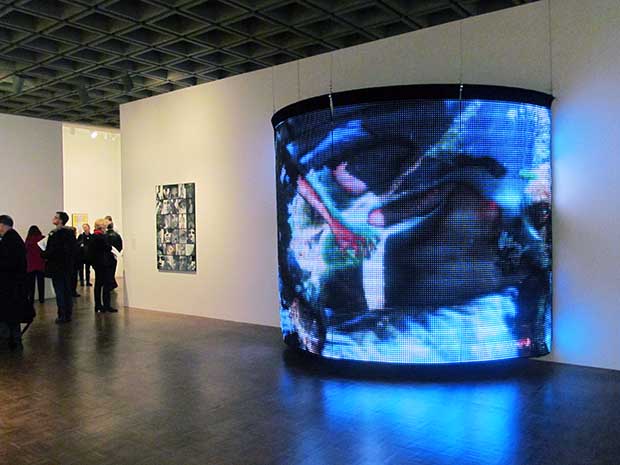
This here futuristic advertisement is an LED curtain interspersed with images of jellyfish and nude men. It’s brought to you by artist and filmmaker Gary Indiana, who also happens to be one of my favorite art writers. Unlike biennials past, this one has far less of a focus on new and emerging artists.
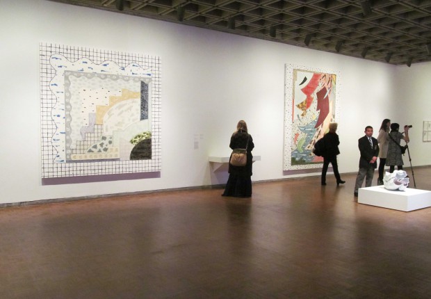
These large retro paintings by Los Angeles’ Rebecca Morris gave a brief moment of reprieve from an often overhung show. The abstract works resemble actual objects and places—landscapes, fabric patterning, tile grout—while simultaneously seeming to engage with no more than painting itself.
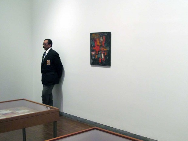
Chicago’s Joseph Grigley ended up creating a mini-exhibition of sorts, a common occurrence at this year’s Biennial. Grigley’s room compiles an archive of art critic Gregory Battcock’s notes and letters, and here we see Battcock’s only known painting in existence.
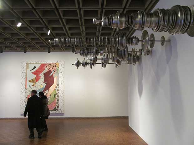
This is not how sculptures (or cymbals) are normally hung. Terry Adkins, an artist who was deeply influenced by music, presented this collection of cymbals protruding off the wall.
Third Floor, Curated by Stuart Comer
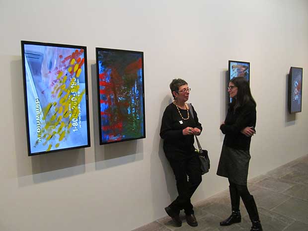
A disappointing body of work by Ken Okiishi, who has previously spun patterned umbrellas over screens and wall paper. Here, he’s brushed paint over some video monitors.
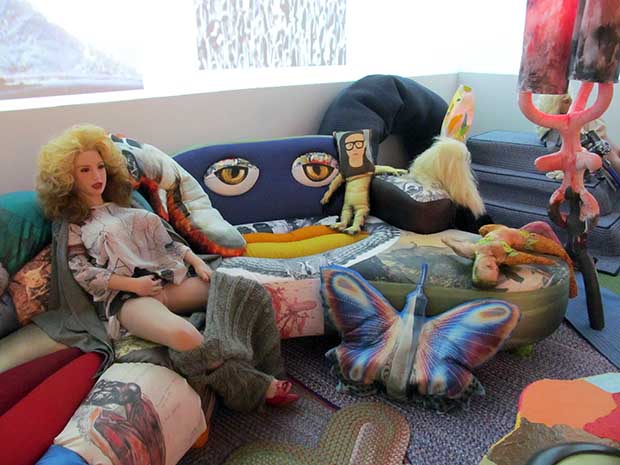
We predict that Bjarne Melgaard’s room of filth will be the Biennial’s standout. At the very least, it’s bound to generate some talk. The room is an overly simplistic mash up of digital culture at its worst—loops of youtube videos picturing bears fighting, dogs eating each other, and snakes swallowing their prey. This, along with images of people being run over and bombing the shit out of each other. Then, of course, there’s this Skrillex pillow next to a masturbating real-girl doll.
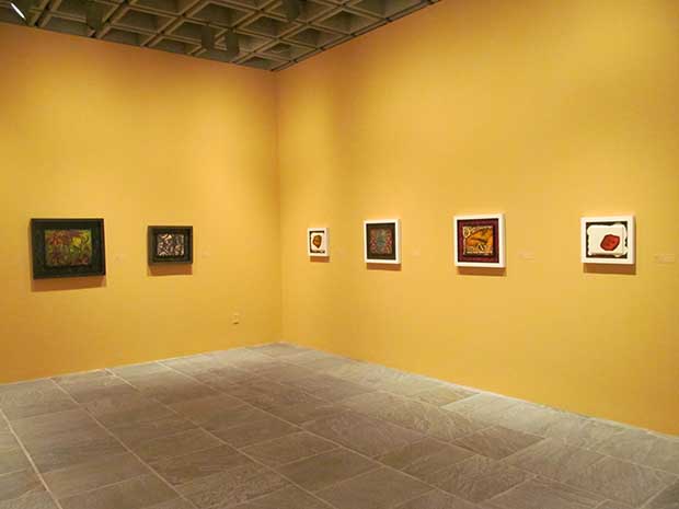
Tony Greene passed away in 1990 from AIDS-related complications. Largely forgotten, artists Catherine Opie and Richard Hawkins organized an installation of his strange, small works that evoke everything from Victoriana to Kenneth Anger. My favorite is a fiery mouth (seen on the far right) enveloped in a cloud of paint.
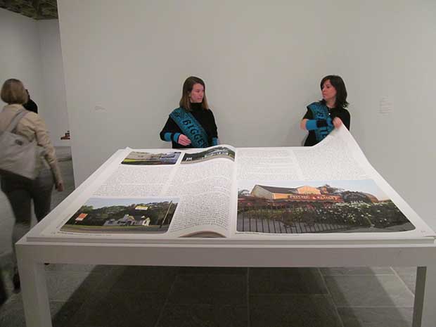
Good: Lisa Anne Auerbach’s Riot Grrl-inspired sweaters. Bad: Having Whitney volunteers work for free while flipping through the pages of her book while wearing her sweaters. Those sweaters read “bigger” and “badder.”
Fourth Floor, Curated by Michelle Grabner

A floor first defined by its use of buoyant color. Recommended for anyone afflicted by the seasonal affective disease.

Sterling Ruby made these oversized ashtrays. They certainly fit the colorful theme. [Author’s note: The author has chosen to remove the line referring to Ruby’s work as “ugly.” Much good art is ugly and the author has no negative connotations with the term.]
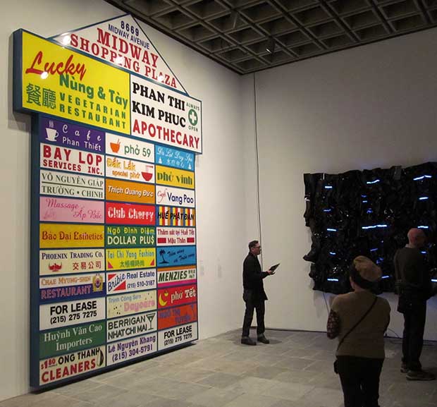
Ken Lum made a fake strip mall sign for fake Vietnamese businesses with names inspired by people and events associated with the Vietnam War. It’s unclear where this sign would be most effective: In a strip mall, where it would not resemble art at all, and therefore go unnoticed, or in a gallery, where it looks so much like art that it’s unremarkable.
Elsewhere at the Whitney Biennial

In what’s possibly the worst space for art at the Biennial, Pedro Velez’s art critic posters were installed right outside the elevators on the lower level, away from the rest of the show. I like these, though; they look like inspirational, slightly hip-looking posters you’d see lining the walls of high school libraries and cafeterias. One particularly timely quote in light of the fairs comes from Walter Robinson: “We don’t have art movements any more, we have market movements.”




{ 40 comments }
who told you being a critic = being a jaded bitch?
Whoa. Opinions are my own. God forbid I have an opinion and say that I like or dislike something. This is all I have to say on the matter.
it’s the how not the what. Tell me all your footnote snark/ pettiness was necessary: ‘Sterling Ruby made these oversized ashtrays. They certainly fit the colorful theme, but they look like junk and don’t do much for me other than sitting there looking ugly.’
I wouldn’t have put it that way, but the point is valid. The ashtrays are unattractive. I expect that’s the point (and honestly, I like this work a lot better than say, the prison bus), but I’m not sure that betters the work. Generally, I find myself wondering whether what Ruby has to say is doing anything more than mirroring what we already know is bad.
Paddy, you’ve yet again left out the crucial measurement of how hard Sterling Ruby tried.
see that was a better critique
Sterling put way more effort in that ashtray than you did in writing thisss yet somehow you are beyond criticism? no.
stop censoring me, deal wih dissent.
You haven’t really offered any criticism, though; you’ve called Corinna “a jaded bitch”, then you’ve said (indirectly) that she was unnecessarily snarky. Following the guidelines you’ve presented, AFC will endeavor to call more artists jaded bitches, in future.
You’re a troll.
no i’m not i have a point.
Trolls are commenters who make the same point repeatedly, and when that point has been acknowledged, they simply move on to a new thread as though they were not heard. This is bullying because its repetition (and name calling) is abusive and it’s why you’ve been labeled a troll. It also tends to make the commenter in question look crazy. You’ve made the same point now, what? 10 times now?
Which brings me to the question:What do you want from this conversation? Do you feel you have not been heard? Do you want a change in the text? (That’s already happened btw.) I’m asking because you seem unsatisfied and I don’t know how to change that. I’m starting to think it’s not possible.
i cannot deal with this attitude. Bully? You’re the one who made a name from abusing artists and calling it a critique, as your crew of three. I just wanna forget this site exists.
do you really believe this is what criticism should be? snark?
it’s people like these who have taught the public to throw bitchy comments at exhibitions to look informed. Because artists, who put way more effort in their work than you in being a mean girls spinoff, don’t deserve any respect at all, right.
I’m having trouble finding the line above about artists not deserving any respect, can you clarify that one for me?
oh come on you’re well versed in sarcasm. Got things to do, bye. An actual job not dick riding artists i don’t respect u know.
“Dickriding” means the exact opposite of what you think it does. Q.E.D. y’all.
do i mean that your job depends on their existence?
Ahahah I just realized you’re the same person who came by to remind us all that die-hard Madonna fans still exist keep it up
reductive much? that whole discussion was about how artfcity was way behind trend by bemoaning the misuse of the word ‘curator’. whatever keeps u busy, honey
u were complaining about something the times wrote about in 09 eeeeshhhh http://www.nytimes.com/2009/10/04/fashion/04curate.html?pagewanted=all&_r=0
now that’s embarrassing even the times beatchu
it’s very disappointing to hear that “computer chess” is in the whitney biennial.
though I think the other fellow commenting in this post needs to find a more full definition of “dissent” than “disagreement” and learn what censorship is, I did think better of my above one-sentence take-down in light of his earlier comments. I found “computer chess” shallow for the following reasons:
Most of the director’s efforts seemed to be in showing off how awkward the vintage camera/editing equipment he chose to use was. The effect was similar to “escape from tomorrow,” which proudly talked up its transgressive guerrilla camera style but didn’t use its footage to make something poignant or incisive. There were a lot of moments in “computer chess” of hushed profundity of the mumble-core variety that Bujalski is known for, but none of them delivered more wisdom than a fortune cookie. There just wasn’t much substance to the film.
http://dictionary.reference.com/browse/dissent and i thought my posts were being erased, k? excuse moi? your critique is also better than Corinna’s, good.
Your point has been made and heard. Time to move on.
bye. See you in 5 months when i remember your site still exists
i see the whole gang is here, fun. Deal with dissent, bitches
such good memory will.
come on, pay attention to joshua
ignore this guy
Tony Greene’s work was curated by Catherine Opie and Richard Hawkins, not Richard Greene.
Copy editor has taken note.
Why is Guest anonymous? Is he embarrassed by how shrill and sexist he sounds?
more than you’ve ever tried to move while being fucked?
Well, if that’s what you want then the solution is easy; You can forget the site exists by not visiting it.
ivy leaguer throws in some latin wow
Not exactly. I wrote about curation becoming a buzzword in 2006 and referenced that article when the 2009 piece in the Times came out (which we also wrote about). http://artfcity.com/2009/10/06/the-new-york-times-on-curating-on-the-tip-of-creative-tongues-part-one/
AH, YOU BEAT THE TIMES I SEE
Comments on this entry are closed.