Earlier in the day we debated whether the Independent was anything other than a fair (it’s not). Now we discuss the art in the fair. We had a lot more to say about the Independent than we did the Armory Show, so that’s at least one good sign for its future.
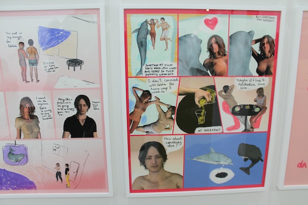
Paddy: Just how smart are dolphins? According to this comic scripted by Dan Graham and illustrated by Antoine Catala they’re just as clever as the average dude. When a dolphin named Eddie meets the sexy and voluptuous Cindy he quickly proceeds to seduce her. The relationship progresses quickly, but when he moves into a pool in Cindy’s backyard the relationship simmers. “I don’t connect with Eddie the same way I used to,” Cindy tells her partner Kerry. Kerry then decides that perhaps all Eddie needs is a bit of spice in his life and introduces him to a toothy humpback whale. Eddie thinks she looks like a brown lump. It’s hard to imagine this piece being more dudely, but that’s fine. I like the absurdity that a female fish isn’t good enough for the dolphin, but Cindy is.
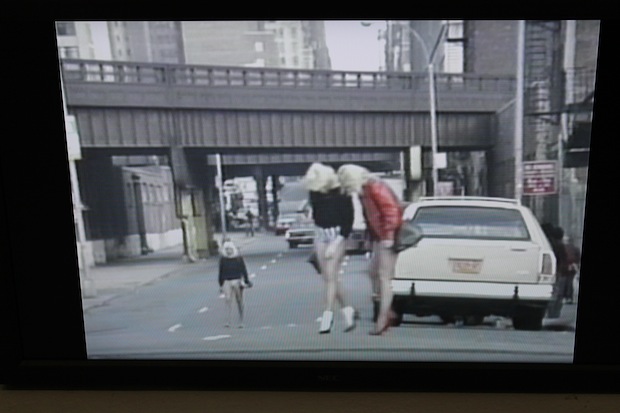
Whitney: Once a picture of everyday life, Michel Auder’s “Chelsea, Manhattan” (1989) is a historical nugget from Chelsea’s not-so-ancient past. It’s incredible; you’ve got hookers and pimps walking around on Derek Eller’s doorstep (just blocks away from the Independent), and the doorway looks exactly the same. It makes me think of today’s art hipsters as just another flock of colorful, migratory birds, passing through for a few decades.
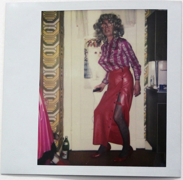
Whitney: Holy shit. You can probably guess that this series of private self-portraits by unknown artist Martina Kubelk from 1988-95 was never meant to see the light of day…EVER. So there might be some ethical issues with Galerie Susanne Zander’s selling them at an art fair; like the other artists in her booth, these images were discovered after a person’s death (these in a flea market) and sold to her. These images are so supercharged and human, though, that I think it would do people a disservice not to show and preserve them. I think Kubek’s trying to express some action movie glamour poses here but often has the look of a little kid caught with his dick out. These and others in this booth are the only works in the fair which I would describe as “moving.”
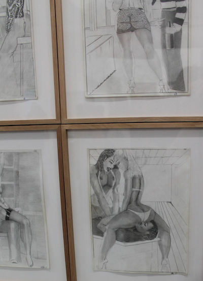
Whitney: If I could buy one thing, it would be William Crawford’s untitled drawings. Found in an abandoned house in Oakland, Zander believes that the series might have been made from prison; some of these were made on prison papers, and they were made in the nineties, but a lot of them look like they’re from the seventies. That would explain the need to illustrate hundreds of sexual fantasies. Crawford’s style also looks like it’s in a time capsule, giving himself a kind of cropped fro and sleek disco interiors. He also has a tendency to place the butt in the center and focal point of every frame. Paddy: Best in Show? It was for me, too.
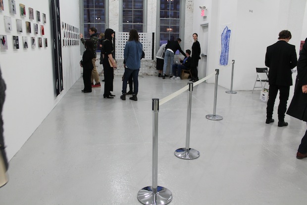
Whitney: Like an official passing of the torch, Gavin Brown’s space is split diagonally with Ramiken Crucible.
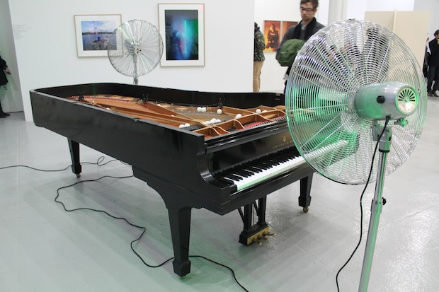
Whitney: Roman Signer had a piano crane-lifted onto the third floor of a building and then ran opposing fans so that ping pong balls will roll lightly back and forth, over the strings. This would be one of the better pieces at Art Basel because of its sensitivity, but next to the few great works at Independent here, it’s an art fair meh.
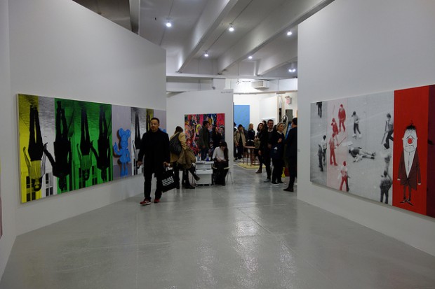
Paddy: This Julia Wachtel installation at Elizabeth Dee is a good example of how the Independent makes art look better than it is. “Champaign life” depicts a life where dreams and realities are the same. On one wall you have Mickey Mouse, Kim Kardashian, and Kanye West next to each other, on another you have a black-and-white image of a beaten figure surrounded by men next to a sad drawn clown in red. The trouble with this piece isn’t that it doesn’t have a lot of range, but rather that the artist does very little to expose just how absurd reality is. The piece looks like a subway advertisement.
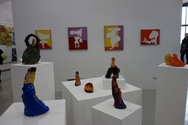
Paddy: Clara Olshansky wrote glowingly of Alice Mackler’s ceramics at Kerry Schuss this summer while her work in a group show at James Fuentes got a less than positive review from everyone at AFC but for me. The main criticism was that these works were little more than blobs with smiley faces, but I still don’t know why that’s a bad thing. The ceramics and the paintings both resemble lumpy Barbapapas, a cartoon I also found charming. Blobbiness isn’t a bad thing when it’s got a good face. These images often have oversized lips, which tend to be the more expressive part of the ceramic figure, though granted most look sort of shell shocked on those pedestals.
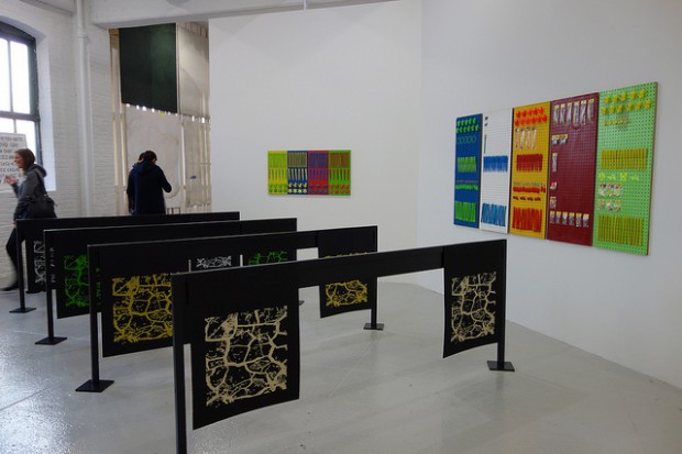
Paddy: As far as I knew Karma dealt mostly with books, but this booth shows they have greater breadth to their program than I realized. These truck flaps and wall mounted panels by Amy O’Neill looked pretty great to me, though I suppose part of that was the simple thrill of seeing a yet-untouched working-class material touched by art. That the display device resembled a set of hurdles didn’t hurt either. I doubt there’s too much to be read into gesture, I just found the transformation pleasing.
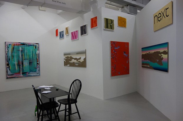
The Real Fine Arts booth includes Nicolas Ceccaldi, Nicolas Ceccaldi / Mathieu Malouf, Manuel Gnam, Bill Hayden, Morag Keil, Alissa McKendrick, Dave Miko, Jon Pestoni and probably photographs better than any other in the fair. This is, however, all relatively safe abstract work that looks better at the fair than anywhere else.


Comments on this entry are closed.