
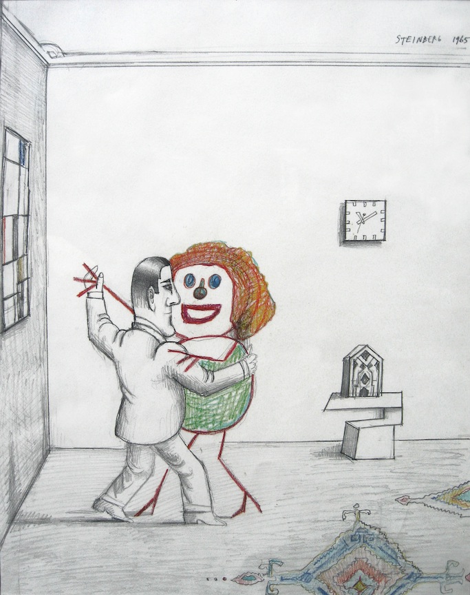
Saul Steinberg , Dancing Couple, Graphite, colored pencil on paper, 20×14 inches
1st 20 Years, various comix artists and New Yorker contributors (Through May 13th)
Adam Baumgold, 60 East 66th Street
What’s on view: Small drawings, paintings, and sculptures.
Paddy: There’s no press release to explain the organizing principle of this show, and as far as I can tell, it doesn’t have one. Who cares. The exhibition brings together an extraordinary collection of comic book artist work and various drawings made from the 1940s through until today. There are over 60 artists on view, most of it small work, and almost all of them are worth some contemplation. Thankfully, there’s no salon style hanging so it’s not a painfully crowded show.
As far as individual works go, my favorite work is the Whitney Museum-owned Saul Steinberg drawing of a fully-rendered man dancing with a stick woman (pictured above). He’s wearing a suit and carefully drawn in pencil, she dominates him with her clown face and bright orange hair. They appear to be dancing in a museum.
The whole scenario is delightfully absurd and there’s a lot of that kind of sensibility to the show. In the back room there’s a drawing of dancing dog in disco cloths by Anna Sommer, and by the window, a small sculpture depicting the artist in studio made entirely out of pencils by Andras Borocz. (A close up look reveals he’s carefully carved out the artist’s face on the pencil head.)
It’s playful stuff and a great match for some of the well known comic book artists in the show; Chris Ware, Lynda Barry, and SETH to name a few. For those who like super obsessive line drawings, Marc Bell has a piece in the back gallery you could literally study for hours. I did my undergrad with the artist, so I can’t claim total objectivity here, but his graphic drawings end up looking map-like, revealing an underlying grid to all these cows, figures and script-like features he’s rendered.
In that sense the Alex Katz paintings of people in the water or the yellow house landscape should be an uneasy fit, but for me, they worked. These works were simple, so they both provided a break from some of the more obsessive drawings and seemed inline with the graphic nature of the show.
Speaking of graphically inclined work, the Charles Burns before and after diptych portraits from “Black Hole” are great. These are rendered with Burns’s trademark black and white rendering—no grey, ever—and picture the same kid’s face, once without acne, once with it. It’s matter of fact, but I like that he’s depicted as a mouth breather too, which makes him particularly awkward and unappealing.
Whitney: I don’t have much to add to that since I agree with pretty much everything you’ve just written. Typically I try to avoid writing about comics at all, because I really think the field is better off flying under the art world’s radar. This grabbag of samples re-enforces that theory. You don’t get the same depth of feeling as you would from reading a whole book, but it shows how a level of ideological self-seriousness goes out the window, when you’re making thousands of images to tell a story.
The images themselves, though, are often very carefully constructed. I was always under the impression that Burns made his images in the computer because the lines are so pristine. I was amazed to see that each of those hash marks seem to be painstakingly painted/markered in. Unbelievable.
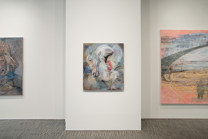
Ponies & Psychos,” Jim Lutes (Through April 5th)
Wright Gallery, 980 Madison Ave, Third Floor
What’s on view: Chicago-based artist Jim Lutes mixes abstraction with the Old West—and horses!
Corinna: Oh, man. I did not know that Jim Lutes was a horse guy. Wright Gallery has all sorts of white-washed paintings (Hello, George W. Bush!) that reference horses and the American West, all covered with some abstract swooshes. These aren’t necessarily good paintings, and I couldn’t find a wink of critique in them about the Old West or anything else. I did appreciate Lute’s willingness to show himself sitting atop a horse in just his tightie whities and athletic socks. Still, it’s too bad this just reminds me of Breaking Bad, but maybe that effect’ll wear off now that the TV show is over? Regardless, I had fun with this show.
Whitney: Yeah I didn’t automatically get the “violent histories of the Pacific Northwest” referenced in the press release and titles like Horse Slaughter Camp, after Sohon, but I did think this was a great painting show. (All except from the painting you mention, “Pink Savage,” which reads like a straightforward illustration of the show title “Ponies & Savages”).
Lutes uses the horse motif like staring at a flame; one image “Memory in the Wind” depicts a layer of smoke over a desert. It’s made up of faint outlines of thousands of horseheads. That sounds cheesy, but Lutes really does use pony obsession to communicate a sinister, deranged mentality. They’re similar to Jutta Koether’s wispy environments, which seem to be more based on rhythms than symbols.
Raymond Pettibon
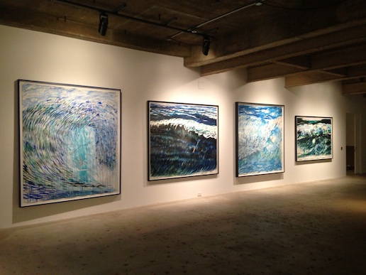
Are Your Motives Pure? Raymond Pettibon Surfers: 1985-2013 (Through May 17, 2014)
Venus Over Manhattan, 980 Madison Ave, Third Floor
What’s on view: 48 paintings and works on paper featuring surfers and waves
Corinna: You know you’re from California when you end up drawing surfers. For decades.
I wasn’t too excited going into this exhibition—maybe I just don’t get the passion of riding a killer wave—but I left with a change of mind. Only good art—well, quality anything—can do that.
None of Pettibon’s waves seem “real.” The blues are too dreamy for that. All his marks are obsessive, too. His hatchmarks turn waves into cylindrical whirls. Sometimes the foam atop the crests are poofy.
Paddy: I’m just going to interrupt here to say that I don’t give a shit about surfing and don’t even want to look at art about surfing, but I thought this exhibition was successful too! It’s a lot of pictures of waves—some that dwarf the viewer and some small enough to fit in your average sized bathroom, and that water has a life to it. The marks are surprisingly compelling for what they are; liney scratches, washes, curly wisps, mostly in blue or black. I think that’s because the water totally dominates the figures. It looks monstrous, and expansive. It looks mean. Compare that to those mechanical Robert Longo waves made back in 2000, “Monsters.” I suspect these drawings won’t be everyone’s cup of tea, but at least you can’t fault them for being tacky.
Corinna: Yes! I really enjoyed the show. And more than that, Pettibone’s captions—which are on nearly all the works—get at how surfing isn’t just about surfing, it’s a way of re-imagining his relationship to what he’s making. Here’s some captions do that job really nicely:
“Some things (sea foam, for instance) cannot be drawn at all, but only surfed.”
“When you have finished finding yourselves, step confidently out of the tube and I will be waiting for you.”
And some are just existential-William Blake-like mini-poems:
“With every going out and coming in, with touching bottom and with coming up for air, or staying in the tube, there is a longing for escape, beyond the sea, for a lifting, from time to time, of the actual horizon (like the necessity under which the painter finds himself, with his last tube, to set a window in the background of his picture).”
Paddy: I wrote down your first quote too because I thought it was nice to see the artist acknowledge the limitations of the medium. It’s hard to look at this work and not remark on the influence Pettibon has had on Chris Johanson. The text and image relationship is very similar.
Did you see the text attached to the drawing depicting a bunch of surfers and a naked woman? It read, “There are woods, there are women…but there are beaches too, and girls like grains for sand: two for” I wasn’t so sure about that piece—it seemed really misogynist to me, but then the cut off text and 50’s rendering style made me decide it was a probably entirely appropriated. That made me feel a little better about the text, since it seemed like the image and text was more a reflection of a surfing obsession than it was a position about women.
Whitney: I also wrote down that first quote, because it made me think of the connection between letting the Zen wash over you and diving into painting. You don’t know why you paint or surf, but the result is usually best when you don’t question it too much. I didn’t get the misogyny in the quote you mentioned, Paddy, but that’s because I thought of it as putting aside sex in order to meditate.
Like Lutes’ ponies, Pettibone’s waves communicate different levels of flow. Sometimes the surfers look like they’re on the edge of a cloud; another surfer is almost drowning in a Niagra Falls-like storm of water. That’s helped by how Pettibone paints with loose, calligraphic strokes; the sketchy waves are not fully fleshed out, but they’re more like the sum of a lot of marks. And when they’re all together, that’s how the paintings themselves work, too. (The effect doesn’t translate well through the photos, you just have to see them). Overall, the show reminded me of the “Bulletin Boards” exhibition here last year, where a set of simple limitations can be an amazing boost to intuition.
Paddy: Ah, I interpreted the quote as meaning women are ubiquitous and the same.

Comments on this entry are closed.