
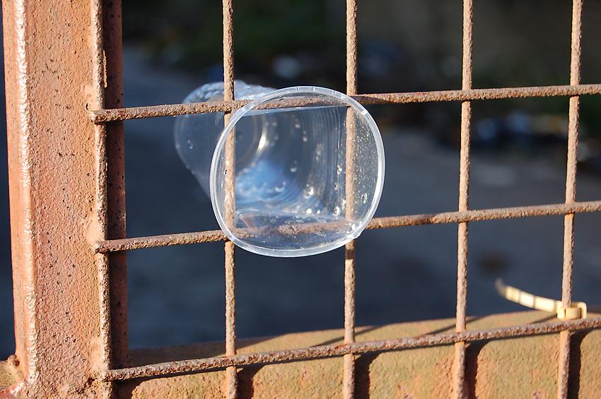
Richard Wentworth, “Istanbul,” 2006. Image courtesy of Peter Freeman Gallery.
Richard Wentworth: motes to self
Charlotte Poseneske: Early Works
Peter Freeman, 140 Grand Street
Both shows run through May 31
What’s on view: A series of sparse Ab/Ex-looking minimal drawings and paintings from the 1950s and 1960s (Charlotte Poseneske); photographs of fences, grates, urban detritus made strange pinned up on the walls, and lined up on long work tables (Richard Wentworth)
Whitney: Charlotte Poseneske was famous, which I think explains the extra-lite handful of sketchy paintings. You can’t blame the artist for the lack of substance here, since she passed away in 1985, and these are mostly unseen sketches. Poseneske later moved on to make minimalist sculptures which mimic industrial prototypes.
Poseneske ended her art career with a 1968 manifesto, writing that she could not come to terms with the fact that art can not have a significant political impact. Art still has a communication problem, but dispassionate arrangements like this one don’t help. (To be fair, I’m not sure this is even a full show, or just a handful of stuff the gallery needs to move. It’s really small).
Richard Wentworth’s room full of photos was a relief after that, simply because the arrangement felt more intentional. Hundreds of photos of scraps, ribbons, shreds, cups form abstract, graphic arrangements, like finding beauty and logic in garbage. It reminded me a lot of Diana Cooper’s wall arrangements, but rather than making systems, this mostly seems to come more from the Instagram impulse to identify graphic similarities between car bumpers, pipes on the ground, and patterns on pavement. Past that, it seems fairly ambivalent, and that’s how I left it.
Corinna: Historically, there’s a lot to be said about Poseneske’s emphasis on serial repetition—a key phrase for how we end up talking about people like Sol LeWitt. Regardless, the drawings we have on view seem a bit like the leftovers you’d find in an artist’s studio; I was surprised by how dirty some of them are.
As for Richard Wentworth’s photos, I did like seeing the weirdness of everyday life emerge from seemingly banal situations. As I’m writing this, however, I’m realizing that yes, that’s a pretty cliche thing to say about photography nowadays. (Sorry for writing someone’s as-yet-to-be published press release.) So even though I genuinely liked a couple of the photographs—like one bizarre close-up picture of mayonnaise slowly flowing out of a McChicken thing—it’s a style that’s pretty commonplace.
Sylvan Lionni, “Dust,” 2014. Image courtesy of Kansas.
Sylvan Lionni: Half Life (through April 26)
Kansas, 59 Franklin Street
What’s on view: Super-minimal trompe l’oeil screenprints on mirrors made to look like dust drawings, with bits of tape, and pairings of L-Rulers
Whitney: This show looks as though it’s been pieced together from the remnants of a big renovation, but the tactics are extremely familiar from art. The show reminded me of a chapter from 9.5 Theses and Class, in which Ben Davis makes a case for the genuinely radical and thrilling beginnings of conceptual art, and discusses how the term has been bastardized over the years. He quoted Lucy Lippard’s Six Years:
It seemed in 1969 that no one, not even a public greedy for novelty, would actually pay money, or much of it, for a Xerox sheet referring to an event past or never directly perceived, a group of photographs documenting an ephemeral situation or condition, a project for a work never completed, words spoken but not recorded; it seemed that these artists would therefore be forcibly freed from the tyranny of a commodity status…
This show doesn’t necessarily share the political goals of 1960s conceptual art, although it does seem to resist commercial norms. But this is a different world. Tony Matelli has been making similar dust-and-mirror trompe l’oeil for years, but larger, and those seem to show up fairly regularly on the fair circuit.
And unlike artists like Ian Pedigo or B Wurtz, in whose detritus you can discover ideas about time, and the nature of painting, Lionni’s concerns seem to stop at the surface; Lionni “aims to qualify material, aesthetic, and conceptual properties within our revolving banality” through “overlooked details embedded in the American mundane”.
Is it enough to find beauty in the mundane? As a fellow gallery-goer once remarked, most people are guilty of photographing a crushed can on the ground, or a rainbow in a puddle, but art can do better. After three years of looking at shows like this, I am convinced that that kind of microscopic lens just reduces concerns to what this is supposedly avoiding in the first place—commodity, which can even package dust.
Paddy: I can’t believe that any artist showing in a commercial gallery today is making work with the intention of avoiding commodification. If that’s the real intent, don’t show it in a gallery.
Whitney: I don’t think Lionni is trying to do that either—I just think that this work tries to resist mainstream ideas about beauty, which is often shaped by commodity. If you make a Pollock out of something other than paint, it suggests that you’re trying to subvert a material which people already accept as valuable.
Paddy: It’s not possible to subvert material people already accept as valuable in the context of the gallery. Either the dust sells or it doesn’t. Either way, who cares? That’s the conclusion Vito Acconci and other conceptualists came to 30 years ago, and why he gave the practice up.
Anyway, Lionni is using ink, not dust. If subversion were really the end goal, you’d think he’d use a less archival material. This practice seems rooted in formalism to me—driven by the idea if you look and think hard enough about the work, there will be some intangible reward.
Whitney: True. It’s ultimately a formalist show. The beauty in overlooked materials is revealed when they fit into the same gestures we get all the time.
Paddy: I think your example of Toni Matelli is a great one, though these seem more focused on process. First Lionni photographs a dusty aluminum panel, then he screenprints it back onto the aluminum. It’s recursive.
It’s also a bit boring. I get the sense we’re supposed to care about the industrial material, the process and its artifice. Why? Are the ruler sculptures bettered because they were fabricated by the artist and reference geometric abstraction? Not for me. There’s a little more visual interest thanks to the juxtaposition of different sized and colored rulers, but that’s about it.
As an aside, when I was at the ADAA art fair, gallerists spoke to me about the work they represented almost entirely in terms of process. I get the feeling process-based art is appealing to gallerists because it can be used as a selling point.
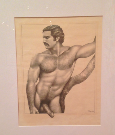
Tom of Finland, “Bruno,” 1979.
Stroke: From Under the Mattress to the Museum Walls (through May 25th)
Leslie Lohman Museum of Gay and Lesbian Art, 26 Wooster Street
What’s on view: Illustrations from gay “adult” magazines, past and present; with paintings and ephemera related to the illustrations
Corinna: Before you start reading, I should probably preface this with a big fat NSFW. This show is porn. Dicks! Jizz! Round, fat asses!
Whitney: I scheduled this in midway through the trip, thinking we’d need a break from art. I’m really glad we did.
There’s everything from Don Merrick’s hardcore rape porn to Neel Bates’ utopian dormitory orgies, to Michael Breyette’s patriot flag flying makeouts, to Tom of Finland’s hyper-detailed mythical beasts– just look at this dude coyly hanging his penis out of the frame! This comes with a small vitrine of correspondence between famed homoerotica producers like Bob Mizer, Neel Bate (aka BLADE), Charles Leslie (cofounder of the Leslie Lohman Museum), Tom of Finland (who literally signed his name “Tom of Finland”), which reminded you that these aren’t cultural anomalies, but a closeknit working community. In one letter to Neel, Tom of Finland writes that “Most of my works are pornographic illustrations, not art.” If it’s not art, then art could definitely take something from it. As another visitor noted, “It’s a good sign when art makes you smile.”
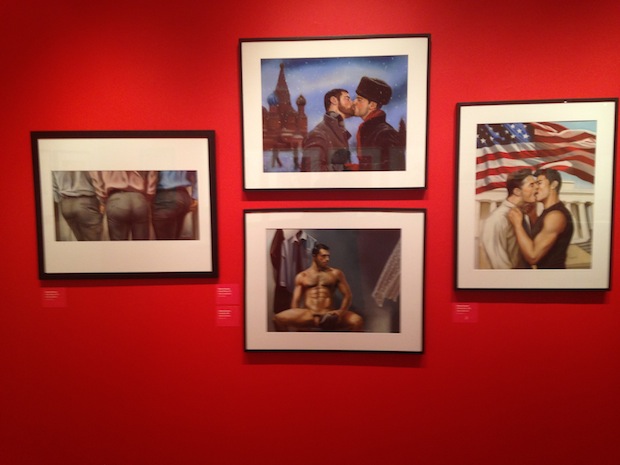
Wall of Michael Breyette works from the 2000s (please pardon our shitty photos)
Corinna: This was definitely the highlight of our outing. I wasn’t expecting great curation, but we found it anyway; the exhibition made a case for a history of hardcore illustration. Just look at Robert W. Richards’s work that’s amazingly 80s or Tom of Finland’s sleek, machinistic representations of the human form. They’re all a reflection on general design and illustration trends of their times, but they also showcase the sheer variety that’s to be found in porn. I’m into variety, not so much consensus; we have too much sameness in the contemporary art world right now.
Leah Ruple, “Coal Miner’s Daughter,” 2012 | Lukas Geronimas, “Custom framed dust drawing,” 2014. Image courtesy of Suzanne Geiss Company.
Particular Pictures (through April 26th)
Curated by Joshua Abelow and Emily Ludwig Shaffer
Suzanne Geiss Company, 76 Grand Street
What’s on view: Provisional painting and drawings and sketches from the Clinton Crew. With peculiarities in style, subject matter, and materials each piece, the show wonders why people are interested in the type of specificity you find in Twin Peaks
Whitney: This show definitely had its moments, or I guess, Log Ladies: Leigh Ruple’s stunning, almost glowing, magenta painting “Coal Miner’s Daughter”; Lukas Geronimas’s cast iron table covered with inscribed doodles; and Chris Johanson’s subliminal message painting “Untitled (A Sense of Something Happening)”. But like Twin Peaks, there are a lot of really poignant moments with no conclusion. Like most provisional painting shows, there’s a lot of variety, but rarely much development.
An exception to this was Gregory Kalliche’s “Our Circle.” In several projections, Kalliche’s replaced the “Universal” logos over Earth with the word “EARTHISH.” It seemed to suggest that everything, even the planet, can be branded; but as brands change, they become more and more distorted simulacra of whatever the essence of the thing was in the first place.
Corinna: I’ll second that, that in this show you’ll find a variety—mostly in the range of materials used—but rarely any development. And by development, I think we mean in terms of ideas, narrative, really anything to make a point beyond an initial impression. Chris Johanson’s acrylic painting sums that up: There’s a circle of text floating on the paper that says “A SENSE OF SOMETHING HAPPENING.” Impressions, that is all.
Having said that, I did get an honest-to-goodness art feeling from Leigh Ruple’s “Coal Miner’s Daughter.” It was the most dynamic painting in the room, and I just wanted to gobble it up with my eyes. As silly as this may sound, I was won over by beauty. Sometimes that happens.
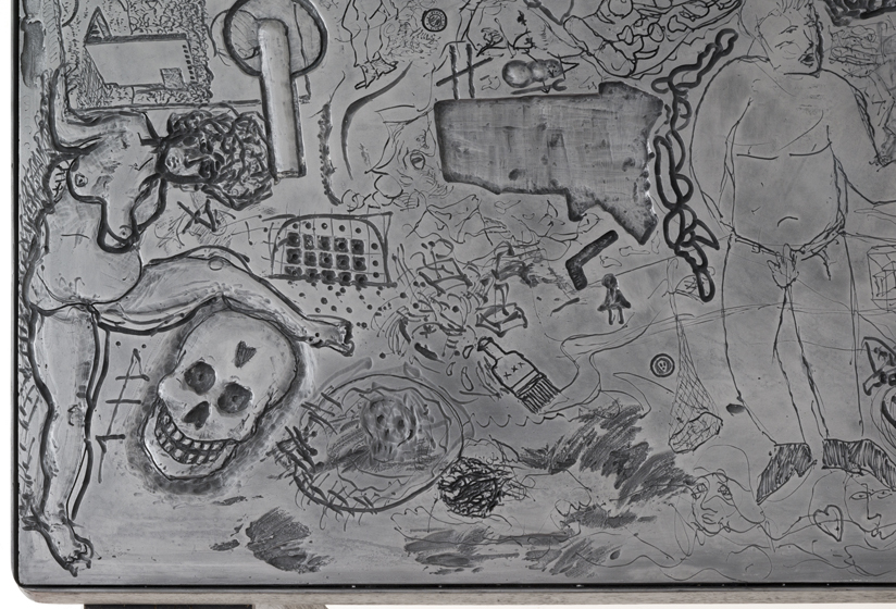
Lukas Geronimas, “Custom table” (detail), 2013.

Chris Johanson, “Untitled (A sense of something happening),” 2012. Image courtesy of Suzanne Geiss Company.
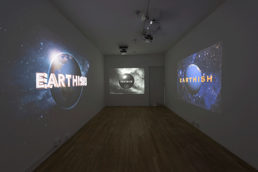
Gregory Kalliche, “Our Circle,” 2013.

Comments on this entry are closed.