
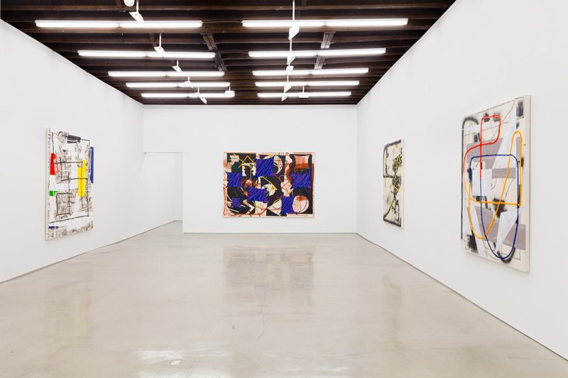
Install view of Trudy Benson’s Shapes of Things at Lisa Cooley. Photo courtesy of the gallery.
Trudy Benson, Shapes of Things
Lisa Cooley
107 Norfolk Street
New York, NY 10002
Runs through May 3, 2015
What’s on view: Nine colorful abstract paintings with squiggles layered over swooshes and textured paint, exposed bits of raw canvas, and lots of paint straight out of the tube
Paddy: First impression: looks like familiar abstraction. Next impression: actually, some of these paintings are pretty good. Last impression: actually, most of these paintings are pretty great.
What just happened? The cascade of thoughts above are a good illustration of what happens when the weakest painting in the show is also the centerpiece: it produces an overly dismissive viewer. In this case, that was yours truly—my apologies to the artist. “Blue Windows,” the largest work in the show, and the most visible, may be the show’s only weak painting. Like many of the other works, it’s a painting that’s all painter problem-solving: loose compositional structures made with generous painterly swooshes and globby lines made with paint right out of the tube. This one is a little too much “and here’s another size of line/texture/pattern I can make with paint.”
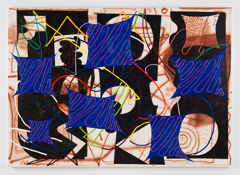
Trudy Benson, “Blue Windows,” 2015. Photo courtesy of the gallery.
The rest of the show though, isn’t contrived at all. I really love how Benson paints over parts of the paint out of the tube—no texture is complete enough without another. Compare this to the endless globular formations of Fabian Marcaccio, and this work looks understated and tasteful. To my mind, “Script” is the show’s masterpiece; a bold painted swoosh overlaid on black and white linear patterning that subtly gestures to advertising, text, and publishing. I’m glad I listed Benson as a great Brooklyn artist under 30 at The L Magazine back in 2013!
But Corinna, when we saw this show together, it didn’t seem like you had same issues as I did with the show. You liked it immediately didn’t you?
Corinna: Close. I went from “Oh, no! It’s a painting about painting with a lot of paint on them” to nearly immediately saying “Nevermind! These are nice.” By the end of the show I was resigned to “Okay. These are still paintings about paintings, but at least they’re enjoyable to look at.” They’re actually pretty fun to look at—all of them—although there’s a loud, clown-y, and retro feel to most of them that might offend those with sensitive eyeballs. I’d count myself in that “I prefer subtle to agro paintings” contingent of art-lookers.
But, Paddy, “Blue Windows” is not a horrible painting—at least not compared to the other works in the show! Yes, it’s a bit of a clusterfuck, composed of every painterly tactic Benson can cook up, and those “windows” look a bit too much like kites for my liking. But “Blue Windows” achieves a sense of movement and depth that a painting like “New Shapes” doesn’t. In “New Shapes,” the tube-paint shapes are too static—outlines nearly form a square, isosceles triangle, and a right triangle—the drip marks too decorative, and the lack of depth middling. The canvas here isn’t so much a painting as it is textured wallpaper. Anyway, that’s my least favorite painting in the show, which is still better than many of the other shows we saw on our outing to the Lower East Side.
Paddy: What? You have a problem with “New Shapes”? There’s barely enough drip marks in that painting for them to be decorative! How lack of depth can be middling? What does it matter if the tube-paint shapes are static? There’s a lot going on in that painting; 3D tube-painted shapes, on top of solid shapes, on top of drawn shapes. It’s almost too much, but I think she pulls it off. I’m not dizzy or bewildered looking at this.
I think we’re focusing too much on the negative here. I mean, we both agree that this show is great (well, you think it’s just okay), so I feel bad that we’ve spent so much time talking about the few points we think are weak. “From Cut Out” is a black-and-white and yellow painting that looks like it’s drawn from a cutout; it’s huge and bold, and yet somehow retains some of the delicacy that a paper cutout might. So many of the object references in these works are nailed. It’s a pleasure to look at.
Corinna: Yes, overall, a joy for my eyeballs. Here is the “good” painting show in contrast to the “bad” one next door. I look forward to seeing more of Benson’s work.
Install view of Pierre Obando’s Like New at Thierry Goldberg Gallery. Photo courtesy of the gallery.
Pierre Obando, Like New
Thierry Goldberg Gallery
103 Norfolk Street
New York, NY 10002
Runs through May 17, 2015
What’s on view: dozens of oil paintings with the faint residue of paint, Ben-Day dots, or transparent layers of color bleeding into each other
Corinna: This is a show of paintings that look like they’ve been rained on.
Paddy: I couldn’t have come up with a more accurate description myself because THAT IS EXACTLY WHAT THEY LOOK LIKE.
Let’s start with the obvious: this is a terrible show. The paintings are the definition of Zombie Abstraction; vertical format, decorator friendly and governed by mechanical process. Many are monochrome-esque, meaning they look like they are made with only blue, or black or grey, but then there’s red Ben-Day dots on the sides too. Who cares. None of this produces a good painting, it’s just a mechanical process that is not in and of itself interesting.
The historical cues that informs for this work don’t add much, but for background here’s what we’re supposed to care about: Obando takes his cues from an atypical Roy Lichtenstein diptych which pictures a screen door in one frame and a broken screen in another. It’s a minimalist work, and Obando uses it as a starting point for his own layering of paint. Accidents occur, which is awesome because as anyone who’s been to art school knows, that’s where the magic happens.
Needless to say, paint washes and Ben-Day dots of nothing aren’t my bag. There’s virtually nothing to talk about here.
Corinna: Totally. This was obvious from seeing the works outside, through the storefront glass, before we walked inside the gallery.

Comments on this entry are closed.