
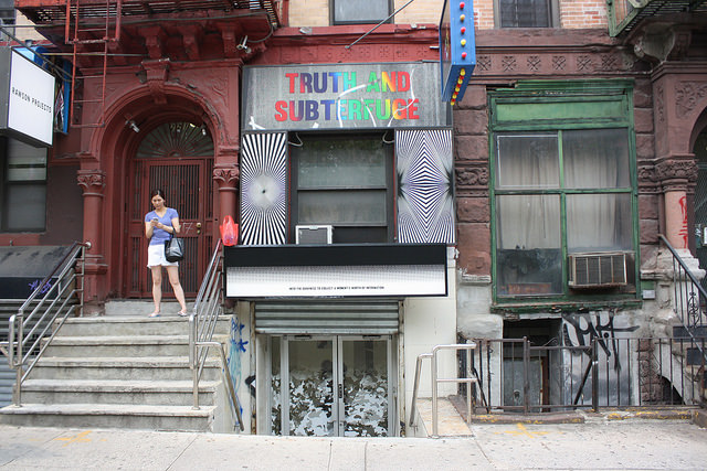
The ever-changing storefront that is the entrance to Regina Rex.
Michael: In part two of our LES outing, things are a little more fun. Regina Rex is showing translucent threads of dawn, Conrad Ventur’s photos of the late Mario Montez, the Puerto-Rican drag queen who became a Warhol superstar and then disappeared from public life for 30 years, living out their own version of glamour in Florida. Appropriately—if your favorite association with Latino drag queens in Florida is a certain Robin Williams movie set in South Beach—each photo is paired with a “Birdcage” by Elisabeth Kley. Up at 247365, there’s a group show, There is no Fact of the Matter as to Whether or Not P, that’s a little more heady and less outwardly fun, but approaches readymade/appropriation with a somewhat playful sensibility.
Corinna: So glad I wasn’t the only one who picked up on the oddity of the “birdcage” association with the drag queen bit. It does give these portraits—of someone at a grandparent’s age—a sense of absurd fragility, given their pairing with bright, Miami-colored sculptures by Elisabeth Kley that, while stable at a distance, are falling apart upon close inspection. (In the words of Cher in Clueless, these are Monets: “From far away, it’s OK, but up close, it’s a big old mess.”) But for real, I love Regina Rex’s new space so much, especially its rotation of signage that’s always a clutter of messages amid a clutter of messages.
247365 has a group show up that’s more playful than what’s on at Regina Rex, but has its witty moments.
translucent threads of dawn
Artists: Elisabeth Kley and Conrad Ventur
Regina Rex
221 Madison St.
New York, NY 10002
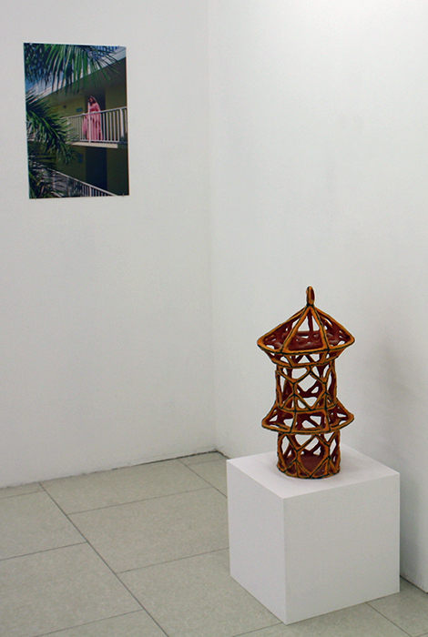
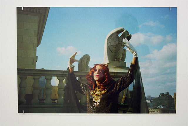
From left to right: Conrad Ventur, “MM #28,” 2012; “Elisabeth Kley Gold Birdcage with Triangles,” 2015
Michael: Out of everything up in the LES right now, this show is my absolute favorite. I wanted to bring a sleeping bag and live in this gallery—which is saying a lot because it’s such an awkward space. The work here is magical. Conrad Ventur’s photographs work so well with Kley’s birdcages on so many levels. They have this sort of tropical escapist quality to them; channeling midcentury glamour and the construction of then-newly-accessible “resort culture.” Like, when travel for pleasure became a middle-class possibility, but with its reference point still the glitz of old Hollywood. They feel aspirational. Here, Montez and Ventur queer that image of glamour, calling out the artifice while proposing that it’s accessible even more so via appropriation. But at the same time, they’re vulnerable and seem to be eulogizing an era that’s end(ing/ed). Kley’s ceramics are brittle and frail—several of them seemed to be already cracking—and Mario Montez passed away shortly after these photos were taken.
Corinna: I’ve seen these photos before—Paddy wrote about seeing them at Untitled, too—and there’s a way to too easily fetishize the person, Mario Montez, that comes across during a solo show. Pairing Kley’s works with Ventur’s photographs was a bold move; Max Warsh of Regina Rex mentioned that it was Kley who initially suggested the pairing. That’s the type of right-on decision-making you can still get from an artist-run gallery, which Regina Rex is.
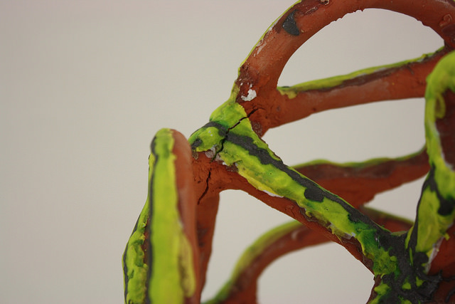
Up close with one of Kley’s birdcages. You can see the joints aren’t quite solid.
There is no Fact of the Matter as to Whether or Not P
Artists: Zach Bruder, Sam Ekwurtzel, Sofia Leiby, Anne Libby
247365
57 Stanton Street
New York, NY 10002
Summer hours: Tuesday through Friday, 12:00 – 6:00 p.m.
Corinna: 247365 excels at work that’s sometimes absolutely silly, but that for some reason, I usually want to live with. Maybe that has something to do with the materials used; often there’s a domestic appeal, even in cases where there’s terror at hand.
Michael: It’s funny—I had (unrelatedly) just been thinking about how the concerns of a lot of recent sculpture and painting have inverted, in some ways. So much contemporary painting has to do with means of production more so than image-making, while sculptors have become consumers—collaging readymade objects that have semiotic significance, like an image. I think this has something to do with late capitalism and alienation from manufacturing, I dunno. I’ll figure that out later, but this show kind of hit the nail on the head. Or rather, purchased a nail and then silk-screened the instructional diagram for how to hit it on the head onto a surface. (Corinna: Oooohhhh. Damn. Wish I’d thought of that.)
Anne Libby, “Force Divided By Area” (Putty III), 2015
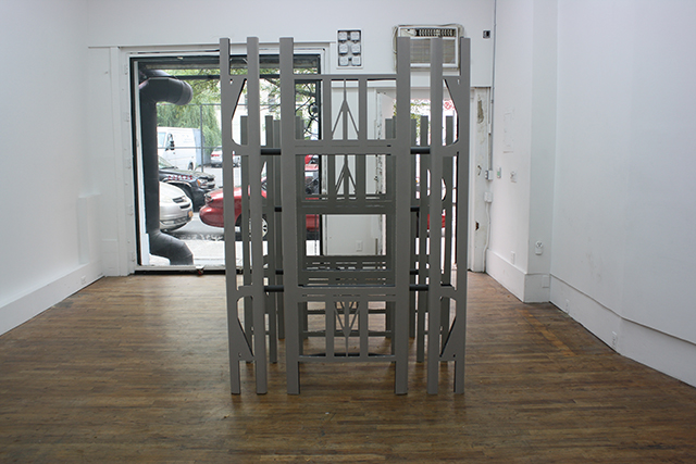
Corinna: For terror, there’s Anne Libby’s “gate” at the gallery entrance. It looks like a folding table has been sliced into meticulously baroque sections: think Damien Hirst’s sliced animals. More or less, I couldn’t help but think this could be an expandable prop for some doom-and-gloom Dungeon Land. Not too sure how I feel about this work individually, other than, perhaps, a strong use of material play. You have to look at it from front to back to see the Gate of Terror.
Michael: This was my favorite piece in the show. The artist cut away all the molded plastic around the metal supports for a cheap plastic table, revealing the engineering logic behind the otherwise unimpressive design. The result of that physics-based thinking is surprisingly Gothic. It made me think of Joseph Stella’s painting of the Brooklyn Bridge or other artists who marveled at engineering feats in the era when The Machine Age was a source of wonder rather than dread.
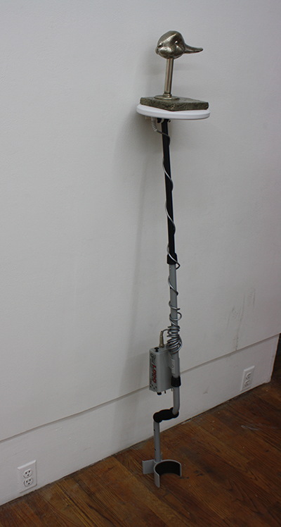
Sam Ekwurtzel
Corinna: This is a metal detector with a duck-rabbit attached to the head. It took us a while to figure out whether it was a duck or a rabbit. The joke never gets old. Thanks, Wittgenstein!
Beyond the visual play of the duck-rabbit, it’s a pretty apt figure to be part of Ekwurtzel’s assemblage: it is what you see it is.
Michael: Didn’t people used to put animal heads on canes? When did the prosthetic lose its flair for the dramatic? One of my favorite details in this is that the brand of the metal detector is “Lobo.” Technological wolves don’t hunt electric sheep, apparently. They prefer metal fowl. Or rabbits, depending which direction you photograph it from.
Corinna: And don’t forget duck-headed umbrellas.
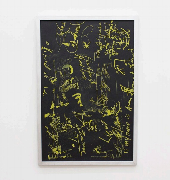
Sofia Leiby, “Hard Lines,” 2015. Image courtesy of 247365.
Corinna: I’ll admit that Sofia Leiby’s paintings are difficult to get into. Literally, they’re difficult to read, with fragments of text and images that have the feeling of hieroglyphs, perhaps in the way that some Cy Twombly loopy marks appear. The marks slip and slide from presence (the deepest yellows) to impermanence (the yellow dust). Like most of the rest of the works in this show, there’s a simple pleasure in looking at this painting as an object, and figuring out its materials. (Leiby’s panel is made up of chalk pastel and silkscreen ink on “masonite”—which is really just, according to Leiby, a chalkboard.)
There’s an interview between Sofia Leiby and Jaakko Pallasvuo on Rhizome that entertains an idea concerning Leiby’s practice, and that explains what she’s doing, as someone trying to find authenticity in painting by getting rid of the self, and yearning for one of those all-encompassing obsessions, like she felt as a teen with Lord of the Rings.
Can we feel as obsessed about our practice, as we did, say as teens desiring to know everything punk, AbEx, Star Trek, whatever it was? It’s just not new any longer, once we figure out all the codes. Gotta find other things to sustain us, beyond the Teen Punk Utopia of dumpster diving forever.
Michael: Yeah, I read this as an admission that the act of mark-making has lost its appeal. Again, back to brush-less painting: Leiby harvests evidence of mark-making from other sources and silkscreens it onto chalkboard—the most didactic of surfaces. It’s probably what Warhol should’ve done when seeing Basquiat’s work made him fall back in love with painterly painting, rather than those lame three-way circle-jerk canvasses they made with Francesco Clemente.
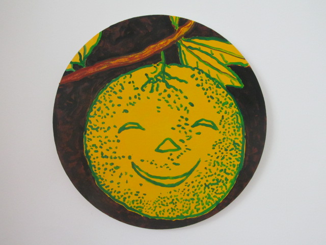
Zach Bruder, “Give You More Gold,” 2015.
Corinna: Hard not to like a smiling lemon!
Michael: Yeah! this is the one Zach Bruder I liked the most. These all feel like logos…and given the spirit of the other work in the show I’m just going to assume they are. This has a little more zest to it (no pun intended, for once) and doesn’t seem so cold and calculated, even though the process behind its creation probably was. Whatever. I don’t know what I’m being sold anymore, but I’ll take it!

Comments on this entry are closed.