
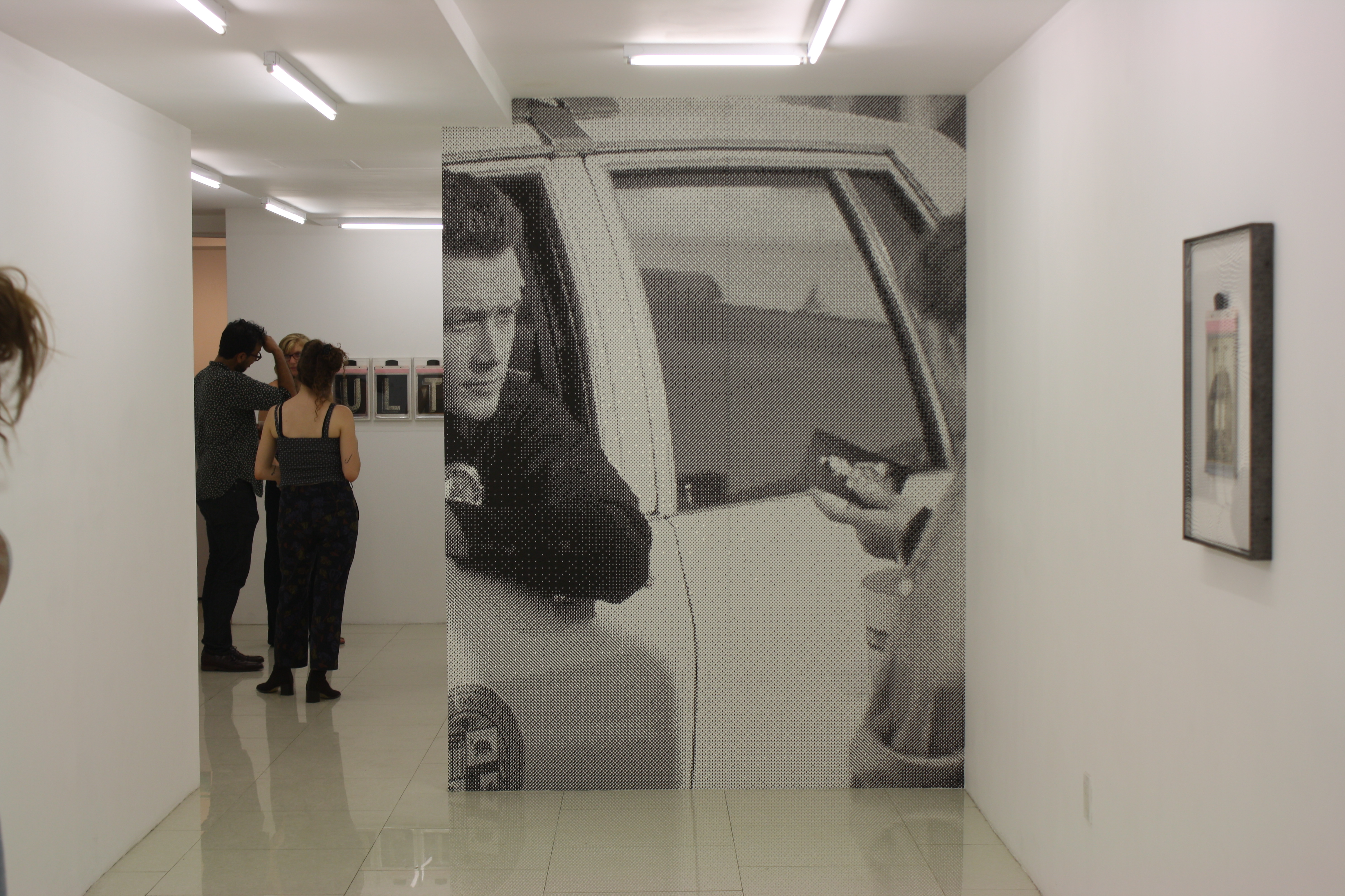
Corey Escoto Deep Trouble at Regina Rex, installation view.
Wednesday night, we ran around to almost a dozen openings in the Lower East Side. Yesterday, we discussed huge, space-transforming installations. Today, we’re looking at two solo shows where the medium was the message: Henry Gunderson at 247365 and Corey Escoto at Regina Rex.
Henry Gunderson: Two & Two
247365
57 Stanton Street
Open through October 11th
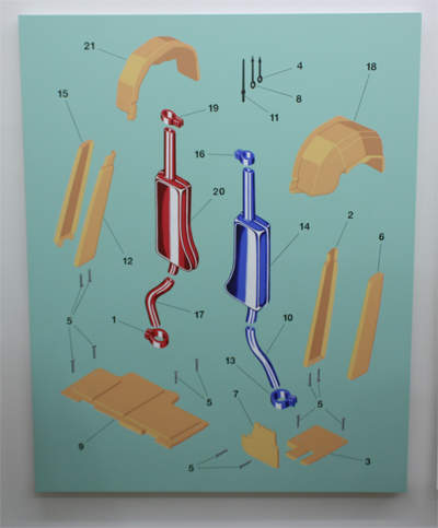
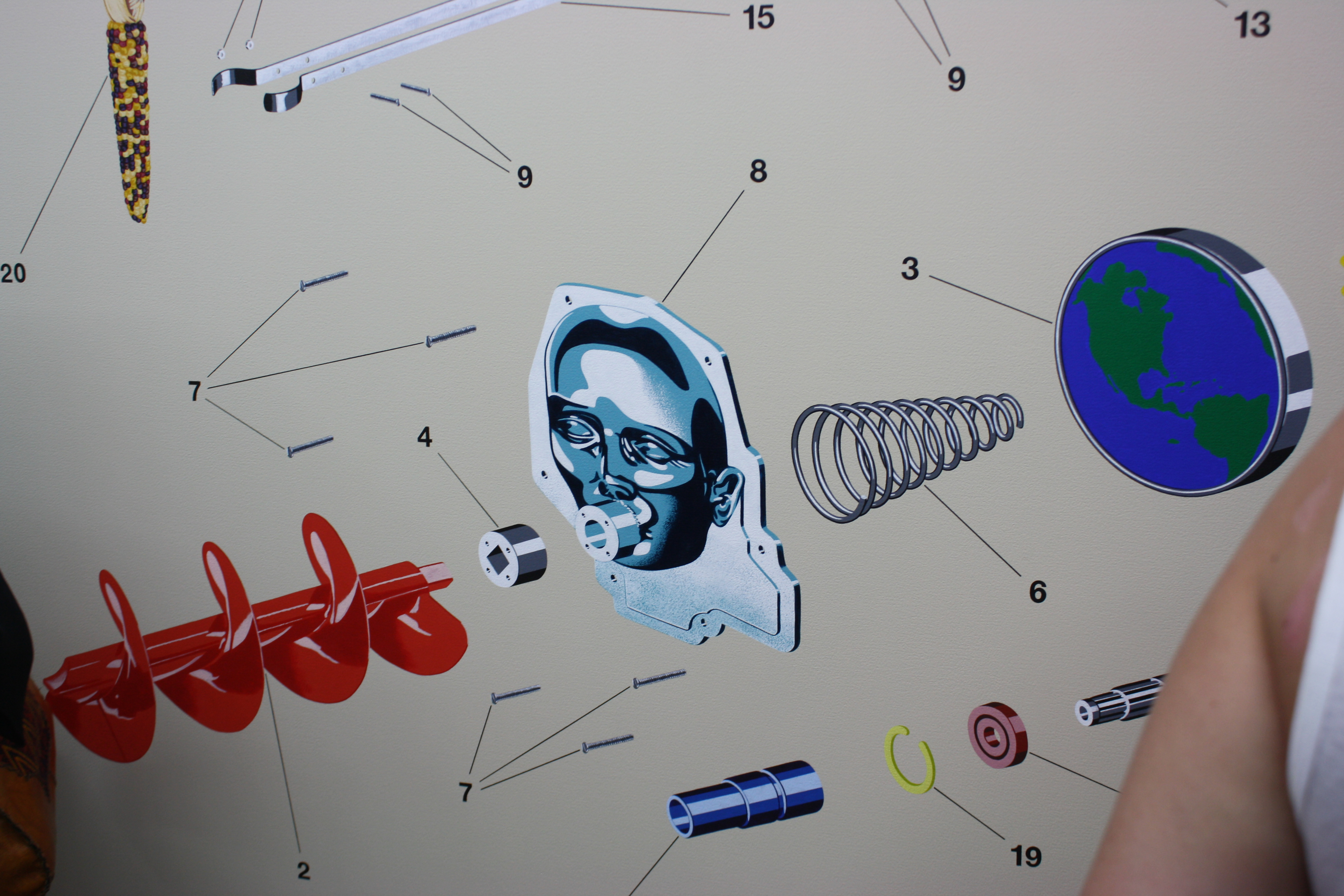
What’s on view: Large paintings that look like schematic drawings of nonsensical assemblages.
Michael: When we first walked into the gallery, I thought we were in the wrong show. Gunderson’s work is totally different every time I see it pop up on blogs—often functioning like a survey of whatever happens to be trendy in painting that year.
Whitney: What do you mean?
Michael: I don’t mean that necessarily as a bad thing, it’s obviously far better for artists to constantly change than to do the same thing over and over again. Gunderson has followed a trajectory from more “street art” influenced stuff to trippy surrealism to normcore-esque logos and gradients—changing like fashion houses change with the season. So this series first struck me as stark and a little sterile compared to earlier work that was “busier” when negative space was less fashionable.
I know that sounds like a cynical approach to making/viewing paintings, but in a way I think it paid off. Gunderson is very practiced at mimesis, and when I was forced closer to the paintings as a result of how crowded the opening was I was really impressed by his skill. Each canvas is almost like a collage of found imagery from diagrams, film, photographs, illustrations, etc… but all those styles are reproduced in a similar smooth surface by the artist’s hand. I definitely appreciated these more after spending more time with them. The “emptiness” of the canvases gives each component a lot of room to breathe, and each isolated image feels like a different specimen of a mode of representation.
detail
Whitney: Oo0o self-relfexivvvee, I couldn’t stop thinking as we passed by painting after painting of intentionally purposelessly numbered items. Here is conceptual art’s dissection of image-making to the point where all you have is a disassembly of parts. Paintings of brushstrokes that are numbered like IKEA instructions scream “I AM AN IMAGE,” commenting on their selfhood as an image. Can word see painting if solve my you jumble about?
See? Is that very nice?
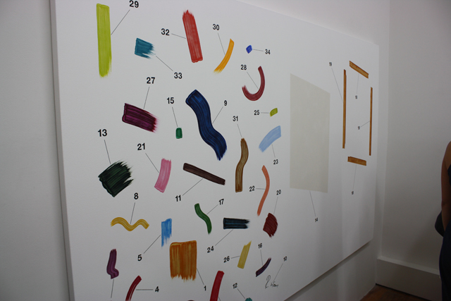
Michael: Haha! I was similarly irked by that piece originally. But I think that “instruction manual” for assembling a painting is at least a more honest approach than doing something derivative and skirting acknowledgement by attaching a more faux-sincere concept to it. Lots of people just like making paintings that look like other paintings. It’s weirdly nice when someone admits it outright.
Whitney: This is true. It’s hollow, and it feels hollow, I think that’s the point.
Corey Escoto: Deep Trouble
Regina Rex
221 Madison Street
Open through October 18th
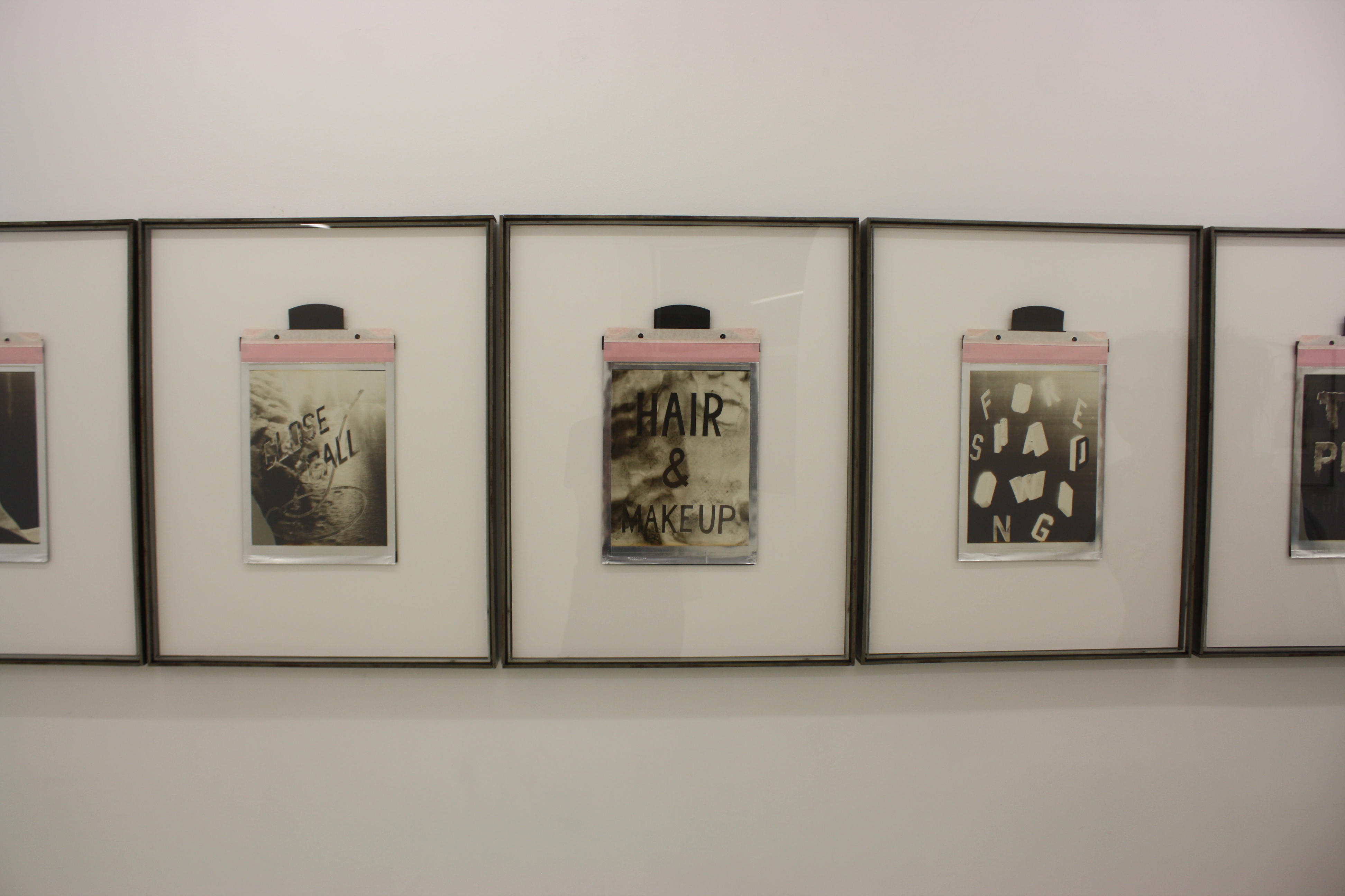
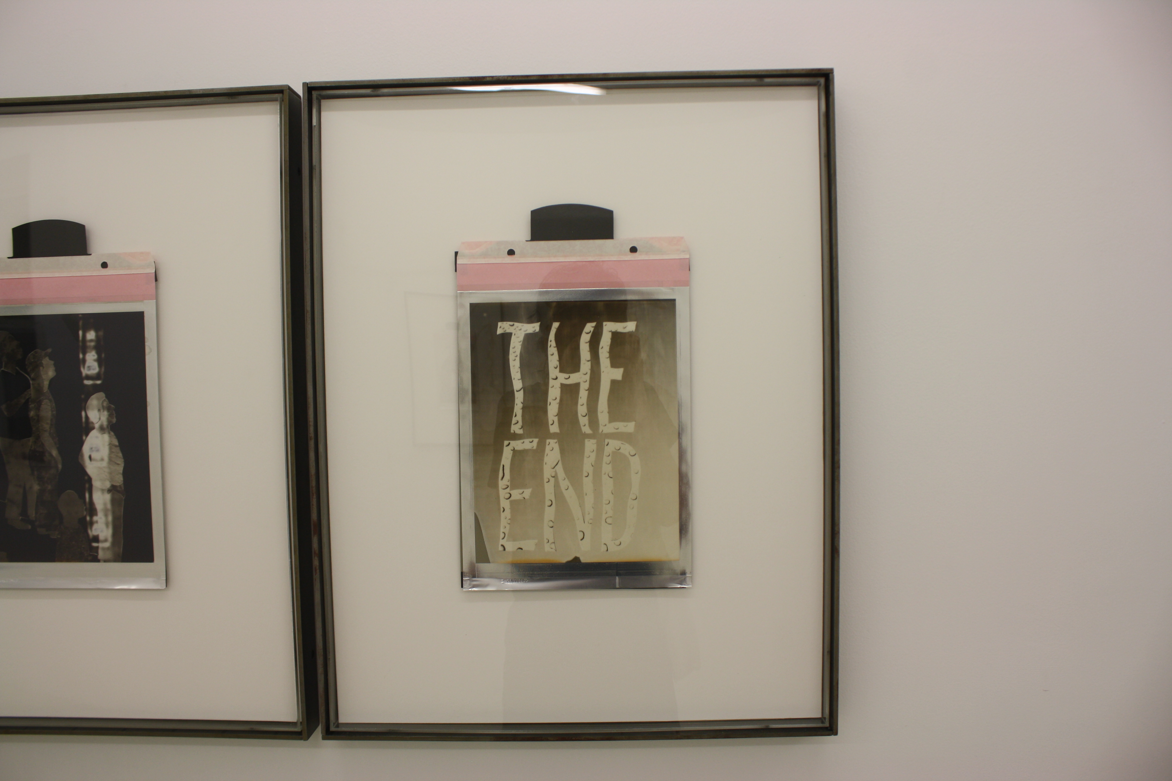
What’s on view: A row of large 8×10 Polaroid prints exposed in layers with stencils that read phrases like “HIGH SPEED CHASE” and “THE PLOT THICKENS.” Another row of prints which reads “M-U-L-T-I-P-L-E E-X-P-L-O-S-I-O-N-S” (each print is a single letter of the phrase).
Whitney: It took me a few tries to understand that the row of phrases like “the plot thickens” and “The End”, interspersed with images like a telephone and a traffic jam were a series of main catalyzing events that, strung together, make a formula for a movie plot. The prints are beautiful one-of-a-kind objects; they look marbelized and certainly have the crisp, aged drama of a still from a 1940’s film noir. Like Henry Gunderson’s show, it, too, looked like art and was the result of a very clever decision making process. It makes me feel smart, and I don’t mean that negatively or sarcastically or positively, just a statement of fact. I don’t have anything else to write here. I dunno, Michael, what did you think?
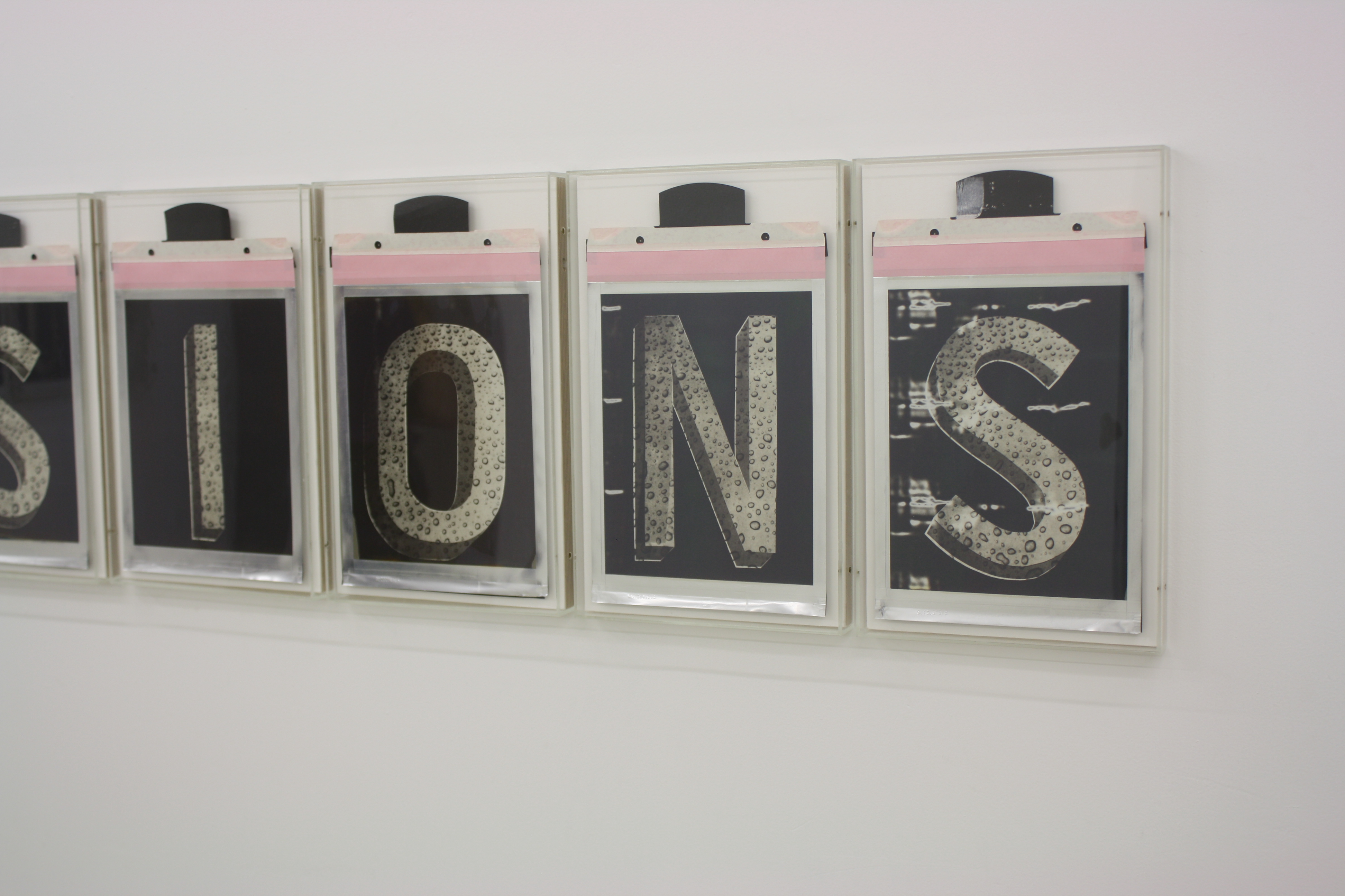
Michael: I really liked these, but I think this is another example of a series that begins with a process and a desired aesthetic and then seemingly-retroactively establishes self-reflexive content to “justify” itself. It’s such a novel approach to photography and image-making that I wish there was a more original concept than “Hollywood cliché”.
That being said, I love how conditioned we are to perceive photographs (which we all know are flat) as having depth. I kept seeing weird blurs or light streaks in these and processing them as a feature in the background. In the “N” and “S” panels of “MULTIPLE EXPLOSIONS”, for example, I kept reading some random streaks as a highrise seen through a moving train window. I’d love to see a whole series of these that played with space or landscape.
Whitney: I agree, there’s definitely a lot of exciting potential with the medium in the same way that Stan Brakhage and drawn-and-scratched on film animation feels really invigorating. The exploring-film-clichés theme is a little too pat; like Gunderson’s show, it comments on them, but it doesn’t seem to have anything to say about the topic. The real passion seems to be in discovering new collage technique.

Comments on this entry are closed.