
 The prestigious Turner Prize shortlist has been announced, and true to precedent, provides plenty of fodder for the British tabloids. GIANT BUTT SCULPTURE UP FOR £25,000 ART PRIZE. RIDE A MODEL TRAIN AND CALL IT ART? But the four artists selected ,Michael Dean, Anthea Hamilton, Helen Marten, and Josephine Pryde, aren’t quite what we’ve come to expect from Britain’s highest-profile art circus. A lot of this work is dense, nuanced, and less overtly attention-grabbing than the butt cheeks would have us believe.
The prize won’t be awarded until December 2016, but in an effort to get out front of the nominations and award game, we’re debating the merit of these nominees today.
Anthea Hamilton
Turner prize shortlist for her show at Sculpture Center, Lichen! Libido! Chastity!
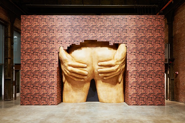
Anthea Hamilton, “Project for door (After Gaetano Pesce)”
Michael: Anthea Hamilton’s “Project for door (After Gaetano Pesce)” was exhibited during her solo show Lichen! Libido! Chastity! at the SculptureCenter in Queens. Supposedly, this is a tribute to Italian architect Gaetano Pesce’s proposal for a skyscraper entrance in Manhattan in the 1970s. I have never heard of this proposal before, and every Google result just turns up information about Hamilton’s work. Is this a myth the artist constructed? A fabulous butt myth?
Paddy: I can’t find anything either, but I believe the proposal probably existed. Have you seen the chair he designed in the shape of a woman? He’s big into anthropomorphization.
Michael: Yeah, I appreciate that Hamilton seems to have a knack for mining the obscure (or not) for seemingly dissonant influences. She makes all these allusions to subcultures, art history, and pop culture in a way that reads as tongue-in-cheek but also a bit like a tribute to how much weirder others’ work can seem compared to one’s own. It usually bothers me when things are wholly referential, but Hamilton does it so well. Everything I’ve seen of hers feels fun without a sense of cruelty or cynicism just below the surface, and I think that’s something that’s been missing from the Turner Prize.
Anthea Hamilton, from “Lichen! Libido! Chastity!”
Paddy: I love this show. In addition to the butt, Hamilton papers a fake wall with fake brick in front of a wall with actual brick. Hung from the ceiling is a suit in printed brick. It’s a funny play on texture because the reproduced material looks radically different in each form.
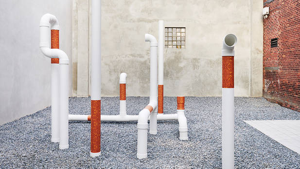
Not to simplify, but her approach seems to be, “what can I do to transform this thing into a different funny thing? The cigarette pipes in the yard are a good example of that (the filters look oddly brick-like) as is the giant butt archway. I’m particularly fond of the boot sculptures on plinths in front of the butt, which at a certain angle appear to be stuck up the butt. Haha and all that, but seriously, haha. The most remarkable quality of this show is just how clever the visual humor is. Hamilton has my vote for the Turner Prize this year.
Michael: Totally!
Michael Dean
Turner Prize shortlist for his show, Sic Glyphs at South London Gallery and Qualities of Violence at de Appel arts centre, Amsterdam.
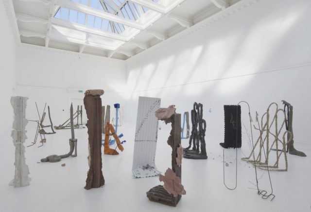
Michael Dean, “Sic Glyphs” installation view.
Paddy: Before I begin, I should note that I write this without having seen any of the work in person and my conclusions are drawn on documentation alone. So perhaps the documentation has mislead me in some way, when I say that Sic Glyphs is the definition of the pretentious bullshit art that plagues the art world. Dean designs written and sculptural typefaces only he understands rendered in materials ranging from the pen to corrugated metal, concrete, rebar, etc. The sculptural elements are arranged in a gallery for viewers to walk through—if they dare. In Sic Glyphs, Dean placed a bunch of sculptures in front of the door, so viewers have to figure out a way in.
The press release for the show tells us this “challenges viewers to think for themselves”—an offensive phrasing that suggests we’re all just passive lemmings heading over a cliff. But that’s not Dean’s fault. My issue with the work as a whole is that it operates on the assumption that the linguistic ambiguity these sculptures present is a strength because it opens up the work to multiple interpretations. That’s just bullshit and the sooner the idea that communicating next to nothing is somehow powerful goes away the better. The point of art is not to give the viewer something so generic that any interpretation is valid, but to actually communicate something. This show was nothing more than a collection of formalist sculptures we’ve seen a million times since the dawn of modernism. Everything else is just noise.
Michael Dean, “Sic Glyphs”
Michael: Huh, I don’t really hate most of this as much as you do, but like you, I haven’t actually seen it. I am a little confused by the documentation, though. Pretty much every photo I’ve seen of Dean’s work looks like it was by a different canonical artist—there are individual works that could be seamlessly transposed to a Franz West or Louise Bourgeois retrospective and we’re not given enough information about why or how the text component is suppose to change them. But when you see all of them together, they’re a bit like different pencil, pen, or paint marks thrown together. Is this about transposing 2D sketches into a 3D environment? Maybe that’s trite, but it mostly seems like Dean is a bit directionless and experiments, which I think is a nice counterpoint to how polished or devoid of vulnerability so much of the work that gets the spotlight at the Turner Prize often is.
Paddy: Franz West and Louise Bourgeois produced far more accomplished sculptures than anything we’re seeing at the South London Gallery. These aren’t even interesting forms. The show at de Appel arts centre seems significantly more compelling, albeit posturing. The show opens with pages of a book torn out and strewn on the flow. So, I guess we’re supposed to draw the conclusion that language is important here.
In one room the walls are covered with MDF, pennies carpet the floor a large cement monolith stands tall in the center. In others, the MDF structures create galleries within galleries—stages upon which tall thin sculptures sparsely hung paintings/images are arranged. I don’t really have anything to say about the work, but formally, there’s at least a bit more going on. The penny installation takes on a religious tone, as though we should all pay reverence to this decrepit sculpture. The idea that the crumbling foundation of capitalism might be something to question felt compelling to me.
Michael: I’m just curious to see what Dean does at the Tate. He seems to have a knack for grand gestures of install, but like he’s still figuring out what the content (if any) is. That might translate to something terrible, but I’m most interested in seeing what the “dark horse” of the crew whips up in the next few months.
Josephine Pryde
Turner Prize shortlist for her show, CCA Wattis Institute, San Francisco, called lapses in Thinking By the person i Am.
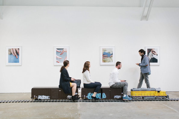
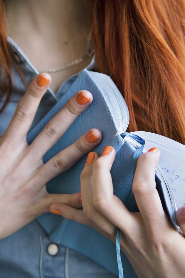
Josephine Pryde’s lapses in Thinking By the person i Am, 2015
Paddy: Pryde invites viewers to ride a 1:10 scale model of a Union Pacific freight locomotive pulling two boxcars. Each have been tagged. The train runs past a row of 19 evenly spaced photographs of a woman’s hands touching an object. Heads are obscured. Often the photographs reference mobile technology, though they are also seen holding books, touching glass, or skin.
The installation brings to mind plenty of contrasts—old technologies such as the train versus our new data driven economy, interactive, IRL experiences of the train, versus static ones captured in the photographs. That’s all fine, but I’m not left with much to say about it.
Michael: Again, perhaps a case of giving the viewer something a little too open to interpretation. I don’t know why, that’s sometimes less of a problem when the work is representational. Speaking of representation, is there something here that relates to that old adage about the painting of work boots? Images of hands necessarily don’t have a tangible utility. But model trains are a representation of an object that also emulates the object’s function. Maybe that’s what makes this pairing so interesting.
Joesephine Pryde
Paddy: Like, this show would be bad if there were no prints in the show, but a downloadable app that showed you images of hands, because then there were would be too much representation that emulates function? I dunno if I think the contrast does anything. Isn’t that just a description two qualities?
Michael: Yeah, I don’t know if the photos do much for me. They’re a bit like slightly-too-stylized stock photos tagged “touch” or “texture”. Of course, some of them are a little too weird to be advertisements, but I can’t shake the feeling that I’m being sold something.
Helen Marten
Turner Prize shortlist for her show “Eucalyptus, Let Us In” at Greene Natfali, New York, and Lunar Nibs at the 2015 Venice Biennale.
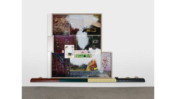
Helen Marten, “Limpet Apology (traffic tenses),” 2015.
Michael: Of the four artists on the Turner Prize shortlist this year, Helen Marten’s work looks the most “like art”. I don’t know if that’s a good thing or a bad thing, but it does provide a different point of entry than a large butt or tiny train.
Paddy: I’m more taken with the sculptural assemblage works then the collages, though they all work together in the Greene Naftali show. The installations have the feel of an archaeological studio from the future, looking at the past. There are desks with maquettes, freestanding sculptures that look like machines designed to do…something. The collages are like maps or diagrams, but it’s pieced together information that doesn’t quite tell a complete story. The world of the future doesn’t understand its past. If the world Marten imagines has any bit of truth to it, the question of who we are now and what we become will never be answered. 1000 years from now, nobody will know.
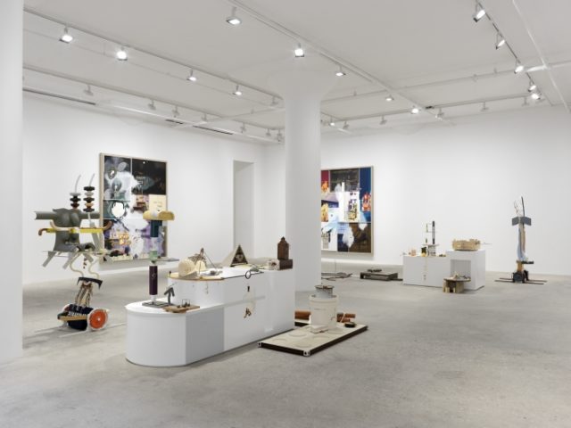
Helen Marten, “Eucalyptus, Let Us In” installation view.
Michael: Again, back to the idea of changing an object or material’s utility and the culture of display. It wasn’t until we talked through all of these that I realized they’re all working through tangential processes. Helen Marten recombines mass-produced, industrial components to make somewhat nonsensical displays alluding to “now”. That’s not so dissimilar from Michael Dean mashing-up construction materials and written language to tell us nothing in particular. I think there’s a subtle play with the value of display and objects losing their utility in Pryde’s work too. And Anthea Hamilton is a master of accumulating and remixing references, materials, and representations to produce something lovingly weird and partially-distinct from the original. I’d love to be a fly on the wall hearing the discussions between the shortlisted artists and the Tate’s curatorial team—this is a crew that seems to be itching to play with museum as context.

Comments on this entry are closed.