
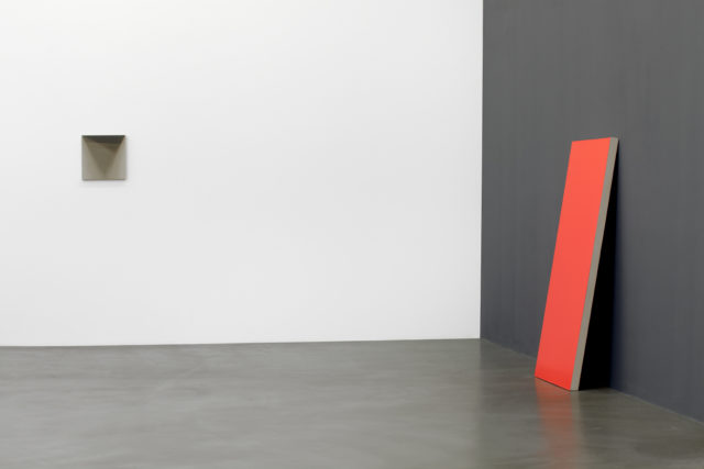
Matthew Metzger, Installation view. “The Shadow of the Mailer”, left. “The Wedge”, right.
The Shade of a Line
October 29 – December 3, 2016
ARRATIA BEER, Berlin
We live in terrible times. I need not explain that assertion. And while I do not subscribe to the reading of art as always and/or necessarily “therapeutic”, it would be silly of me to not acknowledge that art can be therapeutic, even healing. To wit, Matthew Metzger’s exhibition The Shade of a Line is the Xanax in my tea.
Metzger is a Chicago-based painter whose work tilts back and forth between neo-Minimalism and neo-Color Field. I normally have nothing good to say about Minimalist work, as I find such works have nothing to say (and, yes, that is reductive, but so is the style). However, in Metzger’s case, the paintings vibrate with buried colors and dreamy pools of semi-occluded light. They teem with an interior life that reminds me of staring into precious stones, of the first hues of the morning, of being less than lucid. Put plainly, Metzger’s paintings are pretty. Let us give thanks for prettiness in an ugly world.
The Shade of a Line is a small show, under a dozen paintings in total. It unfolds on the gallery walls like a tidy package being calmly unwrapped. It is not demanding to look at, does not shout for attention, nor has the space been staged so as to highlight one work over another. I suspect the presentation of the work is intentionally underwhelming and lit like a medicine cabinet in order to create a contemplative yet precise, an alert, mood. That is also just good retail — let the products be the stars.
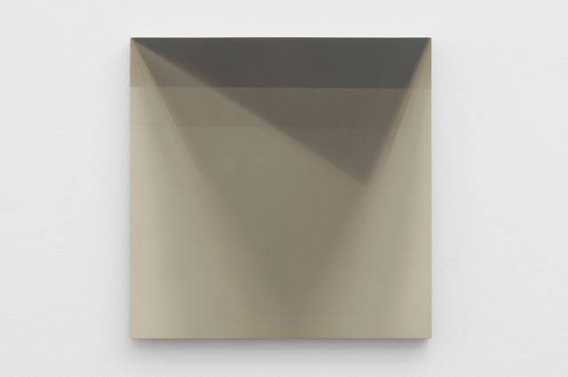
Matthew Metzger, The Shadow of the Cover, 2015
The diptych entitled “The Shadow of the Cover/The Shadow of the Mailer” is modesty and calm incarnated. Both paintings depict pale gray-brown triangle points surrounded by outlines and echo shapes in diluted parallel colors – some more gray, some more brown, some a ghostly fogged white. It is as if Metzger is capturing both a thing (in this case a shape, or near-shape) and the aura around the shape, the heat traces left behind by a figure in motion. These works are not meant to be looked at but rather studied, fallen into, as one does a hunk of selenite crystal or a calm tide at mid-change. The paintings prompt free associations (in my case, phantoms, uncertain peripheral visions, the melancholy of fading materials) and inspire decadent indulgence by (and for) the senses.
Similarly, his 5 and a half foot tall monolith painting “Wedge”, leaned against the gallery wall like it had been forgotten, is a sentinel heralding good cheer. Although the painting is mono-chromatic, I am hesitant to label the actual color. In some moments and viewed at some distances or via certain positions, it appears to be fire engine red, at others tomato red, and at still others pink cheek red. The thing pulses, like a heart at rest. I love it. I want to live inside it.
If you are alarmed by my atypical enthusiasm, well, so am I. Metzger is very much an academic painter and it is arguable that his paintings carry enough philosophical and “high culture” baggage to be labeled elitist or worse, exclusionary (he references everything from the works of Balthus to the philosophy of Jung in his didactics). Minimalism of the think-y, grad-school-clever sort is never an easy sell. And maybe I was having a shit day as was the rest of the world and needed the easy escapism of mere color and line, not to mention spacey abstraction. My brain told me to never mind Metzger’s theoretical bumph.
Metzger’s paintings excel at creating controlled spaces that are both packed with painterly precedent and in-arthouse meanings and at the same time offer the viewer a fluid generosity that prompts guilt-free, pleasure-driven readings. Go for the lovely colors, stay for the reverie.

Comments on this entry are closed.