
The thought that Brice Marden is an overrated artist is not uncommon within the art world. I'm sure this is what prompted Roberta Smith to write several paragraphs in the New York Times on why he is relevant even though he hasn't changed painting before launching into her review on his current retrospective at MoMA. Since one or two painters a century might actually achieve this, I have never found that particular line of questioning that useful in evaluating work, but you do have to hand it to her for distinguishing him from his colleagues Philip Guston, Robert Ryman, Elizabeth Murray and Frank Stella as the artist who sticks closest to tradition, and trumpeting his work for all its worth.
Of course, for all the talk about how beautiful the retrospective is, Smith provides little insight as to what separates it from other Brice Marden exhibitions. It is probably assumed that because his life's work is on display at the MoMA it is distinguishable for this reason alone, but having seen enough shows that can only loosely be considered a retrospective, there has to be a little more to it than that. Why has this show received so much attention? Is it deserving of this attention?
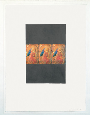
Surprisingly, the answer is a reserved yes. Even as someone who doesn't much care for Marden's work, you have to give curator Gary Garrels credit for choosing the best of it. He has also arranged it exquisitely, (though, it should be noted that Garrels is not single handedly responsible for this, as he follows Marden's hanging methods.) I know it sounds like the ultimate in tedium to discuss such matters as exhibition display and framing quality, but you really can't avoid talking about it when it lends such weight and authority to the drawings and prints section of the exhibition on the third floor. I won't bore you all with the technical details, except to say that work is all housed in the same cream frames and float mounted, and hung using a method used by the collector and curator David Whitney which involves hanging the bottom third of the work at 43 inches (which is low). I'm quite certain Marden would not appreciate the analogy, but because the works are hung at roughly the same height as the dividing Venetian trim on a wall, the viewer has a much more intimate relationship with the work, and is forced to consider the each drawing and print individually. Both the geometric and curvilinear drawings are stunning, Homage to Art 14 (Fra Angelico), 1974 a graphite, beeswax and collage on paper, and Marble #12, 1981, being amongst the more notable works.
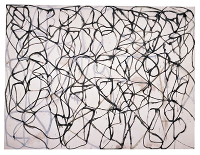
The paintings unfortunately, are a different matter all together. Smith's review largely focuses on this aspect of the show, and would be quite convincing had you never seen his work. However, having observed that the paintings seem characterized by contrived fluidity I can't help but find lines like this a little over blown: “The lines surge and reverse, tumble and straighten out, evoking road maps, silhouettes of hurtling figures and fluid geometries that sometimes threaten to burst the boundaries of the surface.” I suppose everyone is entitled to their own opinions, (even when they are wrong,) but it's a little annoying to have to read so much verbiage to get the point that she likes how the paintings look.
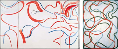
I don't, so it is primarily on this point that we differ. While the exhibition should be given credit for bringing together some of the artist's finest work, all the curation and institutional weight in the world can't transform underwhelming webby lines that emote little more than a few trumped up references to Chinese scrolls. Cold Mountain 6 (Bridge), manages to sustain the historical footnote better than most, but The Propitious Garden of Plane Image, Third Version, is utterly boring to look at despite its size, sadly looking better in reproduction than it does in real life. For her part, Smith attempts to address this sorts of criticisms by mentions that nay-sayers often compare Marden's work despairingly to Jackson Pollock, a parallel that is easy to dismiss, because in most cases it seems to be based on little more than the fact that both artists use an intuitive mark making language to achieve linear abstraction. I never found that their work actually looks similar, where as if you consider the later paintings of De Kooning, which very few people accept; they are aesthetically very close to celebrated Marden paintings. I think most would dismiss De Kooning as making lesser Marden like paintings, and they would be right, but to my mind both fail for the same reasons. The surface is simply not active enough to maintain the viewer's interest. And this, my friends is the essential difference between Marden's work on paper and his paintings; the artist never gives us a reason to walk by the former.

{ 1 comment }
Very good post. I just discovered your site and wished to state that I have really enjoyed reading your thinking.
Comments on this entry are closed.