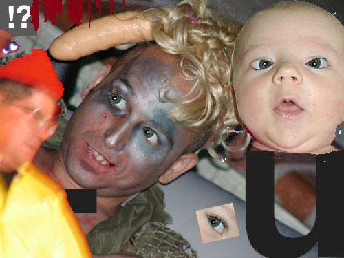
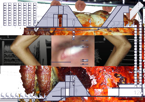
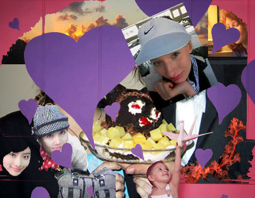
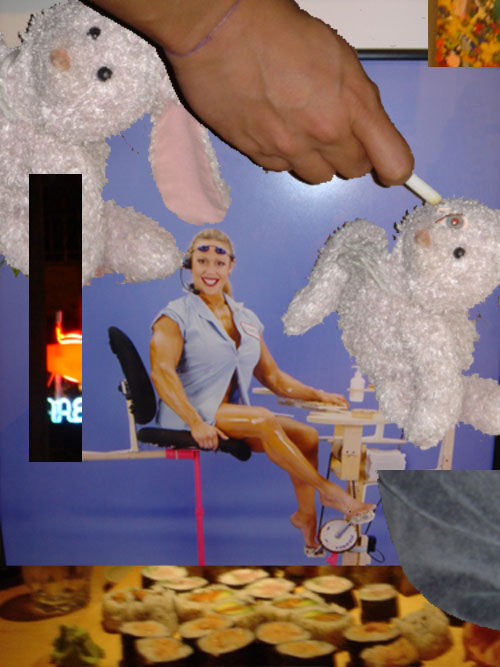
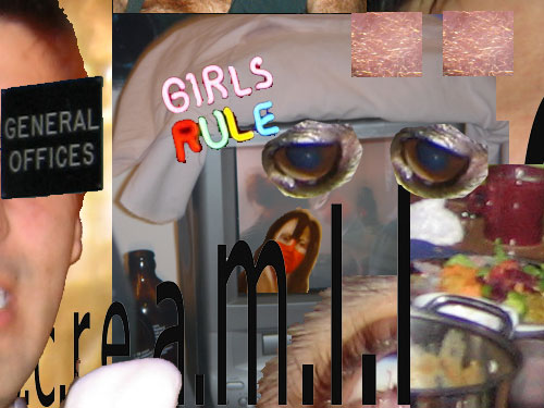
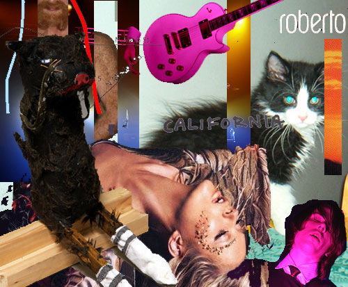

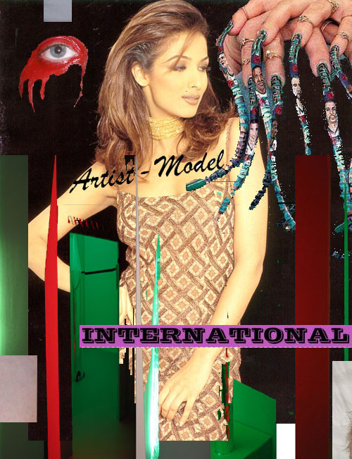
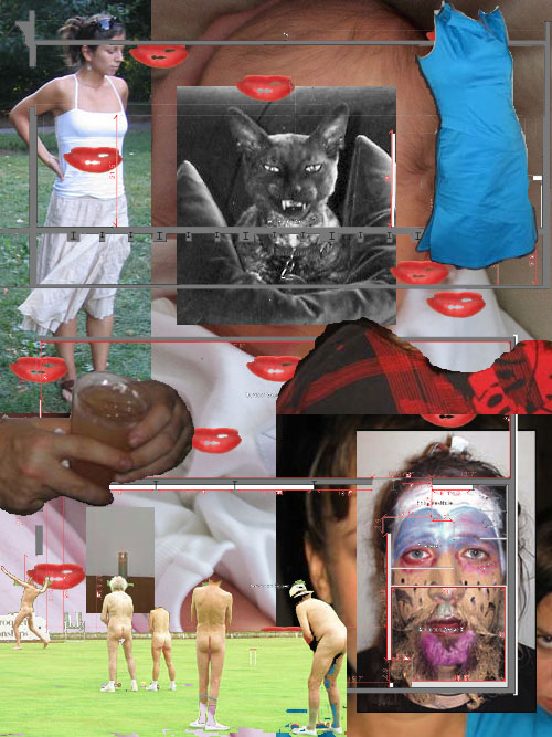
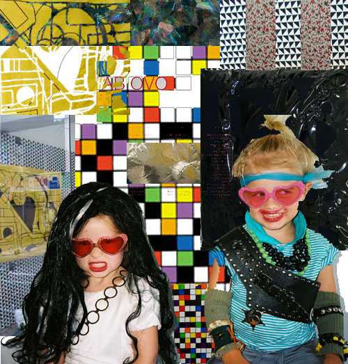
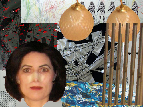
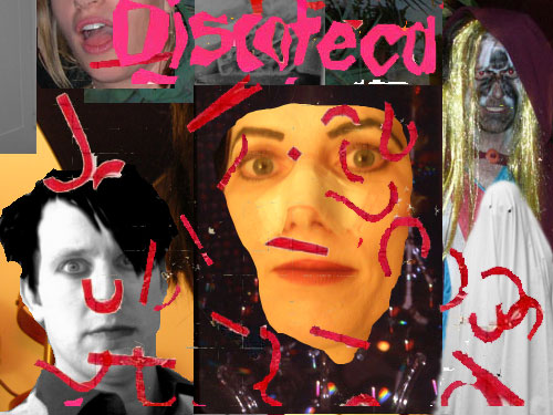
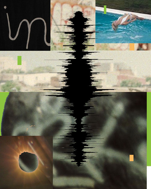
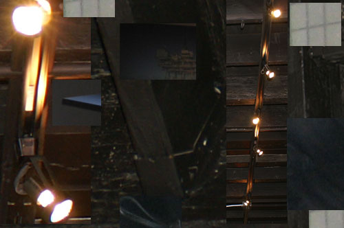
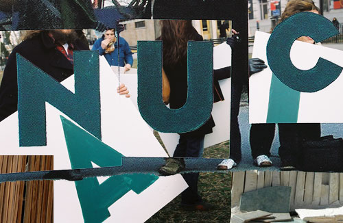
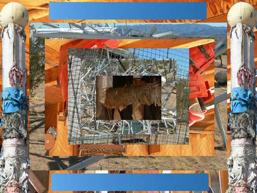
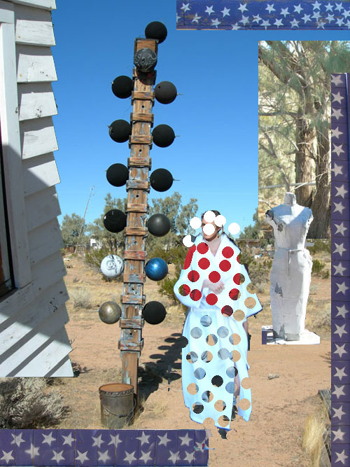
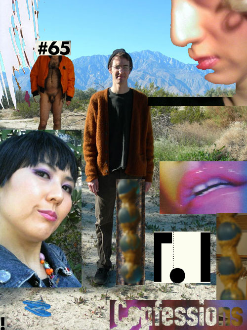
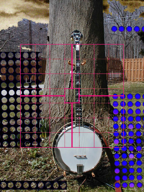
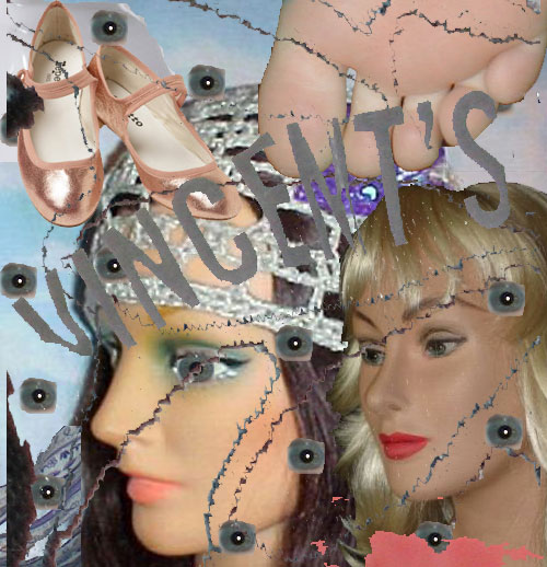
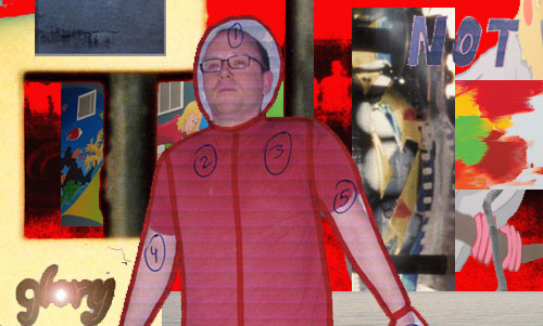
 Created from attachments sent to me by friends and associates between 9/19/02-6/4/06 and were assembled in chronological order. All of the original images can still be found in my Yahoo inbox.
[Editor’s note: IMG MGMT is an annual image-based artist essay series. Today’s invited artist Michael Mahalchick exhibited his third solo show at Canada this Winter. Mahalchick lives and works in Brooklyn and was included in Art Fag City’s list of outstanding artists emerging after 1999 this May.]


{ 30 comments }
wow, more low-aesthetic found internet image art? how novel.
wow, more low-aesthetic found internet image art? how novel.
@clafleche Please refrain from trolling the blog. Critical feedback is welcome here, but it shouldn’t come in the form of sneering.
@clafleche Please refrain from trolling the blog. Critical feedback is welcome here, but it shouldn’t come in the form of sneering.
Paddy, I don’t think clafleche is trolling (cynical and spiteful, yes… but he’s only lured us, as of yet).
Maybe the other three previous IMG MGMT posts were so strong that this one seemed so incredibly weak.
I do agree with the first post that this presentation of digital images is kinda old… if not tired (because it existed in novelty to begin with).
If I were friends with Michael, I would probably be into it… but, really, I don’t get it.
This edition of IMG MGMT is much more an homage to an established style than an essay transferring ideas to the viewer.
I guess I can’t expected to be an objective opinion, but I really don’t think this piece is weak. If I did, I wouldn’t bother defending it. I like this work because the relationship between Mahalchick’s physical work and this post seems so direct. Since he’s been doing this work for so many years now, this piece doesn’t read as an homage to another style to me, though I do see how it might be interpreted as such. The perimeters of the project though almost by very nature dictate that look. I mean, it’s not recent stuff — it’s his inbox from 2002 – 2006.
Anyway, perhaps trolling is overstating it, but clafleche’s sentiment could have been delivered just as effectively without the sneering tone. I don’t see how that kind of feedback benefits the artist.
First, I’m jealous that Mahalchick figured out how to keep his entire IMG MGMT post on the AFC front page (by making it one big jpeg I assume). I had to split my animated GIF selection last year (as do most of the other IMG MGMT authors for reasons of bandwidth) and consequently it didn’t have this much obnoxious impact.
I mean obnoxious in a good way. The piece is a good cyber-collage and has the same crude “everything but the kitchen sink” quality as Mahalchick’s paintings and sculptures. But he’s staying true to the porous, democratic nature of the web medium by making it a pastiche of his friends’ work. I don’t agree that it is an established style. There’s a hint of Paper Rad (without the neo-hippie element) and Abe Linkoln (who probably isn’t that familiar to the un-wired art world) but what interests me is how neutralized and flattened out it is for all the zaniness and use of hot button images.
The flattening of affect into allover abstraction has been around at least since Rauschenberg and Rosenquist (or possibly Schwitters). But compare this IMG MGMT post to Jeff Koons’s recent paintings and it is positively daring and edgy, c’mon. I think people don’t like it because it is somewhat repulsive and garish.
I’m not trolling. I was just being succinct.
I was a bit put off firstly because of the strength of the last IMG MGMT post (which I also commented on), and also because I’ve seen a whole lot of this kind of work (amateur aesthetic internet art, would be a good concise name for it, I guess) on AFC recently and it’s been a bit of an overload.
Secondly, I don’t find this work interesting because, as someone who grew up with the internet, it’s looked old to me since 2000. I don’t think the historical quality of the piece (the 2002-2006 part) changes this. If anything, it concretizes it. I’m not a huge fan of this type of work (and I am a fan of some of it) not because it’s hip (mostly–although there are a lot of people doing it only because it’s hip) but because it’s totally outdated, at least when it’s only image-based. YouTube, yes, is still a fairly new thing to deal with artistically, but email attachments? Random images? Those have been floating around since the AOL days. It’s just taken the ‘art world’ a longer time to find out about it, I guess.
Sorry for being cynical. I’m a cynical guy.
@clafleche I believe you weren’t meaning to troll, but I do think the comment was very insensitive. I don’t agree with it either, but that’s neither here nor there. A lot of narrative faux-naive painting is being made now too. The fact that there’s a lot of it doesn’t negate the work that’s good within the genre. And “outdated” doesn’t necessarily mean “bad”. I feel like there are a lot of artists recouping practices in the late 90’s that ride the line between being horribly outdated and incredibly sophisticated. I wouldn’t contextualize this work this way mind you, but as a criticism I don’t think it’s specific enough to really hold water. The fact that you’re not a fan of this kind of aesthetic seems far more fair to me.
Two side points: 1) being someone who “grew up” with internet doesn’t make anyone any more qualified to talk about what’s new or old, boring or not. All it means is that you never had to adjust to the Internet. 2)I’m very leary of the closing comment. To me it reads as a needless valorization of cynicism, made with the end goal of excusing a condescending response. But those are two very different behaviors. They should not be confused.
I challenge these bored scoffers to name everything in these “familiar” groupings of images. Source photos, techniques, brands of software used. Is it all Photoshop? What is the ratio of scanned to downloaded material? Made to found? Private to public? How much is Mahalchick’s work and how much is his friends’?
It’s easy to look at a collage and say “oh that’s a collage, I’ve seen them before.” Most of us have grown up with web and one thing for sure the experience teaches us is to be blase and think we’ve already seen it. I can name one image: the bearded Russian lady, because that’s what the caption says. Some I can guess at. Even more I have no name for whatsoever. This increases my respect for the work.
@tom This is a really specific comment that identifies questions I had not articulated. Thank you.
@tom This is a really specific comment that identifies questions I had not articulated. Thank you.
Couple things:
– I’m not trying to put myself in a more qualified position to critique the work. I’m responding to the work and my first way of responding is personal. It looks old to me, in the same way a Picasso might look old. The difference is that the Picasso remains visually interesting because it holds a style in an identifiable way. Most of his work is identifiably ‘his.’ This, I don’t think so. And we can argue about whether or not that’s inherent to the medium of the internet, but I lean more in the direction of thinking that that doesn’t matter. It’s not an excuse for making work that is visually weak but heavy in content. You still need to make something that’s interesting to look at.
– @tom re: “name everything in these familiar groupings of images.” I’m really tired of this argument, because it feeds into this whole contest of who can find the most obscure images, who can accumulate the most images, etc. There are so many image blogs out there that are based entirely on this idea. And probably 10% of them are really interesting, and the rest are just repetitive. And that kind of work becomes interesting when things become synthesized and collected in complex ways that are both contextual and visual. The work in this post looks slapped together in a really casual way and I don’t think that’s enough. You’re right, I can’t name every image. So what? That doesn’t make a difference because it doesn’t change the visual reading of the work.
@clafleche Well argued. I think we’ll likely just have to agree to disagree, but I would like to flog this horse one more time. Visa vi the works aesthetic merits: The repetition of dots and lips, the use of the rectangle to create framing devices, and the push between these kinds of cuts, and the weird often fluid images within them…I don’t think any of this indicates carelessness. I’ve always thought Mahalchick’s greatest strength is in his juxtaposition and combination of imagery. It’s not so much the collecting of weird shit (which he also does well) but the fact that he brings to it, an equally unusual sensibility. It’s exceptionally rare to find an artist who can match their source material, purely by manipulation and combination.
Interestingly, I would go so far to say that working with found material represents unique challenge to contemporary artists simply because bizarre crap is now so ubiquitous. It does however pose a familiar problem. Now it’s not just photographers who have to worry about their subject matter being more interesting than anything they brought to it.
“Newer than Koons, older than Picasso”
I would be curious to know who else asked anyone to name the images in an online collage, since this is such an old argument. Does any discussion of this type of work actually take place, other than the one we’re having? I get that clafleche is tired, very tired, by many things: found art on blogs, email attachments, arguments. This weariness is meant to convince us that Mahalchick’s work is “old.” All this exhaustion is indeed contagious.
Meanwhile, it seems others are actually talking somewhat enthusiastically about specifics of the work. Comparisons to other art (Paper Rad, Abe Linkoln, Rauschenberg), analysis of some formal devices (“repetition of dots and lips, the use of the rectangle to create framing devices, and the push between these kinds of cuts”). Perhaps this excitement will also be contagious, enough to overcome the pall of ennui our proud cynic is attempting to hang over this work.
@tom:
“Does any discussion of this type of work actually take place, other than the one we’re having?”
I’m sorry, but that’s an unfair and flatly untrue question/statement. Younger Than Jesus at the New Museum?
“Perhaps this excitement will also be contagious, enough to overcome the pall of ennui our proud cynic is attempting to hang over this work.”
Excitement and quantity of production and visibility of the work do not necessarily reflect quality. In fact, the opposite can often be true in my experience.
@AFC:
I do agree that this reflects Mahalchick’s other work. But I think his sculptures are about 1000 times stronger than this, and I also think that you’re reading that similarity into it because you already know his work. I saw this before ever seeing his sculpture, and I would have never made the connection. This could have been made by many, many people, I suppose is what I’m arguing.
But I agree to disagree about the work because otherwise we’ll keep going forever.
Here’s my last thought on the whole thing: at the end of the day, I see a lot of this type of work as having a visual sensibility–dots and lips, rectangles, Paper Rad, etc.–shoehorned in to compensate for the fact that the work comes mostly out of pure excitement for something new. I’m not saying that the internet isn’t exciting. But 99% of it constitutes garbage, not high art. Yes, of course, everything can be art. So 99% is at least bad art. Simply setting it aside and calling it art, either in a serious or ironic way, doesn’t quite do the trick either. We’re way past that. The medium may be different but it’s the same recycled ideas.
@clafleche “a lot of this type of work” doesn’t mean anything unless specific examples are named(just citing Paper Rad isn’t enough). “an excitement for something new” also doesn’t mean much without an example. What works make you think this? What is the specific aesthetic functionality of the piece that does this? I really feel like the points you’re trying to make aren’t being communicated as effectively as they could be, because the specific aesthetics of Mahalchick’s work have never been mentioned.
I should mention that somewhat ironically “New problem solvers” graces Paper Rad’s front page right now. Of course, this is just another marker of their interest in finding meaning within chaos (which is quite different than a pure excitement for the new).
It seems a heavy burden to bear that Michael Mahalchick should be blamed because 99% of the internet is garbage. Also, I wasn’t aware that any hater of a work in “Younger than Jesus” was asked to name the elements of the work–that must have been an interesting list and I’d love to read it.
Anyway, I like the part of this collage where the black sound wave goes right down the center between a backwards diver, some indecipherable pictograms, an out-of-focus building that looks like a college campus or a hospital, a solar eclipse with some erratic Photoshop masking, and some other material I can’t name. The collision of all this imagery behind the solid “zip” of the sound file seems very poetic and mysterious to me.
Comments on this entry are closed.