
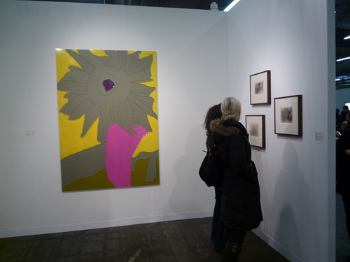
POST BY PADDY JOHNSON
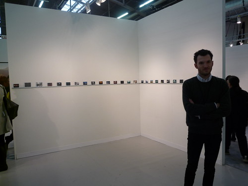
Phillip-Lorca diCorcia, installation view, at David Zwirner
Despite the mediocrity described in today’s lead post about the Armory, the fair’s highlights (and lowlights) were amongst the best I’ve seen at The Piers. There’s a lot of weird art on display this year and that, more than anything, makes the show worth seeing. It’s also of value to note that while there was an overall increase in average to sub-par galleries participating, most of them displayed uncharacteristically good work. The Armory got lucky on that count.
Highlights, lowlights and unexpected trends after the jump.THE HIGHLIGHTS
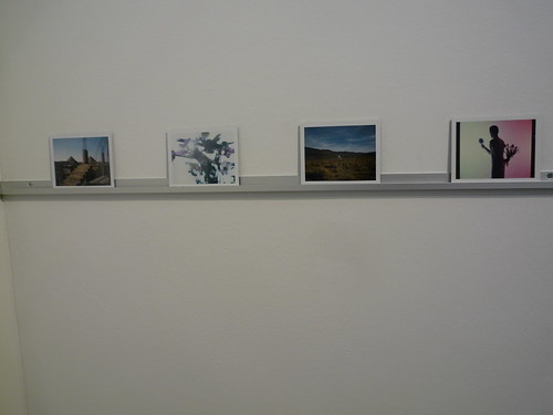
Phillip-Lorca diCorcia Installation detail at David Zwirner, (apologies for the shitty picture)
Even reduced from last year’s show of 1000 shots at Zwirner are 100 Polaroids too many for the booth? I say no. It’s hard to look at them all at this size, but ultimately I found myself looking at many more closely than I did the sized up photos in the other rooms. Zwirner has a booth not to missed this year.

Olafur Eliasson at i8 Gallery
Is there an artist with a practice as inconsistent as Olafur Eliasson’s? His show at PS 1 and MoMA. Brilliant. His piddly man-made waterfalls in New York. Piddly. His current ipod-errific show at Tanya Bonkadar. Awful. The above cars in water series. Pretty good.
The mechanics of the piece is simple: Eliasson asked friends to give him pictures of cars they’d seen in water and from that he made the grid. There’s a lot of this sort of collection work around, but I like this one nonetheless. Its subject matter is sufficiently strange. It may also be the only Eliasson piece we’ve seen to date that’s at all humorous.
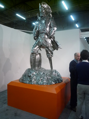
Peter Coffin, Pirato, 2008, aluminum
Speaking of humorous, what’s an art fair without a pirate and his two pegged feet? Thanks Peter Coffin!

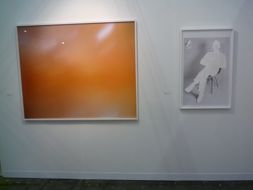
Matthew Day Jackson, Peter Blum
I managed to take the worst picture humanly possible of Matthew Day Jackson’s framed arrangements, which isn’t going to help prove the following point: I think he deserves a bit more play in the international scene. There’s a sentimentality to a lot of his art that isn’t for everyone, but I’ve always liked the work regardless because it’s so purposefully made (as opposed to calculated). So, yeah, the rainbow colored keyed landscape works for me.
LEFT: Trevor Paglen RIGHT: Matt Keegan at Altman Siegel
Altman Siegel exhibited a strong booth at the NADA fair in Miami this year, and deserves a nod here as well. The gallery’s stable includes Trevor Paglen and Matt Keegan, both of whom are particularly strong artists. Paglen’s gallery Bellwether closed last year, so the artist no longer has New York representation. I’m a little surprised no one here has picked him up yet. Postmasters would be a good fit.
THE ZOO FAIR
BEST IN SHOW – FRIEDRICH PETZEL’S SEAN LANDERS BOOTH
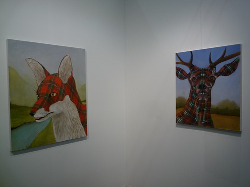
LEFT: Sean Landers, McGregor, 2009, Oil on linen, 40 x 32 inches, RIGHT: Sean Landers, Tartan Buck, 2005, Oil on linen, 30 x 26 inches. Friedrich Petzel Gallery
Animals are undoubtedly the most unexpected trend spotted at the Armory this year, the fair often resembling some sort of bizarre art zoo. Sean Landers’s wolf and deer in plaid camouflage in particular cracked me up; surely no hunter would dare shoot an animal that looked like their shirt. Just outside the booth, there’s an early video of Landers whipping himself. He looks like a hip Greek statue, and would be almost impossible to miss were it not for the OBESE BIRD ON A BRANCH YELLING COMPLAINTS nearby. Only an art fair could produce such a random combination.
Kristof Kintera at Jiri Svestka Gallery
Let’s face it, this isn’t good. I still like it.

Richard Jackson, Bad Dog, 2007, Hauser & Wirth
I’m not sure if the pump attached to this dog’s ass is a fart infuser or a fart collector, though the canister certainly suggests the former. Whatever it is, it seems this dog’s got at least one good trick. Sic em boy!
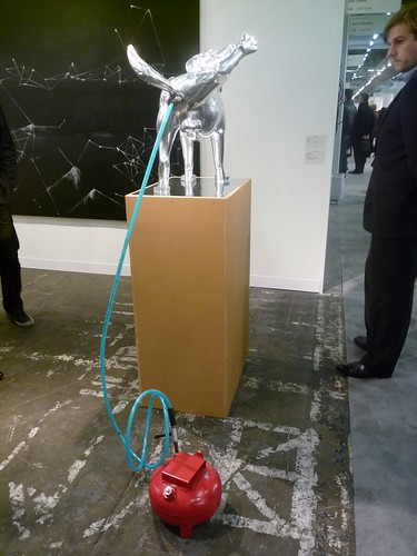
Richard Jackson, Bad Dog, 2007, Hauser & Wirth
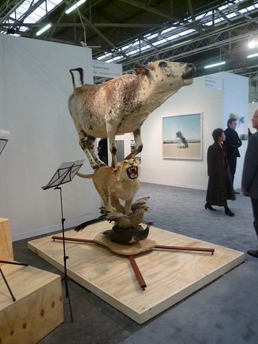
Joachim Schonfeidl, Goodman Gallery
What is this? Cows on top of cougars on top of birds? The wild kingdom comes to the New York Armory.

Christian Holstad, Collect Call, 2009-10, mixed media, 92 x 94 x 91 inches, Victoria Miro
Christian Holstad finally crafted that giant telephone out of swan necks I’ve always wanted. Now to figure out what to do with it.
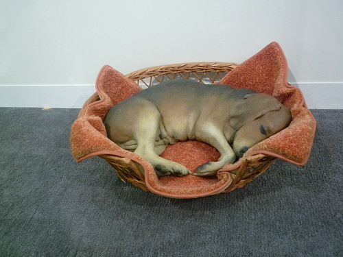
Daune Hanson, Beagle in a Basket, 1979, autobody filler, polychromed with oil, mixed media with accessories. 7 3/4 x 25 x 19 3/4. Galerie Emmanuel Perrotin
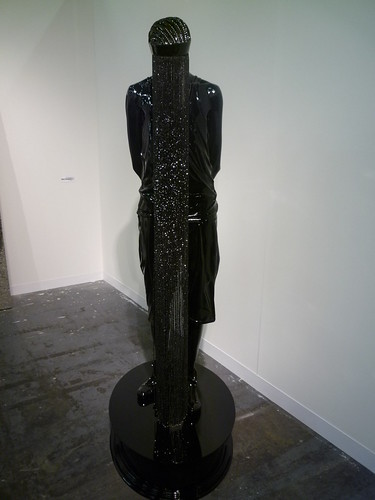
“This would be better if it were an actual dead dog,” a friend told me last night. I don’t agree. The tactic prescribed represents a genre of art I defined over twitter last night as Eureka! Art; art that upon close inspection reveals itself to be something other than it appears. The methodology is closely related to trompe l’oeil a completely ubiquitous technique right now, that involves rendering objects so flawlessly, it’s impossible to distinguish the representation from the reality. Susan Collins, The Armory’s showcased artist this year, provides a great example of an artist playing with this zietgiest, her Swarovski crystals pinned to the wall, flawlessly resembling holes. The problem with Collin’s work though is that it never grows on the viewer. I wish she’d just turn the page already.

Artist Unknown, VIP Lounge
Last but not least, my favorite work of the fair: a giant bronze horse with a lamp shade over its head and functioning light bulb.
OBJECT MOST RESEMBLING CONTEMPORARY ART

Adam McEwen, Nicole Klagsbrun
Like a lot of contemporary art, the quality of Adam McEwen’s work is revealed when the most a viewer can do is describe it. Speaking to this point: It’s a yellow swastika. A view of the full installation here, and a fountain made of graphite I actually liked at the Rubell Family Collection here.
WORST IN SHOW
Installation view, White Cube
Does White Cube exhibit anyone other than Damien Hirst, Gary Hume, and Marc Quinn at the art fairs? They’re all awful. Quinn’s moved on from sculptures of pregnant men to life-sized monuments of tattooed transgendered figures smoking cigars.
PEEK-A-BOO!
Kevin Francis Gray at Mendes Wood
This piece is so out of place at the Amory Show I’m actually charmed by its Los Vegas Hotel lobby aesthetic. At the very least it breaks the monotony of seemingly endless booths filled with fine art.

{ 25 comments }
The horse is made by the Swedish designgroup Front, (frontdesign.se)
http://www.frontdesign.se/newsupdate_mooi.htm
The horse is made by the Swedish designgroup Front, (frontdesign.se)
http://www.frontdesign.se/newsupdate_mooi.htm
Matthew Day Jackson’s work sold for almost $1M at auction last month and has some heavy Pinault backing. I can’t see how he deserves more play then that.
That Adam piece is the worst ever.
Matthew Day Jackson’s work sold for almost $1M at auction last month and has some heavy Pinault backing. I can’t see how he deserves more play then that.
That Adam piece is the worst ever.
Joachim Schonfeidl’s work is perhaps inspired by the Bremen Town Musicians story by the Brothers Grimm? I tried to look at the scores but was not able to piece together what the music would have sounded like.
Joachim Schonfeidl’s work is perhaps inspired by the Bremen Town Musicians story by the Brothers Grimm? I tried to look at the scores but was not able to piece together what the music would have sounded like.
Meh, Jackson gets lots of play in America, though I don’t see his name in the press much any more. I rarely see his work overseas, which was my main point, though I’m not uber experienced in the European scene so maybe there’s more of an audience there for his work than I know?
Meh, Jackson gets lots of play in America, though I don’t see his name in the press much any more. I rarely see his work overseas, which was my main point, though I’m not uber experienced in the European scene so maybe there’s more of an audience there for his work than I know?
In regards to the Eliasson piece:
http://www.micahganske.com/small_jpegs/Exit_Strategy.jpg
Also agree about the crazy unevenness.
In regards to the Eliasson piece:
http://www.micahganske.com/small_jpegs/Exit_Strategy.jpg
Also agree about the crazy unevenness.
Really, Paddy? The horse with the lampshade is your fav. I just lost 48% of the respect I had for you.
Really, Paddy? The horse with the lampshade is your fav. I just lost 48% of the respect I had for you.
S. Haason: Not that this needs to be clarified, but “My favorite” is not an indication of quality.
S. Haason: Not that this needs to be clarified, but “My favorite” is not an indication of quality.
i went from 7 last night and was rewarded with $10 admission. late = thrift! who knew? this is a great post about the show. is that horse lamp related to the profoundly ugly sky mall giant leg lamp? looks it.
i went from 7 last night and was rewarded with $10 admission. late = thrift! who knew? this is a great post about the show. is that horse lamp related to the profoundly ugly sky mall giant leg lamp? looks it.
Aside from being a typical case of a dumb joke made “art” through the conspicuous expenditure of effort and resources, this Peter Coffin piece is swiped from the actually-good and actually-humorous Scott Reeder painting “symmetrical pirate”.
waaaaaaaaaaaaaattttttttteeeeeeevvvvvvvvvvvvvvvvssssssssssssssssssssssssssssssss
that gary hume was so ugly it hurt my feelings – the only thing that even came close was an unfortunate pairing of a tony oursler and a peter halley in a corner upstairs, a conflation of ugliness so intense I half expected it to rip a hole in the space time continuum and suck all of manhattan in after it
that gary hume was so ugly it hurt my feelings – the only thing that even came close was an unfortunate pairing of a tony oursler and a peter halley in a corner upstairs, a conflation of ugliness so intense I half expected it to rip a hole in the space time continuum and suck all of manhattan in after it
Booo! I like Gary Hume. haha..
Hanson’s ‘Beagle’ made me jump.
As far as the Fair-as-Bestiary, nothing beat the taxidermy collage beasties at Pulse!
Booo! I like Gary Hume. haha..
Hanson’s ‘Beagle’ made me jump.
As far as the Fair-as-Bestiary, nothing beat the taxidermy collage beasties at Pulse!
Richard Jackson is amazing ! Saw his bears in Paris.
Richard Jackson is amazing ! Saw his bears in Paris.
Ok, so I agree with your sentiment concerning the yellow swastika, and its good you included the full installation view. BUT it really does have to be taken into context with the rest of the objects in the room. You cant judge it by itself as a piece. Even if the whole installation is also really lame.
Comments on this entry are closed.