Gladstone Gallery, 515 West 24th Street
(Through 1/19) Carroll Dunham
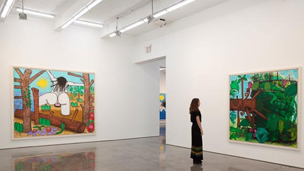
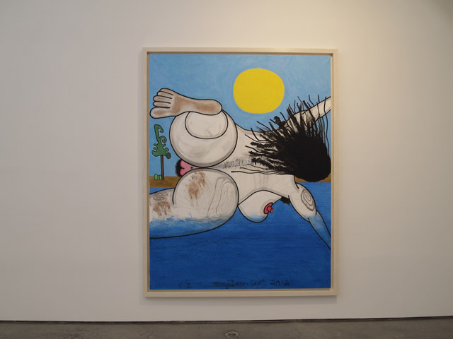
Paddy Johnson: I can’t remember the last time I enjoyed genitals less. This is a fairly typical show for Dunham in that a cartoony figure plays heavily in all the work, but I’ve always enjoyed a strange darkness to his paintings that might otherwise simply be playful. That’s gone. So too are many of the dynamic compositions Dunham’s become known for. What you’re left with is a bunch of bathers with big vaginas and trees. The tree paintings, of which there are three, are murkily painted and unresolved. Overall, not so interesting.
Corinna Kirsch: John Yau reviewed this show for Hyperallergic and made it sound amazing. After making our way to the gallery today, I’ve got to say we’ve got completely different taste. Perhaps I’d care more about this show if, like Yau writes, there were a stake in reinventing the nude:
“Carroll Dunham’s recent paintings are a dark comment on the tradition of the idyll, which goes back a long way in painting, and includes such modernist highpoints as Paul Gauguin’s The Seed of the Areoi (1892) and Henri Matisse’s Luxe, Calme et Volupte (1904) and Joy of Life (1906).”
You know what I ended up thinking about during this show? The dreadlocked strangler. Also, how the Portlandia bookstore owners would love these works. Maybe, if it looks like it might belong on Portlandia, it’s probably not great art.
Will Brand: I like that that system discriminates against knitters and taxidermists, but I’m not sure it works with bird artists. Tom Thayer? Nathalie Djurberg?
I often like John Yau’s writing, and I like what he’s done with Hyperallergic’s weekends, but I can’t deal with this review. An excerpt:
“The sky above the horizon is a cloudless blue field on which the artist has painted either a large circle or radiant orb in bright yellow.”
Dude, just say “the sun.”
“One reason Dunham writes or draws in pencil on the painting’s matte surface is to activate variously colored shapes, each of which is demarcated by a thick black outline or skeletal armature.”
That is to say, drawing borders on things makes them pop. I also don’t get his argument that these are “dark” paintings; they’re paintings of a woman going swimming and then walking around in quicksand. This is one of those days when art criticism feels like the firing range scene in Men in Black.
In any case, these paintings aren’t very exciting to me. They reference art history, and they highlight genitals, but these are qualitative descriptions, not measures of quality. I did like “Next Bathers, five (dive)” (2012), because that’s a difficult pose to capture and I think Dunham did it well.
Marianne Boesky Gallery, 509 West 24th Street
(Through 1/9) Barnaby Furnas, If Wishes Were Fishes
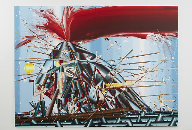
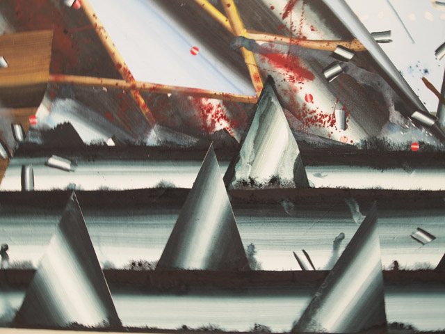
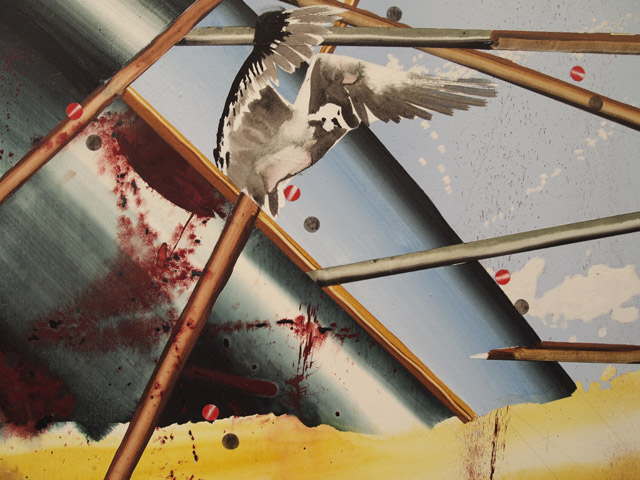
Rhett Jones: This was a really strong show. The first paintings of whalers in the act of killing or skinning has a “Moby Dick Descending a Staircase” vibe to it. It takes that compositional approach and throws in some Ralph Steadman blood splatter and a sort of vector gradient approach to coloring and the whole thing seems to move.
Will: I know the proper art thing to say is that these evoke Léger, but I think you’ve nailed it— those waves and whale parts just read as the Reflected Gradient tool in Photoshop. Then again, I’m seeing a lot that reminds me of Léger’s The Mechanic (1920): the cigarette one of the whalers smokes; the little tattoo-style anchors on the shards of ship.
Definitely a strong show, not least because it’s not trying too hard. Furnas isn’t telling the Ur-Story of All Painting, he’s telling a story about whales. Furnas isn’t pioneering the One True Style, he’s using a bunch of styles we already knew about in ways that suit his story. The blood is bloody and visceral, the pseudo-cubist sections have sharp and satisfying edges, the seagulls have the airy precision of wildlife paintings; everything fits. I feel like Furnas sat down and thought, “How exactly should I paint these waves?”, and then came up with a good answer. For some reason, that’s a rare feeling.
Corinna: I’m not a snob or anything, but I did think about Léger as soon as I saw those steely cylinders.
Will: I don’t think “cylinders” applies to Furnas. In Léger, gradients are cylinders and their shades refer to space. Look at Three Women (1921-22): the bends in the leftmost woman’s hair are realistic, getting darker as the hair recedes from the picture plane. The waves in Furnas’s The Whalers (2012), above, couldn’t possibly follow the same rules, or else they wouldn’t be even remotely wave-shaped. I think these are just gradients.
Corinna: I wasn’t planning on talking about “cylinders versus gradients” and all, but I totally disagree with how cylinders only refer to space. That’s nitpicking: if anything, gradients refer to space, too. Anyway, it’s a good show!
Paddy: I’m with Corinna on cylinders, but whatever. These paintings are best when they aren’t defined by copious references to Modernist painting. It’s distracting, and I don’t see how it has much to do with the content of these works.
Anyway, it’s a good show, but l wasn’t thrilled with its arrangement. There are two paintings of “gutters” splitting the whale, one good, one not so good, and you can guess which one we see first. Galleries: Just because you can sell the work, doesn’t mean it has to be hung. Then there’s “Jonah and the Whale #4”, a painting made almost entirely of drips. It makes sense in the context of all the whale splitting and God-like figures in the back—the figures look as though they are rising to heaven—but you don’t see the show in that order. So instead, the work first comes across as painterly contrivance, which is only later tempered by content.
Oh, check out the gulls in the large painting The Whalers in the back room. Thinned paint that shouldn’t look like anything is transformed to perfectly suggest the grittiness and grace of gulls. What a great moment.
Metro Pictures, 519 West 24th Street
(Through 1/19) Gary Simmons
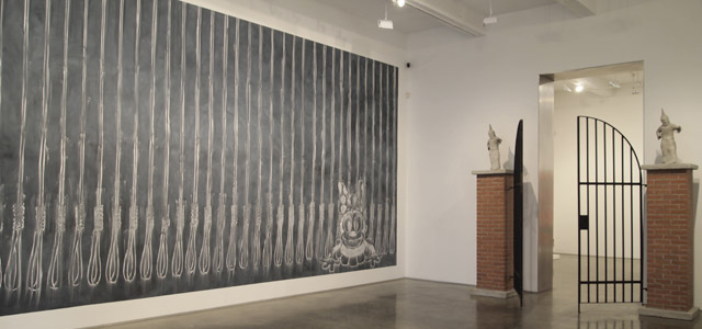
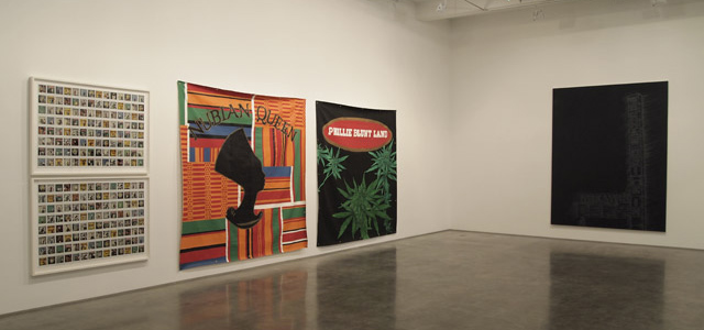
Rhett: This show got better as it went along, but unfortunately it browbeats you when you walk in the door. With a Ku Klux Klan gate and a chalkboard covered in nooses, you immediately know that we’re talking about race; but what are we saying about it? That it’s bad? It makes you appreciate the more subtle and targeted reflections on race at the Glenn Ligon show down the street. I didn’t know what was going on in the blunt advertisement/polaroid room, but it looked better. Then there’s the last room, which benefitted from a nice hanging, but seemed to have the least content. I’ll take that over the on-the-nose start to the show. Looking back at some of his older chalkboards online, I feel a bit cheated; this show doesn’t put Simmons’s best foot forward.
Paddy: That Glenn Ligon show down the street could only be called subtle relative to this show, which frankly is a problem for both artists. And this show did not get better as it went along. There was a pair of bronzed Reeboks in the last gallery, and white boxing gloves with the words “NeverBack” in gold. I suppose there’s a statement about race being made here that’s less bombastic than the Ku Klux Klan gate, but not by much.
Corinna: From what I can gather, critics are most comfortable talking about Gary Simmons’s work in terms of a paradox: we want to move past talking about race, but it’s difficult when we’re still dealing with the past. That sounds all well and good until you realize it resembles the revenge plot of The Dark Knight Rises (minus the destroying Gotham bit). Anyone with a grudge is going to have a difficult time forgetting the past, you know, but I’m not really sure if that’s how we want to talk about history.
As for the works themselves, yep, they feel heavy-handed. But thankfully, there’s a bit of humor thrown in—like the sassy KKK statues, each posed with a hand on their hips. All that alleviates the discomfort of, say, looking at Harlem residents posing with Simmons’s hand-painted poster of Dr. Dre’s The Chronic. Unfortunately, there wasn’t enough humor—or subtlety—to go around.
Andrea Rosen Gallery, 525 West 24th Street / Andrea Rosen Gallery 2, 544 West 24th Street
(Through 2/2) Cellblock 1, curated by Robert Hobbs / Cellblock 2, curated by Robert Hobbs
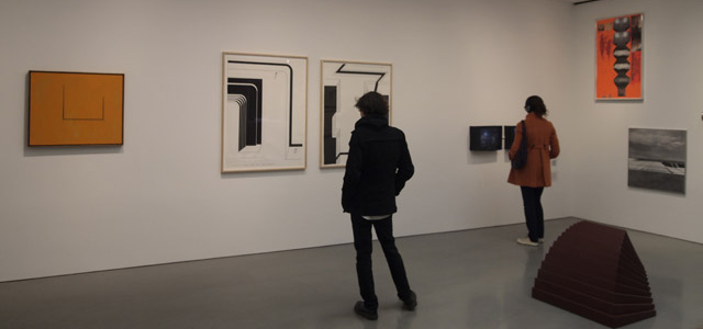
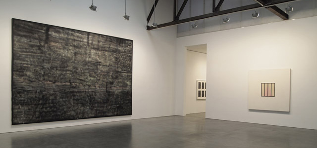
Paddy: A two-part group show, split between Rosen’s lush primary space and her other gallery down the street. It’s new and literally called, “Andrea Rosen Gallery 2”. Lots of big name artists here—Kelley Walker, Peter Halley, Robert Motherwell, etc.—and in the main gallery, it’s impossible to forget that you’re supposed to be in some sort of temple for the rich. It’s exhausting.
Rhett: The first section is pure abstraction compared to the second. It’d look like a geometry showcase, if it weren’t for the overbearing wall text and title. What I liked about the first part was the inclusion of Robert Smithson’s cavern cinema piece. And I think that provided the link into part two. There’s all these geometric pieces that evoke prison cells or biological cells, but then you have this sketch for a hypothetical cinema inside a cavern— this sort of room to dream inside a spelunker’s place of self-imposed confinement. I think it really opened up the rest of the pieces in part one, the Sterling Ruby’s, especially.
Moving into part two, there are more Smithson sketches, giving us a bridge to the video pieces and more explicitly prison-related work on the topic. This relation of black boxes, movie theaters, walls, televisions, etc. really worked, and the works bounced off each other in a great way.
Whitney Kimball: Agreed, for me, the Smithson cavern cinema drawing and Alice Aycock’s Vertical Maze were a crucial link between both shows. They imagine spaces that invite exploration, but resemble underground prisons. The second half of the show more obviously links apartments, urban planning, and screens with confinement, which was necessary to keep the first show of giant brick walls from being a one-liner. The drawings also added another major piece to my Robert Smithson education, which makes sense because it’s curated by Robert Hobbs, a leading Smithson scholar.
Also, interesting piece in the second half: Artur Żmijewski’s Repetition, a 2005 reenactment of the famous Stanford psychological experiment in which a group of college students played roles of prisoners and guards.
Corinna: I like Robert Motherwell. I like Peter Halley. I love Robert Smithson. Heck, I like a ton of the artists (excluding Sterling Ruby), but I didn’t love the show.
For all the effort the show’s curator put in, I just don’t think the idea of art and confinement comes off as well as it could. The show in Andrea Rosen’s main space contains a lot of paintings with square shapes that could, possibly, resemble prison cells. Well, you have to use your imagination with the Motherwells. Part two, in Rosen’s smaller gallery, is all over the place and deals with broader issues of power, control, and all those things Foucault likes to talk about. Meh.
Whitney: Whaa? There are brick walls, bars, and maze drawings everywhere in the main space.
Corinna: They could also resemble bricks. Bricks build homes, and sometimes those homes are nice, warm, and inviting. Some of the works, notably the Aycocks, look like prisons, but seriously, bricks don’t always equal oppression.
Paddy: I’m grateful to have Whitney and Rhett around because they drew more connections out of the show than I did; it’s better than I realized. I just wasn’t particularly interested in much of the work on view. So, while the theme was clear, I wonder about some of the curator’s choices. Does anyone ever need to see that many spartan Motherwells?
Andrea Meislin Gallery, 534 West 24th Street
(Through 1/19) Michal Chelbin: Sailboats and Swans
Corinna: Thug life.
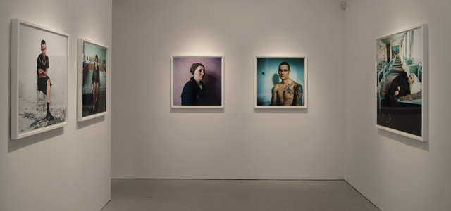
Paddy: I’d like this show more if wasn’t built entirely on clichés. Why can’t people pose for an art portrait and exhibit an expression of any kind? Things look dire here—the work is shot in Russian and Ukrainian prisons—but any sense of humanity has been lost thanks to the austerity of these poses.
Whitney: Yeah, people were over-posed. Set-ups like the V-formation in Young Prisoners, the neon palette, and the super-ironic overuse of fantasy prison murals made them feel like they were on a Guy Ritchie set. This reminded me of Jasper de Beijer’s colorful summer show of Mexican drug war victims.
Fredericks & Freiser, 536 West 24th Street
(Through 1/19) David Humphrey: New Paintings
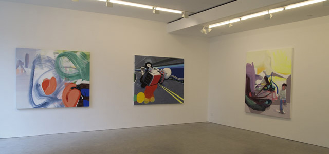
Corinna: There’s one acceptable painting in this show—the girl covering her breasts on a couch that has breasts. Other than that, the paintings look like they were made by someone who really likes swooshes, dots, and stripes, but doesn’t know what to do with them.
Paddy: David Humphrey’s made better work. The problem I have with this body of work is that it seems to live and die by the formula: one representational figure or object surrounded by gestural painting. Sometimes this approach works—there’s a small painting in the back room of a brown figure surrounded by a large blue swoosh that succeeds in making you examine different parts of the painting more—but for the most part I felt like Humphrey was indulging in tropes. Wait for his next show, I guess. Hopefully, he’ll go back to painting weird shit, like that horse and vacuum cleaner in the snow, dubbed “Horsey Love”.
Whitney: This felt like a learning show to me, or a crisis of painting styles, because none of the pieces quite fit together. I don’t love the result, but I don’t really want to knock them for going out on a limb, either.
Paddy: I like that take and will adopt it.
Mary Boone Gallery, 541 West 24th Street
(Through 2/23) Keith Sonnier 68-70
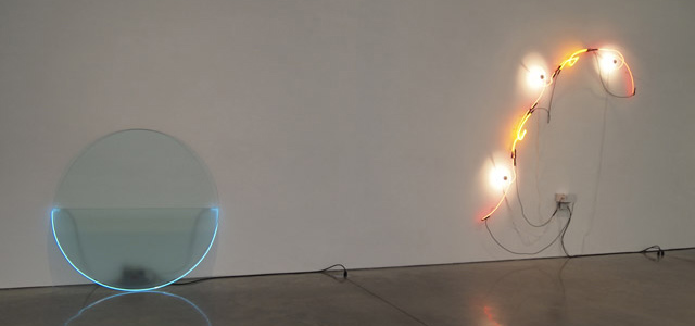
Corinna: So, these are just some neon poles on glass, around glass, and attached to glass. They’re plugged in with visible extension cords that hang, loop, and dangle around the works. If that doesn’t sound exciting to you, don’t worry, it wasn’t thrilling in person.
But I do like what Sonnier did here: he found a whimsical way to deal with neon. That whimsy must’ve meant something in the 1960s, when the uber-serious neon king, Dan Flavin, reigned supreme. Props to that.
Whitney: I agree, I like the one where chrome light bulbs start to look like googly eyes, if only because I’d been staring at Glenn Ligon’s black neon thirty minutes earlier. But there’s not much happening yet for Sonnier in 1968. This is a show about figuring out how to use neon, and you really have to imagine that it’s unconventional to get the intended impact.
Gagosian Gallery, 555 West 24th Street
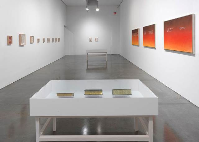
(Through 1/12) Ed Ruscha
Corinna: In his later years, Ed Ruscha began using books as subject matter. Everyone forgot about the books, excluding the bibliophile collectors who purchased them. No matter, he remained the world’s greatest sentence painter.
Paddy: I don’t have an enormous amount to say about this show, which perhaps reflects the large paintings depicting the empty pages of books in the first room. What a cliché.
There were simply too many meaningless messages in this show. Books with bleached out titles, each displayed in letterset beside the object, like:
You talk
you
get
killed.
The kicker here is that it seems the words were never on the book to begin with. Ooooh.
Anyway, between that and the books paired with Ruscha’s renderings with more expressive typefaces, I’d had enough. The only objects I liked in this show were the books in the back room that come with a special display apparatus so that viewers can experience the lenticular quality of the text on the fore edge of the book.
Whitney: Is it a cliché to paint books? I guess now we have a lot of emerging painters who paint on books, but I thought this territory was too boring for most people to get away with it. Anyway, I saw this as divided into aging histories (a book browning) and exclusionary history (crossed-out slang phrases). I was kinda ready to buy into it until Paddy reminded me what we’re looking at. This is literally a show of history books aging.
Will: Empty history books aging, to be more precise. A ten-foot-wide Ed Ruscha book painting reads like the highbrow equivalent of a motivational poster.


{ 10 comments }
I very much enjoyed the clever “review’s” format [each of you expressing your views on each selected exhibit]. Kudos!
very much like the tag-team review approach, btw.
i enjoy this format. do more of them. please.
Corinna, why dont you like Sterling Ruby? (You didnt specify). I think his big scumbly grey piece looks a lot more interesting than most of that secondary market whatever. Yes, it is super formulaic.
Guys: I love the way you panned that Caroll Dunham show. Yawn. Jerry Saltz’s facebook post about how good the work was pre-empted by a ‘Im speaking subjectly here because we are very old friends and Im the godfather to his child but…’
Thanks for clearing up that mess.
These are my favorite articles that you guys post. Thanks for being the eyes and ears.
I’m not into Sterling Ruby; it’s just for reasons other than having to do with the cell block show. I didn’t want to get too off topic.
I thought the big grey piece wasn’t so bad for him, but Ruby really isn’t my bag either. What do people see in that work? Most of it seems really over determined and it’s not even pleasing to look at. I don’t get it.
Was it in the press release that Simmons painted the backdrops in the photos? Those were common photo backdrops throughout new york city in the 80s and 90s so I assumed the photos were found and he subsequently recreated the hangings.
PS There was also the crazy nytimes review of the Dunham show replete with Robert Graves “muse” references.
From a previous PR: “The Polaroids are of individuals and groups of passersby and are not only individual portraits that represent the subjects’ view of themselves but communal portraits representing a time, place and collective presence. In contrast, these studio shots are pre-arranged “sittings” of acquaintances invited to select a backdrop to pose in front of. Their portraits are more intensely concentrated and personally controlled. During the exhibition, Simmons will invite gallery visitors to pose for photographs in front of the paintings on exhibition.” http://www.metropicturesgallery.com/exhibitions/1993-09-18-gary-simmons/
Ok so i think the photos displayed were old (and of backdrop photos not made by simmons). I didn’t really see the point of him recreating the backdrops.
Comments on this entry are closed.