The Artist’s Institute, 163 Eldridge Street
(Through 1/26) An exhibition curated by Haim Steinbach
Paddy: Here’s an organization straight from academia: The Artist’s Institute is a Hunter College project that dedicates each of its “seasons” to a single artist, inviting artists, writers, performers, etc. to respond to that artist. This is the capstone for the Haim Steinbach season: a show curated by Haim Steinbach.
At the very least, it gives us a sense of whose work he likes: Rachel Harrison, Joseph Kosuth, Shelly Silver, etc.
Will: I was excited about this show from the premise, because Haim Steinbach has a reliably good eye and is pretty close to being a curator in his normal practice anyway. What I got wasn’t disappointing, but it wasn’t surprising either. Pound for pound, these are more interesting, more polished, more visually-striking works than anything else we saw, but then again they’re also by far more established artists.
There’s a Joseph Kosuth text painting here, “Andy Warhol (Art as Idea as Idea)” (1968) with an Andy Warhol quote on it: “People are so fantastic. You can’t take a bad picture.” Maybe this is just me, but I was very surprised that Kosuth would have been down with Warhol, given that in 1968 the movement Kosuth represents was in the middle of burying the movement Warhol represents. Doing a little reading, apparently Kosuth made a lot of Warhol references early on; Kosuth’s first solo exhibition in 1968, Alexander Alberro tells us, had both this work and a work with the “fifteen minutes” quote. Education is key.
Paddy: On a personal note, when I interviewed Steinbach last year about his work, he was obsessed with taking pictures on his iPhone. Not portraits per se, as this quote alludes to, but pictures of anything. He thinks everything is art. Anyway, he got a really good one of my hand—it was by accident—and proclaimed the interview a success just for that. That Kosuth seemed in line with Steinbach’s interests, so I liked its inclusion for that.
Whitney: Great work, not a strong show. That Kosuth does go well, though, next to Shelly Silver’s video “Meet the People,” a 1986 series of intercut interviews in which fourteen different people talk about their jobs and their dreams. You could tell they were actors, but I still wanted to hear all their confessionals.
I’m not even sure if there is a theme here, though– you can draw some connections between Peter Halley’s drawing “Apartment House, Prison” and Glen Seator’s “Untitled 1,” though that’s a stretch. You can see parallels with the arrangements of objects on Steinbach’s shelves, but it doesn’t add anything new to the work here.
Corinna: Maybe it was too much to assume that Haim Steinbach’s strong eye within his own practice, usually finding visual analogues among the various objects he collects, would make a similar appearance in his curation? All the work squeezed in The Artists’ Institute’s bedroom-sized space had to be fairly small, wall-sized work. With all the work vying for attention, just inches away from each other, it’s not surprising that I was drawn to the louder works: the text-based work, video, and sculpture.
Feature Inc., 131 Allen Street
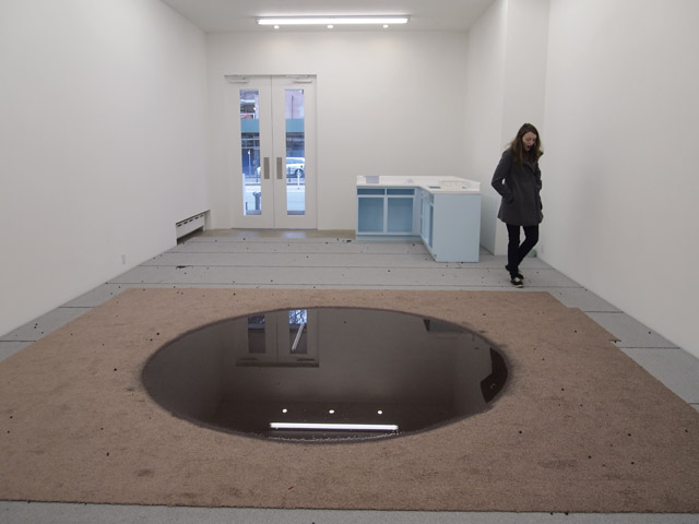
(Through 2/9) Nathaniel Robinson: Outer Air
Corinna: This show continues what I’ve noticed as a burgeoning “domestic” trend, like with Lisa Cooley’s show, featuring a whole lot of chairs, houseplants, and the like. Not a full-on trend yet, but it’s getting there.
When I was in high school, I went on a class trip to the Museum of Fine Arts, Houston; at the time, it was hosting a Richard Long exhibition. You know, he’s the land artist best-known for circular rock formations. I like to call them “flat donuts”. So, my teacher, we called him Doc because he was a former college professor, was egging everyone on, trying to get them to talk about the show. He asked us big kid questions like “Why are rocks in a museum called ‘art,” but they’re just called ‘rocks’ when they’re out in a park?” Nobody was answering his questions, so he just ended up frazzled, asking if we even liked seeing rock circles in the museum. I really liked the show, I told him, because, “Where else can you go see rock circles?”
This show at Feature Inc. reminds me of that same “Where else can you go see that?” impulse. Where else are you going to see what looks like a makeshift kitchen, filled with what looks like mouse droppings and other fecal matter, two brontosaurus sculptures, and a carpet full of water? This is the only place in the word where you can see all of these things together. Nowhere else on earth.
Will: For me, these shows are always a delayed release. In the gallery, nothing much happens, but when I get home, I’m a little more mindful of my kitchen counter.
Lehmann Maupin Gallery, 201 Chrystie Street
(Through 3/9) Robin Rhode: Paries Pictus
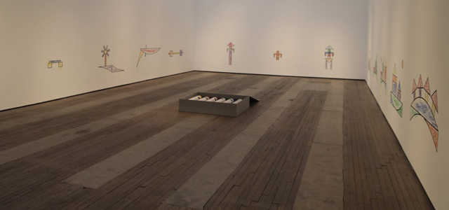
Will: Dude made some bigass crayons, then gave them to some 6-year-olds from the South Bronx and asked them to stay inside the lines. They were only moderately good at staying inside the lines.
Corinna: Oh, so that’s why they didn’t stay in the lines: those crayons were about as big as they are. I bet adults would’ve been better at that. Still, what sort of after-school program is this, making kids draw with crayons nearly as big as they are? It reminds me of American Gladiators when the two finalists faced off with pugil sticks. I bet the kids would’ve preferred some jousting with crayons to coloring some pretty boring shapes.
Paddy: Oh, come on you guys. The kids would have loved playing with crayons that size, as would any adult. The only mystery here is how they stayed inside the lines as well as they did. I know it sounds cliche, but I thought this exhibition was almost joyful in its playfulness. What I did not care for were the photographs upstairs, in which we see Rhodes swipe his arm over what appear to be charcoal drawings to create a sense of movement. It’s cheeseball street art.
Will: I get what you’re saying—we studied fun in grad school—but this is the Pompeii of playtime. Rhode didn’t bring in all the kids he could find, or invite visitors to scribble; he let these specific kids put this specific set of drawings on the wall, and then fossilized it there for an exhibition. I dunno, I just don’t find “once, someone enjoyed themselves here” to be all that heartwarming a sentiment.
Paddy: You make a good point; the piece is a lot better when you don’t know it’s made by kids. Without that knowledge coloring seems like a ridiculous thing to do to a gallery that size. The view is especially enjoyable from the top floor—the images look too small for the space and almost nondescript. It seemed courageous.
The Hole, 312 Bowery
(Through 2/9) Jaimie Warren: The Whoas of Female Tragedy II
Whitney: Everybody’s excited about Jaimie Warren’s food portraits—even Huffpo’s telling people she’s “about to blow up”—for good reason. Her photos, reenacting found photoshopped paintings and images from totallylookslike.com, take straight from Cindy Sherman’s playbook, basically aping people with way too much make-up. Like Sherman or Ryan Trecartin, though, Warren has the rare ability to make great work that looks like she’s just kind of slapping shit together. Art should be that easy.
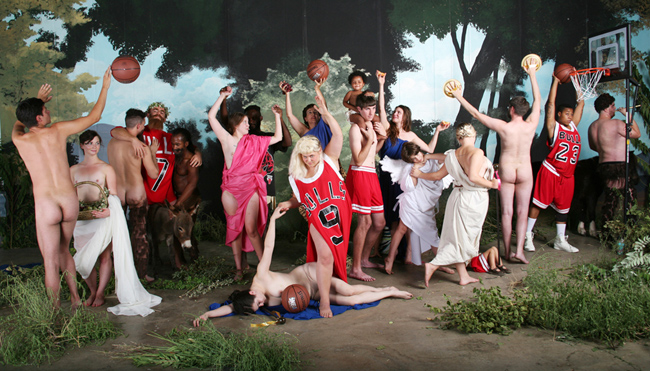
The piece de resistance is a wall mural of a bunch of half-naked Bulls fans reenacting “La Jeunesse de Bacchus” by William-Adolphe Bouguereau. They look like they’re well into a post-game kegger, right down to the nude, Hanes Her Way control-top underpants. It’s sloppy, it’s kind of drunk, it’s aware of art history, it’s narcissistic, it’s internet. Warren’s really good at knowing how much to pose people, and where to let the seams show.
Corinna: Instead of 15 minutes of fame, now we’re content to live out the 15 minutes of others. Jaimie Warren dresses herself up as celebrities (love the Lil’ Kim portrait), celebrities as food (Jean Beignet Ramsey), or a gumbo of art history and pop culture (that La Jeunesse Whitney mentioned). I prefer her straightforward portraits—like her self-portrait as a pizza—to the food puns, but they’re all vibrant celebrations of other people’s celebrity.


{ 1 comment }
Warren’s La Jeunesse de Bacchus looks like a composite of every Kehinde Wiley after one too-many bourbons at the back room of Robertas.
Comments on this entry are closed.