P!
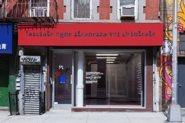
334 Broome Street
Société Réaliste: A Rough Guide to Hell
September 5 – October 27, 2013
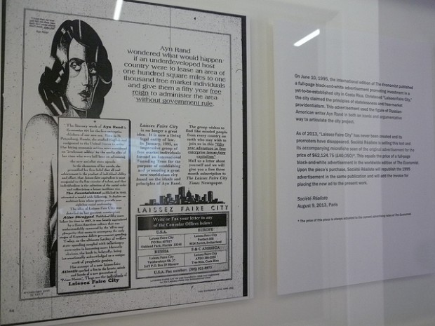
What’s on view: A new, Frankensteinian typeface called “media police,” which combines the fonts of various newspaper logos; scenes from the Fountainhead film, with human figures removed; and a copy of a 1990s advertisement for “Laissez Faire City,” a new city proposed on the ideals of Ayn Rand and unbounded capitalism.
Whitney: Like Malinowska’s A Hawk from a Handsaw, A Rough Guide to Hell looks at the consequences of unchecked capitalism, through abstracted paragons like newspaper fonts (evoking tridents and devil tails) and The Fountainhead (through shots of sterile, masculine film sets). It’s recent utopia, made to look hellish.
The brutality of Ayn Rand’s philosophy doesn’t fail here because it’s pure evil, but because it’s so purist that it’s dangerous to take as a blanket prescription for everybody. When I read The Fountainhead as an undergrad, I didn’t understand it as a capitalist manifesto—I read Howard Roark as an ideologue for artists and freethinkers. Here—in a 1995 advertisement calling for a “Laissez Faire” city in Costa Rica—it’s practically fascism.
Paddy: I don’t get that from the advertisement, though I agree that Société Réaliste is depicting a rather bleak picture of what Ayn Rand’s utopia might actually look like. Fascism is defined by devotion to a single leader, an emphasis on the military, and a love for the state. This ad isn’t advocating for that (though admittedly the rendering does remind me of Metropolis).
It’s worth mentioning that the purchase price for this work $62,124.75, the cost of a full page ad in The Economist, where it was originally run, plus the cost of actually placing it, which the group wants to do. So, in sum, $124,249.50. I like the pricing, but I’m a little disappointed that it would run without modification. Does nobody want to find out what the response to an ad like this might be?
Whitney: Do you mean it should be modified because it looks so out-of-date that it wouldn’t pass for a real call?
Paddy: Yeah, like, none of the contact information listed in the ad would be up to date, so how could anyone who wanted to start an Ayn Rand Island do so? This may sound like nitpicking, but keep in mind, the Occupy Movement was formed in response to a fake ad by Ad Busters. Ideas are powerful but they have to be actionable.
Whitney: I thought so … seems like a missed opportunity, now that I think about it ….
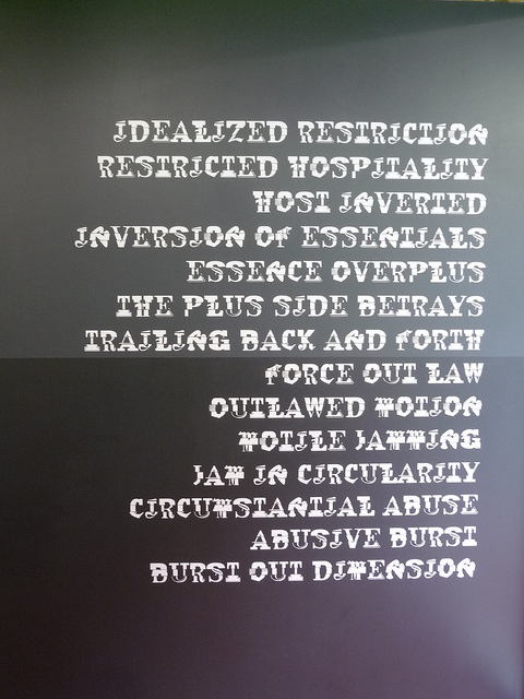
Overall, I thought the show was a little too formulaic, and the beauty of the font isn’t fully explored. They’ve used it to spell big paragraphs of “poetic text of common computer error messages” like “Disordering complexity/complete forgery/forget tautology” on grey and black backgrounds. For me, they might as well have written “The quick brown fox jumps over the lazy dog.” The same goes for the Fountainhead shots—it’s a logical move in the show, but didn’t really hit the emotional point it could have.
Paddy: Does anyone understand why they’re using common computer error messages?
Corinna: I spoke with the guy manning the gallery about it because I didn’t get how a phrase like “disordering complexity” was supposed to related to a “common computer error message.” There is no such thing as a pop-up that reads “404: Disordering Complexity” or “Warning! Complete Forgery.” He told me, what they hit on was the rhythm of computer messages—which would’ve been conveyed better with some numbers, or some sort of visual cue like a pop-up window—with new text. So, yeah, the artists aren’t using computer error messages; they’re coming up with new ones that you’ve never seen before.
I mostly buy it.
Paddy: I still don’t get it. For the most part, it’s impossible to figure out that these are error messages at all without reading the press release. Also, what does this have to do with show concept, which is about creating a capitalist utopia? Who sees a nonsensical computer error message as utopic?
Corinna: Maybe the utopia bit is being overplayed in the press release. All societies, even utopian ones, deal with power, and who’s in power to say “no.” You have to say “no” to something; the regulated market is what a Randian society would refuse, I suppose. I see error messages as being one of Society’s No’s—they tell you when to stop, or when there’s no way in Hell you’re gonna access a page because you’ve physically reached an endpoint on the Internet. All that said, that might just be my interpretation, and it might be a little loose. The artists’ presentation is not straightforward—I wouldn’t have gotten much out of the text if it weren’t for talking to the guy at the gallery, or reading up in the press release. The artists have some work to do to make their points clearer.
Now from a design standpoint, I couldn’t stand the fonts. They look like some combination of steampunk and stackable cups. But I did think the fonts were smart, and set up a clear set of rules: here is what we know about capitalism, and we’re either going to erase it (the Ayn Rand video), cut it up (the fonts), or market it (the ad for Laissez Faire City). Anyway, it was a good show, but maybe it’s just good because I thought the critique was pretty straightforward—okay, maybe after reading the text and talking to the dealer in the gallery—and because I like European-style conceptualism (whatever that means).
Paddy: Those fonts are smarter than me. They’re assembled from different newspaper logotypes and include geographic locators in their names. I get that this is supposed to establish a kind of placelessness, but lacking a background in graphic design I have to be told that’s what they’re doing to understand the gesture.
That characteristic contributes to a larger issue that we’ve all identified; it’s a clever show that doesn’t communicate enough of its ideas through visual assets.


{ 1 comment }
“Visual assets” at the end there is qu/easy.
Comments on this entry are closed.
{ 1 trackback }