
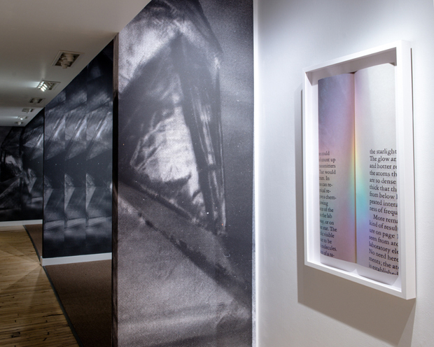
Partial view of Glowing Wavelengths In-Between by Sonja Thomsen at The Coat Check. Exhibition runs through November 30. Photo courtesy of the gallery.
AFC’s Chicago contributors Robin Dluzen and Pedro Vélez ventured beyond the usual West Loop dealers, opting instead to analyze a selection of those organizations and spaces that pave their own ways: the glorified art walk, Brave New Art World; the artist-run space, AdventureLand; and Roots & Culture, a well-established non-profit gallery that regularly exhibits emerging art.

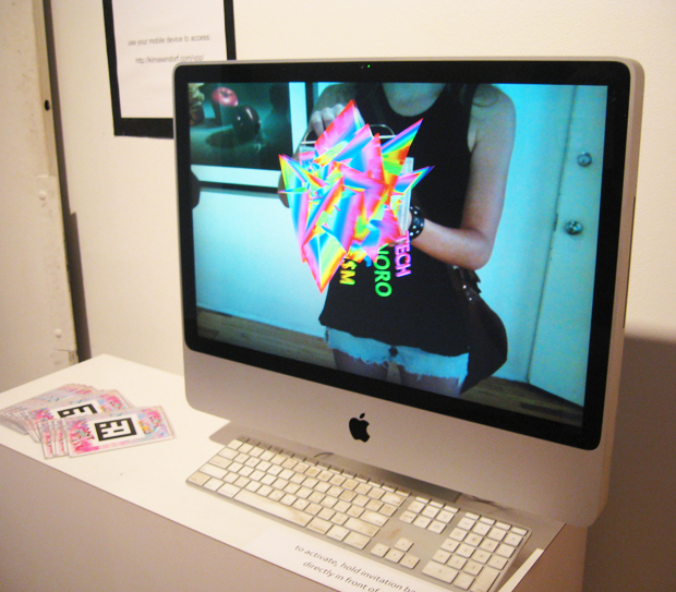
Photo courtesy Brave New Art World and Edouard Pierre.
Brave New Art World
First Thursdays, May – October
River North Gallery District, Chicago
What it is: An art walk with curated performances and artist talks in one of the older, more condensed gallery districts of Chicago
Robin Dluzen: Honestly, I was skeptical of Brave New Art World when I first started receiving the press releases from founder Claire Molek back in March. The BNAW “manifesto” blanketed my inbox and, I’m sure, everybody else’s, while the printouts of it were dropped off at galleries all over town. Filled with lofty, unspecific language, the press release manifesto was pretty unclear:
We maintain there is infinite, inherent value in the practice, product and distribution of art as a vehicle for consciousness … By taking part in this movement you ultimately purpose your value as an individual, and as a member of the human race. Thereby we progress our civilization as a whole with every thought, action, expression or motion.
When I asked a River North dealer about BNAW, he said, “Yeah, we’re excited! First Thursdays is back.” That solved the mystery for me: it’s an art walk. While I can’t speak to Brave New Art World’s direct effect on “the progress of our civilization as a whole,” I can say that it has, in five short months, begun reversing the River North stereotype as a stale district of decorative craft and secondary market Imagist stuff to something more contemporary, yet accessible. Moreover, it’s made its young founder Claire Molek into a local darling.
Pedro Vélez: Yes, the @BNAWTRIBE manifesto reads like teenager’s wet dream. It’s definitely dumbed down for arty-farty types like us. But I think that’s the idea. Claire is trying to attract a younger audience of buyers, hipsters, and yuppies to a mummified gallery district. The truth is River North needs BNAW. Claire is creating noise and hype, and I know her concept works; the last time I visited Jean Albano Gallery was in 1999, and suddenly there I was a couple of weeks ago, feeling surprised to be in Albano’s imagist-den checking out Technoromanticism, an engrossing exhibition of digital art organized by up-and-coming curator Alfredo Salazar-Caro. There are other spaces in River North like The Coat Check and ZG Gallery that that also deserve more attention, but people might be reluctant to visit them because of the River North stigma.
Robin: And the contemporary photography space, Schneider Gallery. But I think the interesting thing is that, yes, a couple of the River North spaces would be at home in the West Loop; though that doesn’t necessarily mean that the West Loop viewership, buyers, and critics are coming to River North just yet.
Maybe BNAW doesn’t need them. BNAW has seemingly produced a new audience to blend with the regular River North-goers, and that is truly a feat to be lauded. But, I wonder, is that turning into new sales for the galleries?
Pedro: Not yet, at least from the dealers that I have talked to. The problem is many dealers are reluctant to join the wave, but it is not like they have anything to lose. The funny thing is that those who are still reluctant to join the wave are using BNAW’s platform to their advantage by keeping their galleries open during these events because they are getting a ton of foot traffic. I don’t think we should expect a quick turnaround in terms of sales. It will take some time for the BNAW brand to fully formed. Who knows, Claire could very easily spearhead an alternative gallery district to the West Loop and away from River North. I would love to see that.
Robin: Does “joining the wave” mean changing their programs to sell contemporary art? Because many don’t need to change their tunes, in my opinion. Places like Printworks and Carl Hammer have quality programs heavily based on historical art.
And yes. It will, of course, take time for this to turn into measurable sales, but sometimes I think we need to be reminded yet again that we shouldn’t be content with just “exposure.”
Pedro: Not dissing Hammer or Catherine Edelman; they have wonderful programs. Still, the River North brand is tired and one has to wonder why those galleries aren’t in a better location, closer to the contemporary market. It’s a “tell me who your friends and I’ll tell you who you are” kind of situation.
Robin: Remember, River North used to be the contemporary art world in Chicago. We don’t need to give all the credit to the West Loop.
Pedro: There are very few galleries in the West Loop anyway, so no, I’m not giving all the credit to them. Chicago’s gallery market is made of clusters of spaces, not really districts anymore.
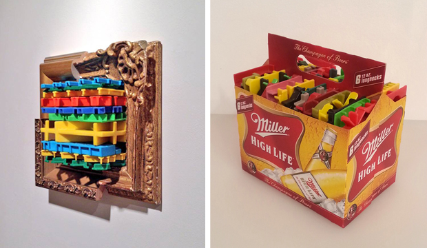
(left): Charles Spurrier’s ‘Gold Monkey (Gold Frame),’ 2013, plastic wire and wood, 11′ x11,’ at Adventureland. Photo by Robin Dluzen; (right): Charles Spurrier’s “Six Pack, Miller,” 2013, plastic and cardboard, 8” x 8” x 5.5.” at Adventureland. Photo by Pedro Vélez.
Charles Spurrier: Color and Desire
November 1 – December 7, 2013
AdventureLand
1513 North Western Avenue
What’s on view: The New York-based artist’s works of found frames and colorful plastic, along with fingerprint collages and a faux-mounted deer head
Pedro: Spurrier paints with plastic detritus by accumulating, reshaping, and repurposing mundane things like colorful toy parts, milk crates, and air fresheners on paper as well as other types of containers. My favorite piece is the one where he packs bunches of cut-off sections of plastic crates inside a Miller High Life six-pack holder. I felt so compelled to just walk off with it.
What I really dig about his work is how he transforms these containers into intricate geometrical abstractions, patterns, and mandalas. I also love how he sometimes adheres these geometrical abstractions to some of his surfaces with acrylic paint. But you have to look closely to notice that: Spurrier has a delicate touch, everything he makes seems effortless. All that reminds me of Tom Friedman. And some of the patterned printed surfaces have the sci-fi metaphorical intricacies of Pedro Barbeito’s early work.
Robin: I agree that these pieces are alluring, however I don’t think that all the works transcend their material novelty. Some, especially the larger works, come across as formalist paintings made out of something besides paint, while only a few truly take advantage of the unique properties of the materials he’s chosen. Those include the diptych entitled “Mom and Dad,” the piece of plastic milk crate is not simply another layer of pattern; on this intimate scale, it acts as a screen, a candy-colored barrier separating the viewer from what’s underneath.
Pedro: What’s so wrong about post-minimalism?
Robin: Nothing’s wrong with formalism and post-minimalism, but if you’re going to reach out to something beyond paint in a two-dimensional piece, why just plop it there?
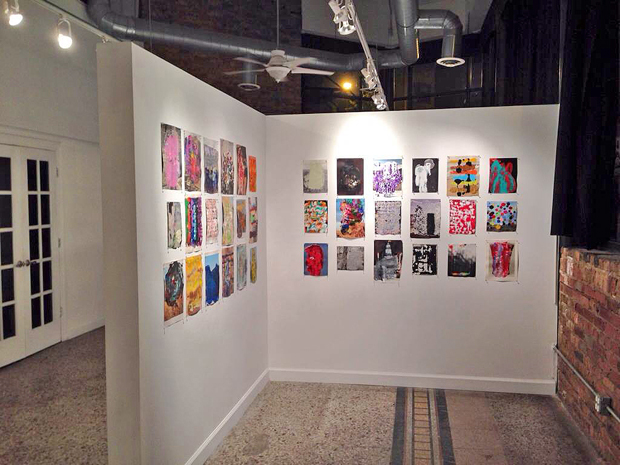
Installation view of Rusty Shackleford’s ‘Pull, stamp, and discard 1-36,” 2013. From his exhibition Dream Feeder at Roots & Culture. Photo by Robin Dluzen.
Rusty Shackleford: Dream Feeder, Katie Torn: Dream House
October 18 – November 23, 2013
Roots & Culture, Chicago
What’s on view: Digital prints, works on paper and objects by Rusty Shackleford, and digital prints and a digital animation by Katie Torn; both are Chicago-based artists
Robin: Torn’s sterile, digitally rendered still-lifes don’t engage me as much as Shackleford’s work. Clearly, the digital prints are the focus of Shackleford’s exhibition, and the inclusion of the 36 small works on paper are a bonus. Unlike the way that exhibiting preliminary sketches next to a completed painting, or printing plates next to a finished print, can often detract from the final product, Shackleford’s paint-blotched book and magazine pages inform the unusual process that’s visible in the prints. I suppose traditional printmaking processes are similar, but Shackleford’s process is more intriguing because it’s capturing a moment of physicality in the crisp, immaterial final product of a digital image file.

Rusty Shackleford’s ‘Yellowman,’ 2013, lambda print. Courtesy of the artist.
Pedro: Shackleford’s interest in nostalgia and archeology is overwhelmed by his process. I kind of get nostalgia from the crude textures formed by his pressing of paint on to a scanner’s flatbed. Those look like photo documentation of tile caulk from an abandoned construction site. Then he has these magazine pages—my best guess is they are from National Geographic—with images of archeological sites and Pre-Columbian objects which he hides under layers of paint. My problem with the work is that it seems Shackleford can’t master his mediums and the end result is neither a good painting nor a good photograph. His colors come straight from the tube and the photographic prints are flat. I guess what I’m trying to say is that his prints look cheap. Actually, I take it back. Now that I think about it, Shackleford might not be a good craftsman but he is a good image maker. Proof is “Yellowman”—I’m really intrigued by the walking Aztec (or is it Mayan?) statue covered in yellow slurs of paint. Where is he/she going?
Robin: I see the archaeology, yes, but the nostalgia, not really. And I don’t think that the content of Shackleford’s source material is overwhelmed by the process; I think they work in tandem. The depicted natural landscapes, artifacts, and architecture from around the globe are experienced by most of us only through the mediation of a reproduction, and Shackleford’s process points to that by and while adding more of his own layers of mediation upon it.
It also doesn’t matter whether the pieces are “good paintings” or “good photographs” (I actually see them as collages). In any case, it’s 2013. “Deskilling” is an institution. It’s a well-established method of making. These are conceptual works, and traditional, so-called “skilled” handicraft is a non-issue here, as far as I’m concerned. It’s wrong to assume that the artist can’t master his medium because has not exercised a technically skillful application of paint or printed the sharpest photo. He’s simply made a choice not to.

Comments on this entry are closed.