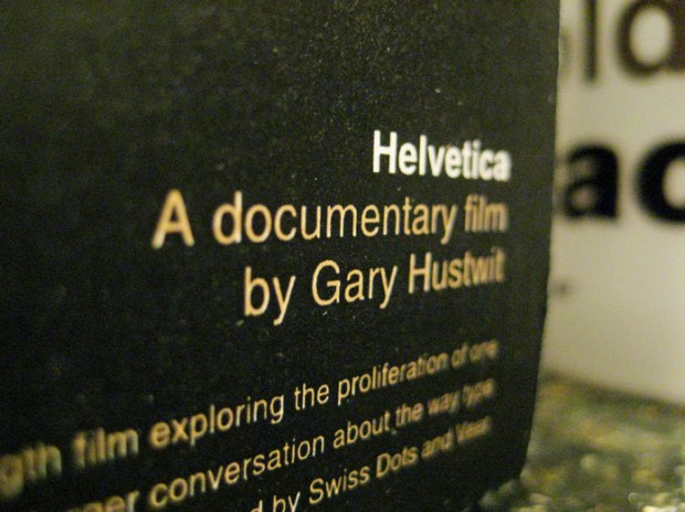
Very little art receives unilateral recognition as a work of genius because it inevitably requires at least a few people put their predilections aside. I don’t happen to love mafia movies, for example, but I manage to get over this for indisputably great films like The Godfather, Raging Bull, and of course, My Cousin Vinny. Gary Hustwit’s new documentary Helvetica, named after its subject (and opening today at IFC Center), suggests the famous font is in a similar class despite suffering from overexposure in the 1970s, only a few decades after its invention. Not thatHelvetica claims to be about proving or disproving the overall value of the font — the film seeks to articulate its character more than anything else — but the success in following a path that addresses the type’s feel, use and functionality comes in the articulation of its elegance of line and form. These aesthetic qualities prove so powerful that the font takes on almost chameleon-like characteristics.
Opening with a barrage of billboard shots, scrolling news services and various street and subway signs in Times Square, Hustwit aggressively illustrates how type permeates our daily lives. Once establishing this basic premise, Helvetica devotes much time detailing its early history and development, going on to discuss the subsequent rejection of the font for its ubiquity and appeal to giant corporations, and its final re-acceptance amongst many contemporary designers. At each stage in the film, the designers, typographers and critics interviewed explain how the ideology of the time informed the making and perception of the font, often pairing these explanations with personal anecdotes or clever quips.
“It’s like being asked what you think of off-white,” says the typeface designer Jonathan Hoefler, suggesting Helvetica is like a background so versatile and ubiquitous you don’t notice it. Anyone with an art background will recognize the power Hoefler attributes to the font in this statement; white, the most important color in any artists palette, can be bold or simply disappear completely. Modernist designer Massimo Vignelli underscores the latter half of this comparison shortly afterward, explaining that type should be an empty vessel that simply facilitates the expression of text.
Not everyone in the film takes this position, but when experts describe the font as being optimistic, mechanical or boring, the early discussion provided by Vignelli and type designer Mike Parker helps viewers understand how to apply personified attributes to inert form. Parker explains that Helvetica is held up by the white space between the letters, describing the font in the language of objects as opposed to mere tool created to facilitate publishing. You believe him not because it sounds “right,” but because once the idea is proposed, you can see the characteristics attributed to the font throughout the movie in the same way you might notice the emotive feeling of a sculpture or painting.
However, given the success of film’s aesthetic and historical commentary, I can’t help but wish that greater attention was paid to a few of the seemingly smaller details. Putting aside my distaste for the shaker-friendly vanilla rock documentary score, Hustwit features confusing interview footage with information architect Eric Spiekermann; though entertaining, his attempt to explain the font’s popularity leads to speculation that the default Helvetica typeface of Mac and Windows operating systems support and encourage the font’s popularity. The point, however, lumps PC’s Helvetica-based default type Arial with Macs’ real Helvetica, assuming the audience knows its history as a font developed by Microsoft after Linotype (the company holding the proprietary rights to the typeface) refused to sufficiently lower their licensing fee for its use.
The distinction may sound too technical or wonky, but Helvetica the film exists because its subject continually stokes this kind of debate — once thought closed — about the font’s legitimacy. Columnist Rick Poyner provides some insight to this phenomenon near the end of the documentary, suggesting new software and social networking sites that invite people to choose fonts bring renewed interest to the field. Enthusiasm for typefaces had been brewing much earlier than that, however; it was at least 15 years ago when people began trading and collecting fonts as a pastime. The most exciting current surrounding the font stems not from it reaching a larger audience (after all, how many more people can it reach?), but rather that its audience now has the skill and resources to recognize it.
This article was originally published on September 12, 2007 on The Reeler.


{ 1 comment }
Any new thoughts on “Helvetica” since 2007?
Comments on this entry are closed.