Jennifer Meanley: Far away, in the meadow
March 22nd – May 25th
SECCA
750 Marguerite Drive, Winston-Salem, NC 27106
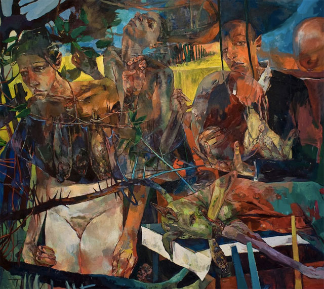
What’s on view: A series of Inferno-inspired forest scenes, reminiscent of Nicole Eisenman, by the young Greensboro-based artist Jennifer Meanley. The title “Far Away in the Meadow” comes from Ray Bradbury’s 1962 novel, Something Wicked This Way Comes.
Whitney: I probably wouldn’t have given Jennifer Meanley’s paintings much of a look if I’d seen them through my inbox, and I would have missed out. This could be really cliché– vaguely war-like scenes mixing familiar style from Marlene Dumas and Kiki Smith– but up close, the paintings are beautiful. Starving dogs and tired women look out from idyllic paradise forests. Scumbly skin manages to look like a combination of bruising and the patchy light that comes through forest canopies. Her figures look like battered bathers.
I read this as feminist work, but with all the literary references, it could just as easily be all fiction. One title “Melopoeia” comes from Ezra Pound’s three kinds of poetry; the word refers to when words are charged “over and above their plain meaning, with some musical property, which directs the bearing or trend of that meaning.”
I’m not sure where Meanley is directly the meaning, though, other than using pre-charged subject matter. That’s ultimately the problem I have with this work– it’s beautiful, complex, but still vague enough to accommodate lots of possibly-random interpretations.
Paddy: This read like a bit like a sci-fi novel; lavish landscapes consumed by disease and misery. The dying dog that’s eating its arm off and the recurring motif of the sick horse paint that picture, but so too do all the sad faced figures.
The meaning of the show as a whole felt directed enough for me, but I agree that it’s hard to know what the works are saying individually. Many looked as though figures were participating in a cultish ceremony “Indefinite Quadrant Performance”, for example, while others seemed more focused on traditional painting. I’m thinking of the tondo still lives here. Overall, the show presented different visions of our world, with the same repeated figures—including Meanley herself. There’s a strong internal narrative and vision here, and for that reason, I’m not sure it’s necessary that all the pieces align perfectly.
Corinna: The exhibition photos on SECCA’s website don’t do justice to the rich, vibrant colors in Meanley’s work. The images up on her own site are much better. I don’t have much to say about the show; Meanley’s a painter who loves painting for the sheer hell of it. There’s something a bit dated about how she paints people—I can’t put my finger on it, exactly—these tortured souls, these big eyed, terrified Bacon/Modigliani/Giotto types.
Paddy: Yeah, it’s hard not to think of other painters when looking at this work; R.B. Kitaj for the literary references and cut up compositions; Liam Goleb and Saville for figuration and paint handling; Tom Tomson for the landscape. But I think those references work; all those artists had incredible paint handling skills, and that’s true of Meanley. Just look at “The Reluctant Bride“, an image of a bloodied horse with human skin tone qualities reaching out to a screaming woman. There’s a real grace to the paint handling and and nuance within her palette.

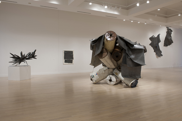
Installation view: “Nancy Rubins: Drawing, Sculpture, Studies”, Weatherspoon Art Museum, the University of North Carolina at Greensboro, 2014. Photo: Dan Smith.
Nancy Rubins: Drawing, Sculpture, Studies
February 8 – May 4
The Weatherspoon
What’s on view: Nancy Rubins’ models for her Monochrome series, life-size sculptures of boat trees (literally, boats attached to metal bars like bunches of bananas), and enormous pencil-covered sheets of paper that have been rubbed so hard that they look like brushed steel.
Whitney: I’m surprised I liked this show. It has all the elements of silly corporate sculpture, with heroic domination over onerous materials (boat sculpture), and then the classic Sisyphus artist story of deriving meaning from the physical evidence of untold man hours (huge sheets of paper painstakingly burnished with pencil).
On their own, I don’t think I would have been particularly interested in either the boat-trees or the drawings, but the combination of the two that made this interesting to me—labor, and power over labor. The Weatherspoon’s Director Nancy Doll told us that Rubins had started working with water heaters, just because they were cheap. It’s surprising to see such big Modernist-inspired works taking what’s available, and results in a DIY Modernism that’s still muscular, but it feels a little more accessible. It feels like middle-class art.
One banana-boat tree, for example, was drooping off its pedestal, as though those intricately-crafted balsa wood boats weighed it down. Rubins holds onto to some humanity, even in those enormous monuments.
Corinna: Except for the drawings, I don’t really buy into that idea that using inexpensive materials is integral to Rubins’s practice. Those boat sculptures we were looking at were maquettes for huge sculptures made with real boats. That’s some Koonsian-type excess right there. But it’s not glitzy excess.
Back to her hot-water heaters, they’re huge hunks of used-up containers. They’re trash. Here, they’re reused, but only to become something like a rack for Rubins’s paper drawings. In the game of rock-paper-scissors, paper beats out a heavier element like rock. That’s happening here, too. So I guess this work is kind funny, seen through the rock-paper-scissors lens. But that’s only a game. In real life, paper would get crushed. The point of bringing this up is just to say that paper shouldn’t win out over mass, especially not in art when works-on-paper rarely garner the attention of weightier materials. I’m thinking of practically every show I’ve seen at Gladstone Gallery (Peter Buggenhout, Sarah Lucas, Anish Kapoor).
I’m not sure if I like using the term “middle class” to describe art; there’s nothing wrong with it, but popular middle class values include “Belief in bourgeois values, such as high rates of house ownership and jobs which are perceived to be secure” and “eager participants in pop culture.” None of that’s really going on with Rubins’s discarded materials. If there’s anything middle class about her art, it’s the belief in upward mobility; she turns trash into art, like some art version of My Fair Lady.
Paddy: Hahaha. Agreed!
Did anyone else find the combination of the graphite drawings laid on top of the containers really contrived? I know it’s useful to show the connection between mediums, but I thought the sheets, affixed to the wall, looked fair more sculptural and metallic than literally draping a couple of them over those barrels as if they were metal.
Corinna: Yes! The corner piece on the far back wall was brilliant on its own. From a distance it looked like it could’ve weighed hundreds of pounds, but that was through the sheer weight of her marks.
Paddy: Oh, man. That was great. I’m less convinced by those boat maquettes. They’re useful to the show as a whole as they provide scale and technique variation, but they feel formulaic to me. Come to think of it, the entire practice feels that way—one approach for each body of work—but it doesn’t always feel like a trapping the way Ruben’s boats do. They’re clusters of handmade, yet generic boats on a stick. It’s just really empty work.
It’s worth mentioning that The Weatherspoon gallery makes art work look more glorious than nearly any Chelsea gallery. The wood floors warm the space, which is large but not so much so that it seems a spectacle. Any artist should be thrilled to show there.
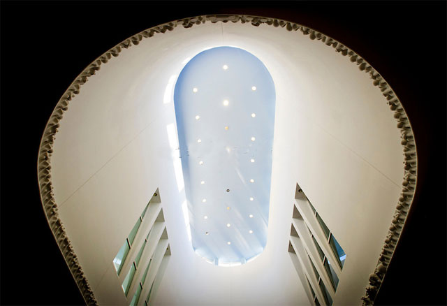
Tom Otterness, “The Frieze” (1982): A Ceiling Frieze in the Weatherspoon’s Foyer
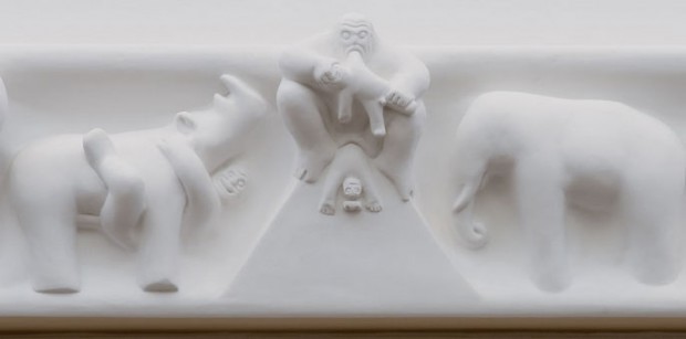
What’s on view: A relief made in an ovular foyer, which tells two different creation stories; men split off to the left, and women go to the right. Women take a bath and do handstands, men work, build civilization, and blow each other up. When they meet back in the middle, the women dismember the men’s king, woman eats the man, while she births out another man.
Whitney: Best Tom Otterness ever!
Corinna: Agreed. Unlike the Otternesses you’ll see at the 14th Street – 8th Avenue station, these hover on the side of darkness. Here we’re looking at the king who’s about to be eaten, I think.


{ 1 comment }
Thanks for this article (and the one about Elsewhere). I’m a regular AFC reader who lives in Chapel Hill, and it was a pleasant surprise to read about shows that are happening in my neck of the woods. Hope you enjoyed your time in NC.
Comments on this entry are closed.