
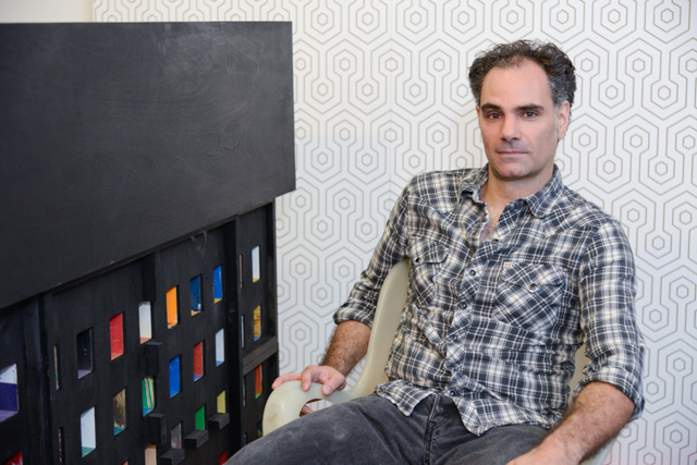
Aaron Williams in his studio. Image: Christian Grattan
[Editor’s note: This week and next we’ll be featuring the work of seven artists we think you should keep an eye on. Not only are they making extraordinary work, but they’re being recognized for it as well.]
A brief look at Aaron Williams’s work isn’t going to get you anywhere. His spray-painted crumpled posters look like Tauba Auerbach’s work, his photos resemble Photoshop gradients, and his routed paintings channel Joan Mitchell. Everything looks familiar. And that’s not an accident. You have to spend time interpreting the references.
Take “Like Pictures,” a diptych in which Williams blows up the carpet patterning from “The Shining” into a Frank Stella-like wallpaper. Throughout his work, improbable fashions are similarly commodified; Williams’s machine-like reductiveness seems acutely aware of how stock images, B-movies, Abstract Expressionism, and even the carpet from “The Shining” can become formalist fodder to put on an iPhone case or a throw pillow. Although the question of whether contemporary formalism is simply decor may not be loud, these days it’s certainly bold.
Williams gives similar treatment to popular art tropes: his spray-painted crumpled posters are decidedly unheroic, his routered replicas of expressionist mark-making seem calculated, and his photographs of the skies outside the studios of artists like Jackson Pollock look more like cool Photoshop gradients than they do markers of anything physical.
And yet, paradoxically, the work never fails to look matured. Sometimes that has to do with size or the work’s formal polish, but a plethora of gallery exhibitions also help. Over the last year, Williams has shown at Garis & Hahn, Lu Magnus, Storefront Ten Eyck, Associated Gallery, and Parallel Art Space. He also launched two solo shows, one at Mulherin + Pollard in New York, and another at LaMontagne Gallery in Boston.
With a CV like that, Williams is a rising star by any definition. We predict success for him, though, not because of what’s on his resume, but what’s in his studio.
What makes a good artist?
The ability to ask difficult questions about one’s work. The willingness to think about the consequences of one’s work outside the studio.
Who and what influences your work?
Much of my new work has involved a critical look towards common art-making strategies and aesthetics. I think about the successes but more often the failures of an art practice, as well as people who have moved the language forward. Art that breaks the passive, illusionist wall comes up a lot for me: Barnett Newman’s architectural zips, Felix Gonzales-Torres’s candy piles.
Certain filmmakers have been great influences, and Kubrick in particular is a big presence in the studio. I’m amazed and inspired by how much he asked of his work and how tangible the effects of his films are.
Your studio has images that look a little like printed gradients, but are actually photos of skies overhead well-known artist studios. You’ve paired this with panels in which you’ve routed out patterns in the the surface. How do you see these works relating to each other—are they meant to relate to each other?
The graded blue photographs came in response to the routed, panel pieces. Last year, I photographed several Abstract Expressionist paintings, focusing on the accidental marks on the canvas: drips, spatter, pools of paint. I isolated these into a digital drawing and routed the marks into a series of painted, construction grade panels. I was questioning lofty, modernist tenets and I wanted to see if marks that were originally created in a completely organic way could translate through an analytical process. The resulting piece is 4’x32′ and was painstaking on many levels to fabricate; I wanted to make another, less exertive body of work that dealt with a different facet of these ideas.
The photographs are images of the sky, taken outside my studio and the studio of de Kooning on Eastern Long Island. I like the idea of materials doing a lot of the work and I was attracted to just pointing a camera up at the sky. Though the photos are a tacit record of place and the studio process, they’re almost characterless; they could be created just about anywhere. I was surprised, ultimately by how much the images referenced digital, rather than natural space.
Is there a way to define or articulate what visual poetry is? I think that’s an important element to your work.
For me, visual poetry is by definition, transitory. The most affecting art pieces are ones that I don’t have a language for yet. I think when one knows how to make poetry, it ceases to be poetry. I try to pursue my ideas in the studio, allow things to happen and to think of the process as building a system of belief and learning. Sometimes these parts make poetry.
In one series, you crumple up posters or magazine images, spray paint over the crumples, and then flatten the image and adhere it to board. How important is the source image to this process?
That was a body of work I made a couple of years ago where I started to really question some modernist ideas, particularly those related to painting. I was thinking about the brushstroke and gesture, particularly the Abstract Expressionists. This set of aesthetic beliefs still casts a long shadow over the art world and there’s a lot of myth and fetishizing that goes on. I wanted to create an alternate mark-making in response to this, something completely unheroic. Rather than work with artist materials, I used mass-market posters, crumpling them in a sort of subtractive gesture. I liked that the images situated the work within a certain contemporary conversation but they weren’t particularly important to me as individual places or people. I saw them in general terms; landscapes and portraits representing the two essential ways to organize space in a painting.
What is the role of illusion—the seen and the unseen—in your work?
As far as illusion, none, really. I realize that some of my work has an illusionist, trompe l’oeil effect but that’s a by-product; if the conversation centers on those formal elements, I’ve failed.
The unseen is a bit different. For me, the unseen brings up ideas that might not be immediately evinced in the piece. Learning more is necessary for me to be interested in an art piece—if I know the parameters of the conversation, I’m usually bored. I try to make work that requires more than just a familiar, visual communication; work that can be a catalyst for ideas.
Do you see yourself living in New York for the next five to ten years?
I have a long answer to this question that has to do with artists, the potential and real failures of art, class systems, colleges designed by prison architects, and astrology, but the short answer: yes.
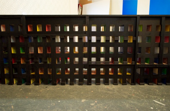
Machine For Living (in progress), 40″x 108″, failed paintings (wood, plywood, mdf, paint), black ink stain. This sculpture is a recreation of a railing from the balcony of a Le Corbusier apartment building, constructed from failed paintings of mine.
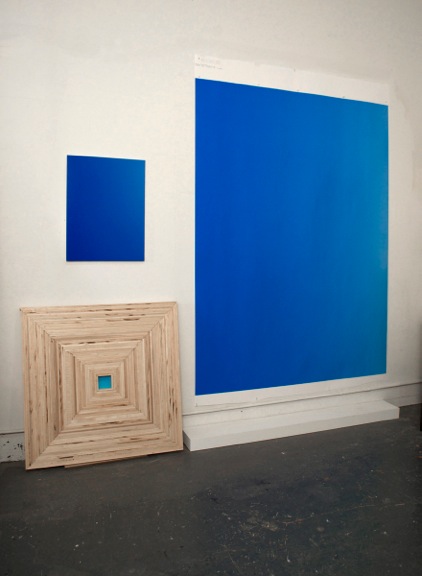
Photographs of the sky taken outside deKooning’s studio on eastern Long Island (24″x 18″ C- print mounted on panel, 80″x 60″ C- print) and an in- progress piece made from carpentry remnants.
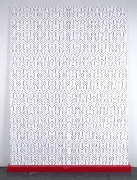
Like Pictures, 99″x 74″, CNC carved, laminated plywood, MDF pedestal, paint. I was thinking about the idea of late modernism existing primarily as decor; “a B movie”, as John Armleder puts it. The height of decor is a repeating pattern. This particular pattern comes from the Kubrick film, “The Shining”, in which Dick Halloran says to Danny, ” It’s just like pictures in a book, Danny. It isn’t real”.
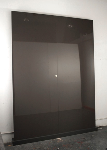
90%, 99″x 74″, Laminated MDF, pedestal (MDF, paint), Krugerrand (1 troy ounce of gold). Based on Richter’s Gray Mirror series and recreated in consumer grade materials with an ounce of gold from apartheid S. Africa embedded in the surface.
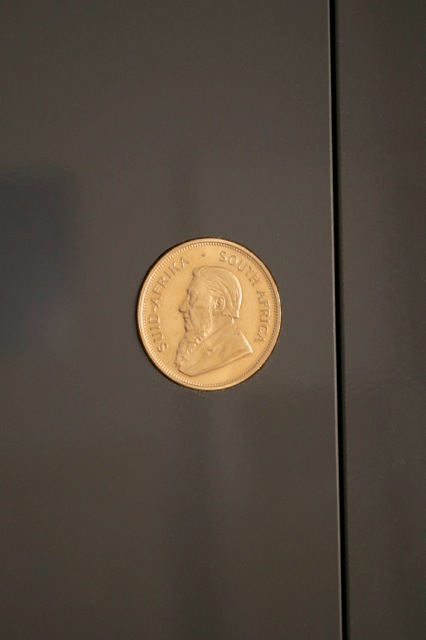
90% detail

{ 1 comment }
An amazing talent getting some much deserved recognition.
Comments on this entry are closed.