

Nick Cave, “King of the Hill” (2014)
Nick Cave: Made by Whites for Whites
Jack Shainman Gallery
513 West 20th Street
Runs through October 11, 2014
What’s on view: Art arrangements of racist objects of African-Americans, found at thrift stores and often intended as furniture. This ranges ranges from a black man’s head as a “spittoon” surrounded by generic oil paintings of ships at sea; a piano stool which looks like a black man; a series of overcoats containing gold necklaces, chains, and watches, hung on the walls by outstretched black hands. Throughout, statues of black boys and dogs are surrounded by their own canopies of beads, metal flowers, and ceramic birds, and a Golliwog doll sits atop a pile of folded quilts.
Corinna: I hate to admit this, but thank god there were no soundsuits, that most trotted-out element of Cave’s practice. In general, Made by Whites for Whites was more thoughtful than many of the other shows we saw out in Chelsea this week: Nick Cave’s obsession with collecting historically racist objects and then turning them into “art” objects could have potential. But I still left with a hard question on my mind: What’s to be gained from putting these objects “made by whites for whites” into sometimes absurd, sometimes sentimental, sometimes offensive new configurations?
Whitney: I also left a little surprised by how fucked-up some of these things are, but more or less ambivalent. There is value in simply raiding our grandparents’ drawers, so that very recent history isn’t erased; Cave does start to make a case for that in a string of gold letters which read “The time is always right to do what is right,” a quote from Martin Luther King, Jr. One particularly good piece has an outstretched hand stacked with a tall pile of handkerchiefs; it communicates the feeling of serving, begging, and being treated as a piece of furniture all at the same time.

Nick Cave, Untitled, 2014
Corinna: The handkerchief (or napkin) work—that was the one work that stuck with me. For better or worse, I thought of Robert Gober’s detached body parts, but less abject and yes, more heavy-handed. Still, it had an emotional draw, about that pesky fact of the unbearable weight of continued servitude over the centuries—though that burden’s as light as a napkin.
Whitney: Yeah. But overall, Cave doesn’t shed much new light on the attitudes that produced these stereotypes; several of them are just offensively stereotyped black boy statues put on a pedestal and surrounded by wreaths. It doesn’t transform them much from the thrift store table, just makes them look expensive.
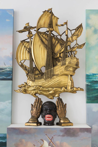
Nick Cave, “Sea Sick” (2014) (Image courtesy of Jack Shainman Gallery)
Paddy: Agreed. The same could be said of the sailboat relief and black bust shelf, “Sea Sick.” The history lesson seems a little more narrative here—we know slaves came on the those ships—but then the arrangement doesn’t seem like it’s motivated by anything other than commercial gallery trends.
Honestly, I want the suits back. We’ve seen a million of them, but they were at least inventive. And they freed him of having to do work about representation and identity, which while valuable, also feels like what’s expected of successful black artists in Chelsea. The whole show reminded me of what Nayland Blake told me a few years ago in an interview, when I asked him about gay marriage.
To me, a progressive idea of a society is one that understands and values difference in and of itself, because what happens otherwise in seeking sameness is that everything gets caught up in a trap of representation. In other words, African Americans are asked to represent African Americanness to the culture as a whole — they’re asked to do the work of discussing race — and the moment they don’t, they become unintelligible. People are like, “Why are you talking about class?” And at the moment the queer people stop talking about sexuality, and start talking about race or about something else, they get pilloried from and within their community for not doing the work of representation.
And that’s the thing that’s valuable about art: It can make representation complex, and it’s the place where we explore ambiguity and complexity within representation. It’s not like people can’t speak, but we have certain ideas, and the moment that’s challenged, people look at [us] like we’re insane. And that’s a really debilitating place because it’s a fixed system representing itself as change.
Corinna: Okay, I guess I see where you’re coming from—the soundsuits are complex, while for some reason these newer works seem to be vague, and less inventive? Anyway, the works look nice—and in the case of the overcoats, perfectly shiny objects for the art fairs. I predict I’ll see those at the fairs, assuming Cave has more than the three at the ready in this show.

{ 19 comments }
WHITE FAG CITY.
LIKE REALLY. 4REAL. #WTFTW.
Yup. We’re white.
HEY, IT’S AS GOOD AN EXCUSE AS ANY. SEEMED TO WORK FOR KEN JOHNSON, RIGHT?
Indeed the ignorance of people experience that comes with privilege is often worn as a badge of objectivity! It boggles the mind…
It is a fact, but here it’s being used in the pejorative, to signal how it seems to be limiting your view of this material. The tone throughout is very casual and often inappropriate to the subject. To say, for example, that an arrangement referencing slave trade is motivated solely by “commercial gallery trends” is really off, especially without providing any evidence of that. There are a few instances of that above, and I think it’s worth looking at again.
Thanks for your feedback Dushko, but I think this can be backed up. Display shelves, for example, are a commercial gallery trend. What does on them, of course, is another matter, but I think it’s fair to say that the arrangements themselves use a visual language common to commercial galleries.
a few minutes in i said aloud, “michael ray charles meets very bad david
hammons.” it was disappointing; nick cave abandoned his own rich visual
language and instead turned into an mfa student with too many
resources.
Oh well. She quit the art world…..
“it’s fair to say that the arrangements themselves use a visual language common to commercial galleries.”
Indeed, but that’s not what you said. You said:
“the arrangement doesn’t seem like it’s motivated by anything other than commercial gallery trends.”
That’s quite a different thing to say, and I think you know as much.
Whitney makes a similar argument earlier when she decides that Cave doesn’t transform these objects, he “just makes them look expensive.”
Again, these are just thrift store objects arranged according to commercial motives and conventions.
Given the subject matter, that is quite a serious claim, and even if you think, as you say that “it can be backed up” the fact that you publish something which doesn’t really back it up signals a certain arrogance, which I think the first commenter was pointing to pretty directly.
Is it not clear that I’m talking about the arrangement of the objects, not the content of the objects? Whatever you think is obvious to me, is not. I’m concerned if we’re coming off as arrogant or ignorant—that’s not the intent. But I do think the argument we’ve tried to make, can be made.
Display shelves are a commercial gallery trend, and therefore Nick Cave’s work is motivated by nothing more than commercialism? Display shelves and vitrines and pedestals (all of which were used in the show) are also used in museums, archives, libraries, and a host of other places that have anthropological connotations. Moreover, the watch-lined overcoats refer to a whole other level of commerce — the shady deal made on the streets, stolen goods offered on the sly. The stacks of afghans in the piece pictured at top refers to both factory and thrift shop.
If the show is parroting commercial vocabularies of display I think that you have to specify the range of commercialisms at stake as well as the multiple rhetorics of display. To reduce this work to “playing to the market” is awfully lazy.
If the works are ready made objects, the arrangement is key, is it not? When you say the arrangement has no apparent motives outside the market, you are judging the core of the work. That to me, would be exactly when you would want to back up your claim, but you leave it there to hang, repeatedly. Corinna even says, to drive the point home at the end, that these are ready for the art fairs. So you breezily accuse an African American artist of making these items look expensive and commercial, and you don’t see the problem?
You should be concerned about how you’re coming off. That’s why I responded to Whitney’s dismissal of the very apt, in my view, first comment.
I love comments because they give you an opportunity to learn. Now, I think this feedback has been pretty useful – it’s expanded the way I was thinking about the show – but I’m not sure the condescending tone is helpful. I’ve heard what you’ve had to say and have said it has merit. What are you looking to get out of this conversation?
I’m sorry, Paddy. I genuinely don’t want to condescend to you. I am, however, very frustrated with the tone and argument of this piece and I remain frustrated way your team has handled this stuff in the past, including comments. So I was annoyed to see it again—”Yup. We’re white.”—and I carried my frustration into these comments.
When you adjusted what your argument had been and called that adjusted argument “fair,” I found that disingenuous. But I see now that you actually didn’t understand the difference.
I apologize for not giving you the benefit of the doubt. Your approach to these comments was better than it had been in the past, and I appreciate that.
What I am trying to get out of this conversation is clarity about what was going on in the above article, why someone would write “WHITE FAG CITY” as the first comment and why people would say other such things privately.
Yeah, I totally get that. Our response to comments has been too dismissive or defensive in the past. I’m really trying to get better because I know it’s been an issue. That includes the posts too – I’m glad you took the time to really spell things out.
Really glad to hear that. Comments are obviously a very difficult aspect of publishing online, and I can totally see being defensive or dismissive in the heat or fatigue of the moment, so I appreciate the effort.
Especially on a Saturday night!
Okay, I see what you’re saying. Useful feedback! Thank you!
Comments on this entry are closed.