Jane Corrigan at Kerry Schuss
34 Orchard Street
September 13-October 26
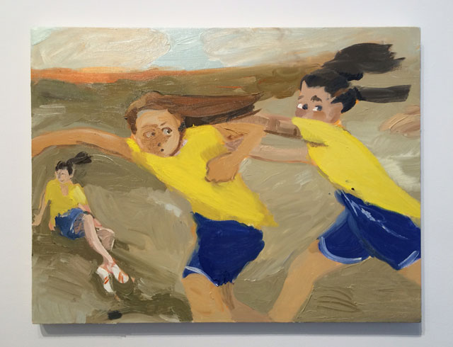
It’s been at least two years since I’ve seen a painting show as strong as Jane Corrigan’s at Kerry Schuss. Eight paintings of sporty teenage girls make up this show, each of which feels like the result of a quick live-figure painting pose. Not a mark on the canvas is without a descriptive purpose. The frenetic brushwork creates a self-contained, high-intensity energy consistent with that of her teenage subjects—and we’re told the paintings are equally young. Many were delivered just a few hours before the show opened.
The canvases on view—the largest being just 39 inches—are drawn from worked-up painted sketches (available for view in the back office to anyone who asks). Amongst the stronger works in the show, “Three Girls in a Field” depicts three girls fighting for control over what one assumes is a soccer ball. One girl’s face is barely rendered—it’s a mess of scribbly painting that matches the wind in her face—while her opponent’s eyes bug out, almost cartoonishly, as she grabs a hold of the girl’s arm. In another painting we see a girl on the ground with a shocked and near fearful look on her face thanks to a bloody scrape on her knee.
The mastery in these works lies not just in their technical skill, but that the subject matter feels true to life. The paintings imagine a fictional world not that far from our own. These girls could be our daughters or our young friends, and like most teenagers, while they may be aware of our presence, they are too wrapped up in their own activities to care.
Roxy Paine
Marianne Boesky
September 4th to October 18th
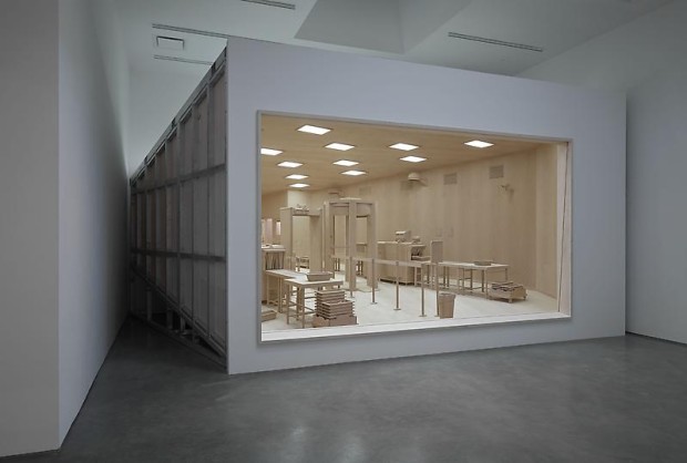
It’s hard not to be impressed by the technical skill that Roxy Paine brings to his life-sized wooden dioramas and unidentified machines. The latter look like a cross between a photocopier and an engine.
The centerpiece in his latest show, an airport checkpoint station, doesn’t just render every object perfectly, but actually accounts for viewer perspective. Close up viewing of this piece shows the station to be distorted—you are supposed to look at the work from far away so the objects scale properly, and the depth of field appears larger than it actually is.
As is helpfully pointed out in the press release, Paine is interested in the “tension” of “chaos and control, fact and artifice and the organic and the industrial”. It would be helpful, then, if the artist had actually tried to create any of this so-called tension. Simply identifying subject matter and materials with these qualities isn’t a statement so much as it is a representation of what we already know.
And it’s this kind of art-making that evokes the cynic in me. Isn’t the most obvious reason for replicating something in a nicer material and more impressive optics that you can sell it for more money?
Stephen Shore
303 Gallery
507 West 24th Street
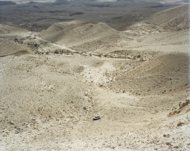
A boy sleeps with his head against a dirty bus window, and a small bit of orange reflects onto his hair. He is in Jerusalem, which means it could be light reflected through a sticker on the window or a head injury. The image is one of the first of over 40 on display, in the conflict zones of Israel and Ukraine. Even the most mundane images feel tinged with the poverty and sense of unease that comes with war. A green hill in Israel dotted with white stones reads like a graveyard, as does an abandoned car cradled by bone-dry mountains.
The images of Ukraine, which are separated only by a wall, were taken in the homes and villages of Holocaust survivors. That suffering mostly goes undocumented in these images, though a shot of rotting apples stuck in an eavestrough serves as an apt metaphor. Some wounds are invisible, and linger on as a result.
Genesis Breyer P-Orridge and Pierre Molinier
Invisible Exports
89 Eldridge Street
September 5th to October 12th
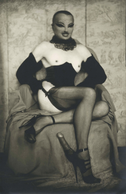
It’s probably a grand understatement to describe Genesis Breyer P-Orridge and Pierre Molinier as ‘lacking squeamishness’. That said, it’s also a reasonable place to start when describing their work, since this is a show of obsessively-retouched photographs and self-portraits manipulated to give the figures younger, creepier looking faces, and more flexible bodies. Molinier, in particular, took great care when altering his self portraits, grafting on doll faces, reshaping his legs to look more feminine, and collaging body parts together as though scene through a kaleidoscope. His obsession with craft matched his obsession with fetish.
Breyer P-Orridge tends to manipulate his photographs less, relying on the situation itself to form a narrative. That means Polaroids of his wife Lady Jay lying on the floor in heels, or peeing into a pan, along with shots of buttplugs completely lodged into the anus.
This work feels a little less developed than Molinier’s, if only because it’s worked less. That said, it’s hard to doubt the commitment of an artist who has transitioned his body to look like that of his now-deceased wife. That’s not in any of the P-Orridge art on display, but in this case, knowing that the work was done is enough.
Matt Keegan and Anne Truitt
Andrea Rosen, Gallery 2
September 12 to October 22
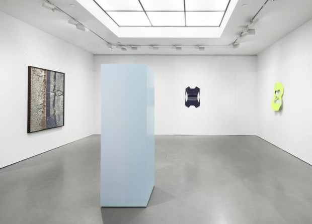
Do industrially processes leave any room for humanity? Matt Keegan’s work raises that question, since he works with a combination of both. In this show, the gallery walls have been covered with drywall that’s been gently sliced and painted into a woven grid pattern of primed and painted wall. It’s all hand-built, but it looks mechanical. On the walls, abstracted sculptures that look like modern shields are modeled off the cut paper from which they were originally made. They are scaled up manufactured in steel and hung on the walls. In the center, an Anne Truitt column painted in light blues and pinks holds the room together.
All this may sound like more process based abstraction—and in some sense it is—but unlike many of his colleagues, it’s impossible to look at this work and conclude that the artist isn’t bringing anything to the table himself. The work is simply too calculated for that, and in this world, that makes Keegan a notable outlier.


{ 4 comments }
Interesting that the Ukraine photos look like so much like Stephen Shore while most of the Israel ones kind of look like anyone. Or did you think so? Maybe my eye just isn’t as keen looking at the Israel ones?
Yeah, actually, I remember wondering what makes a landscape shot unique when you know hundreds of other tourists have pretty much identical shots. Some of the Israel shots seemed Shore-y but you’re right—a lot fewer than those of Ukraine. This shot of the road for example: http://www.303gallery.com/index.php?iid=1215203&exhid=272&p=img and this shot of a poster:
http://www.303gallery.com/index.php?iid=1215190&exhid=272&p=img
Right, I think it’s partly the color palette and composition, but more so that those are explicitly not-journalistic, a determined flattening out of narrative.
You are very smart.
Comments on this entry are closed.