
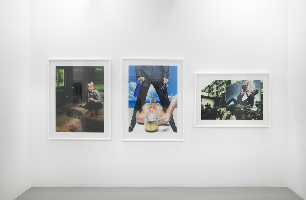
Installation view. Image courtesy of the gallery and Artsy.
Hank Willis Thomas, Unbranded: A Century of White Women: 1915 – 2015
Jack Shainman Gallery
513 West 20th Street
524 West 24th Street
New York, NY 10011
Runs through May 23, 2015
What’s on view: Images of advertisements featuring white women, but with the brands erased; images are organized chronologically, with a year written underneath
Corinna: Have you seen the subway ads for this exhibition? There’s one that I keep on seeing with an Amy Sedaris-lookalike, marred by a black eye, with the title of the exhibition printed across it. Putting that up in a subway, that’s borderline subversive, offensive, and, at the very least, someone probably notified the MTA that the black-eye ad should come with a trigger warning. Seeing that ad framed in a gallery, the effect is duller.
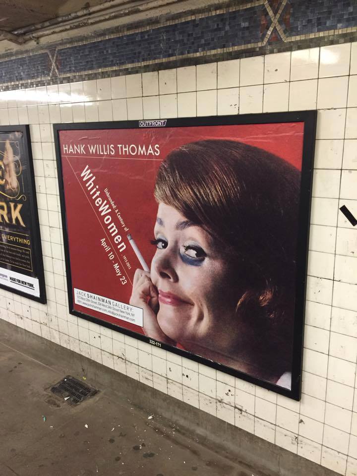
Hank Willis Thomas subway ad. Image courtesy of Hank Willis Thomas’s Facebook.
Paddy: Have seen them—but I haven’t seen the one you’re talking about. There’s one on 14th street I mostly noticed because, well, when was the last time you saw a gallery place an ad in the subway? It pictures a woman in white on a mattress floating in outer space. The original ad copy has been replaced with text from Jack Shainman. It’s a strange ad, but the goal doesn’t seem to be to get people into the gallery. It looks like it’s supposed to be part of the show.
Corinna: I’m curious whether anyone came into the gallery because they saw a subway ad. Paging Jack Shainman. Do you have an answer?
So, once we were in the gallery on 20th Street, what did we learn/feel/think about, seeing all these grainy, technicolor ads from the 20th century through today? Not much. When you’re presented with just one image per year, there’s no way to think the project sets out to cover a ton of historical ground. What you’re left with are a lot of smiling women: a woman in a martini glass, a woman emerging from a watermelon, a woman seemingly peeling off her skin. These are just a handful of the more absurd images, and the stronger ones in the show. It’s not just that women are objects, on part with the objects they’re selling, it’s that women have become broken down into body parts—you don’t even need an entire woman to sell your product!
Had the exhibition been focused on a more tailored concept—for instance, if it were just about women-in-parts—then the show would have succeeded more. Instead, I left with a jumbled sense of advertising and the women featured in them. Some hinted at political and social issues, like images from the 2000s of a happy, same-sex couple, or the muddied legs of female soccer players. In the 1960s, we saw a couple of women-in-outer-space adverts. Most of the time, you couldn’t know the source image for the original ad, though some very famous ones made an appearance, too—like Calvin Klein’s ad for Obsession with a very young and very nude Kate Moss, or one of the first Sex & the City ads, featuring a very nude Sarah Jessica Parker with a laptop strategically placed over her crotch. Of course! Women in advertising are often nude.
Paddy: This show needed more space. There were way too many images crammed into a small space. I’m not sure how many people saw the Rubell Family Collection show 30 Americans but when I saw it installed in 2008, they displayed roughly three decades of doctored ads by Hank Willis Thomas—these ones focusing on African Americans—all chronologically. The images snaked around the walls showing a clear shifts in styles. It reminded me of Hans-Peter Feldmann’s series of photographs of people at every year of their life, not for thematic reasons, but because together change was more apparent than if the works were displayed apart. It’s a great piece.
I get the sense that Thomas knows more about the history of these images than the photographs themselves tell us. For example, that strange image of a woman on a phone, reclining and being dragged by her hair was taken in 1955, the same year Emmett Till, a 14 year old African American was murdered for allegedly whistling at a white woman. I know this because Thomas points it out on his Instagram, not because I’m all that familiar with American history (I grew up in Canada). Is there a connection to this story and the creation of the ad? I don’t know, but Thomas seems to think so. That’s important, and the kind of information that adds meaning to the piece.
I know we all hate explain-y museum labels, but this is a good example of work that would really benefit from a few.

{ 5 comments }
Just saw the show this morning and totally disagree with the assessment outlined here.
This is an instance where the lack of context actually serves the work. The layout is purposely designed so that the viewer has to actively work to fill in the gaps. By stripping out the text and copy from these ads, Hank Willis Thomas puts a spotlight on the repugnance of their imagery.
As you look at the show, certain narrative threads begin to emerge. It’s very telling for example that the first post-war ad is of a woman using a vacuum cleaner. This follows on from ads depicting women contributing to the war effort (albeit, whilst being ogled at). It’s a powerful juxtaposition. The message is clear: “the war is over, get back to the housework ladies”. Likewise, I felt there was a definite increase in sexually aggressive imagery around the time of the women’s liberation movement. The show encourages us to make our own historical readings.
HWT’s minimalist approach is effective. It underscores the latent (and indeed, explicit) misogyny of the ads. Sure, a label could fill in the historical context, but sometimes, in order to really feel these things, you have to read the imagery by yourself.
You bring up some good points. Yes, some similarities emerged, but they were very thin—as you refer to them, as “narrative threads.”
I’m speaking as someone who hasn’t seen the show here, but that also doesn’t sound like a very controversial read of history…
I like your read Tiernan. Next time we’re bringing you on one of these trips!
Agreed!
Comments on this entry are closed.