
Tom Boram
Young Blood 2016
Maryland Art Place
218 West Saratoga Street
Baltimore, MD
Artists (and MFA programs): Tom Boram (UMBC), Elena Debold (UMBC), Sarah Eargle (Towson), Taha Heydari (MICA), Kei Ito (MICA), Andrew Paul Keiper (MICA), Dane Winkler (UMCP), Jowita Wyszomirska (UMCP)
July 14 – August 20, 2016
What’s on view: A survey of paintings, sculpture, installation, and digital work from 2016 graduates from Maryland MFA programs.
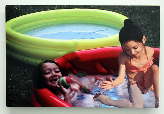
Paddy: Given that this is a show of some of Baltimore’s best new talent emerging from schools, I’d like to begin with something relatively positive. So, I guess I’ll begin by saying that any show that offers reprieve from the heatwave should get a nod and this exhibition included air condition and a minimalist pool filled with cool water. Unsurprisingly, there were just as many attendees at the bar as there were surrounding the pool!
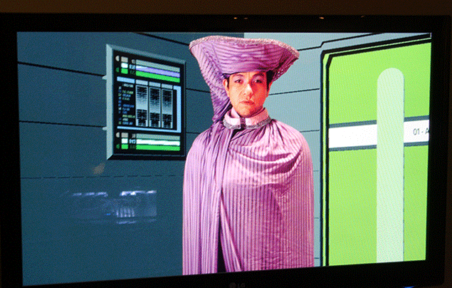
Probably the most important thing to say about this exhibition, though, has nothing to do with where people stood in the gallery and everything to do with the fact that it’s a disappointment. Is this really the best emerging talent Baltimore has to offer? Looking back at the pictures I took of this show, I can only find three—an indication of my lack of excitement. A fourth picture, now deleted, was dedicated only to documenting how poor the lighting was in the gallery. Unlike most contemporary galleries, MAP uses track lighting. This gives the show a retro-feel, which might have been useful if the concept weren’t Young Blood. The only artist in the show whose work benefited from the hang, was Tom Boram, whose screen and interactive control panel where appropriately placed on a stage, and needed subdued lighting anyway.
Michael: Disappointment is the operative word here. Young Blood is usually a highlight of the week, and MAP has great curatorial chops… I’m wondering what went wrong this year. Improbably slim pickings among Maryland’s myriad MFA candidates? I find that hard to believe, and looking back at the list of artists in the show I realize that I don’t even remember seeing everyone’s work. Where was it all hiding? Maybe I was just laser-focused on the work that overtly caught my attention.
I was giddily looking forward to seeing Tom Boram’s Star Trek piece and Taha Heydari’s paintings. I really liked the build-your-own Star Trek piece, but I left mostly confused by the how/why it worked [I think you have a better grasp on that, Paddy] and was totally let down by some underwhelming work from Heydari, who is actually a great painter.
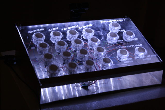
Tom Boram’s control device.
Paddy: Boram’s was not the most intuitive piece. The way it works is this: A screen stationed in front of a control panel shows Star Trek themed fan fiction vignettes. Each vignette either stars a single character, plays a soundtrack of your choice, or sets an establishing shot. The control panel allows a user to toggle between characters, music, and themes.
However, a map of characters and relationships is hung beside the piece and reveals some of the limitations of the controls. Basically, you need to find your character on the map to know what buttons on the control panel will work, but there’s no indication anywhere that the map is a key to the piece. Understanding how the device works isn’t hard, but it’s impossible to figure out on your own.
Michael: I like that absurdity, where it seems like an awful lot of work on the part of the artist and viewer for a comically-fruitless payoff—there’s no narrative progression or resolution here. The work just cycles in a closed circuit of things that almost (but not quite) signify Star Trek. Little details like the “LCARS” graphic design on the panels are spot-on, but the insignia and spacecraft look like someone went out of their way to avoid stepping on anyone’s copyrighted toes. I often fall asleep with some iteration of Star Trek streaming on Netflix because it’s such a comforting vision of humanity, and I think I’ve seen every episode at least 3 times. I suppose this is a bit like that, a mantra device. It also relates to all those fan fiction series on YouTube, which I always wished embraced their janky aesthetics and went for DIY charm instead of disastrously ambitious green-screen overuse.
Taha Heydari
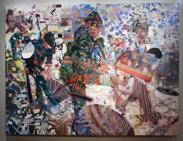
Michael: As a viewer, I’ve taken pleasure in the multiple forms of spectatorship afforded by Taha Heydari’s paintings I’ve seen in the past. They’re constructed from countless approaches to mark-making, each leaving some index of their process. But the best also possess a cinematic quality that seems to be struggling for legibility against some chaotic force—a corroded video codec, artifacts from bootlegging or static interference. It’s as if there’s a battle being waged between the image and the methods by which it’s assembled. The paintings here though feel like they’ve lost that battle. They lack a focal point or enough salient information to convey a gestalt. In Heydari’s other work, there’s some suggestion of political content or social commentary that’s indecipherable here. These are the “B-sides” a good curator would leave behind in a studio visit to prepare even a solo show. It’s kinda disappointing to see them representing the work of a really talented painter in a juried exhibition that should be a prestige.
Paddy: The pixelation suggests datamoshing of some sort, which has been over for at least eight years. At the time, the artists I knew who were mashing videos together believed that pop culture was so ubiquitous and so vacuous, that the content didn’t matter. It could all be run together. Eventually, though, these artists gave up exploring the process, deciding it was a dead end. The fact was, the content did matter and always would—no matter how hard you fucked with the pixels.
If there’s anything interesting about these paintings, perhaps it’s that they present a challenge to those conclusions. The source material here really doesn’t seem to matter. There are figures, but what they are doing or why is totally obscured. A viewer could read almost anything into them.
The problem, though, is that there’s not any point in doing so because the compositions and painting itself is poorly executed. What good is a visual concept if there’s nothing engaging about the way it looks?
Kaita Niwa: Nyū Hāfu
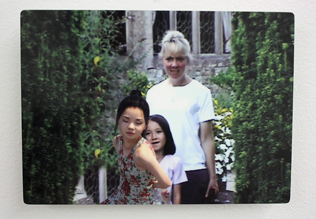
Kaita Niwa, “DSC02362,” aluminum print.
Curated by Josh Nukem
Terrault Contemporary
218 W. Saratoga St. 3rd Floor
Baltimore, MD
July 9 – July 30th
What’s on view: digital prints on aluminum, each labeled after a file name, depicting a CGI girl inserted into various family snapshots, and a triptych that depicts a woman—presumably the little girl as an adult—in a futuristic space station.
Michael: I think we both initially found this show pretty unnerving. If there were an avalanche in the uncanny valley, this little girl would be riding the crest on skis, grinning creepily at the destruction. The images read like an AI’s anthropological study, with a detached quality that’s amplified by the cold material and sterile image names. But I loved it.
We were both surprised to hear the story behind these—Kaita Niwa is a transwoman, revisiting family photos to insert a childhood avatar of herself into the narrative. The project is an attempt to reconnect with her estranged sister, the other girl in the photos. That makes the weirdly clinical treatment of the images even stranger… I’m reminded a bit of Jacolby Satterwhite’s work here, where very contemporary/sci-fi aesthetics and digital processes are merged with family narrative and identity issues. But the emotional effect between the two artists’ bodies of work couldn’t be more different.
Kaita Niwa, “IMG_3574,” aluminum print.
Paddy: Yeah, I mean with Jacolby there’s nothing particularly disturbing about all the fucking in his videos. The worlds he renders seem to envelope the viewer in their excess, so they are very pleasurable to watch.
This show, by contrast, made me feel queasy. At first, I thought the imposed avatar in two of the images seemed slightly sexualized to me. Looking back at those pictures now, it’s harder to see that, but a whiff remains. Avatars are generally sexualized to begin with, so it’s tough to remove that quality entirely.
Mostly, though, it’s the uncanny valley you speak of, that’s eliciting that reason. Is that a good thing? Hard to say. I know I hated the show when I first saw it. Now that I’m a bit more removed, I’m starting to wonder if that reaction is evidence of the work’s strength. (Usually, I dismiss the idea that reaction itself is a validating force, so I’m really on the fence about this.)
Whatever the case, I can’t imagine ever hanging that work in my home. Partly, I think that’s due to the fact that it’s often the subjects of the original photo that seem out of place, not the imposed avatar.
Michael: I wonder if the uncomfortably sexual vibe of the little girl has to do with the fact that it’s a gendered character extrapolated from a gendered adult? It’s the process of childhood in reverse… in an ideal world, kids are a sexual blank slate allowed to mature into adults over time. Of course, that’s not the case in our world, and the gendering of children is what drives the conflict here.
I think a lot about the idea of queerness as an anachronism, and this exhibition brought to mind a quote I read from critic Bret McCabe around this time last year: “if you’re not a white heteronormative male in 21st-century America, then you’re already living a kind of sci-fi existence, a time and place where the world as you might desire it hasn’t become reality yet.”
Here the sci-fi revisionist gaze is cast backwards.
Wouldn’t we all like to retouch our childhoods and relive them as the people we wish we had been allowed to be? But there’s also a sense of optimism in the space station triptych. In one panel, a future body seems to be growing in a tank. She doesn’t need the fussy, awkward years of a body’s childhood on Earth. The avatar’s all grown-up now, living in a high enough orbit that there’s countless miles of vacuum between her and the problems below.
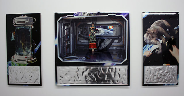
Kaita Niwa, “New Half,” “Venus on Impact,” and “887 2 AN 515,” print and acrylic on aluminum.
Paddy: It would never occur to me to think that living, exiled on a spaceship, is all that optimistic! I like that interpretation, though I don’t share it. In the third panel she’s reaching out for a floating elephant, which to me suggests a longing for earth and perhaps different memories.
Michael: An elephant never forgets, even if it would like to? Or maybe the queers and scientists on the station have shoved the Republican party out the airlock once and for all.
Paddy: Okay, that’s the best interpretation yet. You win!

Comments on this entry are closed.