
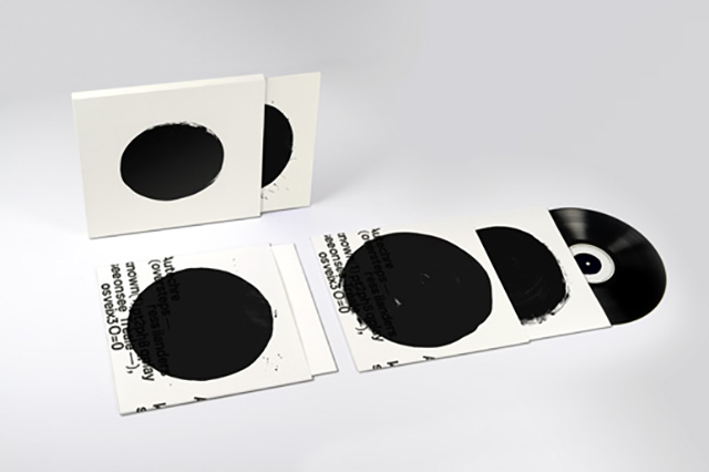
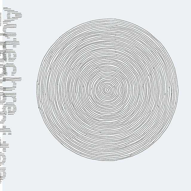
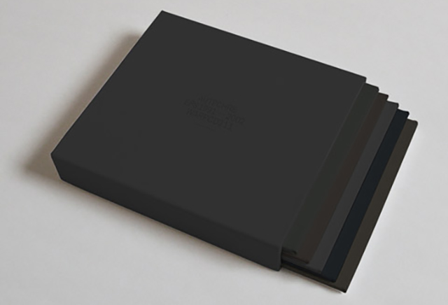
Oversteps vinyl edition (2010) by The Designers Republic
I’ve always hated minimalism. I don’t think that’s a blanket statement I’d make about any other artistic movement but I hate minimalism. From my perspective, it was audacious for like a year, and then it was decoration. This hatred even extends to minimalist design for the most part, though I can occasionally be persuaded to appreciate a nice, functional spice rack. But, I’ve always loved the tension between the experimental electronic music duo Autechre’s stark album packaging and dense, maximal music.
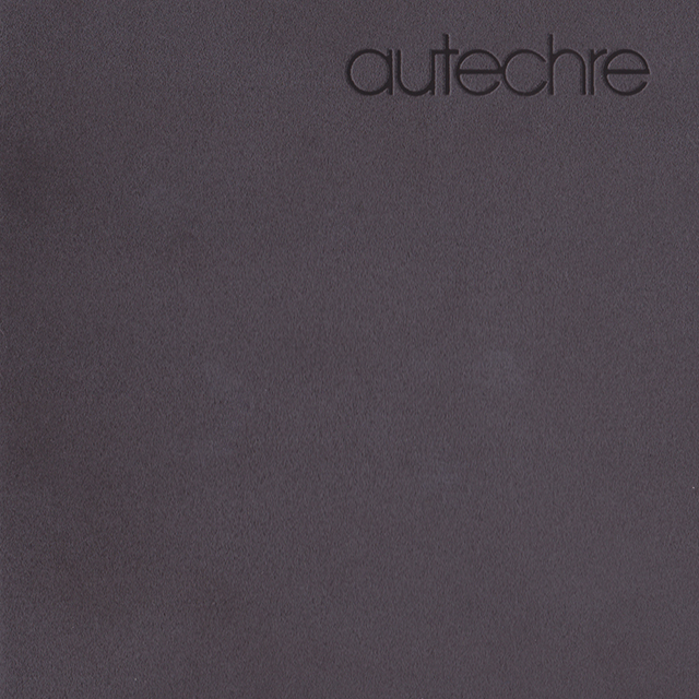
Throughout their 30-year career, the experimental electronic music duo Autechre (Sean Booth and Rob Brown) has been subverting expectations of what an album in the genre looks like. And as their music became more complex and structurally more in line with sound art and noise, they’ve crafted an uber-minimal visual identity.
For all but a handful of records, Booth and Brown have worked with The Designers Republic. The extremely influential firm was pretty much the in-house design team of Autechre’s label, Warp Records, in the nineties.
TDR was responsible for the vector shapes and flash-heavy web design for the record label as well as the iconic album covers for artists like Aphex Twin and The Orb. The aesthetic TDR pioneered fell somewhere between Japanese toy packaging and Russian constructivism. Long before DIS Magazine was doing the nihilistic dive into consumerism thing with slogans like “Work Buy Consume Die” and “Buy nothing, pay now” the firm’s work defined a certain futuristic 90’s aesthetic, launched a thousand design houses and resides in the permanent collections of MoMA and the Victoria and Albert museum.
While TDR was certainly onto something that was very original and identifiable at the time, they always treated Autechre a little differently. Together the group and firm worked on striking packages that were simple, refined, tasteful and deliberately clashed with the dense music contained within.
Although TDR isn’t a fully functioning studio anymore they still pop out of retirement now and again to work on the latest Autechre offering and the work has never been better.
Below, we take a look at the evolution of Autechre’s singular aesthetic in an age when the physical album is pretty much dead.
The Early Years
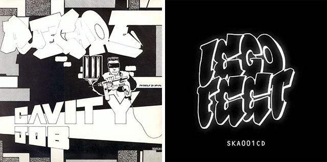
Cavity Job (1991) and Lego Feet (1991) designers unknown
In their formative period, Booth and Brown were just a couple of graffiti writers in the Manchester rave scene who were figuring out how to use their new gear. The elements that would come to define Autechre really weren’t there yet but they were experimenting with a new kind of dance music that was meant for deep-listening rather than dancing.
The Cavity Job and Lego Feet E.P.’s were released on Hardcore and Skam respectively. Aesthetically the E.P.’s are tied into Booth and Brown’s graffiti backgrounds and the hip-hop influenced street culture of Manchester. There’s virtually no aesthetic relationship between these covers and what Autechre would later release but it’s worth noting the ways in which nonsensical graffiti tags would influence the group’s choices for album and song titles. The name Autechre itself has no real meaning or definitive pronunciation and on the first EP it’s written in typical graffiti-style bubble letters. Street art’s approach to text as a visual medium without content would eventually mix with techy_punctuation and file name conventions to form a template for song titles like “Maphive 6.1,” “Etchogon-S” and “pce freeze 2.8i.”
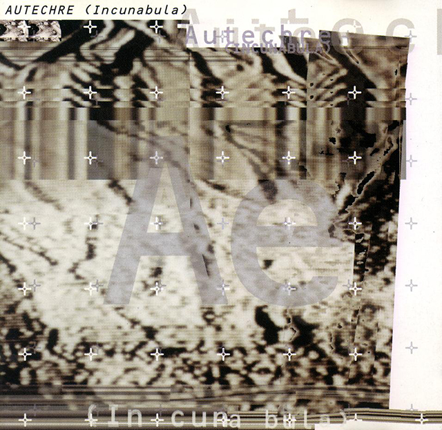
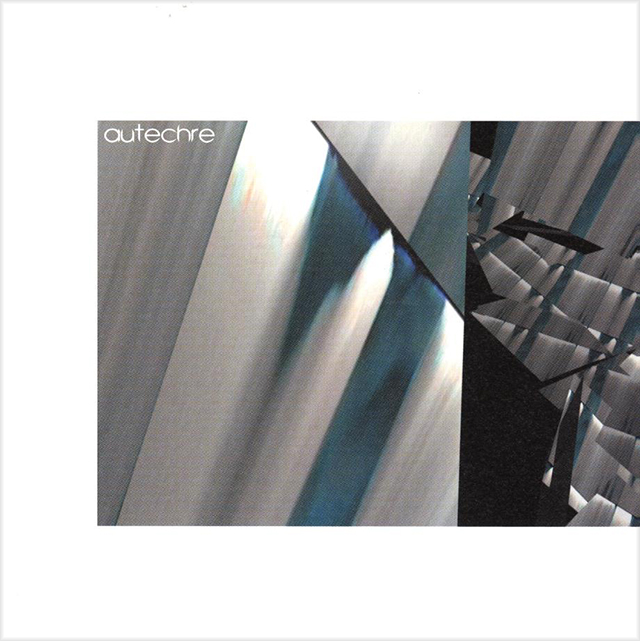
Incunabula (1993) by The Designers Republic
Incunabula and Amber were Autechre’s first full-length albums and the beginning of the group’s relationship with both Warp Records and The Designer’s Republic. Musically the two albums showcase Autechre’s experimentation with techno and hip hop beats mixed with more intricate melodies and sound design. In fact, the title Incunabula simply means “the infancy or earliest stages of something.” (Album and song titles that have a literal meaning pretty much stop here)
Incunabula features glitchy, layered, abstract imagery and debuts the Ae abbreviation that would become a staple for the group, though it would later be all lowercase. Generally, it’s pretty unremarkable, this style was ubiquitous on club fliers at the time and can still be seen today, but was another step towards the mature Autechre that was to come.
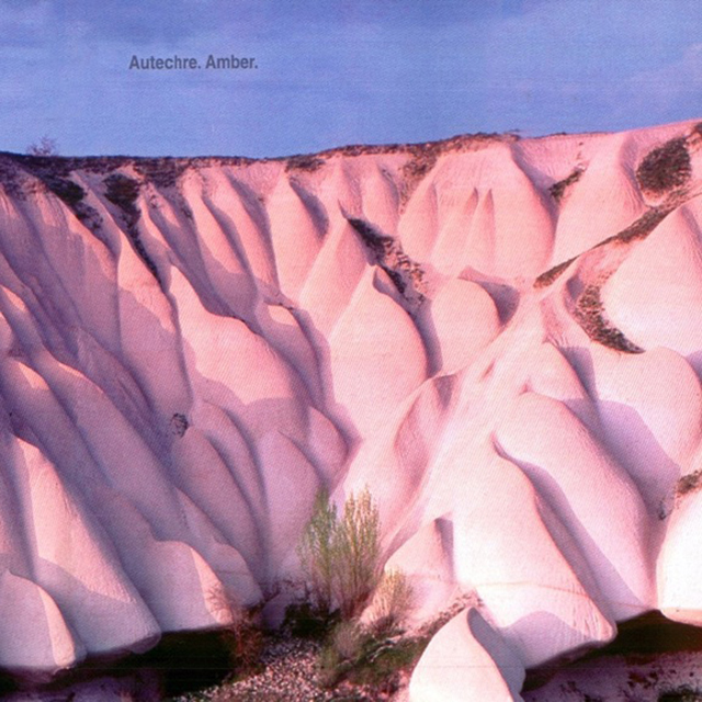
Amber (1994) by The Designers Republic

Amber full sleeve (1994) by The Designers Republic
Amber is an anomaly in the Booth/Brown catalog, it being the only album to feature a photo on the cover. One might relate the sand dunes to soundwaves but the most important progression here is a more refined approach to packaging that delivers a single visual element and a pared down text treatment.
A Political Statement Becomes An Aesthetic Statement
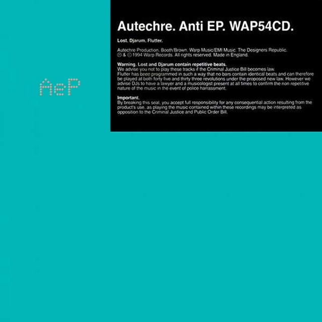
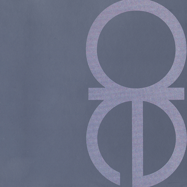
Anti EP (1994) by The Designers Republic
For the Anti EP, Booth and Brown stumbled onto two characteristics that would come to define their style going forward. The cover for Anti EP was Seafoam Green with the initials AeP in a braille-like font. An affixed label explained that two of the tracks featured repetitive beats and one track, “Flutter,” contained no identical repetitions from bar to bar. This concept was devised to protest the proposed “Criminal Justice Bill” in England that, among other things, would have banned “sounds wholly or predominantly characterised by the emission of a succession of repetitive beats,” at a public gathering of more than 20 people. This legislation was an attempt to destroy the U.K.’s rave scene.
The minimal cover was designed to highlight the legislation and the track that contained no repetition was meant to subvert the law through studio trickery. While the law never passed, the band had found a more distinct visual identity and the lack of repetition would become the group’s musical trademark. Even though you could nod your head to Flutter it was always subtly shifting and being effected from bar-to-bar. While the track was conceived as a one-off protest, it proved to be an excellent piece for concerted listening. The more traditional beats that had initially inspired Autechre would fall to the wayside in favor of a more sculptural approach to sound.
It All Went a Bit Khaki
Tri Repetae (1995) by The Designers Republic
With Tri Repetae, Autechre came into their own. The newfound confidence the group felt shines through in the choice of an album cover completely devoid of anything but a solid greenish-grey-gold color. In a recent interview with Resident Advisor, Brown explained, “We’ve always just been us, we’ve always just been the sum of our influences, and whatever style we’ve turned our hand to, it’s just been us. Natural. But when Tri Rep came out, yeah, it did change—the colours changed, it all went a bit khaki, a bit robotic, a bit more combative—and people getting into that was a confidence boost.”
Every sound on the album seemed to be artificially constructed, it was two discs of the most maximal music Autechre had ever produced and the dense compositions called for a new visual approach. The choice of a single color to represent this tangled and challenging new approach invited the audience to just listen to the music and set the album apart from anything else on the record shelf. “It all went a bit khaki,” is not a phrase you would expect from an electronic musician then or now. What could sound more boring than khaki? But this music wasn’t boring at all. Aggressive “beats” moved and morphed, coming together into a sound that rewarded repeated listens.
The two EP’s that accompanied Tri Repetae could be seen as a step backwards in the band’s album artwork, it may have just been a bit of reassurance for the fans and the label. Garbage is practically the same cover as Anti EP with some digital abstract mess on it and Anvil Vapre just features a treated still from the band’s music video for Second Bad Vilbel. One step back, before taking several forward.
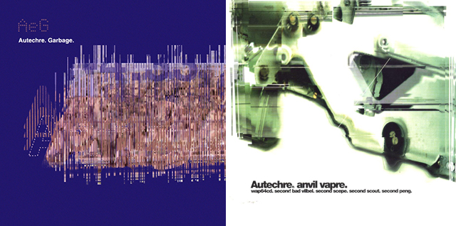
Garbage (1995) and Anvil Vapre (1995) by The Designers Republic
Diving into the Avant-Garde
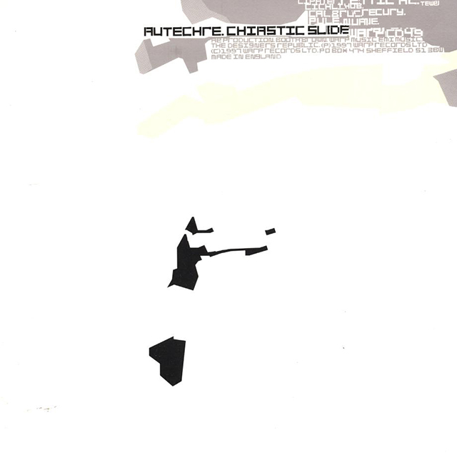
Chiastic Slide (1997) by The Designers Republic
The three covers that adorned Chiastic Slide, Envane and Cichlisuite reflected Autechre’s move into the avant-garde and digital processing. All three albums feature work that recalls early computer-generated art that was often just a test for rendering code in a visual form. This was fitting because Autechre was experimenting with an expanded set of production tools and turning to early-electronic compositional influences like Stockhausen and Xenakis. While the music was pointing forward, the covers were looking back to the tradition that Autechre suddenly found themselves working in.
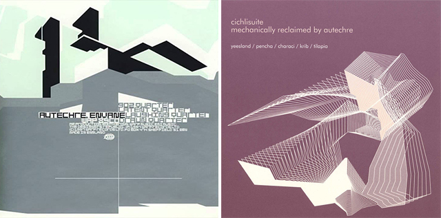
Envane (1997) and Cichlisuite (1997) by The Designers Republic
A Fully Formed Approach
LP5 (1998) The Designers Republic
For LP5, the group’s sound was more confident and abstract than ever and the packaging could be construed as even more minimal than Tri Repetae. Even though the front of the album identifies it as a work by Autechre, there’s no “cover” at all; just a matte black case with the band’s name stamped into the plastic. Yes, I know, insert your Spinal Tap, “Black Album” joke here.
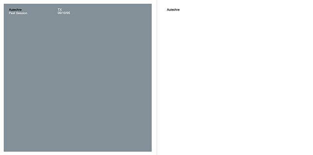
Peel Session 1 (1999) and Peel Session 2 (2000) by The Designers Republic
The End of an Era
EP7 (1999) by The Designers Republic
EP7 represented a finishing point of what had become the “Autechre sound” and the beginning of the group’s heavy use of the generative software MAX/MSP. There’s still a semblance of recognizable beats going on here but the architectural approach to sound and music was taking over. Tracks were more like a sculpture or structure that the listener was observing from different angles. Fittingly, the strict black-and-white lines of EP7 look like something made in the architectural software CAD.
Generative Music and CG Imagery
Confield (2001) by The Designers Republic
The period of music between Confield and Untilted contains some of Autechre’s most original and “difficult” musical work and found Booth and Brown fully embracing the method of using generative technology to design approaches to music rather than deliberately compose it. More elaborate imagery signaled this shift in approach.
The music on Confield literally sounds like it’s smearing and it has a sort of autumnal mood. The muted, stretching pixels on the cover were a natural fit.
Gantz Graf (2002) by Alex Rutterford
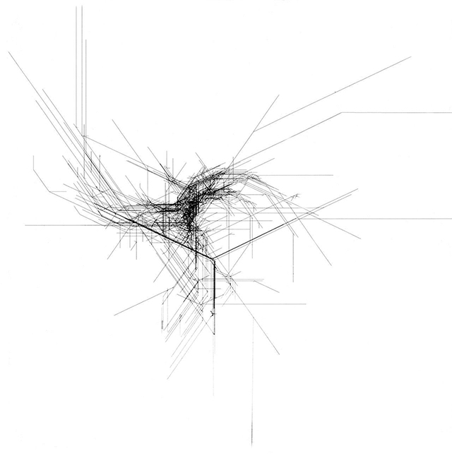
The cover of Gantz Graf would seem to be a return to minimalism, but it’s a bit deceptive because the EP contained a DVD for Alex Rutterford’s elaborate, computer-generated music video for the title track. It was only the second music video that Autechre has done and thus far it has been the last. It feels like the ultimate visualization of what an Autechre composition would look like; an ever evolving machine with no purpose whatsoever.

Selection from the music video for Gantz Graf (2002) by Alex Rutterford
This would mark the group’s first packaging collaboration with someone other than the Designer’s Republic since joining Warp Records. Rutterford would go on to design the covers for Draft 7.30 and Untilted. While I admire the bold green of the back cover contrasting with the muted abstract imagery on the front of Draft 7.30, Untilted’s artwork does nothing for me. The simple, vector shape and colors feel very corporate. I could see it as an image that would grace the edge of a powerpoint slide for a hip mid-aughts startup. Likewise, the music had begun to feel stuck in a holding pattern.

Draft 7.30 (2003) by Alex Rutterford
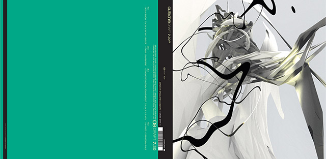
Draft 7.30 (2003) by Alex Rutterford
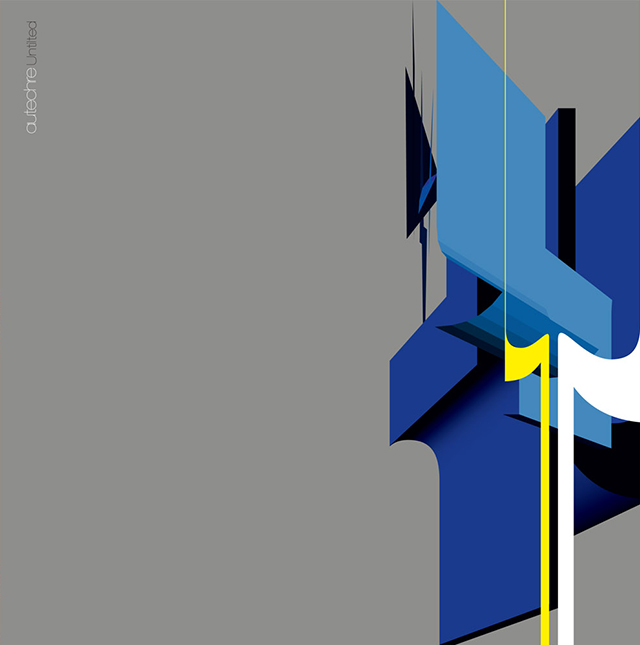
Untilted (2005) by Alex Rutterford
Quaristice – The Anomaly
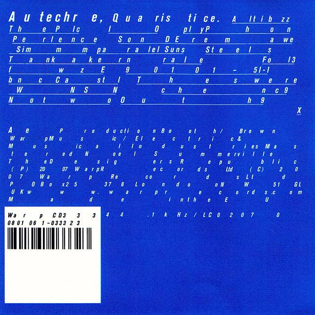
Quaristice (2008) by The Designers Republic
Quaristice and Quaristice.Quadrange.ep.ae marked the return of The Designer’s Republic and Autechre has worked with the firm ever since. These covers tweaked the formula a bit by printing a ton of broken up text on a flat blue and grey respectively. The use of text as a slightly functional design element was a call back to the early days but the group had never included so much of it. The nearly identical EP cover signaled the shift into the dark period that Autechre has continued to this day.
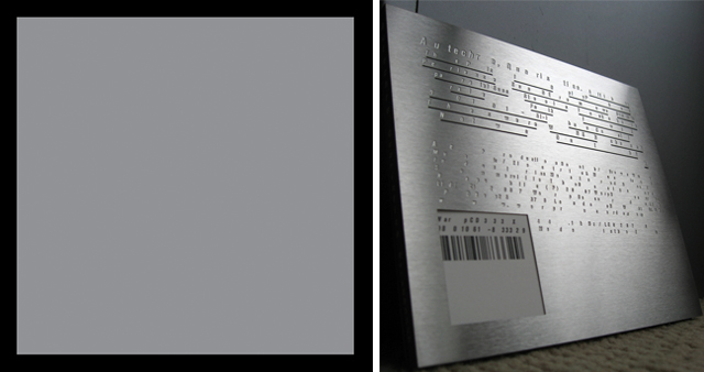
Quaristice.Quadrange.ep.ae (2008) and Steel Edition of Quaristice (2008) by The Designers Republic
Into The Void
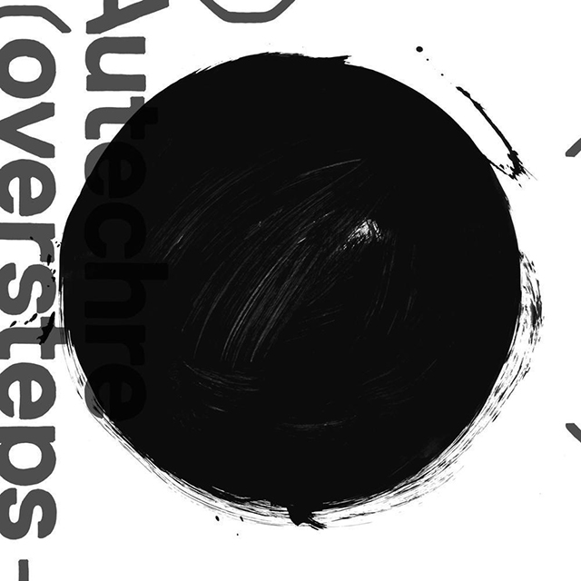
Oversteps (2010) by The Designers Republic
Oversteps marked a transition into a sound and aesthetic that fans and critics have generally agreed was revitalizing for the group. The black hole on the cover is reminiscent of Richard Serra’s drawing work and the music itself became more influenced by Autechre’s live sound. That is to say that it’s oppressive, noisy, unpredictable and maybe even a little nihilistic.
This “dark period,” most recently culminated in the release of a five-disc live album called, elseq 1-5. Autechre’s live performances famously take place in complete darkness. They’ve even been known to have the exit signs turned off if they can get away with it. Musically, this collection shows off Autechre at their best and aesthetically they finally went more minimal than ever by doing away with packaging altogether and releasing it only as a digital download. Six pieces of digital artwork accompany the release, each consisting of nothing black circles and squares. How much more black could those shapes be?
Move of Ten (2010) by The Designers Republic
EPS 1991 – 2002 (2011) a reissue of all Autechre EP’s, now swaddled in black and dark earth tones. By The Designers Republic
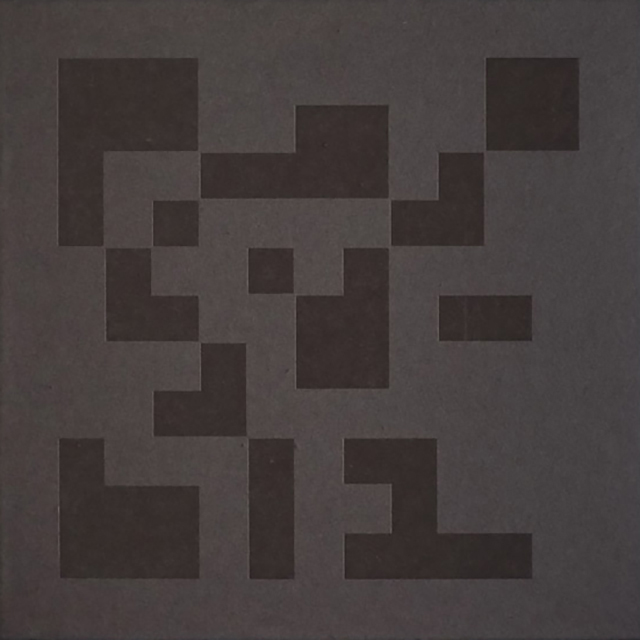
Exai (2013) by The Designers Republic
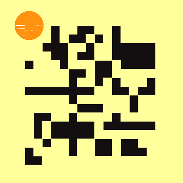
L-Event (2013) by The Designers Republic

elseq 1-5 (2016) by The Designers Republic
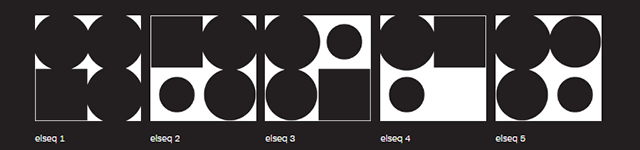
Individual artworks for elseq 1-5 (2016) by The Designers Republic

Comments on this entry are closed.
{ 1 trackback }