As a rule, we don’t generally discuss student work on the blog. There are plenty of reasons for this, but for me, one is simple: I am forever grateful no one from the art press ever saw the terrible work I was struggling through in art school.
Yet nearly every Spring, I am impressed by commencement exhibitions—how is it possible that so many college seniors have their shit together more than so many grown-ass artists? Thesis shows at Maryland Institute College of Art (MICA), my old alma mater, tend to be particularly polished and worthwhile.
This year, though, has been a rough one for students nationally. I can’t imagine dealing with Trump’s election in the Fall and inauguration at the start of the Spring semester, all while trying to figure out what the hell you’re doing with your last year of art school. So much work looks like students just gave up hope halfway through a concept—as if a collective trauma had left everyone dispirited and unable to focus. We at AFC can certainly sympathize. The situation is fucking unfair.
That’s why this year we’re covering the MICA commencement show, which closes today (go see it if you’re in Baltimore!). Although it’s overall less enthusiastic and high-caliber than years past, those who persevered through the crisis and turned it out deserve recognition. It’s worth noting that the sprawling show could, in general, benefit from some outside curatorial advice.
Below, the stand-out highlights from the class of 2017. If they can survive pulling-off thesis projects this good in spite of (and often in reference to) the apocalypse, the art world will be a cakewalk:
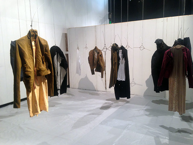
Chas Druin’s work in the Gateway Building stands out for several reasons. It’s one of the best strategies for displaying garments I’ve seen employed here—they take on an eerie, vaguely sinister presence that complements the work’s dystopic vibe. The individual pieces recall military or ritualistic uniforms that have been deconstructed and reconstructed into odd forms that would fit awkwardly on typical bodies. One form, which might be a peacoat re-tooled into some sort of protective suit for radiation, looms menacingly over a more feminine (but still gender ambiguous) ensemble. This collection is what Comme des Garçons costumes for The Handmaid’s Tale would look like, one of many reasons it feels timely.
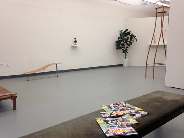
Tucked away in an upper studio of the Fox Building, A.F. Oehmke and Emily Walla’s collaborative installation makes the overhung gauntlet in the rest of the building worth it. Walla’s sculptures reference impractical midcentury modern furniture. They’re flawlessly crafted, but suggest fragility and an uncomfortable domestic sphere—this is a precarious home where inhabitants and visitors must walk on eggshells. The only splashes of color are a few sparse houseplants and tabloids (“Our Catastrophe”) from A.F. Oehmke scattered on several of Walla’s pieces. “Our Catastrophe” has headlines such as “SHIT’S FUCKED UP!” and “ARE WE ALL BECOMING KIM?!?!?!?!?!?! JERRY SALTZ WEIGHS IN!” The decline of Western Civilization, indeed.
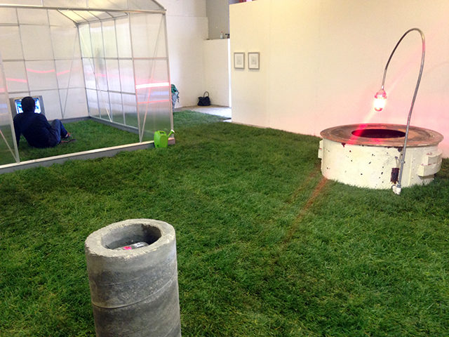
Trevor Blauth’s Epitaph was one of the first rooms I encountered in the Station Building, and perhaps became the high standard by which I considered all subsequent shows. The installation has an immersive quality that speaks to the remarkably high production value. And like most of this year’s highlights, it’s fraught with anxiety. The gallery is full of sod, with industrial-looking wishing wells (one of which holds a Fiji water bottle floating in dirty water) and a full-scale greenhouse. In the greenhouse, an old TV displays a video game avatar waiting endlessly on a futuristic subway platform.
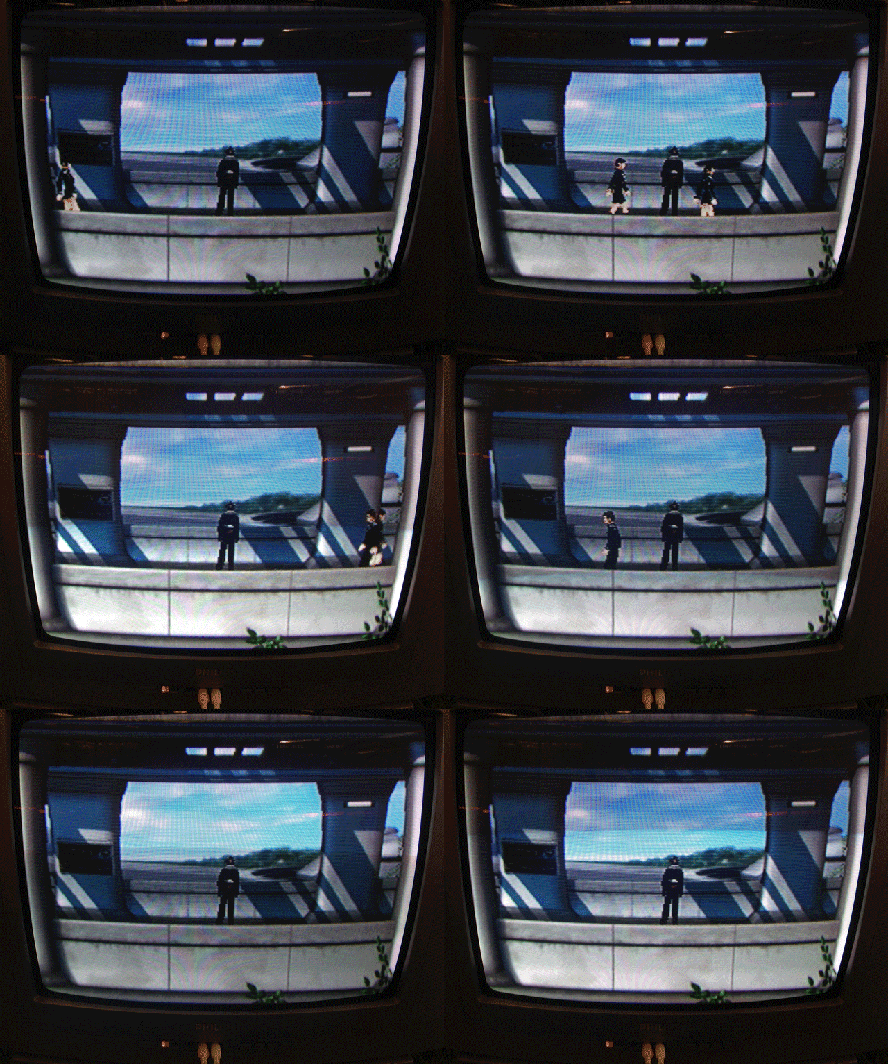
There’s no controller, so the viewer just watches the back of the protagonist as background characters pass him by. Scattered around the gallery, burnt pieces of paper display tiny text, such as “I think happiness is what makes you pretty. Period. Happy people are beautiful. They become like a mirror and they reflect that happiness.” It’s not mentioned in the text, but it’s a quote from Drew Barrymore, the artist whispered to me.
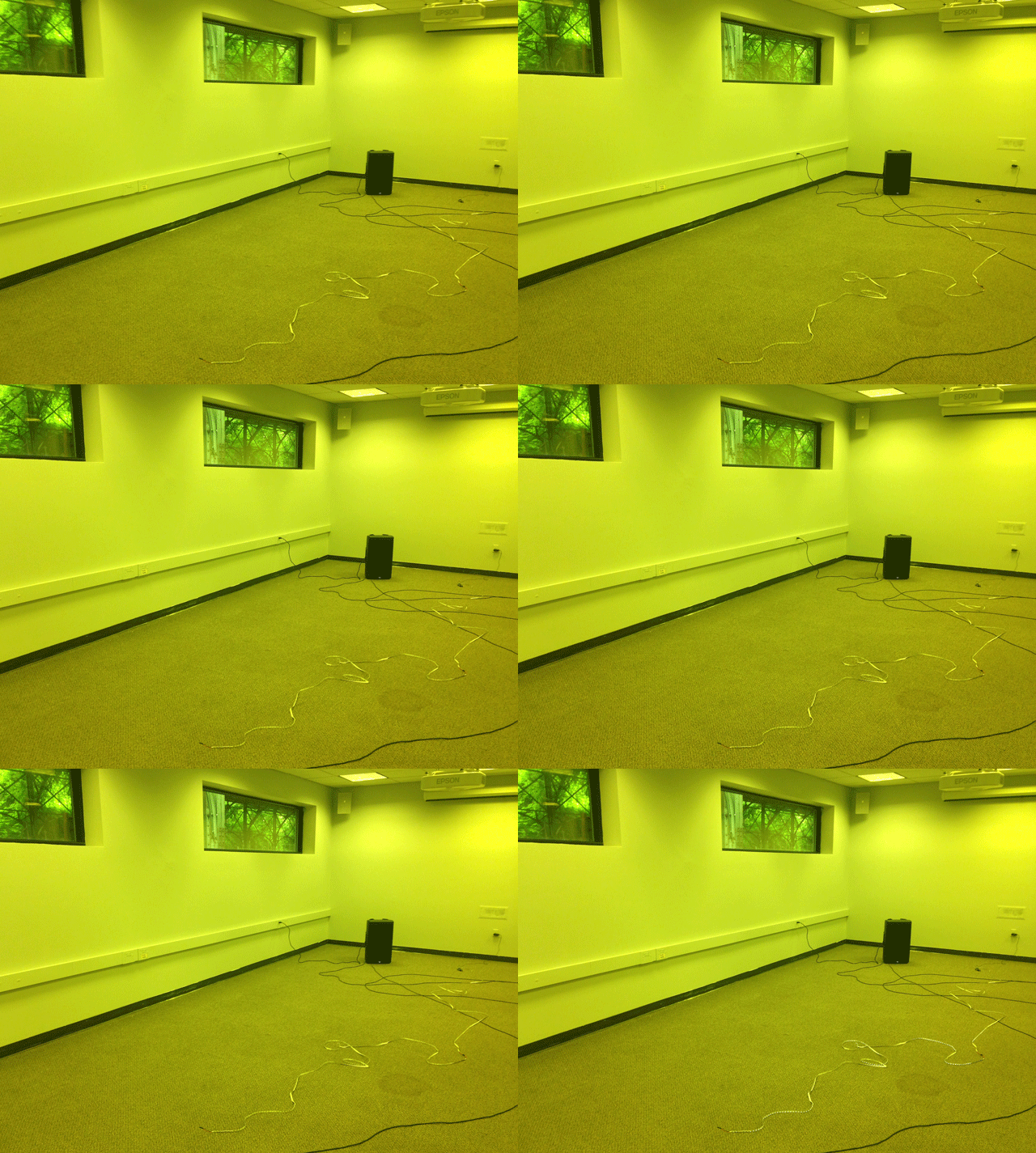
Down the hall, Reece Cox’s “Acids in the Style of Phineas Gauge” would be easy to miss if it weren’t for its rumbling soundtrack. Thankfully, it drew me in. It’s one of the most understated but oddly rewarding installations. The artist has replaced all the fluorescent bulbs in a grim conference room with lime green lights. They match the color of sunlight trickling through the tree canopy of the overgrown train tracks outside perfectly—extending the surreal quasi-urban/quasi-wild outdoors into the institutional space. As if to remind the viewer of the room’s usual lighting, a haphazard strand of LEDs flashes occasionally in synch with Cox’s droning music. It’s strangely elegant in its simplicity and honesty (the four speakers are visible, no effort is made to clean up the cords, and the whiteness of the simple light tube references the artifice of the intervention).
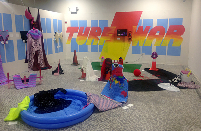
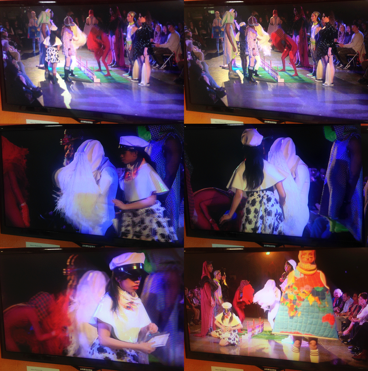
Of all the vaguely post-apocalyptic work in this year’s commencement show, Alison Baskerville’s Turf War feels the most fun. Her space is littered with technicolor garments that include Balaclavas with slogans such as “HOLLYWASTE” and “CHESTCOAST”. A monitor displays a strange, ritualistic fight club that’s somewhere between lucha libre, a fashion show, and worldstarhiphop.com brawls.
This is the suburban nightmare of the not-so-distant future—if Mad Max: Beyond Thunderdome predicted leather would outlast civil society, Baskerville seems to argue it would be synthetic weave, faux-fur, plastic sequins, and all the dayglo vinyl and polyester fabrics that go on sale after Halloween.
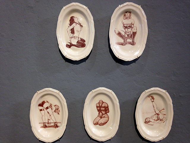
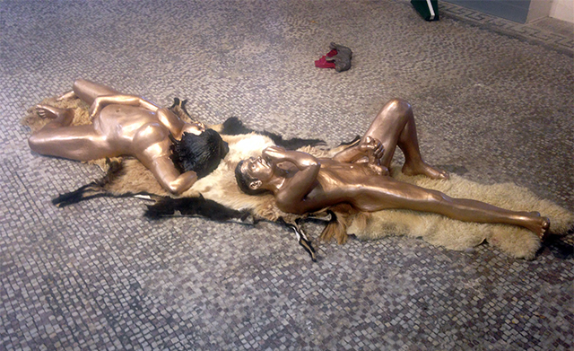
In the adjoining gallery, Keli Beth Smith’s ceramic pieces get a nod for their versatility and demonstration of mastery over the craft. These include her fetish formal china (top of the page) and figurative sculptures such as “Slam Pig,” in which two golden figures lay on an animal hide masturbating facing away from each other. I should mention that masturbation is a recurring motif across every discipline this year. I suppose that’s one tried-and-true strategy for stress management? At any rate, these ceramic figures are a little unsettling due to their size—they’re proportioned like adults, but scaled to be the height of children. These wouldn’t look out of place in a blue-chip gallery.
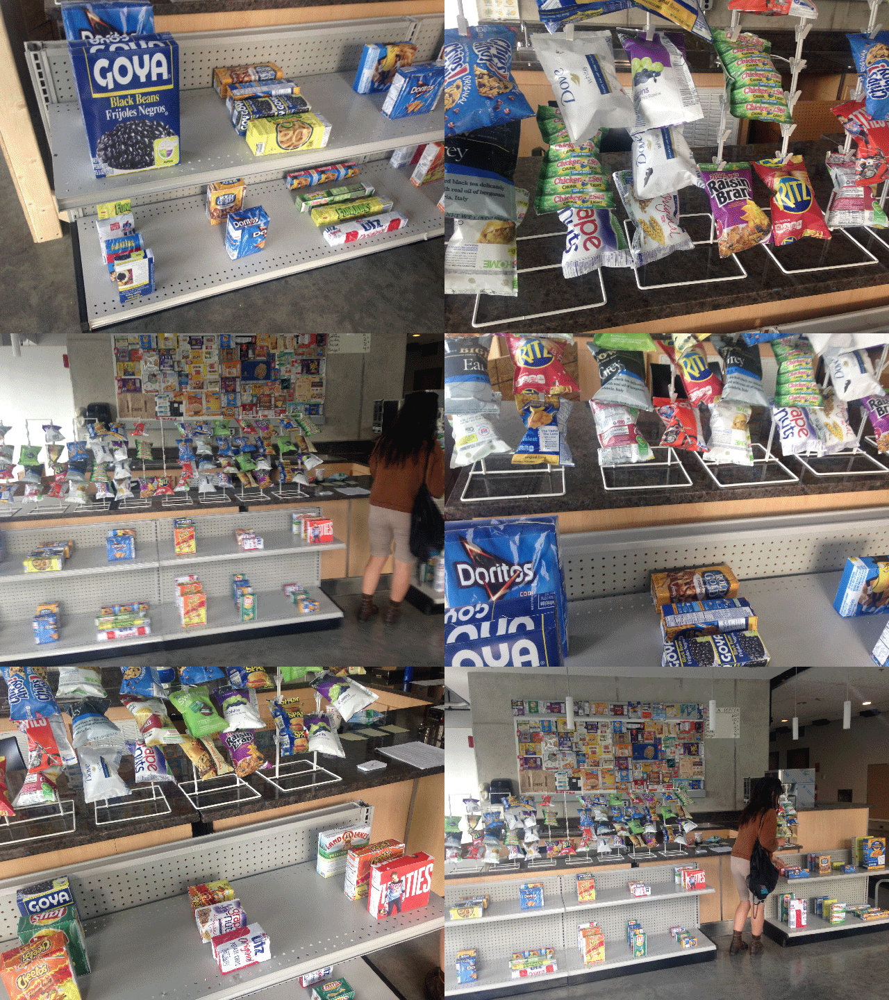
I have a soft spot for Will Staub’s takeover of the Gateway Building’s cafe, largely because I once worked for the school’s food services company, and he certainly interrupts the monotony of that post. Staub repackaged the instant food items for sale, so that Goya blackbeans now come in a breakfast-cereal-proportioned box or Chicken of the Sea tuna can come in a potato chip bag (gross). All of the labels have a strange warped quality, as if they had been scanned from their original packages and then reformatted to other shapes regardless of their dimensions. When we visited, the cafe was closed, but an instruction sheet provided for employees filled us in. Everything is for sale, including regular menu items which would be covered with a red dot once ordered. His items, however, can presumably be restocked. Bagged goods cost $10 and boxes $20. That’s a little steep for campus food options (just slightly, sadly), but a damned bargain for an art object (consider Gabriel Orozco’s collection of $30,000 convenience store products, rigged to depreciate with an economy of scale). This feels like a sounder investment.


Comments on this entry are closed.