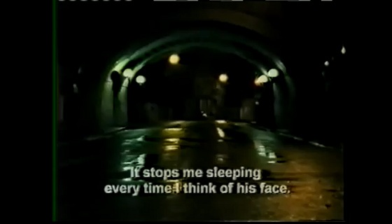
The smartest writing online about Anri Sala’s Nocturnes might be its YouTube description. Nocturne, a video Sala made while in Lille, in 1999, before his Venice Biennale appearance and subsequent success. It consists of two tightly interwoven interviews Sala recorded with young men he met there: one, Denis, is a former soldier, who has recurring nightmares and PTSD symptoms after a tour in Bosnia as a UN peacekeeper and plays video games to forget; the other, Jacques, tends an enormous home aquarium with thousands of fish, and awakes in a panic whenever the steady gurgle of water stops. Both have trouble relating to others. As the video progresses, Sala weaves the speakers together more and more, until they approach something not unlike a similarity.
That’s about as much as you’ll get from any of the descriptions online: it’s a documentary, and Sala’s principal goal was to get the viewer to see this fairly obvious similarity – socially isolated people have hobbies that make them feel better, gee whiz – and also to think about loneliness and insomnia while looking at glumly romantic images of rainy France. I don’t believe it, or at least I don’t want to: frankly, if that’s all there is here, you should be bored by the description alone.
Rather, what interests me about Nocturnes is how it visually alternates between classic cinematic beauty and an aesthetic of awkwardness. Just watch: if we look at the film from the beginning, there are touches of documentary, particularly in the jittery hand-held shot from :23 to :44; immediately, though, Sala transitions into the long, cinematic tracking shot that continues to 1:04. Between 1:11-1:14 there is a shot of a fish being lowered into a tank that seems to suit this cinematic aesthetic, and even seems to have foleyed sound effects, but then there’s a long period of interview, with the camera slightly too close to the subject for comfort. It’s a dance that continues for the duration of the video, and mimics the interplay of subjects.
There’s one simple gesture that, I think, makes clear how far Sala is from the average video art documentarian: the whole piece is unbearably dark. This has a single unavoidable and important effect: for simple visual reasons, this video must always be projected on a black wall, in a darkened room. It calls to mind something the curator Chrissie Iles said in an October roundtable on “The Projected Image in Contemporary Art”, which I’ve quoted before:
Is the space painted white? If so, [the piece] refers more to the gallery. Is it black? Well, then it's more of an immersive space, like cinema.
It’s an obvious point, perhaps, but that also makes it a reliable tool; Sala is ensuring, with his lighting, that we watch this video while thinking of the conventions of cinema – and, of course, most likely sitting down (obviously there is element of “night”, too, but this could be represented with streetlights just as well as with darkness). I don’t think that darkness is very common, for documentary film; true stories in galleries are most often told on monitors or small projections, meant to be seen standing up, and most documentary video art makers seem to keep this in mind – there is no Nocturne-like darkness, one observes, in any of the work of Phil Collins. In fact, the one exception that springs to mind is Pierre Huyghe, who is constantly shown with Sala, shares a gallery with him in New York, and whose exhibition of The Host and the Cloud earlier this year was pitch-black (after an hour of watching the film in silence, I nearly shit myself when, in a particularly light moment, I noticed someone was sitting in the next seat over).
Oddly enough, it might be an xkcd comic that made all this stand out to me. A year ago, there was one the alt text of which noted that high framerate video looks cheap because of its longstanding association with TV: camcorders and TV are most often 30 fps, interlaced so that there are actually 60 changes to the screen each second, while 35mm film is set at 24 fps. It’s an odd effect: the more faithful and accurate recording is, in fact, the one that looks less authoritative.
Watching Nocturnes, I think of Orson Welles’s last film, F for Fake. It purports to be a documentary, though it never quite takes itself seriously: there are lengthy interviews in the accepted documentary style of the day, but then also avant-garde passages, visual games, and scenes of Welles himself playing magic tricks; in the end, a large part of the film is revealed to be a fabrication. It’s not quite Spinal Tap, because Spinal Tap required the documentary aesthetic throughout for its punch – F for Fake somehow frees itself, carving out a highly ambitious space that’s neither all truth nor all fiction, with fittingly mixed results.
I wonder whether Sala’s style isn’t a game, in a way, played on the side of the social commentary at the heart of the piece. Just how far can he take his aesthetic, before we begin to instinctively disbelieve him? Ultimately, he doesn’t go very far; the interviews are paramount, after all, and it’s a risky game to play. Our guts are now well-trained to pick out the falsified moving image; every YouTube video, it seems, has a commenter beneath it shouting FAKE!, and half the time he’s right.
FAAAAAAKE.
Business/Pleasure is Will Brand's new daily column of the best of Video Art and YouTube crap. Most days have one business video and one pleasure video. Got a tip? E-mail it to will.brand@gmail.com.


Comments on this entry are closed.