

Frank Stella, "New Work," install shot. (Photo courtesy of FreedmanArt)
This week, we crawled out of our blog cave to set out on a new adventure for our “We Went to _____” series: the Upper East Side. To be expected from the UES, we saw some blue chip art, but we also found some surprises, like a show by emerging net artists. What we liked, and what we should’ve skipped, below:
Frank Stella: New Work
FreedmanArt
25 East 73rd Street
May 17 – September 27, 2012
Leighann Morris: Frank Stella’s finally been out of his hard-edged shell for a while and it’s weird. Stella’s Scarlatti Kirkpatrick series is influenced by the harpsichord sonatas of 18th century Italian composer Domenico Scarlatti and the writings of twentieth century American musicologist Ralph Kirkpatrick. Stella’s giant abstract sculptural response is a cascade of swirling polychrome forms, coiled with steel tubes. The structures are supposedly “evocative of the colorful sounds and rhythms of Scarlatti’s music”, but look more like a response to Lady Gaga’s flamboyant dress sense. The weird disjointed relationship between sound and sculpture going on in this exhibition was summed up by AFC’s Corinna Kirsch mouthing “Is this music meant to be playing?” It doesn’t quite work; this show looks like Frank Stella has lost his mind.
Whitney Kimball: Not sure whether this is Frank Stella’s renaissance or laziness. Elements of pinwheels and roller coaster tracks combined with the harpsichord makes me think Six Flags-meets-Versailles, as though the over-the-top stimulation and self-indulgence of Baroque culture is now experienced on a consumer level. I like that.
But then again, that’s a pretty random observation. This is like when you put the itunes on shuffle and watch a black-and-white cartoon on silent– because of the rhythmic nature of the visuals and sounds, any combination will start to look perfectly-choreographed.
Corinna Kirsch: Yeah, I think Stella’s lost his mind. But whatever, the show’s kind of fun. If these whimsical steel sculptures were made by a younger artist, I think we’d say the same thing about that loveable kook. I tell you what, I can’t wait for Frank Stella to start plopping these sculptures behind the pit of an orchestra playing Scarlatti. Eh, maybe they’re not that great and I should’ve stayed at home.

Caro Niederer, Katmandu, Sirohi-Stil, Nepal, ca. 1830 (Katmandu, Sirohi- Style, Nepal, approx. 1830), 1993—2012. Oil on canvas board, 18 x 24 cm.
Caro Niederer: Paintings
Hauser & Wirth
32 East 69th Street
June 27 – July 27, 2012
Leighann: Seriously underwhelmed by this exhibition of eighteen new paintings by Swiss artist Caro Niederer. She uses a load of different mediums other than painting, so this show of only canvases ended up being really flat. Her large, colourful canvases use found photographs, postcards, or personal snapshots as a “starting point” to “describe emotion”. The end product is a few dull still-life vases, figures on the beach, and mountainous landscapes. My experience of the works weren’t “fleeting” or “nostalgic”, as proposed in the press release. The only response was boredom.
Corinna: Overall, I liked this show, even though there were entirely worthless rooms. Like that pink gallery full of paintings that looked like reproductions of the Kama Sutra, which added nothing new to my thoughts on either sex or painting. What I like about Niederer is her play with paint: she never uses blacks, just deep blues to carve out forms, and her paintings are full of dalliances like squiggles and glops. She does a lot of things you’re not supposed to do with painting, and that travels down to her choice of shoddy subjects like landscapes and still-lifes.
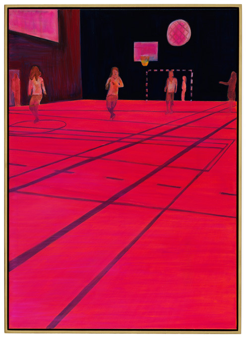
I’m a fan of Niederer’s Basketball, a hyper-pink landscape of a basketball court, and its odd, infant-level perspective and court lines that look like Photoshop crop boxes. I also like it because, hey, it looks straight out of Tron.
Whitney: Eh, I dunno if using blue instead of black is “playful” as much as adhering to standard procedure. This snoozer fits right in on the Upper East Side. Default subject matter displayed zero imagination, like vases of flowers, family snapshots, and Fairfield Porter tree lines.
That would all be fine if they were used to add something, but it reads like a formal exercise, toying with abstraction in a long tradition of early Modernists or folk painters. The painting “Kyusui-Tei Pavillon in Autumn” looks like a Mondrian reproduction, and she’s abstracted her series of Indian tantric painting reproductions by limiting palette and detail to basic shapes. A lot of the larger portraits and still lifes bend the totally-outdated still life rules slightly by incorporating photographic cropping, angles, and lens flares. Zzz…

Bosko Blagojevic, 9., 2012.
Brand Innovations for Ubiquitous Authorship
Higher Pictures
980 Madison Avenue, 3rd Floor
July 19 – August 17, 2012
Leighann: This group show asks over 60 international artists to use custom printing services such as CafePress, Zazzle and Walmart to produce an object. The exhibition was conceived by Artie Vierkant, a rising star in the art world, and the finished objects were delivered directly to the gallery in sealed boxes. The press release was almost on target when predicting that the show would be “filled with highs, lows, and hopefully more than a few transcendent successes.”
There are more lows than highs in this show, but we’ll let them off considering it’s a summer exhibition. An array of tack occupies the small, enclosed gallery space. Artie Vierkant’s sneakers slump against the wall, Daniel Temkin’s scattered multi-colored flip-flops line the floor, and Jesse Alexander Madden Harding’s printed apron hangs on the wall next to loudly patterned shower curtains by Travis Smalley, Jaakko Pallasvuo, and Daniel Everett. There’s too much happening in the gallery space, and each object shouts over the next. Result: an exhibition that looks like the remnants of a kid’s birthday party.
Whitney: I agree, there is too much, though I think packing the space was kind of the point—that the internet brims with far too many images for you to possibly see in your lifetime, and each one can spawn unlimited copies. The lens here captures everything but the main event: the feet which the camera snapped by accident, the movie you only ever saw as a poster, or the secondary-brand product logos, all disposably immortalized as towels, toilet paper, curtains.
But I don’t think plunging the toilet of digital photography gets us very far. Given the opportunity to make a meaningful idea, why be the umpteenth show to reiterate the problem?
Leighann: I get that the point is clustering, but all the show told me was “Hey, we’re surrounded by these crappy reproduced images all the time, here are some more! Loads more! In a tiny space!”
Corinna: Is Zazzle the best thing ever? No! Is Wal-Mart the best thing ever? No! Are these the best artworks ever? No, but I’ll argue with you guys, I think this is an important show. Vierkant took a trend, of combining the online and IRL worlds, and put it into a show. Unfortunately, most of the ways that exist for putting the stuff you make online into physical space happen to be corporate: Zazzle, Wal-mart, and the like. There’s not a ton of well-crafted stuff in the show, but that’s what we’ve got now with these made-to-order companies. Given the restraints, I think the work on view shows a wide range of innovation; there’s just awesome awesome stuff in the space that I’d be happy to have in my shower, kitchen, or living room.

Installation shot of Bulletin Boards at Venus Over Manhattan.
Bulletin Boards
Venus Over Manhattan
July 20 – August 24, 2012
980 Madison Avenue, 3rd Floor
Leighann: Art writer and collector-turned-gallerist Adam Lindemann’s Venus Over Manhattan stands out from its polished Upper East Side neighbours with its bare, skeletal walls and vacant space. The gallery’s second show, Bulletin Boards, organised by White Columns’ Matthew Higgs, was definitely the strongest of the shows we saw. It is exactly what a group show should encompass: twenty emerging and mid-career artists, including Rita Ackermann, Vince Aletti, Darren Bader, Gavin Brown, and Tom Burr, are given a 4-foot-by-3-foot bulletin board to fill/destroy with photographs, postcards, paint, polyfiller, and anti-capitalist slogans. We don’t know why Gavin Brown gets a slightly larger board than everybody else to display a photograph of the inside of his fridge, but the Bulletin Boards show was the only exhibition we saw that resulted in varied, engaging and interesting responses from all of its participants. Favorite billboard goes to Antione Catala, who used one half of the billboard space for images that allude to Hell, and the other side for postcards and photographs of the letter “O”. Hello! Genius.
Whitney: Could not agree more! This was one of my favorite shows this year, partly because it actually feels presented like an art show, not a showroom. I love the all-visual language of these, which is not surprising, given the fact that many of these artists specialize in it: B Wurtz, Nate Lowman, Mike Cloud, Antoine Catala, most people who show at Gavin Brown.
I loved that “Hell”/”O” board, too, with a bunch of stock photo “O”‘s on the right surrounding a photo of Oprah with her arms spread. Hearing the crescendo in your head (“oh…oh..oh.OhOH!”) while looking back and forth from the Hell cutouts is hilarious. It also reminded me of “BEES.”
Mike Cloud’s board displays Microsoft Word-processed parables about younger and older artists, ending in lines like “Upon seeing the impossibility of further reply, the artist conceded to the superiority of its admirer and invited it to stay in its home while in town.” I thought that was a really succinct sketch of contemporary art dogma.
While the scraps of notepad paper and stuffed boards may look about as random as “Brand Innovations” from the outset, it’s the opposite; the artworks riff on each other, and each rewards the viewer with some thought.
Corinna: The premise of the show feels like a school project: “Hey, artists! What can you shove inside this bulletin board? Now, go!” I don’t think this is a fantastic show, but it does illustrate how creativity can blossom under the shackles of a few restraints. I liked Virginia Overton’s use of putty to buttress the glass, and I liked Mike Cloud’s tacked-up stories and Antoine Catala’s “Hell-O” board too.
As far as summer group shows go, this one’s one of the better ones I’ve seen this year. In comparison to the other summer show curated by Matthew Higgs this summer for James Cohan, this one looks better. It’s less cluttered and the range of artists makes more sense than the ones at James Cohan, which included everyone from Warhol to Andy Coolquitt.
What I find most interesting is that a show like this seems refreshing. It shouldn’t, though, because at its heart, it’s just a school project. But the desire for some sort of order in contemporary art, rather than, say, a scattered installation of stuff, means a lot for the direction we want art to take.

{ 2 comments }
Corinna’s comment: “there’s just awesome awesome stuff in the space that I’d be happy to have in my shower, kitchen, or living room” is precisely the type of response encouraged by this niche community of artists. Perhaps this show is a sincere reflection of the transparency between these artists and corporate brands.
Perhaps the ironic nature behind these works is a bit more recidivist than it might appear. The inclination to use a tool such like Zazzle to produce works that remix and ‘rebrand’ corporate objects with each individual artist’s own aesthetic brand echoes validation behind the quote “ironic mimesis is not a critique, it is the mind of a slave”. Travess Smalley’s abstract patterns might not be any different than Jay Z’s patented hue of blue.
You know, I’d like to say that I was the only one on this trip who liked this show, and right before the comment you pull out, I make the statement that “this is an important show.” I do talk about the corporate nature of the work, based on the current fate of “individualized” content belonging to companies like Wal-Mart and Zazzle. I don’t disagree with you, and I never stated that these works are ironic—they’re not.
Comments on this entry are closed.