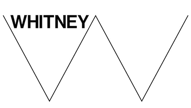
All-star designers Experimental Jet Set say the W they’ve used for the Whitney’s logo represents “the heartbeat of New York, of USA.” It “encapsulates” a “dialectic between the ‘old world’ and the ‘new world’. Does this dialectic need to be encapsulated because it’s in the middle of the ocean?
Artspeak does the firm a disservice, but so too does its decision to illustrate the differences between these two worlds through the use of stereotypes. The line drawn W isn’t just a convenient way to introduce variation of line and typeface, but it’s a familiar gesture to the abstract geometric lines that are commonly used in art.
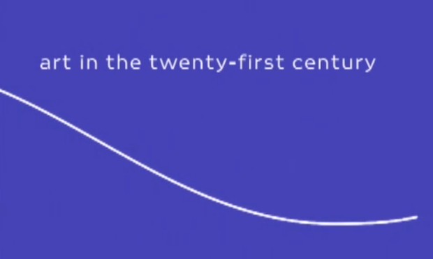
And if we know anything about art, it’s best represented by abstract animated lines.
Art21, available for viewing here.
But if this is something you like, here’s where you can get it.
Abstract animated lines aren’t all bad. The Walker’s vision for line usage includes padding for text, adding an overall energy to a generic template. Here, the line more closely resembles text than imitation of geometric abstraction, and is therefore more successful.
And an office favorite, the marriage of lines and identity:


{ 4 comments }
http://www.youtube.com/watch?v=OmSbdvzbOzY
Holy crap. That’s amazing!
I agree, some of the ‘artspeak’ in the full writeup on Experimental Jetset’s site feels a little out of touch – especially that jazzy line about “the heartbeat of New York.”
That aside, their write up (http://www.experimentaljetset.nl/archive/whitney-museum-identity) is refreshing compared to the bullshit that most design firms spin up after they’ve won over a committee with design iterations tailored to whatever par is for that institution.
I got excited to read something critical about a critically praised Dutch design group (politically minded individuals themselves, in the wake of Dutch arts funding cuts and a controversial new redesign of the Stedelijk Museum’s identity). Instead, you, like myself and probably others, found the one odd sentence that doesn’t sit right and round the post out with a few mediocre video bumpers and a piece from the Walker that is completely out of context.
Was hoping for more. I think there’s an interesting tension in this redesign. Harping on “lines” is myopic.
Hrm. Perhaps we didn’t make it clear enough, what our issue was with the lines; they’re someone’s idea of what art looks like, and therefore play into art stereotypes. It’s a cliche, and that’s what we were hoping to demonstrate. The Walker video was used for their bumper as well, so I don’t think it’s so far out of context.
In any event, while I don’t agree that harping on lines is *entirely* myopic, I think your critique is a good one. So, if I can take a stab at offering more, here are a few thoughts:
1. I don’t get the rational for emphasizing the W. It feels random, and perhaps employed simply because the designers felt like the W was a versatile graphic. That’s reasonable, but I wish there was a little more conceit behind the choice to emphasis the W other than, we-can-turn-this-into-something-else.
2. I don’t like much Web 2.0 aesthetic, and their header at least, is swimming it. The Whitney’s header is huge now thanks to this graphic, so it looks fashionable, but it’s just an aesthetic that asks me to scroll more before showing me what I want to see.
3. It does seem to be a pretty versatile graphic, and I think that’s good.
4. The logo grows on you. The lines transform. You see space, you see form, you see movement. It does the things they say it does, when the company speaks of a mutable future. The Whitney name, it’s brand, is solid. Immovable. They did that very well, imo.
Comments on this entry are closed.