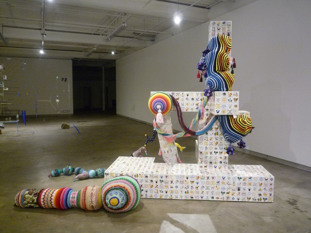
Installation view of “Locating Ourselves” at Scrap Metal Gallery. From left to right: Sarah Sze and Joana Vasconcelos.
Two weeks ago we flew out to Toronto to check out Art Toronto and the city’s gallery scene. Two totally different worlds. While the fair suffers from a lack of ambition, the gallery shows we saw presented a more balanced picture of the city as a whole. It’s not perfect, but at the very least we managed to take in some work by a few of the Venice Biennale’s better artists.
Locating Ourselves: Shary Boyle, Sarah Sze, and Joana Vasconcelos
Runs through February 22, 2014
Scrap Metal Gallery
11 Dublin Street, Unit E
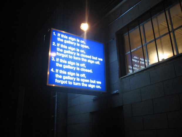
What’s on view: Three large-scale works by artists who represented their home countries in this year’s Venice Biennale; a very funny shop sign outside the gallery
Corinna: Let’s talk about this space for a second. It’s hard to find, down an alleyway, and you’re made to be unsure about whether the gallery’s even open.
Inside, there’s just three works set down a long, nearly bullet-shaped warehouse. I suppose I wasn’t terribly excited hearing about the show: three works by three artists of varying quality who showed at the Venice Biennale this summer.
Paddy: Yeah, this after our hosts had complained that Canada was overly obsessed with Venice!
Corinna: Well, whoop dee. That’s just art-collecting tourism—flying out to an island in the summer in hopes of finding artists to bring home, then show off in the chilly homeland.
Paddy: Good God, Venice wasn’t that bad.
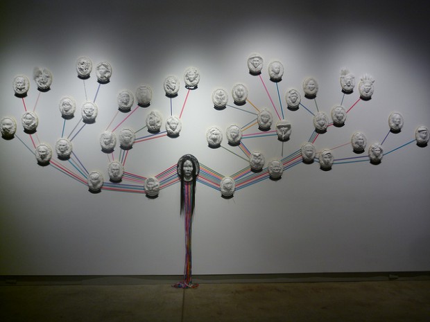
Corinna: Ha! That criticism aside, I was surprised to find out that I liked Shary Boyle more than I thought, based on her Venice installation. Her ceramic works are small, and very detailed; they fared poorly in the Canadian pavilion, even though it was one of the cozier spaces at the Giardini. Here, scale didn’t matter so much, with her twisted family tree of Victorian-inspired portraits—she created her own family tree based on real figures from Canadian history, Canadian stereotypes, and fantastical creatures. It was a bit twee, a bit saccharin, but I’m pretty sure it was more complex than anything I saw her do in Venice (although who knows if my memory could fool me).
Paddy: I think the problem with her work at the Canadian Pavilion was that it was too self-conscious. A ceramic reclining mermaid in a cave with the world’s history projected on her body depicts ingenuity rather than exhibiting it. And, of course, all those figurines on record players seemed ridiculously precious.
Here, the wall map of heads feels calculated but less self-conscious (if it’s possible to even say that about a family tree). On a purely aesthetic level I like her use of color. On a conceptual level, I like that I was actually able to identify some of the heads from the plaques below. I identified the “sadist perfumer” as Patrick Suskind, because, well, of course. Seeing as how being a blogger doesn’t leave me much time to read novels and such any more, I was glad to see I’ve retained at least a kernel of literacy in the literature department.
I wasn’t particularly into Sarah Sze’s life-sized tinker-toy/science experiment—it’s too fragile for my taste—but maybe that was the point? Near the front of the piece the inside of a broken egg shell is painted blue, a color she then puts everywhere, mostly via tape. It seems like some examination of life was going on.
Joana Vasconcelos’s knitted rainbow a geometric shaped sculpture that’s covered in tiles. You can walk around this sculpture four times and still find parts you missed or didn’t look at closely. It’s pretty amazing. It made me sad we missed it when we were in Venice.
Derek Liddington: Modern Love
Runs through November 23, 2013
Daniel Faria Gallery
188 St. Helens Avenue
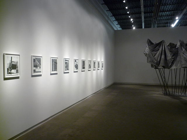
What’s on view: An exhibition the color of charcoal, with dozens of Malevich-inspired graphite-on-paper works and a sculpture that looks like a capsizing tent made from blankets
Corinna: When you walk up to the graphite drawings, you can see the sheer amount of obsessive repetition that went into making every circle, square, and triangle. I like to doodle, too, and sometimes I go over the same line over and over. I get the impulse; what I’m less sure of is what’s so important about showing this type of work. Liddington’s work is gesture, plain and simple, and it somehow “nods” to early 20th century abstraction. I don’t see much at stake with these works, and I don’t know why, at this time in history, you’d choose to make art that looks like that, and that doesn’t have much to say.
Now I know that might sound cruel, but I’d like for my art to be about something—or at least interesting enough to keep me wanting to look. So I went to the press release, which describes Liddington’s work as such:
Simple Constructivist forms are complicated by vibrating edges and blurred planes. Using drawn or textile-based geometric forms, Liddington investigates tension as a means for uncovering moments of violence and passion.
I’m not convinced there was much violence and passion in this work. If there was? Well, I guess I’d have a bit more to say about the exhibition.
Paddy: Let’s add to this grey canvas tarp sculpture in the middle of the gallery, which arguably looks a little more contemporary and probably worse for it. At least the historical reference gives us something to complain about. There’s really just nothing to say about the sculpture.
In the back room, they had a Douglas Coupland painting of a piece of dotted yellow paper. Not much content there either, but that photorealist painting seemed more human than anything in the front room. There was a small gouge of paint in background where a finger had obviously slipped at some point. Normally, that kind of thing drives me mad. Here, it was a breath of fresh air.
Nicolas Baier: Transmission
Runs through January 25, 2014
Division Gallery Toronto
45 Ernest Avenue
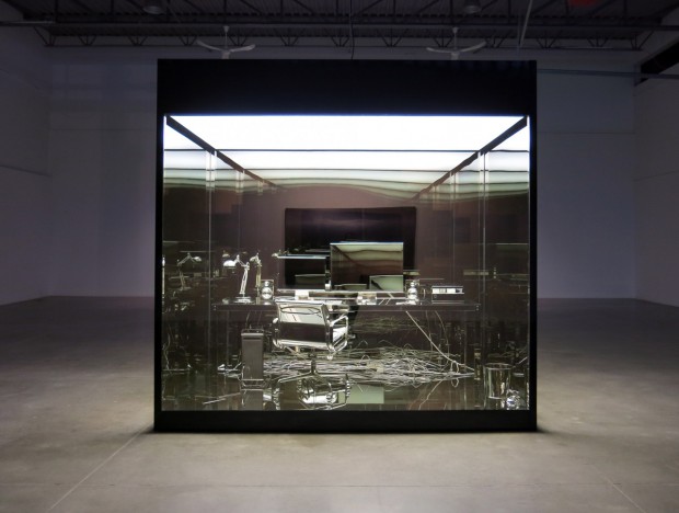
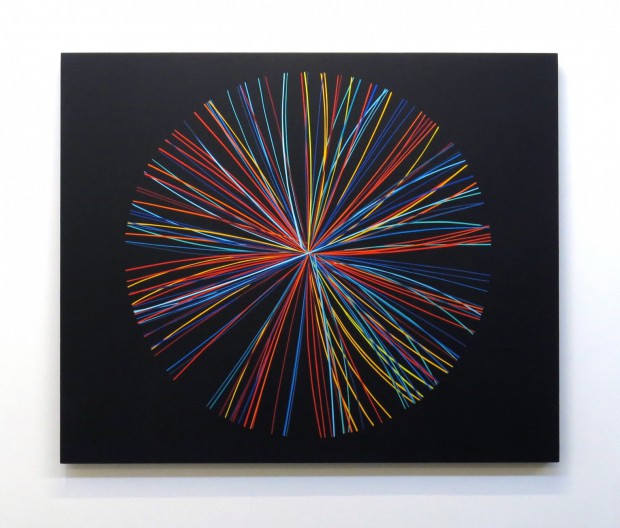
What’s on view: A gleaming chrome recreation of the artist’s studio in a vitrine; inkjet prints of scratched up mirrors made to look like “real” scratched up mirrors; dodecahedrons and other geometric shapes; and a big, iron computer mainframe—minus the computers.
Corinna: “If Damien Hirst came of age in the 2000s.”
Paddy: I didn’t get the death theme Hirst’s so obsessed with from this piece at first, though when a large number of your works point to the universe and knowledge, I guess that read’s inevitable? The show’s centerpiece, a gilded office read as a throne for the workplace. You’re not supposed to be able to see your reflection (it turns out that’s not entirely the case—plexiglass is reflective), but the read remains the same: office spaces are dehumanizing.
It turns out the cube is actually the artist’s studio. There’s some half-eaten food the artist took the time gild as well which, according to the press release makes the piece about death. That’s drawing a lot of meaning from a bit of leftover food. I imagine that what the artist is really hoping for here is that the viewer will note the absence of a human skull and books—all common fare in vanitas—and remark that we’re absent now and our sum knowledge is incased in a bunch of cables. Not exactly a deep message, but I guess that’s the point. I don’t love the point.
Anyway, the problem with this show as a whole is that every surface gets treated the same; the universe isn’t that boring. It’s not just the gilded office, but the paintings made with meteorite dust, the mirror in the shape of the dodecahedrons, and the ink-jet print on matte paper with a picture of holes on it. I guess what’s supposed to make this stuff interesting is its invisible history. The mirror is shaped like the universe and took 800 hours to make (oooOOooh). That picture of holes is actually a photograph of human neurons, shot through a microscope until they bore a hole and then assembled.
Meh. So what?
Corinna: I’m really not sure how much of this is invisible history and how much of this happens to be just invisible process (of how it was made). That, in my opinion, is even worse than an invisible history.
Paddy: Good point. And in some cases it’s both; the mirror is shaped like the universe (invisible history), and it took 800 hours to make (invisible process).


{ 2 comments }
A very beautiful art to watch out… thanks for sharing
Great, Its beautiful Pic. in Scrap metals.
Comments on this entry are closed.