
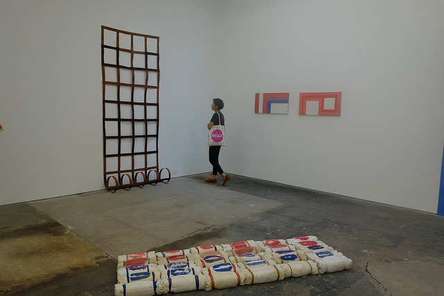
CANADA Installation view. Image: Paddy Johnson
CANADA Gallery, 333 Broome St
June 7th-July 20th
What’s on view: A show of under-recognized French art movement called “Supports/Surfaces”, a group of 15 guys from the South of France who were inspired by Communist thinkers and made art out of sheets, ropes, plastic, and generally soft blue collar materials. Artists included André-Pierre Arnal, Pierre Buraglio, Louis Cane, Mark Devade, Daniel Dezeuze, Noël Dolla, Jean-Michel Meurice, Bernard Pagés, Jean-Pierre Pincemin, Patrick Saytour, Claude Viallat
Paddy: One odd quality about contemporary art made from the 70’s on is that it’s often difficult to identify the decade it was made in today. CANADA’s “Supports/Surfaces” is a pretty good example of this, since the paintings in this show were made in the 70’s and early 80’s and most look like they could have been made yesterday. What’s the difference between Louis Cane’s 1970 “Toile Decoupee”, and Joe Bradley’s 2008 “Gordon”, both of which combined shaped fabric surfaces to create a silhouette that looks like a robot? The main one seems to be that Cane’s doesn’t come on a canvas stretcher.
According to Phil Grauer, Canada’s director, that’s a sign of courage. Artists today don’t do work off the stretcher, in part because they don’t sell. I’m not sure if I buy that though. Daniel Buren, Tony Conrad and Kim Macconnel all worked on unstretched canvas in the 70’s—it may have been more common at that time. Also, the market for their work wasn’t as robust as it is now. It’s not that courageous to give up sales you don’t have. I don’t know that we should be staking out courage by sales volume anyway. The market is only one dimension of the art world—it doesn’t have to be the defining one.
Whitney: I see how it could be courageous to make paintings on raw canvas off the stretcher at any time- it is harder to sell, no matter what time you’re in, so it’s usually a small indication that you’re putting art priorities first. That, or laziness.
I agree, though, that it’s not that interesting to define courage by subverting the market because the market can adapt pretty quickly to make anything saleable. I thought this more reflected a lifestyle– the PR mentions that these guys were Communists, and a lot of them were war vets, so it would make sense that they’d be interested in hand-produced anti-production-value artmaking. Anyway raw-looking and workman’s materials seems to be a common theme for artists with a social/activist bent– Robert Rauschenberg, Noah Purifoy, David Hammons, Ana Mendieta, to cherry-pick.
They were also fans of Matisse, which seems to be the inspiration for the cut-and-paste collage aesthetic. Unfortunately I’m not sure the work itself goes much farther than swapping out the materials, usually to make some sort of grid pattern.
Paddy: Yeah, mostly, this is a show about grid structures. I have to admit, that’s not a subject I’m overly interested in—by definition an artist is either following a formula or breaking it—but there are some beautiful moments in the show. Looking through the grid of Claude Viallat’s died hanging rope and on one side seeing the repeated dropping form of a pink curtain on stilts and Jean-Pierre Pincemin’s quilt-like grid on canvas marks one. Everything seems to line up or mimic each other’s forms. There’s a rolled grid tacked to the wall in the next room on a far wall that subtly ties to the two rooms together.
Of all the work in the show, I probably got the most out of Pierre Buraglio’s collages. One piece made a montage out of two pieces of folded newspaper arranged in the shape of a collage and backed by a bit of blue mesh plastic. Another stapled bits of painted canvas onto stretched canvas that looked like wall paper. In each case the materials seemed to be pointing beyond themselves, and in the context of a collection self-referential seventies paintings, that might actually be courageous.

P! Installation view. Image via: P!
Elaine Lustig Cohen & Heman Chong: Correspondence(s)
P!, 334 Broome Street
May 4th – June 22nd, 2014
What’s on view: Paintings by influential artist-designer Elaine Lustig Cohen are paired with book cover paintings by the much younger artist Heman Chong. Chong has selected abstract paintings by Cohen that reflect her book design work; Cohen has commissioned new paintings to add to Chong’s ongoing series “Cover Versions,” paintings of fake book covers with real titles. The show had two separate hangings of the work, the first by Prem Krishnamurthy of P!, and then it was re-hung by Ruba Katrib of the Sculpture Center. Like the gallery itself, both Chong and Cohen are crossovers between design, art, and generally art-related intellectual endeavors.
Whitney: There were two hangings of this show; I’m not sure I get the advantage of this one (Ruba Katrib’s) since it seemed to just separate the paintings by palette and size. And then I don’t get exactly how Chong’s book cover paintings “footnote” Cohen’s larger paintings other than the fact that they are smaller, include text, and incorporate Cohen’s stripe motifs. And then there’s the fact that the book covers and the text don’t really line up in any meaningful way; “Night” by Eli Weisel is just a pinkish cloud. It’s very similar to “Daniel Deronda” by George Eliot and “Robinson Crusoe” by Daniel Defoe. And what do these titles have to do with each other? Just that Cohen chose them, I guess.
But, like most shows in this gallery, there’s a level of professional nerdery that makes me think there’s subtlety here that I’m not a party to. Only type-obsessors would notice, for example, that made their own typeface for the press release which only Chong and Cohen are allowed to use. It’s a combination of Futura and Din. If you look really hard, this gives the font a kind of rippling effect, where the narrower letters make the words look more compressed. You have to appreciate that level of specialization, even if it’s not your particular area of expertise.
Paddy: I found the exhibition pretty confusing too. I get the appeal though; the gallery is pairing an artist who makings paintings of imagined 1960’s and 70’s book covers and the paintings of a designer known book covers she produced during that same time. There are a lot of ways this exhibition lines up historically.
I missed the first hanging of the show which was hung by Prem Krishnamurthy who simply paired the book covers that responded to the paintings, but the documentation on their site suggests that this might have been a better arrangement. As a viewer you can see how the Cohen’s use of line informs Chong’s paintings even if the rationale for how the titles were chosen doesn’t become that much more clear. John Gardner’s classic 1971 novel Grendel, a small painting with a bobby pink cloud cut with eight transparent horizontal lines and Cohen’s large diagonally striped geometric abstraction works well together because aesthetically they both seem to be referencing outer space.
This brings us back to the problem you mentioned, though, since Grendel is a comic book about a monster giant. If there’s no relationship between content and cover what’s the point of citing the book? What does that have to do with Cohen’s paintings? As far as I can tell, nothing, which is why I would have preferred asking myself what the connection is between someone like Frank Stella and Elaine Lustig Cohen as opposed to Chong and Cohen. Stella and Cohen came into their own at the same time, but in different fields—Stella in painting and Cohen primarily in graphic design— and even a Google search illuminates the shared aesthetic sensibility running through both traditions. Unsurprisingly, Cohen’s paintings have a close aesthetic similarity to her graphic design work, which often treats letters as if they were building blocks for abstraction and representation.
On the subject of Chong, if I had to pair him off with someone, it might be Julian Montague, a Buffalo-based artist who was making fake covers for fake books in his series “Volumes from an imagined intellectual history of animals, architecture and man”. Apparently Montague’s ability to mimic and poke fun at genres is virtuosic, but I don’t pay enough attention to book covers to know. I assume Chong is choosing the covers he does because he has some connection with those titles too. What that is, though, isn’t made apparent.

Comments on this entry are closed.