Greater New York
MoMA PS1
22-25 Jackson Avenue, Long Island City, NY
On view October 11, 2015–March 7, 2016
Curated by Peter Eleey, Douglas Crimp,Thomas J. Lax, and Mia Locks
Much has already been said about Greater New York, PS1’s massive survey of over 150 regional artists that spans deceased pioneers who cut their teeth in the 1970s to a fresh crop of young, experimental fashion designers. With that in mind, we’re going to offer a couple of slideshows, each with personal highlights and commentary from a different AFC writer. There’s really too much great (and some mediocre) work to cover it all in one post.
It’s funny, Paddy and I went to this show straight from the airport after being out of town for a few days and I think that sharpened the experience so much. Everything to love and everything to hate about this big, weird city seemed rendered in high relief here. The sheer breadth of artistic practices in all their impressive and/or shitty quality, the ever-present anxiety over gentrification and inequality, the varied strategies to confront those problems, the heart-wrenching/obnoxious nostalgia for the “good old days” when those issues were less apparently acute, and of course the city’s infamous cynicism—I can’t count how many other attendees we bumped into who met our pleasant surprise at enjoying the show with scathing critiques of “misses” I had barely noticed.
The exhibition is very loosely organized as a progression of work that addresses the psychogeography, politics, and architecture of the city’s built environment; to considerations of subculture, identity, or social structures; to individualistic expressions in garment, performance, or figurative representation. Overall, this curatorial strategy seemed most effective on the ground floor, where work directly referenced New York’s urban fabric and the consequences of recent tears, alterations, and additions to it: namely gentrification, displacement, and the construction boom.
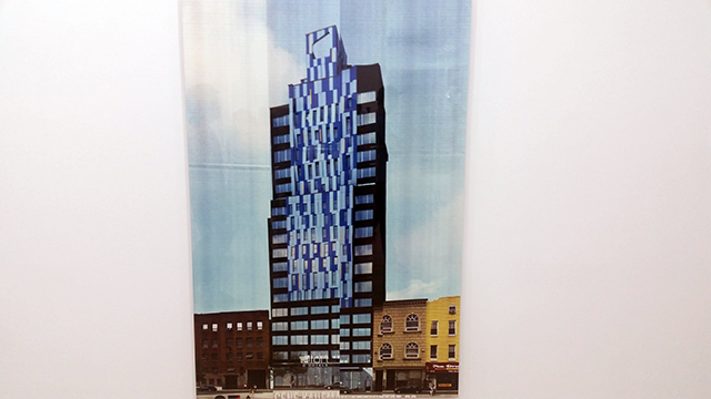
That warping of the city’s fabric is captured so well in Nick Relph‘s absolutely stellar series of prints. They’re all made with a handheld scanning device that copies architectural renderings from construction fencing—often including stains, wrinkles, and graffiti in the process. The images come out disorientingly wonky, not unlike the often-humorous discrepancies between digital renderings of new “luxury” construction and the frequently-shoddy-looking reality. In a very real way, the current construction boom is reshaping the city into an increasingly alien, unstable landscape. Relph’s work reflects the uncertainty and awkwardness of that transition so perfectly. But there’s no way any work of art could be more surreal than comparing contemporary Long Island City to the neighborhood in the era that the majority of the work in Greater New York was made.
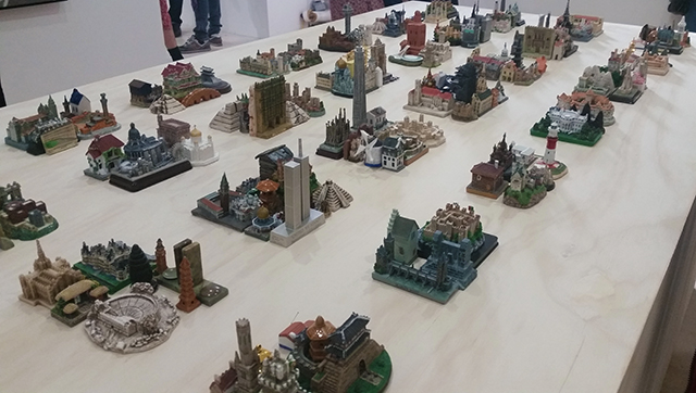
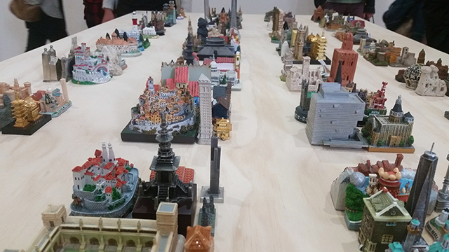
Then again, New York has always been characterized by change as much as landmarks. This piece by Liene Bosquê is a collection of found souvenir miniatures—from pagodas and picturesque villages to cathedrals and skyscrapers—arranged in a Manhattan-like grid. I was immediately reminded of the great illustrations from Rem Koolhaas’s Delirious New York: A Retroactive Manifesto for Manhattan, a book that traces and celebrates all the hubris and often-competing visions that compromised to shape the city’s architecture, and by extension, culture. It’s so hard to resist the urge to play with this work, and easy to remember that New York is so loveable precisely because it’s all about the seemingly incongruous being squeezed together in convenient little rows.
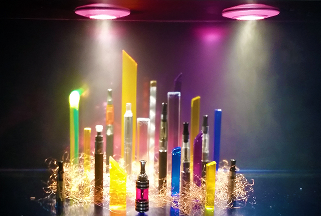
Even in a dark room full of fluorescent-hued pieces, Ajay Kurian‘s “Comfort Zone #3 (Heaven is for smokers and non-smokers)” is inexplicably mesmerizing. It’s a skyline composed of electronic cigarettes and pieces of plexiglass in a fog-filled glass vitrine. It’s so effective as a miniature fantasy cityscape with a pretty minimal palette of materials—bringing to mind Oz’s Emerald City and all the wizard’s smoke and mirrors. It’s also a funny conflation of two new, contentious issues regarding ownership and use of urban space in the 2010s era: the rise of e-cigs (I’m still not sure where I’m allowed to “vape”, or not) and of the “superscrapers”. Here, the hand-scaled gadgets recall the impossibly tall, impossibly skinny “finger buildings” sprouting above the concrete jungle’s canopy like an invasive species from Dubai.
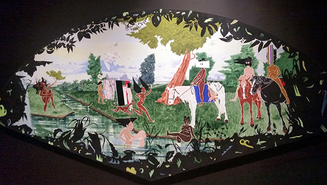
Nearby, William Villalongo presents a different utopian vision in “Jubilee”, a painting shaped like a fan depicting a bucolic scene that’s somewhere between “The Luncheon on the Grass” and the decor one might encounter during lunch at a Chinese restaurant. (I mean the latter in the best possible way.) The landscape is populated by female figures of various, often ambiguous ethnicities and different body types frolicking and making art, seemingly free of male gazes or racial tension. In one vignette, a woman with an afro is gleefully braiding a blonde woman’s hair. In another, an Asian woman is squeegeeing a canvas with stripes of black, green, and red—colors most often associated with the Pan-African flag. In this order, however, the stripes signify a relatively obscure former republic in present-day Bulgaria or a town in Holland known as “The Flower Capital of the World” (thanks, Google!). Perhaps, in this perfect post-racial world where there are no men starting wars over borders anyway, flags have no reason to exist and she’s just making an abstract work like her friend. Eerily, the scene is framed by a silhouette of foliage—positioning the viewer as a voyeur lurking in a bush. Everything about this painting made me feel guilty for liking it. “Post-racial” is increasingly treated as a dirty word of false promises, and the obvious artifice of the scene (each figure is collaged-in separately) seemed to suggest that the fantasy is indulgent and escapist. It’s an especially uncanny work in the context an exhibition with so many pieces directly addressing racial injustice and the associated anxieties.
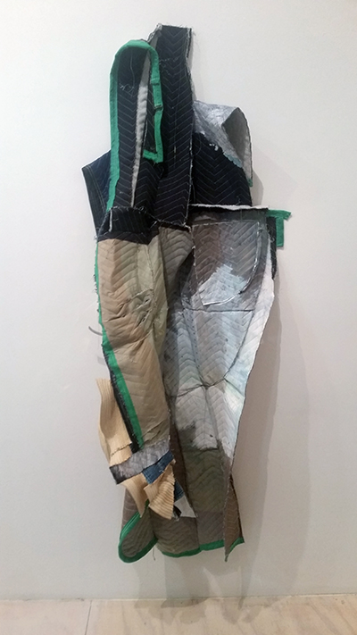
Eric Mack‘s work is probably one of the most successful examples of a contemporary practice that’s positioned in dialogue with the city’s art history while still feeling timely and poignant. The wall text here draws comparisons to 1960s painting that mashed-up everyday objects with abstract expressionism—the curators don’t name names, but I thought of how romantic Rauschenberg’s New York of cheap lofts and junk stores always seemed. Here, though, Mack is painting on moving blankets, which evoke the crisis of displacement and the reality of artists having to adapt their studio practices to nearly-nomadic conditions. For context, at this opening alone, I bumped into three different visibly-distressed people who told me they had either lost their studio or homes recently to development. I actually started to tear up a little bit while I looked at this piece, thinking about that history and how screwed-over this generation of artists in New York is. Seriously, fuck!
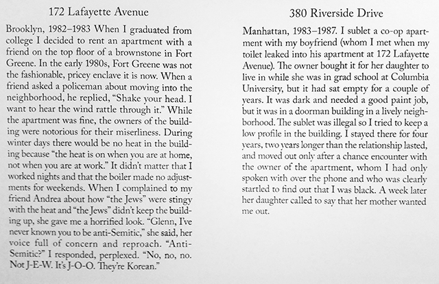
Some pieces, though, serve as reminders that housing in New York has always been a struggle (albeit never as expensive as today), particularly for people who don’t happen to be white. In “Housing in New York: A Brief History 1960-2007”, Glenn Ligon silkscreens a personal anecdote about each place he has ever lived directly to the wall. They’re sometimes funny, but often tragic and infuriating. Through his experiences, there’s a moving narrative touching on issues such as housing discrimination, slumlords, the bohemian heyday, gentrification, and eminent domain abuses. Ligon has had to move a lot. Reading this intimate history at such a public scale, surrounded by strangers, was a powerful experience.
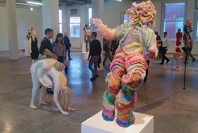
Elizabeth Jaeger, “Maybe We Die So The Love Doesn’t Have To,” 2015 (L) and Raúl De Nieves, “Days(Ves) of Wonder,” 2007-2014.
Upstairs, there is a totally weird Pantheon of statues that might be one of the most absurd curatorial decisions I have ever encountered. I literally laughed out loud when I stood in this room. Hopefully, that was intent, because I had no idea what is the message was. New Yorkers are whacky? Figurative sculpture is inherently whacky? I’m not sure what we’re supposed to take away from this chamber, but a lot of the individual works are good. I love Mary Beth Edelson‘s “Kali Bobbit” (1994), a dominatrix-goddess of castration and Judith Shea‘s “Easy Does it” (2014) which is an art-world-looking woman posed in a kind-of tense-but-trying-to-keep-it-together shrug. She’s a very relatable figure.
The goofy-figuration vibe is best exemplified by Elizabeth Jaeger‘s “Maybe We Die So Love Doesn’t Have To.” I couldn’t decide if I liked it or not when we saw it at NADA earlier this year. I think Paddy did? Both Lexie Mountain and SSION seemed ambivalent about it too, when they reviewed it for AFC.
But Raúl De Nieves is the artist here that definitely deserves inclusion in Greater New York, though definitely not in this room. His work is all about process and less explicitly about figuration—and that process is what should be the focus here, as it strikes me as very uncommon among young artists in this city. De Nieves painstakingly hand-beads objects using inexpensive materials in a totally labor-intensive way. This sculpture took seven years to complete! I can’t think of another young artist whose practice even looks remotely similar after seven years. That’s commitment. The resulting objects have a strange precious/not precious quality that’s extremely endearing—the complete opposite of the high production value but sterile, more hastily-produced sculpture that characterizes so much of the commercial art world’s rapid, expensive output. This guy here is lumpy and awkward and not quite beautiful, but he looks like he wants a hug, and I kind of want to give it to him.
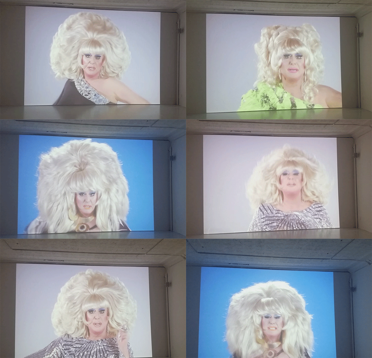
Yet it’s not over until the fat lady sings. Depending on what route you take, the sprawling, uneven exhibition kind of dead-ends in this room, where a giant projection of Lady Bunny lipsynching greets viewers on completion of the gauntlet. It reminded me of playing a video game where you navigate an esoteric temple to face the “boss” of the level. And really, the experience is a great analogy to New York City—for all the challenges and heat and crowds and inscrutable weirdness and housing insecurity—at the end of the day, nightlife and drag queens and larger-than-life personalities make it all worth it.


Comments on this entry are closed.
{ 1 trackback }