
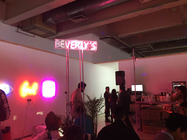
Beverly’s
For years we’ve sung the praises of NADA, an artist-centric fair that celebrates and works to commodify the strange, the creative and the wonder. In 2015, though, we began to question the model. Was NADA a bit stale compared to recent years? Was ARTIST RUN, a new fair that celebrates the DIY artist, closer to our interests?
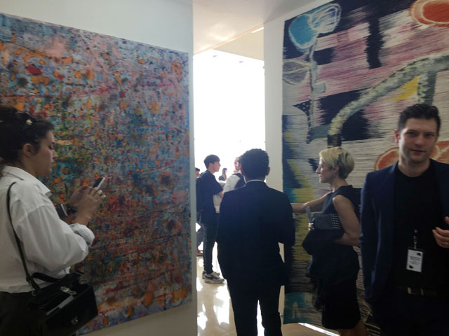
These questions came up a lot yesterday at the Material Art Fair in Mexico City, which AFC staff writer Michael Anthony Farley described as a “great compromise between ARTIST RUN and NADA. Farley was referring to the structure of the fair, which invited more dealers than artists to participate, but retained the artistic energy and life essential to new art by keeping the booth prices low. It’s a great fair.
I agree the sentiment, but would put it a little differently: Material tells us that NADA can easily be replicated. The art and spirit of the fair are near identical right down to the awkward venue. (This year’s floor plan was incredibly narrow labyrinth like, a quality that worked for the fair because so much of the work did not carry an air of preciousness.)
If I were a fair organizer the ease of replication would make me a little nervous. It suggests that NADA isn’t so much a unique vision of fair organizers, but rather a reflection of a particular consumer group’s aesthetic preferences. The fair could see a lot more competition in the future. (Why NADA needs to be a non-profit to promote this work remains a bit of a mystery—both fairs charge admission.)
Material makes clear that within emerging circles, low booth costs almost always create better fairs. Dealers and artists can take more risks and for this demographic the ability to do so is essential. And many don’t even come with the objective to make sales—instead they hope to connect with other talented artists. And that should make the Material Art Fair more important to many artists than any other event this year.
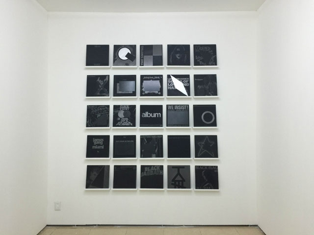 Manny Prieres’ “I Was A Teenage Revolutionary” at Spinello Projects. Michael: Each of these carefully-reproduced album covers is based on records from the artist’s own collection. Each one is two-sided and features a faithful rendering in graphite, gauche, and enamel on panel. Paddy: Part of the marvel in this piece is unseen: it’s a unique edition of three. The amount of skilled labor that went into this work seems near absurd.
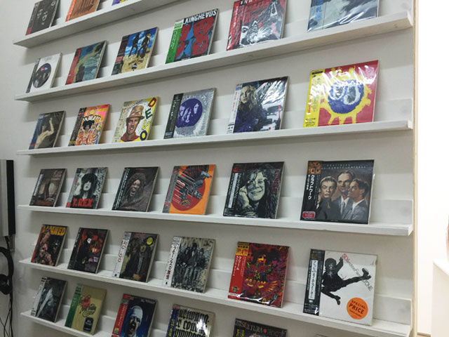 Masaru Aikawa’s oil on canvas CD covers and CDs at Eitoeiko, Tokyo, albums. Michael: Like Prieres, Aikawa recreates beloved albums, this time in full-color, complete with Japanese price stickers. The artist also created recordings of himself humming the songs and singing along in broken English. I immediately recognized “Blitzkrieg Bop” from one bar of Aikawa humming “nunna nunna nun nah!” This probably brought the biggest smile to my face of anything I have ever seen in an art fair. Paddy: Agreed. The fact that the artist sung all these songs himself—terribly—makes the work. Pop music celebrates the gifted voices, art celebrates that dude who toils alone in his basement.
Andrea McGinty at East Hampton SHED.
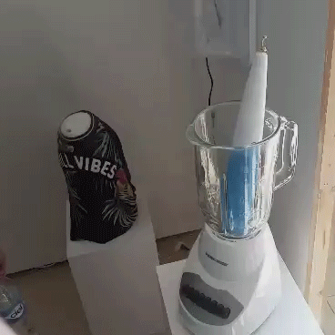
Michael: The piece on the left is a humidifier spurting steam from a tropical-print garment that says “CHILL VIBES” while the piece on the right comprises a vibrator with a belly button ring tip bouncing around a blender. McGinty’s capacity to utilize mass-produced consumer products in a way that’s so evocative of the body or a sensation/desire never ceases to amaze. Not pictured: an e-cig plugged into the gallery outlet with a toe separator and keychain depicting palm trees. It’s like a “Sandals” resort commercial encouraging us to unwind and pamper ourselves compressed into a trinket one could buy from a street vendor
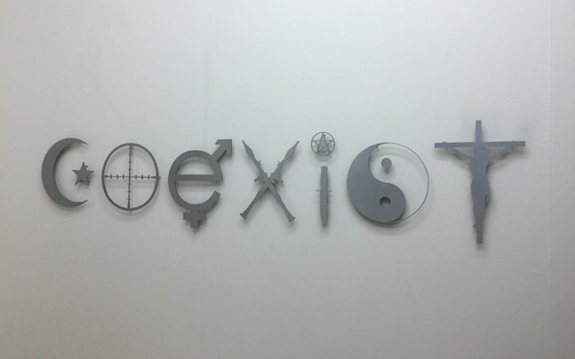 Dmitri Obergfell “Co-exist” at Gildar Gallery. Michael: Apparently a lot of Mexican viewers didn’t understand this piece. But it’s probably the smartest subversion of those inane bumper stickers meant to urge people to put aside their differences.
 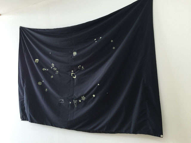 ” at Carne Bogota. The Colombian artist made this flag featuring a constellation of star-shaped logos—from the “Starfleet” insignia to the Hardee’s mascot.
Juan Sebastián Peláez, Carne, Bogota
Michael: Espacio KB, another gallery from Bogota, also had a really solid booth of work that was smart, a little political, and funny. The text pieces are from Juan Uribe, and the video by Mariana Jurado depicts a woman (presumably the artist) wearing American flag leggings and repeatedly trying to sit on a broken chair. Rather than fix the chair, she continually smashes it further and further into rubble. It’s a pretty apt metaphor for the current state of politics, particularly in regards to our country’s policies in Latin America.
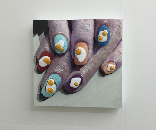
Gina Beavers at Clifton Benevento.
Michael: I love this series. It looks like Beavers has been on a trajectory where her deliberately-bad paintings have been getting progressively closer to good paintings—without sacrificing her devotion to kitsch. Paddy: Agreed, though I think these egg finger nails are superior to the carved our fruit fingernails. Those seemed a little too obvious to me. Nail decals using fruit are common. Fried eggs are anything but.
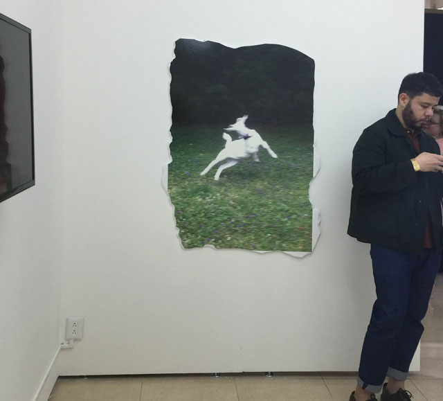
Anna Sophie Berger at New Galerie, Paris.
Paddy: I got the feeling this out-of-focus goat didn’t do much for you, Michael, but I liked this picture because it confused my expectations. The image seems like the kind of image that gets saved because you can’t be bothered to throw the file out. It’s really generic. So the fact that Berger printed it out and stuck it to foam core seemed kinda funny to me—the mix of care-not-care makes just enough sense for it land on an art gallery wall. Michael: Not at all! I loved this. Coincidentally, it reminds me exactly of a night I spent hanging out with some goats where all the photos came out blurry and horrible but I couldn’t bring myself to delete them, because how often do you get to take nighttime pictures of fun goats?
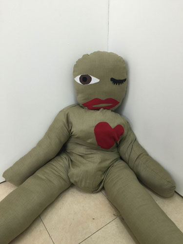
Dardan Zhegrova at Lambdalambdalambda.
Paddy: An interactive piece that requires the viewer to snuggle up with the stuffed figure to hear one of three love poems about gay love. The poems change each day and apparently they aren’t all as dark as the one I heard, which seemed stalker-y in nature!
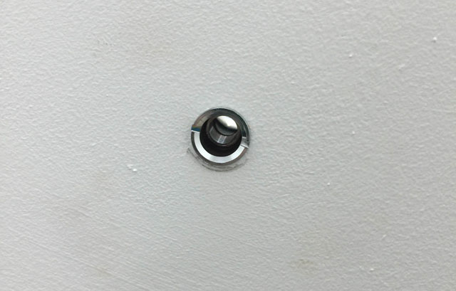
Queer thoughts, Puppies Puppies, “Peephole”
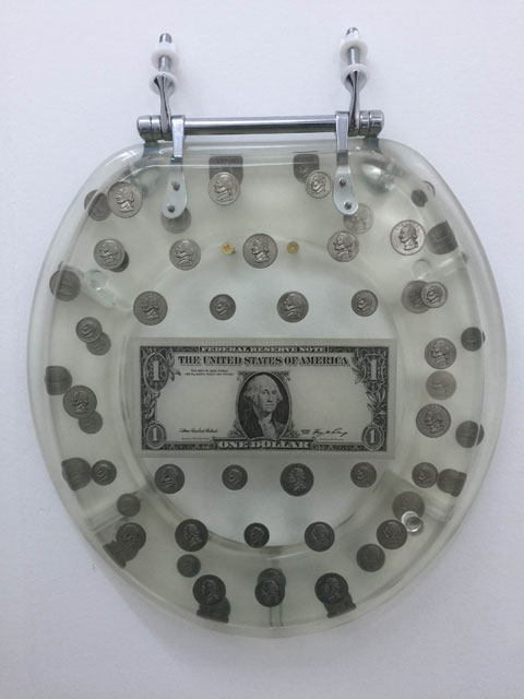
Queer Thoughts, Puppies Puppies, “Toilet Seat”
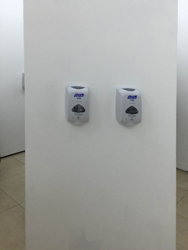 Paddy: I see the Purell as the final stage in this Puppies Puppies work, which includes a monied toilet and a peep hole that reveals a woman wearing a monster mask sitting on a toilet. After everything you’ve seen, you’ll need some Purell. (As if anticipating that, the machines shoot out way too much of it.) The last time we talked about this artist, we were discussing a dead frankenstein lying in the middle of a booth at NADA. I think it’s safe to say Puppies Puppies has a fairly unique aesthetic.
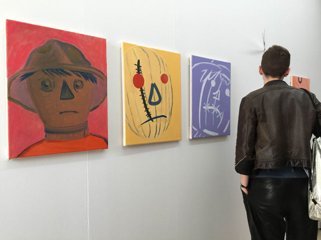
City Limits, Conrad Guevara, “Kuebiko (peanut)”
An unhappy scarecrow painting. I’m not sure I even have that much to say about this work, except perhaps that its faux naivety is very funny, but also, almost proto-typical Material Art Fair/NADA.
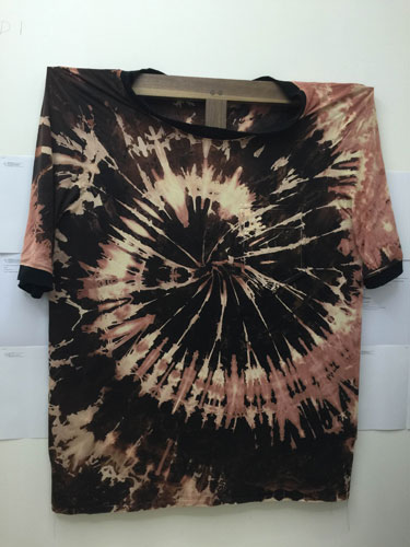
The oversized t-shirt trend continues. This was at the Michael Manning/David Horowitz booth by Last Resort in Copenhagen.
Tomm El-Saieh and Yann Gerstberger at Michael Jon (Miami/Detroit).
We don’t have a great photo of this booth (a result of the fair’s maze-like configuration that prioritizes IRL experience over photo ops) but it’s worth mentioning for several reasons. Yann Gertberger, a DF-based artist, was actually showing in the gallery next door as well—creating the illusion of a two-booth show, which worked out nicely for all parties involved. Gertberger’s tapestries are a melange of fiber techniques—dying, weaving, collage-like stitching—that make them the rare process-based fibers work that read more like paintings than a commentary on craft. They’re great. I’m not sure I would’ve made that association had I not seen them next to Tomm El-Saieh’s work, which are abstract paintings that almost read like all-over millefleur prints. Both artists work in a similar pallete with light gestural touches and a process that borrows concepts from both painting and textile design. I can’t think of a better pairing at the fair wherein two artists made each others’ work seem that much richer.
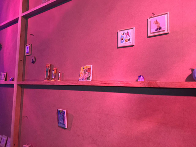
The mini fair
Paddy: Alison Kuo and Stina Puotinen curated a fair of miniature art works hidden behind a wall at the Material Art Fair bar, Beverly’s. Cast in pink light, each work had to be examined closely. I loved it. Hat tip: Irena Jurek, participating artist and AFC contributor.

Comments on this entry are closed.
{ 3 trackbacks }