
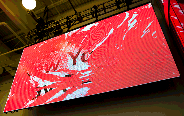
Paddy: The biggest change to NADA this year is that it’s no longer free to visit. It now costs $20 for a day pass, which raises a fairly obvious question: why is this art fair a non-profit? Their stated mission, is to “create an open flow of information, support and collaboration within our field”, which doesn’t exactly read as a “public good” to begin with. If NADA really wants to offer an “alternative to the art establishment”, as they state on their website, they could start by making sure that the fair remains distinctive by being open to everyone. That means offering free admission and booth rental prices that remain in the realm of affordable to mere mortals. They’re falling short on both.
It may also mean putting the kabosh on asshole-boy pranks meant to scare the uninitiated, such as Brad Troemel and Joshua Citarella’s almost certainly fictitious spider project. The piece involves releasing six poisonous wolf spiders into the fair for every dollar donated to the “NADA Spiders for Change Fund”. For every spider spotted, they claim they will donate $100 to cancer research. Art stunts such as this have become ubiquitous at all the fairs, and make clear that a shake up is desperately needed.
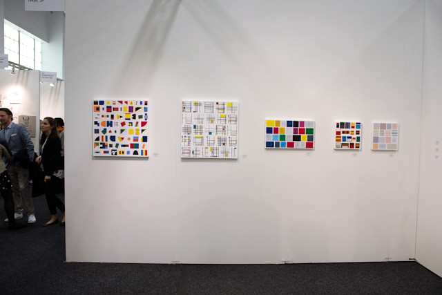
If the job of a fair is to introduce viewers to new art, an obvious fix might be to try and switch up the exhibitor list a little more from year to year. There are a number of reasons that’s not happening—clicks are natural in any field—and as we’re seeing across the board, the same galleries show at the same fairs. After five years in New York, the arteries of the art fair are hardening.
All of which is to say, I found NADA a bit of let down this year. It was a refreshing change of pace from Frieze, which seems to be where fun goes to die, but very little of what I saw surprised or energized me. Bummer.
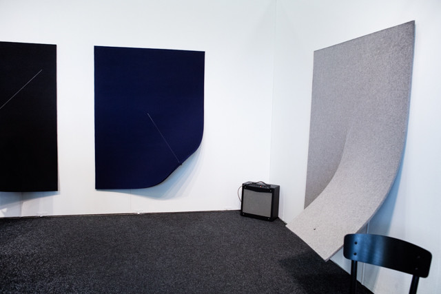
At Spinello Projects, Naama Tsabar’s felt-and-guitar string pieces look like minimalist sculpture, but are connected to amps and can be played like musical instruments.
Michael: I think it’s worth noting that fresh blood matters—we were happy to see Miami’s Spinello Projects and Chicago’s BOYFRIENDS gallery making their debut at NADA New York, shaking up the same-old roster of New York-centric galleries. And despite the new entrance fee, attendance seemed to be booming. Gallerists reported crowds lined up before the fair opened, and it was noticeably more packed than Frieze.
That being said, NADA felt wildly uneven this year. That’s an impression that might be down to layout—the most interesting booths are tucked away farthest from the entrance. The first fifteen minutes I was in the fair, I thought NADA had switched its niche to the hotel art market—boring abstraction that wasn’t even “pretty” and tropical motifs dominated. I think it’s a bad sign when most of a fair’s highlights are work you’re already familiar with. It wasn’t until we had wandered the fair for a while that we discovered new artists we actually liked. That’s always something I look forward to at NADA, and this iteration did introduce us to a few new faces—just not as many as years past. If you make it through the rows of “lobby art” in the front, it’s a party in the rear. Namely, there’s stuff to do here beyond passive viewership or window shopping—virtual reality installations, immersive booths, artwork that can be played like a wondrous new musical instrument—there was fun to be had here that never felt gimmicky like some of the attempts we saw yesterday at Frieze.
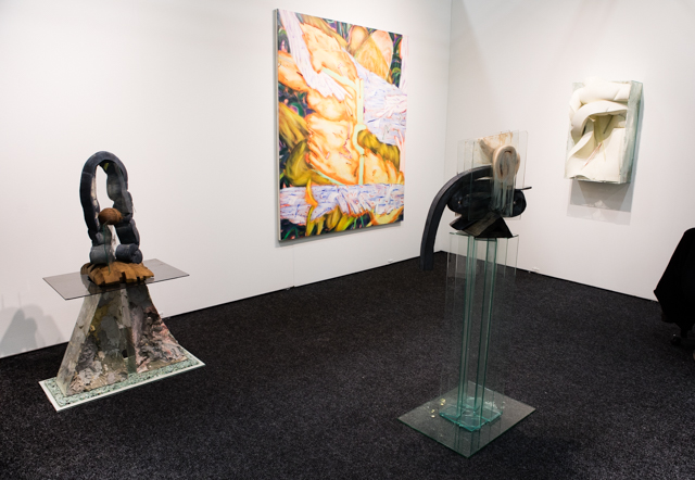
Maximilian Rodel and Lisa Tiemann at Fiebach, Minninger.
Paddy: Raging contemporary art trends: pastels, particularly in pink, smiley faces, plants, tropical themes of any sort, the 80’s.
This booth, near the front of the fair introduced us to the idea that we’d see plants pretty much everywhere. Why are plants so popular? Climate change is on our minds, so artists are thinking about nature more? No idea if that holds water, but it’s a theory.
Michael: Maybe because houseplants are the one element of the domestic environment that transcends class and the fickle, arbitrary cycles of interior decor zeitgeist? They’re comforting, timeless suggestions of “home”, or at least suggest what one could put in all the ceramics people are selling these days.
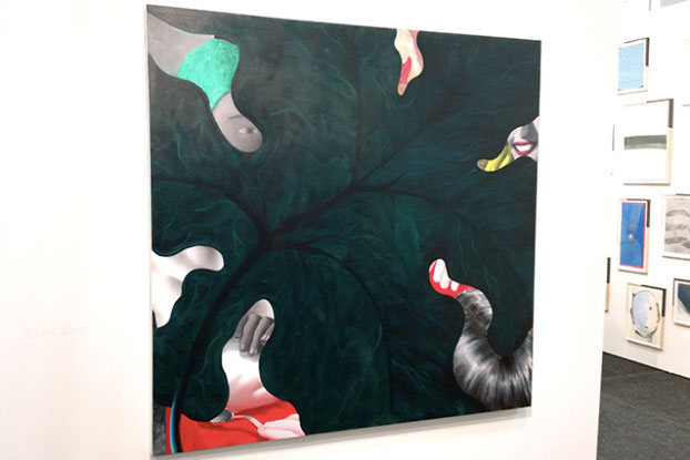
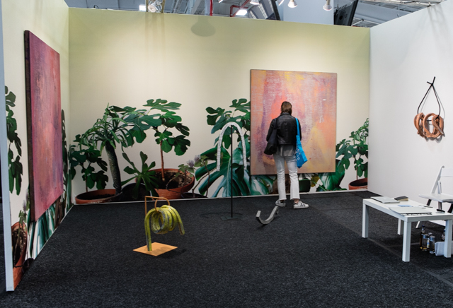
Jordan Kasey at Nicelle Beauchene Gallery
Michael: This painting from Jordan Kasey is one of my favorite examples of the aforementioned trends—we get glimpses of black and white bathers rendered in an 80s-illustration-esque style wearing pastels through the negative space of what I believe is another philodendron leaf (philodendrons have apparently overtaken ficus lyrata and palms as the houseplants of favor in contemporary art). I always appreciate how Kasey’s work is uncannily cheery and rendered in an unusual combination of techniques. Her style’s so recognizable, but the paintings never feel repetitive or boring.
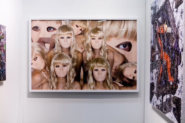
Chanel Von Habsburg-Lothringen and Jacques Louis-Vidal at BOYFRIENDS
Paddy: It takes guts to cover the better part of your booth with one framed photograph and in this case it really paid off. Chanel Von Habsburg-Lothringen’s photograph of nine naked women in masks, huddled as if posing for some weird Vanity Fair shot, is like an attention grabbing vortex. The images are so creepy, it’s hard to look at anything else. Jacques Louis-Vidal textured painting of figure trying to walk through a vent held up but it was hard to see the image without some distance and in a five foot cube that’s not a luxury any artist has.
Michael: It’s so true—the multiple sets of almost-faces making eye contact with the viewer will go down as one of the most memorable sights at NADA 2016. They’re so, so creepy and evocative. My mind raced to associate this image in some kind of classification or precedent—advertising, 1970s cult horror film still, weird Japanese porn—and came up feeling unmoored to anything but the gazes.
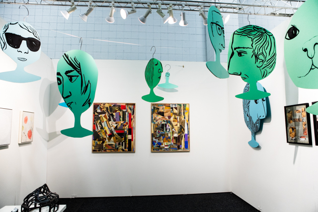
Soloway installation view
Paddy: These Fawn Krieger heads on hangers really make Soloway’s booth. I know the marker for good art isn’t supposed to be how it would look in a home, but this is such an inventive way to activate space, that I’d want to visit almost any apartment that hung these pieces from the ceiling. Each head hanger is unique, from a woman wearing shades, to a bearded man, and even a cat, and could be used as hangers for Krieger’s designed clothing. Those pieces are black, genderless, utilitarian jumpsuits and shirts that Krieger describes as feminist. I’m a little too tied to my own interest in the feminine to ever want to own one of them—they are very potato sacky—but I don’t think I’m the intended market for these things. They obviously belong in a museum.
Michael: ltd Los Angeles had a strong booth, if for no other reason than the works here seemed to collectively present a fully-realized world. On their own, I might not have cared for every individual piece here, but they’re curated to reinforce each other’s strengths. Alex Becerra’s ceramic beer bottles, titled “Delerium Tremens”, were positioned next to Jennifer Chan’s “Body Party” digitally-printed bed—like last-night’s bedside leftover drink one might swig to postpone a hangover when waking up from an orgy. Anja Salonen’s similarly decadent fantasy tableaus in oil (“All men are dogs” and “When the back door is the front door and the garden too”) presented a counterpoint to Ian James’s more stoic/normcore “Reliquary Containers” for everyday minutiae. I feel like I spent most of my time at NADA inexplicably feeling rushed. Here, I wanted to linger.
Paddy: Marian Tubb’s inkjet on silk that hung from the ceiling and piled up on the floor like a table runner made this booth for me. There’s a youthful exuberance to the work here, all of which is representational. The piece seemed to literalize the world of constantly streaming digital images that so clearly informs all of the work in this show, either directly or indirectly. Having all those images melding into colors and pile up in the center felt like a natural conclusion.
Trish Tillman at Aysa Geisberg Gallery
Paddy: It’s hard to overstate the success of this booth. Tillman’s collection of wall mounted and freestanding sculptures sits somewhere between fashion and art with clear references to African art and modernism. The chains, the faux crocodile leather, the clasps, all seem to suggest that many of these works are somehow worn. In reality, none of that would ever happen. These are strange, ritualistic totems, meant to gesture at and synthesize moments within a continuum of art and culture.
Dave Hardy and Victoria Roth at Regina Rex
Michael: I don’t have much to say about this work, beyond the fact that the paintings looked like they depicted the sculptures, or perhaps vice versa. I assume that’s not the case, because they’re by different artists, but I appreciate how gross they both feel—they both relate to the body, or at least something organic, using totally toxic synthetic materials.
Paddy: It may not be apparent just how smart Dave Hardy’s sculptures are at first glance. For example, it’s not necessarily clear that all of his sculptures are assembled without glue or any kind of “fixer”. Each piece is carefully arranged and perfectly stable. The foam is dipped in cement, which makes it a much heavier and stronger material than it looks.
It’s funny, I don’t think of Victoria Roth’s work as being so gross, I guess because the palette in some of the older work is so pastel. I love the scale of these paintings—you feel like you could sink into the folds of color and organic forms. They’re definitely work I’d want around me.
Michael: Really? I like it because it’s kind of gross. Both the sculptures and paintings remind me of those pseudo-scientific animations of fat cells getting zapped by miracle drugs in diet pill infomercials. Everything looks like a squishy thing that you don’t want to touch.
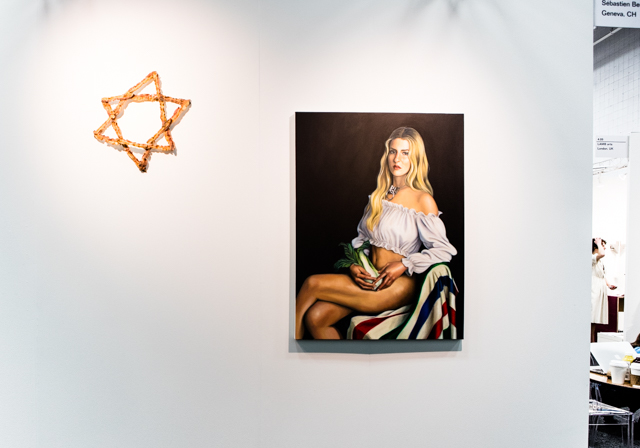
Chloe Wise at Galerie Sebastien Bertrand
Michael: So not kosher.
Paddy: I suppose this follows up on the bread backpack from last year, though I think there was more self aware absurdity to that piece. This work, by comparison takes a more earnest schlock and shock approach.
Just so it’s clear to everyone what’s being depicted here, beside the Star of David made of bacon, there is a women, wearing no pants, holding a head of bok choy over her crotch. Awesome.
Caroline Wells at Roberto Paradise
Michael: I think I have seen a Caroline Wells yarn figure with a rainbow crotch at roughly every other art fair I’ve been to in the past few years. Don’t get me wrong, the first time I saw one of these, I loved it. But now, I only find myself wondering how there is possibly enough demand for rainbow yarn crotches to justify the quantity of these there are on the fair circuit. I want to see the big queer factory that pumps these out. I bet it’s a magical place.
Paddy: Why does that figure have two rainbow crotches? The great quality about some of the others was how hilariously massive their exposed crotch was—typically mid splits. (There’s one of those on the back wall.) This one doesn’t even make sense.
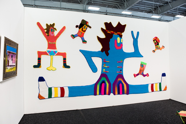
American Medium, Installation view
Michael: First impression: there’s so much to actively see at American Medium’s booth. In a fair with quite a few boring installs, I appreciated this fact. Second impression: the booth is populated (exclusively?) by artists from the New Museum’s First Look: New Art Online series: Brenna Murphy, Ann Hirsch, and Wickerham & Lomax (née DUOX). Wickerham & Lomax’s huge digital prints are packed with unexpected details you can only observe up-close, and are the perfect scale for a fair booth. They’re like eye-grabbing advertisements from a distance, but when you’re right in front of them you notice things such as the tiny “screens” with stills from Black Lives Matter protests cascading in front of the styrofoam wig head. We were also happy to see “Take Karaoke: A Proposition for Performance Art” playing here, the Wickerham & Lomax video we showed at F.A.G. Bar in Miami last year. We could watch that (and have) countless times and always discover something new to love.
Paddy: I love the work by all the artists on view here, but the display made me feel like I was at a maker faire booth. There was so much hardware in the space, you could easily get the impression that was what was for sale. As it happens, Electric Objects, a booth actually selling hardware made specifically for showing art, was located just across the aisle.
Fuminao Suenaga at Maki Fine Arts
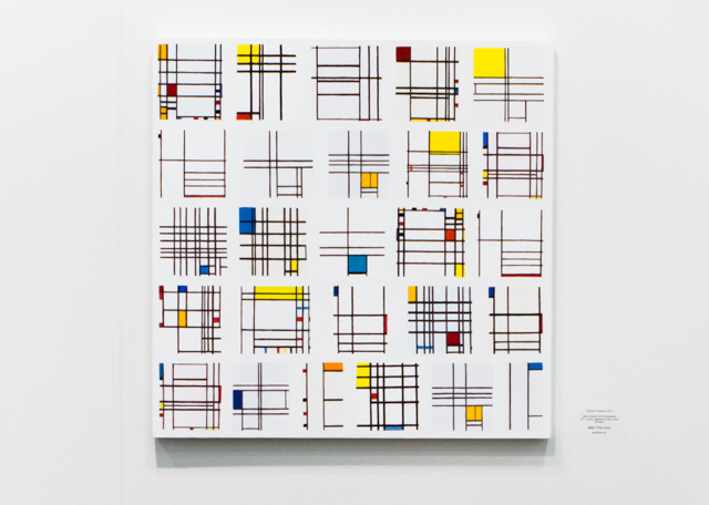
Paddy: Okay, Michael, I know you loved this work, but you can count me out on this one. Here, we see a grid of Mondrian versions, applied to canvas in much the same way we might expect it to be reproduced on a t-shirt. It’s decorative and as an experiment—these are search results arranged on a canvas—yields virtually nothing new. Why do you like this work?
Michael: I think the Mondrian iteration is the least successful in the series, likely because each individual Mondrian is so graphically bold. But as a whole, I love Fuminao’s “Search Results” paintings. Each one is a painting of the image search results for a different abstract painter. I might like this more in the context of NADA than I would in a gallery, but I think it was a clever way to play with representation v.s. abstraction in a fair with so much vapid painting.
I especially loved “Search Result (28 Lucio Fontana)”, a random grid of solid-color rectangles with tiny slashes. I always think of the Yasmina Reza play “Art” when I see a Fontana (one of his slashed canvasses served as the book’s cover) about a bourgeois man whose relationships crumble after he buys an all-white abstract painting that divides the opinions of his friends. I suppose I am always grasping for something to reassure me abstraction still has teeth and relevance beyond decor—even if that means a representational painting of tiny abstract paintings. It’s still much smarter than all the countless pieces in the fair that look like stretched tie-dye T-shirts.
Fuminao Suenaga, “Search Result (64 Ellsworth Kelly)”, “Search Result (26 Piet Mondrian)”, “Search Result (28 Lucio Fontana)”, “Search Result (18 Mark Rothko)”, “Search Result (15 Agnes Martin)” at Maki Fine Arts.
*Photos by Marsha Owett (the good ones) and Michael Anthony Farley.

Comments on this entry are closed.
{ 1 trackback }