
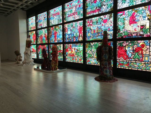
Raul De Nieves, “beginning & the end neither & the otherwise betwixt & between the end is the beginning & the end”, 2016
Out of the ten Whitney Biennials I’ve seen, this is the first one that could have used a vomit warning. But here we are, in Trump’s America, a future many of us never wanted to imagine, let alone live through. What is the purpose of art in this New America? This year’s Biennial bears no answers. Art doesn’t exist to defend its purpose and even if it did this exhibition was organized prior to the election. Nevertheless, it does bring then-simmering themes to a boil. So, while almost none of the work is Trump themed, as a whole the exhibition reads as a response to the challenges the country faces—increasing income inequality across the board, failing institutions, and the rise of hate-fueled violence. If art is a mirror, then this year’s Biennial should scare the shit out of you.
Considered New York’s most important survey of contemporary art making, politics is at the center of the work of 63 artists selected by curators Christopher Y. Lew and Mia Locks. Thanks to the museum’s huge new digs on Ganesevort, artists are afforded a lot more space, which gives way to conceptual groupings that flow from one to the next. It’s quite literally a pleasure to look at and leaves plenty of room for the nausea to sink in.
This biennial even includes art that made me feel like a despicable human being for having concluded that the show had merit. Jordan Wolfson’s “Real Violence” is a 2:25 minute virtual reality experience, the first 20 seconds of which consist only of a countdown. Said countdown constitutes my most vivid memory of the piece—namely because it was the only section I could watch in its entirety. Only a wall label few will read prepares the viewer for what’s on the screen, which is two solid minutes of the artist violently swinging a baseball bat into another man’s head and then crushing his bloody skull into the cement. (The man is actually a super-realistic android.) He does so on a city sidewalk surrounded by high-rises. A verbal prayer from a Chanukah blessing plays in the background.
On the one hand, this could be read as a reflection of larger pop culture trends. Shows like Westworld have popularized themes of violence against simulated humans, and perhaps Wolfson is making a connection to Jewish laws against idol worship through the blessing. More likely, though, this is simply a terrifyingly accurate mirror of the America capable of electing Trump. Religion of any kind seems scary or completely misunderstood. (I heard one attendee mistake the Hebrew blessing for Arabic.) Citizens hungrily consume any and all spectacles regardless of their impact on their health. (Who won’t talk about this work?) And that’s to say nothing of the ongoing feelings of paralysis many of us feel, fueled in part by those who are unwilling or too disinterested to respond. (The piece was made in 2016, and presumably in development long before Trump became president.)
Speaking to this reluctance to see, I spent the better part of two minutes within the VR environment, turned away from the violence, watching an office worker standing on a nearby street corner who didn’t notice the crime. (Like a victim of abuse, it never occurred to me to remove the headset.) According to the wall label, the man taking the beating occasionally makes eye contact with the viewer, an added level of creep, if you can endure it. I could not.
All of this begs the question, how does a critic fairly evaluate the biennial after seeing a work like that? The piece is essentially screen burn—everything seen before or after is viewed through the image of a man being beaten to a pulp. Is that fair to the other artists? The answer, of course, is no.
The fact is, though, the screen burn I was suffering from wasn’t coming just from Wolfson’s piece, but from the Trump presidency itself. The Trump administration casts its long shadow over every Facebook conversation, tweet and social outing, and unfortunately, not even this year’s Whitney Biennial offers many sunny spots.
This context can make conceptual art and formalism lose their resonance. John Divola’s photographs of discarded portrait paintings by students carefully hung inside abandoned spaces look nice enough, but many of the conceits driving the work don’t go much deeper than formalism. Is it too great a luxury now to contemplate how the gaze of the portrait’s sitter makes us more aware of the frame of the camera? It sure feels like it. The same can be said for the work of John Riepenhoff, who makes whimsical sculptures of anonymous figures holding up the works Riepenhoff might sell in his gallery. Haha and all that, but I don’t need to see the legs of an art handler behind a work to appreciate how it got on the wall.
These were outliers in a strong show, though, and work I could see appreciating more in a different exhibition in a different time. Looking through Trump’s lens, I initially read the figure in painter Dana Schutz’s “Shame” as forcefully poking itself in the eye. Perhaps this was too literal a read as the piece was located nearby her painting “Open Casket” which depicted the Emmitt Till, a 14 year old lynched in 1955, and directly across from Occupy Museum’s horrifying breakdown of the financial ties that run the art world and all student debt. Closer inspection of the painting—gracefully rendered so that even the most layered and manipulated brushwork seemed economical—reveals a head hung between two hands. That, too, worked.
The Whitney Biennial, installation view. From left to right: Cauleen Smith, Torey Thornton, and William Pope L.
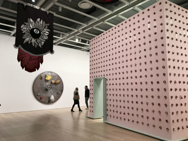
Fittingly, a large section of the fifth floor has been colonized by the resistance, which resembles the set of Game of Thrones. Cauleen Smith’s collection of medieval-styled knight’s standards (they’re shield emblems) hangs from the ceiling beside what resembles a pink torture chamber gridded with flesh decorations by William Pope L. (In actuality, the medallions are bologna slices affixed with black and white portraits). Both address the subject of race. Smith’s flags, for example, come out of the artist’s dismay for what seems like a never-ending stream of videos evidencing the abuse of black people and are hand sewn with messages like “We Were Never Meant to Survive” and “Stop.” Pope L’s “Claim (Whitney Version)”, is a bit more complicated. The text tells us the bologna corresponds to a percentage of New York’s Jewish population—though the number of medallions is off by at least two, if not more. This known error supposedly points to big data and its nefarious uses visa vis immigration and voter fraud—a message no one would get without a wall label. Still, the fact that the box reads like a prison for random citizens is powerful enough on its own and thus rightly commands a large presence within the biennial.
There’s a toughness to this work that cedes to sensitivity elsewhere. Samara Golden created a corporate housing structure against the museum’s westward-facing windows that amounts to infinite tunnel of the homeless. Mirrors on the floor and ceiling create the illusion of endless floors, each lined with sculptures of people wrapped in sleeping bags. It’s heartbreaking.
Mercifully, there are some breaks. Talia Madani’s explorations of light have almost nothing to do with politics, but she gets a mention anyway for having completed the weirdest painting in the show. “Shafts” is a blackened painting in which rendered light shines from the butts of four babies crawling along a Tron-like grid. In the foreground, a father figure holds up a strip of their lost poo, bathed in the light from their butts. Hilarious.
It was almost a surprise to learn that I still find baby shit and butt lights funny, considering the context of our failing democracy. In some ways, I expected only work like Wolfson’s to be able to speak because that’s the volume we operate at now. But the biennial also reminds us that’s too narrow a vision for art or for America. Communication isn’t about how loud you can speak but about showing up, listening, and taking an interest in new ideas.
It was a suite of Carrie Moyer abstract paintings that made that truth most clear, and gave me hope. If the observations made above had any validity—that art that looked inward or focused to heavily on formalism tended to miss the mark—these paintings shouldn’t have made any impact. And yet, there I stood, marveling at the billow of light that seemed to emanate from inside the smooth green and amber swooshes of “Candy Cap” and the thin ultramarine blue washes that still made dense forms in “String Theory and Daisy Chains.” I left feeling emotionally injured, yet somehow more optimistic than I have in weeks, which is consistent with with the shock of watching America turn into a kleptocracy and fascist regime. The highs and lows are more extreme than I could have ever imagined.
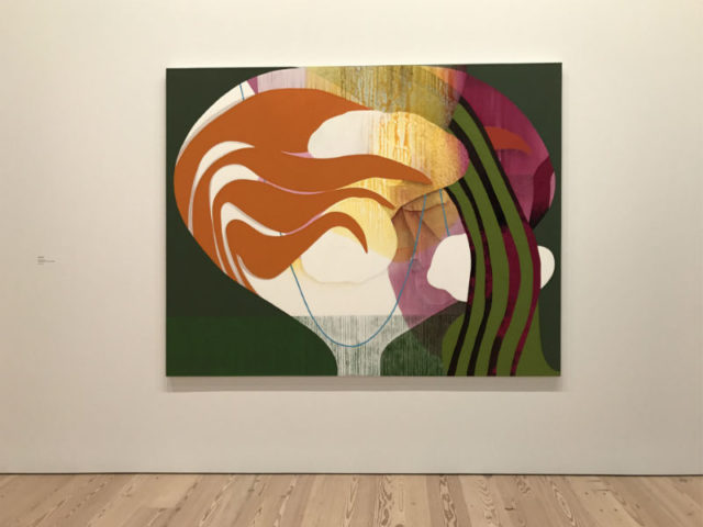
Carrie Moyer, “Candy Cap” 2016, 72 x 96 inches
Ajay Kurian, “Childermass”, 2017, dimensions variable.
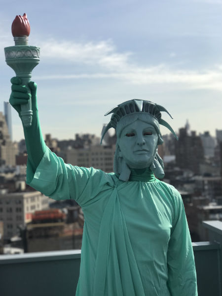
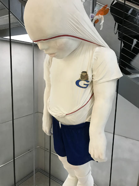
Puppies Puppies, “Liberty” 2017, performance on the 8th floor of the Biennial.
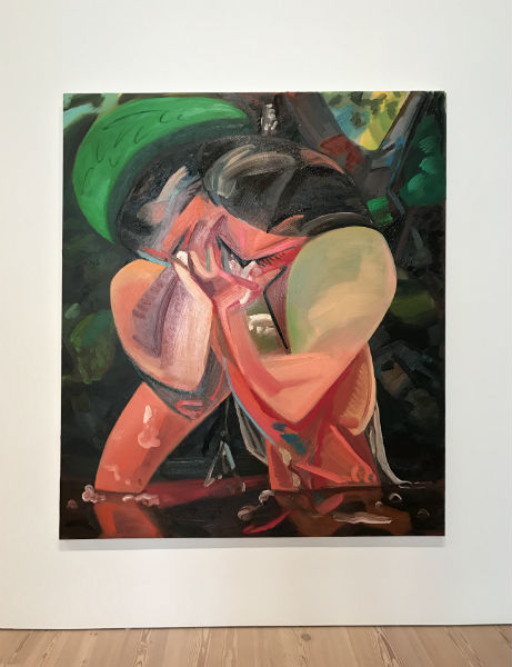
Dana Schutz, “Shame”
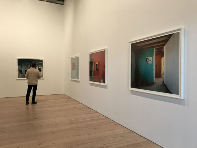
John Divola, installation view
John Riepenhoff, installation view.
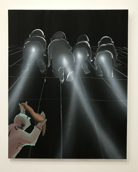
Talia Madani’s “Shafts”, 2017, 55 x 44 inches
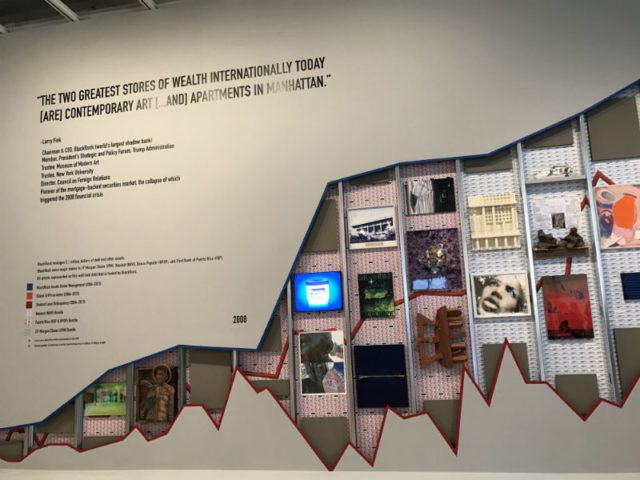
Occupy Museums, “Debt Fair”, 2017, Installation view

Comments on this entry are closed.
{ 2 trackbacks }